|
|
Post by Farrar on Jun 26, 2020 8:59:41 GMT -5
One of the things Joe should be credited with is he stayed on the FF for about 130 issues after Kirby left. Up until John Byrne took over. Through Buscema, Perez, Seinkewicz among others, he kept the quality of the art and the look of the book consistent. Yes, post-Kirby people like Buscema and Buckler and others were basically doing layouts for his finishes. It was Sinnott's FF that became the gold standard. |
|
|
|
Post by Farrar on Jun 26, 2020 8:55:59 GMT -5
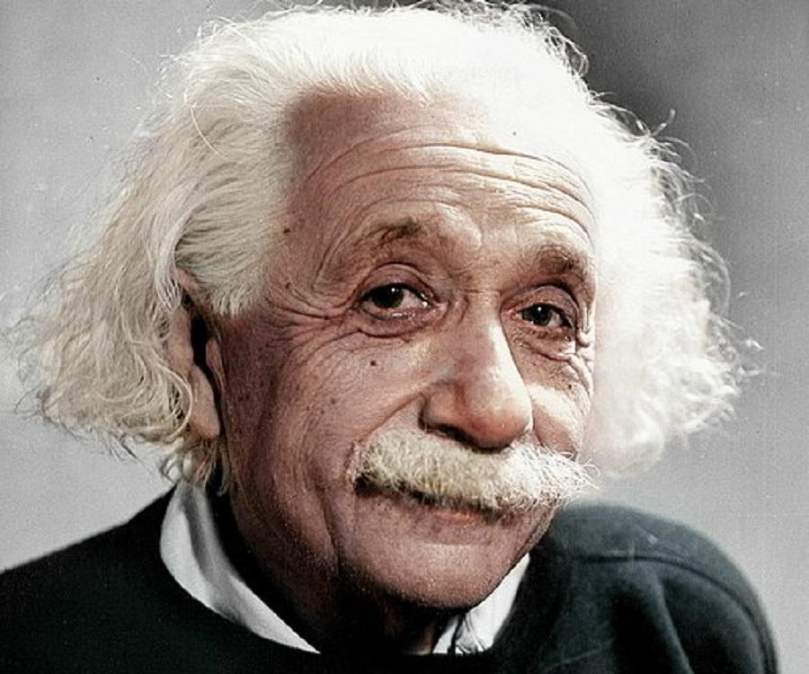
Very sad news  . He seemed like such a great person and needless to say, he was a giant in the field. His FF work with Kirby is what I came in on, and for me, that combo can't be beat. RIP Mr. Sinnott. |
|
|
|
Post by Farrar on Jun 24, 2020 9:19:20 GMT -5
|
|
|
|
Post by Farrar on Jun 23, 2020 21:08:09 GMT -5
June 1970
My DCs Adventure #396: Adventure #396: I must have had this issue, because I remember reading in the letter column (in response to a letter from Rich Morrissey) that Mike Sekowsky was going to take over Supergirl with the next issue! I loved Sekowsky's Wonder Woman (this was the mod Diana Prince version, but I wasn't having too much luck finding recent WWs on the stands--it was very hit or miss for me). Anyway, I have no recollection of the two Supergirl stories in this comic at all, re-reading them as an adult doesn't ring a bell. Very forgettable bland series, so I was really looking forward to seeing if Sekowsky could inject some excitement into this comic. Now, Brave and the Bold #91--wow. Prince Hal has already explained just what made this story was so great, so I'll just add that it's one of my favorite issues from my childhood. I was so glad to see Black Canary getting more and more airtime at DC. I could never manage to pick up the JLA comic, though I'd managed to read a few here and there thanks to my friends; and I had last month's GL/GA, which featured BC...but in this particular B & B story she really came into her own. There was a real emotional core to this story; she wanted to recreate what she'd had with her late Earth-2 Larry with Earth-1's Larry Lance, only he turned out to be far more sleazy than the other Larry. But he looked good, thanks to Nick Cardy, so her infatuation was perfectly understandable (and frankly Cardy's Larry looked a hell of lot more attractive than that Fandral-wannabe Green Arrow, lol). Batman was jealous (and his attraction to her would resurface later on in a couple of JLA issues). I remember thinking these were adult emotions and that this was such a grown-up story. And of course Cardy made it look like a movie, or as Hal put it, film noir. Great comic.
|
|
|
|
Post by Farrar on Jun 23, 2020 20:37:48 GMT -5
If by "The big Guns era" you are referring to the mid-90's, there is a certain double entendre there...
Big Guns as in weapons, and Big Guns as in certain anatomical attributes. Both were all over the place in those '90's books.
I don't see how it was physically possible for some of those 90's female characters to walk upright. Don't get me wrong-- as a red-blooded male I am certainly appreciative of the aesthetic of the female form in general, but it got pretty ridiculous during that era for "mainstream" titles. Some of those Marvel and Image characters looked like they were drawn by Bill Ward on a bad acid trip.
You hit the target(s) exactly sir...if you know what I mean, nudge nudge wink wink know what I mean. Say no more. Well, "guns" is also a long-time slang term for big heavily-muscled biceps and triceps, so those are the "anatomical attributes"  that popped into my mind. I have no interest in 1990s comics, but from what I've seen online of them weren't biceps/triceps also similarly exaggerated during that era, the mid-'90s? Or am I thinking of another time? |
|
|
|
Post by Farrar on Jun 23, 2020 19:20:56 GMT -5
mrp
|
|
|
|
Post by Farrar on Jun 19, 2020 12:34:39 GMT -5
^^^^ You're so right, Prince Hal -- they look like themselves in the Adams array! |
|
|
|
Post by Farrar on Jun 19, 2020 12:30:43 GMT -5
I doubt Kirby had any interest in doing cheescake art. But his women were not ugly. 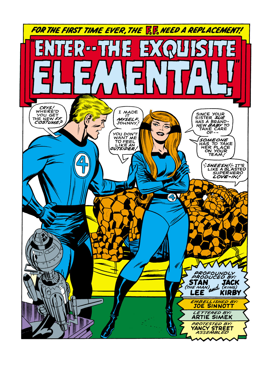  I happen to think that in the 1960s Kirby drew nice-looking women, and men too (especially the blonds such as Thor/Don Blake and Steve Rogers); but it should be noted that for the 1960s FF, once Sinnott became the regular inker, the women's faces were often heavily Sinnott-ized, as here with Crystal; and also Sue (and Reed and Johnny too) in the FF #5 panel below (Sinnott's first FF). For that image of Sif (which for space purposes I won't include here), that's a Colletta face--his trademark thick eyebrows, rounded lips, etc. Great Kirby bodies (Crystal and Sif). ETA: And also in the '60s, for the Cap feature Stan had Romita redo many of the Kirby Sharon Carter faces. |
|
|
|
Post by Farrar on Jun 18, 2020 13:03:03 GMT -5
JUSTICE LEAGUE OF AMERICA 82 ...Despite my love of his artwork, I was never a huge fan of the Murphy Anderson heads, most of which always struck me as way off-model. Black Canary’s hair looks like it needs to be shampooed; GL’s mask is way too wide; Batman looks like he’s waiting to be called onto the set of a Hostess Twinkies ad; and that weird little cleft in GA’s beard always bugged me... Thank you. I too always disliked those faces, especially GL's and Black Canary's. Her hair/wig is just too short; she was known for her voluminous flowing locks, not a chin-length 'do. I know it was probably drawn or cropped to be shorter because of space limitations, but the result is it just doesn't look like her! Well, Anderson will redeem himself (in my eyes, at least) with some great heads on a different comic book cover next month. Stay tuned! And looking over the June DCs, juxtaposing the 'Tec #402 and Superman #229 covers makes me laugh; the latter almost seems like it's parodying the former . Good example of the different editorial approaches still in force then at DC. Damn I love Curt Swan (and whomever came up with the #229 cover premise--Infantino and/or the Supes writer, etc.).  |
|
|
|
Post by Farrar on Jun 17, 2020 21:46:06 GMT -5
June 1970My Marvels

Amazing Adventures #2: Inhumans: I didn't care for Kirby's dialogue, it sounded stilted to me. And Chic Stone's inking looked old-fashioned and clunky. Black Widow: this feature looked promising; Natasha had no super-powers, so I found her relatable. And while no one ever mentions John Verpooten as being among the pantheon of great inkers (with good reason), here his basic style meshed perfectly with Buscema's pencils: he was faithful to JB's lines and smoothed it out a bit, without homogenizing it (as I felt was the case when, say, Sinnott would ink Buscema). Anyway, Natasha was fighting on the side of the common man, sort of like GL and GA over at DC; and also like Batgirl in her back-up series over in Detective (the red hair/black costume furthered the association in my mind). But whereas Batgirl was refreshingly free of self-doubt or neurosis, Natasha had that can't-be-a-Marvel-character-without-it trademark angst. Avengers #79: I liked this core team of Wanda, Pietro, Clint, T'Challa, and the Vision. In the story Wanda referred to Natasha's recent dumping of Clint. I figured one of the reasons Roy Thomas brought Wanda back to the team was so he could get some romance in the book. By this time I had plenty of Avengers back issues including from the Kooky Quartet days, so I knew that back in the old days Clint had his eye on Wanda. I figured it was only a matter of time before we'd see a Clint-Wanda pairing in the new comics. Fantastic Four #102: First there was that cover--a familiar Subby pose, but the FF looked so uncharacteristically lanky on the cover--wait a minute, the cover was by Romita not by Kirby! What was going on? Well, I got my answer in the issue's Stan's Soapbox where it was announced that Kirby was leaving Marvel! Noooooooooo!!!!!!!! Thankfully #102's interior art was by Kirby-Sinnott...but what would the next issue bring? Sub-Mariner #29: An okay story, good art by Sal as usual. I liked the Namor-Dorma-Diane situation and here there was some dialogue about Namor asking Diane to "speak no more of any feelings she may have" for him. Huh? Such an encounter or dialogue had not occurred in any way, shape or form in any of the four previous Subby issues I'd read. Had something happened off panel that? If so, I felt cheated! Anyway, as I found out decades later, a story that had been intended for an earlier issue had been pulled (and printed later on)...so this particular piece of dialogue in #29 referred to something that happened in a story that hadn't actually been published at the time. Marvel Super-Heroes #28 was on sale this month too, but as it no longer included X-Men reprints (just Daredevil and Iron Man, two characters I wasn't especially interested in), I skipped this comic. What I didn't know was that in the next month, July, the X-Men book would be revived and it would continue with the reprints that had started in MSH.
|
|
|
|
Post by Farrar on Jun 17, 2020 11:24:25 GMT -5
First of all, welcome back  Interesting hypothesis you have there. Personally I think he was combining elements of what he'd written before, which included a healthy dose of humor (which helped make the Marvel new superhero characters sound less like cookie-cutter superheroes). Humor was always a big part of Lee's dialoguing/writing style. In the '40s and '50s Lee did a lot of scripting for various genres including funny animal titles, "working gal" titles (Tessie the Typist, Millie the Model, etc. ); teen humor titles;and the like. Even when Goodman's company did Atlas horror/mystery titles (1950s), Lee would add some humor in there too; and many those stories were predicated on a psychological twist or character flaw (greed, dissatisfaction, alienation, etc.)...so, not unlike Spidey or other heroes' angsts. It all came together for him when he was tasked with getting Marvel back into superheroes in 1961; by then he was seasoned enough, and had enough autonomy, to write the way he liked to (cue overused story about his wife advising him). IMO it would have been second nature for Lee to inject these more "realistic" components into the new superhero work. If you're interested, and since you mentioned TwoMorrows, there's a really good overview of his pre-Marvel (FF 1961) writing in Alter Ego #90. |
|
|
|
Post by Farrar on Jun 17, 2020 10:47:17 GMT -5
NOT AN ENTRYAnyone else a little surprised that this oddly specific monster--green-skinned, antler-like antennas, handless arms, 3-toed claws--appear on two different covers by different artists (though from the same company)? And preceding both was this, from 1947.   The green guy sure got around, didn't he--at least he put on shorts for the Flying Saucers cover Fwiw: In AE #106 Tony Tallarico noted that the Avon publisher "decided to save money on covers, and he was using some paperback art for the comics..." I don't normally like to resurrect old discussions but I bought a copy of Illustration #35 (from 2011) the other day, because it contains a comprehensive overview of the great pulp artist Joe Szokoli. Highly recommended article (and issue)! And a bonus in this issue were some illustrations by Harry Clarke, from a 1925 edition of Faust. Why am I posting this here? Well, take a look -- may be NSFW so I'll use spoiler tags. {Spoiler: Faust 1925}  |
|
|
|
Post by Farrar on Jun 17, 2020 8:14:29 GMT -5
Thanks BigPapaJoe and Confessor . I remember seeing that Superman and kids image a few years ago, not sure if it was here or somewhere else online...but I remember wondering about its origin, so I'd looked it up and found that it was a colorized version of an image that was originally created for distribution to schools, as a book cover for students.  Here's a link to a 2008 auction that includes some information about the above item 2008 Superman auction |
|
|
|
Post by Farrar on Jun 17, 2020 7:52:11 GMT -5
Swan-Klein  |
|
|
|
Post by Farrar on Jun 16, 2020 13:31:36 GMT -5
Avengers #25 is a favorite cover of mine, so... MDGKirby's Kooky Kwartet Kameo in 1967's Avengers Annual #1  |
|


 . He seemed like such a great person and needless to say, he was a giant in the field.


 that popped into my mind. I have no interest in 1990s comics, but from what I've seen online of them weren't biceps/triceps also similarly exaggerated during that era, the mid-'90s? Or am I thinking of another time?