|
|
Post by wildfire2099 on May 2, 2015 10:56:03 GMT -5
I LOVED the New Warriors in my formative comic book years... I start reading in the 30s or so, then went back to the beginning. Fabian NIcenza was definitely the first writer whose name I noticed (followed very closely by PAD). I thought it was brilliant to package up a bunch of characters that weren't doing anything... somehow it worked really well with the Warriors where it has failed other times... (Like the Champions, later Warriors incarnations, etc). I totally geeked out when Busiek had Justice and Firestar in his Avengers... I've always thought Justice was one of the best developed characters in Marvel... it's a shame he doesn't fit into any of the hip franchises. I actually just picked up the few issues I was missing back then with the intent to read them again, so perhaps I'll post some specific issue thoughts at some point  |
|
|
|
Post by coke & comics on May 2, 2015 12:45:30 GMT -5
Who knows where life and the thread will lead, but my loose intention is to only cover a couple years, probably stopping well before Thunderstrike. But we will see.
|
|
|
|
Post by coke & comics on May 2, 2015 12:50:50 GMT -5
It is perhaps relevant to note that I started reading comics in December of '89. I was a back issue guy from the get-go. In fact, I think it was a few years before I even noticed the new issue racks. In my early days of comics reading, my family took a trip to stay in a cabin by the Russian River, and several comics were bought for me for the trip, a group of comics I recall fondly, including Thor #411, which introduced the New Warriors on the last page. So they've been with me almost as long as I've been reading comics.
But most of the series here I picked up a little later rather than as they were coming out. In 1990, I was mainly interested in Avengers, Transformers, and grab bags of '80s comics.
|
|
|
|
Post by coke & comics on May 2, 2015 12:57:12 GMT -5
As I said in the opening post, I knew many of these characters best because I loved my Marvel trading cards, and they were quite popular at school.These characters were filed under "rookies". Card stats included characters' "win" percentages, and cards with higher percentages were popular. The only 100% heroes were brand new ones like Deathlok. Though I recall thinking at the time that Captain America really had the better stats, if you took into account the percentage and number of battles.
It was an early insight into the problem of averaging ratings today, and something people should be wary of when using Yelp or such things. There are better mathematical algorithms for combining ratings than simply averaging, which take into account how many ratings something has.
|
|
|
|
Post by coke & comics on May 2, 2015 13:17:32 GMT -5
Deathlok #1 by Dwayne McDuffie, Gregory Wright, Jackson Guice, and Scott Williams 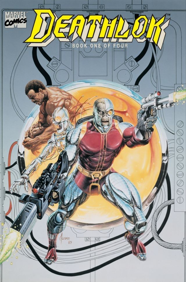 More than double-sized comic, with a spine and everything. A "prestige format", you might call it. You knew right away this was special. And it's beautiful. I find Jackson Guice and Scott Williams to both be somewhat hit or miss, but they put their all into making this comic look amazing. The very first splash page is a brain being surgically removed from Deathlok. Somewhat gruesome, but exquisitely rendered. This Deathlok will be revealed to be John Kelly, the second Deathlok. His story will be told in Marvel Comics Presents #62. Roxxon is an oil company with a weapons division. They use their weapons division to enforce their industrial interests internationally. This is obviously a fictional story. In real life, an oil company would simply hire some politicians to direct the US military to do this for them. While obviously inspired by the classic Deathlok, this series borrows quite heavily from the Robocop film, down to the purely robotic alternative they eventually send against Deathlok I'm going to claim, contrary to what I believe to be popular opinion, that this is actually quite a good comic. Its emotional core is formed by a lead character with a strong sense of morality, some touching moments with his wife and kid, and the internal conflict as he tries to override his programming to be a weapon to become a man again. Michael's mind: "No. No killing." Computer brain: "New parameter: No killing." EDIT to add: I should perhaps also mention this new Deathlok is black. So Marvel introduced two prominent black superheroes this month. Whatever else you can say about '90s Marvel, it was at least trying for diversity.
|
|
|
|
Post by coke & comics on May 3, 2015 2:57:54 GMT -5
Ghost Rider #3 (July, 1990) by Howard Mackie, Javier Saltares, and Mark Texeira  The cover tells us that Ghost Rider battles "The necrotic Blacout, the nihilistic Deathwatch and the Nefarious Kingpin". I like the alilteration. Nihilism. Say what you will about the tenets of national socialism. At least it's an ethos! The truth is I recall this Ghost Rider series as being decent. Maybe opinions change over 25 years. Or maybe it gets better. Because these first 3 issues... just aren't very good. I think they achieve the mood they aim for. And Ghost Rider looks cool. But there's just not much more I can say in its defense. Well, that and Deathwatch reminds me a lot of Strongbad. Long lost siblings? We do learn the predictable secret of the canisters in the suitcase this issue and it wraps up the first arc. "In the darkness of a nuclear winter I shall rule all." A Blackout quote. The trading card I had 25 years ago, which included quotes from the characters abbreviated it to "In the darkness I shall rule all." I like the shortened version better. In fact, I like that line enough that it's likely the sole source of my interest in Blackout. Disappointing to learn the true quote is less dramatic.
|
|
|
|
Post by coke & comics on May 3, 2015 20:49:43 GMT -5
Punisher: Kingdom Goneby Chuck Dixon, Jorge Zaffino, and John Wellington  Punisher was ahead of his time. Introduced in Amazing Spider-Man, starting to take shape as a character in the pages of Giant-Size Spider-Man, Marvel Preview, and Marvel Super Action, leading into a Michael Zeck miniseries, and finally getting his own ongoing in 1987, by Mike Baron and Klaus Janson. In some sense, he gave birth to the '90s. And the '90s loved him. He starred in two solo series, guest-starred everywhere, and had more graphic novels than I can count. To spotlight this hero who birthed an age, I've picked one of his many hardcover graphic novels, not the first, but the first of 1990. I'm not going to try to read all of them for this thread. The art is an oddity in this year of obsession with hyper-detail. Very loose lines, almost sketchy figures. But plenty of shadows to remind you what year it is. Straightforward Punisher story. He obsessively hunts a money launderer he believes will escape justice. Some easy political commentary thrown in here and there. Though it's a little odd to see the government still so worried about communists and Russians in 1990. This comic feels a year late.
|
|
|
|
Post by coke & comics on May 4, 2015 3:30:22 GMT -5
Spider-Man #1 (August, 1990) by Todd McFarlane  OK, you caught me. Spider-Man isn't a rookie. In fact, he had at this point been in continuous publication for almost 30 years and already appeared in 3 monthly titles. But this #1 fits in so well with this thread. First, there were so many covers, each rarer than the last. And it was drawn by Todd freakin' McFarlane, the hottest of the hotshot artists so valued by Marvel at the time. And it was dark. Shadows everywhere. And blood. It was a dark and violent Spider-Man comic. And oh so collectible. Why, if you bought the platinum cover when it came out, then you are almost certainly reading this from your beachside mansion, enjoying your early retirement. 15 years later, it's actually quite easy to make fun of this comic. What's trickier is to notice that it's actually really good. Now, I never was one for McFarlane's faces. His Peter Parker looked nothing like Peter Parker. Ditto for his MJ. But... the man drew faces. Look at the crowd shots on Page 1. All distinctively McFarlane. Details, slightly potato-shaped faces. But lots of them. And all so different. Every one of those people he drew looks like a person with a story. They aren't pretty, any of them. But they are individuals. And they look like they have stories. Now turn the page to the 2-page double spread. McFarlane, better than any artist since Ditko, gets that drawing Spider-Man is in the posing. Swinging through the air, one leg forward, one back, hand grasping the web. A bit of a crazy contortion. But that's Spider-Man. He's supposed to look unique in the way he flies through the air. Heck, look at the cover. Look at him crouching. Left arm twisted, some fingers down, right arm over the left leg, asymmetric. McFarlane once stated his vision was that even if you only saw the character in silhouette, you should still recognize it as Spider-Man. And he achieves that vision on every page. Remove the webs and the eyes and the color from that image. Just look at the contortions of the body. That's McFarlane's Spider-Man. It is, frankly, amazing. Now look at the page layouts. Todd McFarlane doesn't use borders. The story bleeds to the edge of each page. (Actually makes the whole thing difficult to read in trade. It's meant for the comic binding) Now, the art may not reach the edge of the page. The panels sometimes do and sometimes don't. They are sometimes set against a white background, and sometimes a black. But there are no borders. Just backgrounds. The panels are set against the backgrounds, sometimes with space between them, sometimes overlapping. Every page a different design. No Spider-Man artist before Todd has made as much use of the freedom to arrange panels to tell their story. He also likes big panels, rarely more than 3 a page. This lets the art shine, and really feels like part of an era where art is king. (Heck, they didn't even bother to get a writer for this comic). Because of the large panels, the story doesn't get very far. This is what you might call "decompressed storytelling". In fact, almost nothing happens plotwise in this comic. Some strange voodoo drums summon the Lizard, who starts killing people. Spider-Man captures a mugger, goes home to MJ, then heads to school the next day. That's it. Spider-Man doesn't meet the Lizard. He doesn't notice the Lizard is on a killing spree. Nothing. That will come later. We have 5 issues to tell this story, a story Ditko would have told in half an issue, leaving room for a backup story drawn by Kirby. Again, this comic is dark. Darkness is not new to Spider-Man. Kraven's Last Hunt was dark. Its success led to another "dark" Spider-Man story soon after, about the Mad Dog Ward. But it's not common. Spider-Man is not a dark hero. Spider-Man comics are never violent. In fact, there had never been a Spider-Man comic more violent than this. So. To summarize. Dark, violent, not much of a story. But the art is too good to dismiss. This really is one of the great Spider-Man stories. We'll see more of it.
|
|
|
|
Post by adamwarlock2099 on May 4, 2015 9:00:57 GMT -5
McFarlane does a great visual Spiderman, yes, so yes. I too think his human faces are grotesque. But I also think Kirby's are too. But his art is great, for Spiderman and a lot of the villains that he did while he was on the book, Lizard, Hobgoblin, Wendigo, etc., as well as doing great with the guest stars, Wolverine, Ghost Rider, etc.
But I did like the tone of the book, as I at the point I started buying these earlier issues, was only reading the current Spiderman titles, which at the time was the Clone Saga. And while it may have made an attempt to be dark with the story it was telling it just came off as ridiculous to me. So when I started buying these, it was for McFarlane's art, cause in the 90's there was no shortage of it, so I already knew who he was. But I hadn't read Kraven's Last Hunt, at that point, and this was the first dark Spiderman story, and for me it worked, and it was a nice change, or alternative, at the very least. I kept reading the title up until were I had was at the present with the Clone Saga, and liked Mad Dog Ward.
I also enjoyed his last story with #16 that continued in X-Force #4, where both issues were presented in "widescreen", in that you had to read the whole comic horizontally. Nice gimmick.
I also think McFarlane did good with Spiderman banter. And it was really apparent in the above mentioned story.
|
|
|
|
Post by Nowhere Man on May 4, 2015 20:26:04 GMT -5
McFarlane, for all the megalomania that followed in the wake of him building an empire at Image, was an interesting artist and did breath a bit of fresh air into Spider-Man in the late 80's and early 90's. I also liked his stint on the Hulk. That said, I think he would have been better on a pure horror title if horror titles where in vogue in the 80's.
|
|
|
|
Post by adamwarlock2099 on May 5, 2015 8:18:01 GMT -5
McFarlane, for all the megalomania that followed in the wake of him building an empire at Image, was an interesting artist and did breath a bit of fresh air into Spider-Man in the late 80's and early 90's. I also liked his stint on the Hulk. That said, I think he would have been better on a pure horror title if horror titles where in vogue in the 80's. The only reason I would say I didn't like his stint on the Hulk is because he did portray him visually as more of a monster. He has knack for monstrosities like Ploog or Wrightson. And Hulk at that time, as I believe it was before Fixit's persona, really wasn't a bad transition of the Hulk. |
|
|
|
Post by coke & comics on May 9, 2015 0:43:17 GMT -5
New Warriors #2 (August, 1990) by Fabian Nicieza, Mark Bagley, and Al Williamson 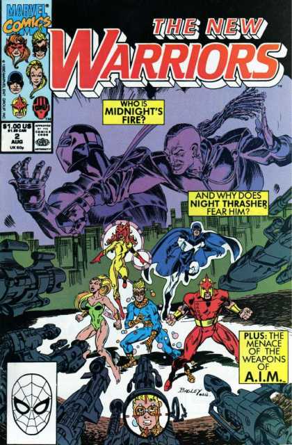 Many of my thoughts on this issue are similar to my thoughts on the last. Bagley a good but still-developing artist. The last issue had a fairly typical gathering of the team format. They come together and decide at the end to stay together, coming up with a name in the last panel. This issue opens with a training sequence, in standard superhero tradition. Chord watches from the control room and gives feedback. I could easily see Professor X in his place saying the same things. And then--also in true superhero tradition--a noncombatant dangerously enters the workout room, creating havoc. We then learn some secrets of Night Thrasher's past (his recent past, of course. He is just a kid still.) as old faces resurface (again, not from that long ago). We are introduced to Midnight's Fire and Silhouette, siblings Night Thrasher met on an early outing. And we learn where Night Thrasher got his scar. No, I can't explain Thrasher's earring. I assume we will later learn why he hates snakes. At some point, they are confronting the villain, a martial artist clearly no match for the New Warriors, but they decide Night Thrasher has something to prove so all hold back so he can beat the bad guy solo. Really, this isn't a particular good issue. Lots of cliches, characterization weak, contrived choices, subtle racism. There is a Vietnamese person named "Chin". "Chin" is usually a Chinese surname, but really you have an issue of transliteration. There is a Vietnamese surname derived from "Chen", but it is usually pronounced and in english spelled as "Tran". I think the character should have been "Tran". This is a minor point, but the issue as a whole is filled with more subtle but far more questionable treatment of Asian culture, including blending and confusing Chinese/Vietnamese/Korean culture, and describing the villain's motivations as "very Asian".
|
|
|
|
Post by the4thpip on May 9, 2015 4:17:27 GMT -5
Guardians of the Galaxy #1 (June, 1990) by Jim Valentino and Steve Montano  I'm only going to review this one issue for the thread, I think. I almost skipped it, but it fit in too well, as Jim Valentino was also part of the Image migration, going on to creatre Shadowhawk. In some part, this thread is a look at the prehistory of Image, which went from somewhat ignoble beginnings to perhaps the best comic publisher today, putting out books on par with the heyday of Vertigo. Jim Valentino is not a man whose work I know well, so I appreciate insights by the readers. He takes on both the writing and art duties here. When the assistant editors aren't writing the books, the artists are. The issue opens with an unmotivated action sequence and heavy narration to introduce the characters, typical of many stories of the era. We will later learn they are on a quest for the legendary shield of Captain America. We learn the team consists of Starhawk/Aleta, Nikki, Charlie-27, Martinex, Yondu, and Major Vance Astro. All classic team members. They fight a villain called Taserface. That... is apparently not an ironic name. Y'see, he blasts a taser from this face. "There is reason why I cam called Taserface!" he boasts. ... The story of the issue isn't much (though I like the basic premise of the quest for the shield) but Valentino seems to be on the better side of the early Image artists. His style is of the time, round boobs and heavy cleavage for the ladies, muscles lines and other detail lines for the men. I'm a big fan of the recent Guardians of the Galaxy film, so I did enjoy seeing Yondu whistle to control his arrow in the issue. The issue ends with them confronting the Stark. Taserface had weapons resembling Iron Man's, and we see he is part of a gang of aliens with armor resembling a whole host of 20th century armored heroes and villains. It will be a recurring theme of this series, the references to the 20th century Marvel universe. Don't give Valentino much credit for the art. The LCS owner of the shop I frequented at the time was a friend of Steve Montano's. He showed me a couple of snapshots of what Valentino's "pencils" looked like. Calling them layouts would be generous. Whereas Liefeld drew people so hands and feet were hidden or off panel, Valentino would leave such things for the inker to do, as well as arms, legs, facial details, musculature, backgrounds...the finished page was usually 80-90% Montano's work, which is why when Valentino left and West took over, but Montano stayed as inker there was a lot of continuity in the look of the book, it was still mostly Montano's work, just not the page breakdowns/panel layouts. -M Must have been so confusing for Montano when Dale Eaglesham did two fill-ins, as Dale is obsessed with detail and cannot bring himself to do breakdowns (one of the reasons why he is equally as fast or slow whether he works with an inker or not). Still, you can barely tell it's his art, so I guess Montano just re-drew everything out of habit. |
|
|
|
Post by DubipR on May 9, 2015 10:48:35 GMT -5
The best of the rookies of 90s Marvel...  Thunderbolts #1 Thunderbolts #1Released: April 1, 1997 While the whole Heroes Reborn mess was happening, Kurt Busiek introduced us to a new superhero team that took Marvel over by storm! A new set of protectors to hold down the Earth while Captain America, the FF, Thor and Iron had left this realm. Citizen V! Songbird! Atlas! Mach I! Techno and Meteorite! Secretly they were Baron Zemo and his Master of Evil in secret, trying to gain access to the Avengers files and take over the world. First off, it was a brilliant coup and perhaps the best shock intro to a team in Marvel history.. no one was expecting that! Secondly, having a talent like Mark Bagley jump from Spider-Man to start a new series was a great help. Some of Busiek's greatest Marvel writing was done here; taking old throw-away characters and concepts and making them brilliant and actually a threat. |
|
|
|
Post by wildfire2099 on May 9, 2015 12:02:01 GMT -5
Thunderbolts was a great title for a really long time...really until they started re-vamping it every couple years.
I still think one of Marvel's biggest mistakes of the current era was not pushing Songbird as the next big female hero... when you look at how popular Ms. Marvel and Carol Danvers became, I think they really missed the book on Songbird (and, to a lesser extent, Jolt).
I think the issue was Marvel mistook WHY Thunderbolts was good, it's not just 'Marvel's Suicide Squad', but rather the dynamic of a team that was half evil villains trying to trick the masses, and half villains that legitimately wanted to reform that was really fun and unique.. especially after Jolt got added as the innocent new heroine.
|
|


