|
|
Post by sunofdarkchild on Apr 26, 2024 0:37:45 GMT -5
The letters to the editors pages in those days were filled with letters praising the art on Superman: The Man of Steel to high heaven, and I never understood it since it was clearly the worst-looking book by a mile.
In general I find Louise Simonson's writing on Superman in the 90s to be a huge improvement over her writing on the X-Men books in the 80s, especially her awful New Mutants. But the Superman writers were much better at collaboration and the editors much better at maintaining continuity between the books than the X-Men's editors had been, especially once Bob Harris took over in the late 80s, where there were huge mistakes that slipped past because he just didn't care.
|
|
shaxper
CCF Site Custodian
Posts: 22,870
Member is Online
|
Post by shaxper on Apr 26, 2024 3:59:55 GMT -5
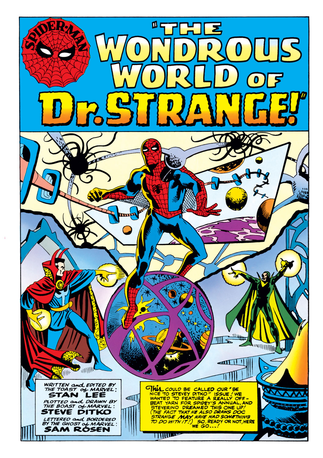
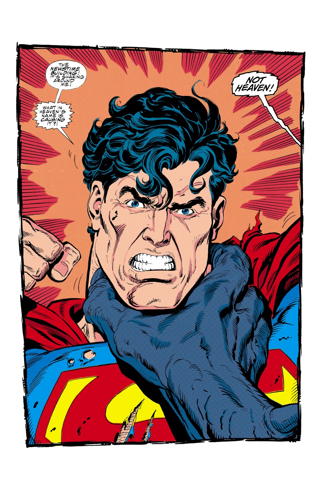
Bogdanove's cover is an homage to the splash page of Amazing Spider-Man Annual #2 which, I suppose, only helps to support your argument that the Superman titles didn't exactly have their finger on the pulse of what 1992 audiences wanted.  Since the whole point of an homage is that it is recognized as an homage, it's strange that Bogdanove tipped his hat to, well, a splash page which I can't imagine that most readers would have recognized - it's not exactly an homage to Amazing Fantasy #15. Weirder still to me is the fact that Bogdanove is only copying parts of the background, Spider-Man's legs, and left arm. Even side-by-side, the similarities aren't immediately noticeable (to me, at least). Any cover by Ditko, any of those glorious splash pages used in the first annual with The Sinister Six, Spidey lifting that machinery in issue #33 - an homage to any of those and I'd understand, but page two of that annual where Spider-Man teams up with Dr. Strange? I don't know... Nice catch! I felt the Ditko influence, but Boggie's work seemed primitive in comparison. Maybe it was just the idea of homaging a 1960s interior panel arrangement on a 1990s cover, as you suggested. Jeff: I've got to get in a review this week. Also Jeff: But not while you're in the middle of a tense and complex text conversation with your ex wife about the kids! Jeff: No sweat. I can do both... I'm seriously embarrassed on this one. And also, is it more a commentary on my obliviousness or on the total inconsistency in Bogdanove's art that I couldn't immediately tell?  I definitely would have enjoyed that more. It seems to me, though, that Jerry White was every bit as detested as the Post-Crisis Jason Todd (and maybe moreso) for pretty much the same reasons, and folks just wanted this giant Marv Wolfman mistake removed without the chance of return. And now he might return. |
|
shaxper
CCF Site Custodian
Posts: 22,870
Member is Online
|
Post by shaxper on Apr 26, 2024 4:08:42 GMT -5
The letters to the editors pages in those days were filled with letters praising the art on Superman: The Man of Steel to high heaven, and I never understood it since it was clearly the worst-looking book by a mile. In general I find Louise Simonson's writing on Superman in the 90s to be a huge improvement over her writing on the X-Men books in the 80s, especially her awful New Mutants. But the Superman writers were much better at collaboration and the editors much better at maintaining continuity between the books than the X-Men's editors had been, especially once Bob Harris took over in the late 80s, where there were huge mistakes that slipped past because he just didn't care. At least at Marvel, I could understand why Simonson had previously been an outstanding editor. Her plots were always strong, even when the writing and dialogue didn't quite get it there. I can't even say that about her Superman work. As you implied, there's a definite disconnect between Simonson and the other three writers, leaving me wondering whether she isn't playing well or is being left out. |
|
|
|
Post by chadwilliam on Apr 27, 2024 21:04:57 GMT -5
Jeff: I've got to get in a review this week. Also Jeff: But not while you're in the middle of a tense and complex text conversation with your ex wife about the kids! Jeff: No sweat. I can do both... I'm seriously embarrassed on this one. And also, is it more a commentary on my obliviousness or on the total inconsistency in Bogdanove's art that I couldn't immediately tell? For the most part, I'm not a big fan of Bogdanove's work though certainly, the man has his moments. The big massive brawl to the death with a big dumb monster that's coming up? By all means, let Bogdanove let loose. A style which feels incompatible and perhaps even at odds with what's going on in the other titles? Not necessarily a bad thing when in about half a dozen issues from now, the four titles are going to wildly diverge from one another with "Reign of the Supermen!". But when you open Superman: Man of Steel and are blown away by the first page and it's by someone other than the regular artist...  That still throws me, hence my bringing it up. Strangely, though Gammill's pencils are so much more impressive than Bogdanove's, suddenly the improvement makes me feel like the title's become redundant. I suppose it's because Gammill's work here doesn't look radically different to my eyes from Tom Grummett's over in Adventures of Superman that I feel that way, but I will say that if you're Mike Carlin and you're looking to justify a fourth Superman title (which, yes, by this point has already been running for close to a year and a half) it might actually be easier to make your argument using Bogdanove's cruder artwork than someone else's more appealing stuff if that more appealing stuff feels like a repeat of last week's show. eh. I don't want to come down too hard on Bogdanove - you want Superman repeatedly punching a laser back to its source then Bogdanove's your man. And there's something so earnest about his style that I'm genuinely convinced that as he's drawing this stuff, he's screaming the Superman theme at the top of his lungs even as his neighbours are pounding on his door threatening to call the cops if he doesn't shut the hell up. But yeah, I just thought it was worth a mention. |
|
|
|
Post by Marv-El on Apr 28, 2024 14:05:04 GMT -5
I apologize Shax. I was reading your latest review (informative & insightful as always) but then I came across that amazing cover to Sensational She-Hulk #43.
Funny, never read that issue but the cover somehow calls to me nonetheless. You'll excuse me while I go look up available copies on eBay.
|
|
shaxper
CCF Site Custodian
Posts: 22,870
Member is Online
|
Post by shaxper on Apr 29, 2024 16:17:01 GMT -5
Strangely, though Gammill's pencils are so much more impressive than Bogdanove's, suddenly the improvement makes me feel like the title's become redundant. I suppose it's because Gammill's work here doesn't look radically different to my eyes from Tom Grummett's over in Adventures of Superman that I feel that way, but I will say that if you're Mike Carlin and you're looking to justify a fourth Superman title (which, yes, by this point has already been running for close to a year and a half) it might actually be easier to make your argument using Bogdanove's cruder artwork than someone else's more appealing stuff if that more appealing stuff feels like a repeat of last week's show. Interesting point. I personally prefer the titles feeling similar to one another: different enough that you can feel the individual contributions of unique writers and artists if you are looking for them, but cohesive enough that this does feel like one shared universe featuring one set of characters with one set of distinct looks and personalities, regardless of the title at the front of the book. That being said, it could be fun to see Bogdanove unleashed - just how absurdly exagerrated can he take things without feeling any need to conform to the visual look of his peers? Sometimes I like that absurdly exaggerated '90s style where muscles and pouches expanded to reflect the intensity of the moment, but not in a core Superman title. I kind of love this read on his art. It might help me stomach/appreciate it a bit more going forward. And I really think I need to make a bigger deal about Gammill's return. Sure, it was a rush job, but he drew (in my opinion) the most iconic covers of this era, and I'm thrilled by the possibility that he might be back to do more soon. |
|
shaxper
CCF Site Custodian
Posts: 22,870
Member is Online
|
Post by shaxper on Apr 29, 2024 16:25:13 GMT -5
I was reading your latest review (informative & insightful as always) Awww, shucks. Talk about cover appeal! I may not be very kind to John Byrne in this thread, but he sure knew what he was doing with those She-Hulk covers. |
|
|
|
Post by Chris on Apr 29, 2024 19:58:10 GMT -5
if you asked me to thumbnail a panel in which Supergirl tries to push past an invisible energy barrier and gave me a hundred years to consider it and try it from every possible angle, I still probably wouldn't have come up with this totally unique approach:  WOW, Guise is something else. Maybe not quite totally unique...  From Action Comics #505 (March 1980), art by Curt Swan and Frank Chiaramonte. Swan uses the same camera angle looking down from above, but with a cliff instead of a building. I'm not saying Guice swiped from this or even had it in mind. But as I said before, his layouts and angles got a lot less interesting after he stopped drawing Flash where writer Mike Baron was giving him layout suggestions, so I kind of wonder. |
|
shaxper
CCF Site Custodian
Posts: 22,870
Member is Online
|
Post by shaxper on Apr 30, 2024 6:10:15 GMT -5
I'm not saying Guice swiped from this or even had it in mind. But as I said before, his layouts and angles got a lot less interesting after he stopped drawing Flash where writer Mike Baron was giving him layout suggestions, so I kind of wonder. He may well have. While I've been assuming he is using photo references and/or actual people for the basis of his panels, chadwilliam has made the case that Guise is straight-up swiping existing art. Could also be that the Carlin Office is indulging itself in classic Superman in order to keep itself grounded. We've seen numerous homages to classic Superman art (even from the Fleischer animated shorts) throughout this run. So maybe Guise was encouraged to check out and borrow generously from Superman's past. Or it's a coincidence. Whatever the case, nice catch! |
|
|
|
Post by Chris on Apr 30, 2024 9:29:41 GMT -5
I'm not saying Guice swiped from this or even had it in mind. But as I said before, his layouts and angles got a lot less interesting after he stopped drawing Flash where writer Mike Baron was giving him layout suggestions, so I kind of wonder. He may well have. While I've been assuming he is using photo references and/or actual people for the basis of his panels, chadwilliam has made the case that Guise is straight-up swiping existing art. No, that was me. Could also be that the Carlin Office is indulging itself in classic Superman in order to keep itself grounded. We've seen numerous homages to classic Superman art (even from the Fleischer animated shorts) throughout this run. So maybe Guise was encouraged to check out and borrow generously from Superman's past. Or it's a coincidence. Not the first one. The Superman office at that time was downright allergic to anything that could be considered pre-Crisis, e.g. the Weisinger and Schwartz eras, for the most part. So either Guice swiped from Swan on his own, or as you said it's coincidence and Guice came up with that angle on his own. Or, I suppose, someone else entirely once used that angle and Guice swiped that. But either way, the angle is not "totally unique."  I have to tip the hat to Marv-El* a little though, if he hadn't mentioned Action Comics #505 in this post, I wouldn't have thought to check it and found that page. Whatever the case, nice catch! Thanks. * How do you tag someone again? |
|
shaxper
CCF Site Custodian
Posts: 22,870
Member is Online
|
Post by shaxper on Apr 30, 2024 9:41:51 GMT -5
My apologies! I don't have the time to prove otherwise right now, but there were definitely numerous cover homages, at the very least: the race with The Flash, one during the Exile storyline, and (I believe) several others as well. The easiest way is to look at those odd little gray buttons above the reply window. Sixth from the right end is an @ symbol next to a person. Click that to tag someone. Or you can just type "@username". The problem with that is, not everyone's actual username is the same as their display name. So, for example, if someone tries to tag you, "@chrs" might not work because your actual username is "2amchris". |
|
|
|
Post by zaku on Apr 30, 2024 14:05:54 GMT -5
I don't have the time to prove otherwise right now, but there were definitely numerous cover homages, at the very least: the race with The Flash, one during the Exile storyline, and (I believe) several others as well. Yeah, I think they were just trying to distance themselves from aspects that had aged worse in the 90s. But the homages were fine. I mean, he's still Superman! You can change the myth up to a certain point. |
|
|
|
Post by Prince Hal on May 3, 2024 16:13:47 GMT -5
Bogdanove's cover is an homage to the splash page of Amazing Spider-Man Annual #2 which, I suppose, only helps to support your argument that the Superman titles didn't exactly have their finger on the pulse of what 1992 audiences wanted.  Since the whole point of an homage is that it is recognized as an homage... then an homage that no one could possibly recognize is a steal.  |
|
|
|
Post by chadwilliam on May 3, 2024 19:40:08 GMT -5
eh. Bogdanove does offer an "After Ditko" note below his signature though I wonder if that couldn't be read as blaming Ditko for the cover rather than tipping his hat to him.
I mean, what's to stop a lazy artist from saying to himself, "You know what? I'll just erase half the cover, slap on a 'After Colletta' on there and this cover's good to go!"?
|
|
shaxper
CCF Site Custodian
Posts: 22,870
Member is Online
|
Post by shaxper on May 14, 2024 21:15:14 GMT -5
eh. Bogdanove does offer an "After Ditko" note below his signature I'm not sure what (if any) industry etiquette applies here, but it seems damn ballsy for such an unestablished artist to try to homage an industry legend like this. Boggy had been in the industry for six years by this point, but (unless I'm mistaken) this was only his second regular gig, the first being Power Pack. I don't know what the immediate fan reaction to his work on Man of Steel had been, of course. Maybe he thought he was the next Liefeld. |
|