|
|
Post by Icctrombone on Nov 2, 2015 9:52:45 GMT -5
No offense to anyone , but I consider this to be a nitpicky thread. To pull one panel out of a book and criticize it, is kind of harsh. Even the great artists have had a bad panel or two. A entire book that is badly drawn will eventually lose sales and the artist will be fired , but one panel ? I'm afraid to post any of Hein de Kort's work, somebody's head might explode. (for those who want to GIS, I'd not do it at work. Some images might be NSFW) POST IT !!!!!!! |
|
|
|
Post by sunofdarkchild on Nov 2, 2015 10:21:05 GMT -5
Let's be clear about a few things. Just because someone does great work most of the time doesn't mean they are exempt from criticism when they mess up. The Dark Knight Returns, Year One, Sin City, ect. don't excuse All Star Batman and Robin. And at no point did I ever say a word about the artist. Maybe he's done great work in other places. Maybe he hasn't. And as has been shown, it isn't just a panel, but a two page spread, meaning 10% of the comic was devoted to that image.
Anyways, this is being taken way too seriously. The point of threads like these is to laugh at the bad art, not to engage in a philosophical discussion about whether adding extra joints to a person's knees and elbows and having none of the limbs be close to the same size is stylized or just bad art.
|
|
|
|
Post by Cei-U! on Nov 2, 2015 10:26:23 GMT -5
The point of threads like these is to laugh at the bad art, not to engage in a philosophical discussion about whether adding extra joints to a person's knees and elbows and having none of the limbs be close to the same size is stylized or just bad art. But that discussion is the most interesting thing about this thread. Otherwise, it's just an exercise in cheap mockery. Cei-U! I summon the meat in the sammich! |
|
|
|
Post by DE Sinclair on Nov 2, 2015 10:36:22 GMT -5
No offense to anyone , but I consider this to be a nitpicky thread. To pull one panel out of a book and criticize it, is kind of harsh. Even the great artists have had a bad panel or two. A entire book that is badly drawn will eventually lose sales and the artist will be fired , but one panel ? That was why I asked about other examples of the artist's work. Maybe this is his preferred style of drawing or maybe it's one panel from left field. Can't tell from one panel. |
|
|
|
Post by sunofdarkchild on Nov 2, 2015 11:54:21 GMT -5
The point of threads like these is to laugh at the bad art, not to engage in a philosophical discussion about whether adding extra joints to a person's knees and elbows and having none of the limbs be close to the same size is stylized or just bad art. But that discussion is the only interesting thing about this thread. Otherwise, it's just an exercise in cheap mockery. Cei-U! I summon the meat in the sammich! So tell me what the difference is between this thread and the 'worst cover ever' thread. Are covers so much more subject to criticism and laughter than panels? Even when those panels actually take up twice the size of any cover? When did criticizing one panel become an attack on the artist and his skills/knowledge? It's really rich that I get accused of 'hypocrisy' and then the person who makes the accusation presents a series of plain images as 'the worst ever.' I never said a word about or against Eric Canete, his skills, or his knowledge, and I have no intention to. I did not question why he was given the job or say that he should be fired, and I have no intention to. But to everyone who says that it is 'mean' or 'nitpicky' to single out a panel for critique, if that is the case then we should also never single out individual panels for praise. |
|
|
|
Post by Arthur Gordon Scratch on Nov 2, 2015 11:59:53 GMT -5
|
|
|
|
Post by Deleted on Nov 2, 2015 11:59:53 GMT -5
But that discussion is the only interesting thing about this thread. Otherwise, it's just an exercise in cheap mockery. Cei-U! I summon the meat in the sammich! But to everyone who says that it is 'mean' or 'nitpicky' to single out a panel for critique, if that is the case then we should also never single out individual panels for praise. Or just stfu about everything, right? I say b*&ch on, complain on, critique on. Fans are allowed to do this. No one, imo, is saying anything to awful because, most of what I have read, has been people stating that this or that is awful, but the artist did well on such and such. It's not just a bash session to insult artists and creators, as far as I can tell. I mean, my comments are probably the worst offense because I just complained about the art, and I had nothing constructive to add after that.  |
|
|
|
Post by Deleted on Nov 2, 2015 12:01:09 GMT -5
I WILL BE THE JUDGE OF EVERYTHING.
|
|
|
|
Post by Arthur Gordon Scratch on Nov 2, 2015 12:06:14 GMT -5
I never said a word about or against Eric Canete, his skills, or his knowledge, and I have no intention to. Yet, you started a thread called "Worst drawn comicbook panel of all time " and opened with this : "It makes Liefeld look like Da Vinci." Don't be surprised if some of us finding this preposterous came here to argue about it  But as Cei-U posted, don't worry, counter-examination and discussion is indeed what we fe find interesting here, so at least you gave us fuel  |
|
|
|
Post by adamwarlock2099 on Nov 2, 2015 12:13:08 GMT -5
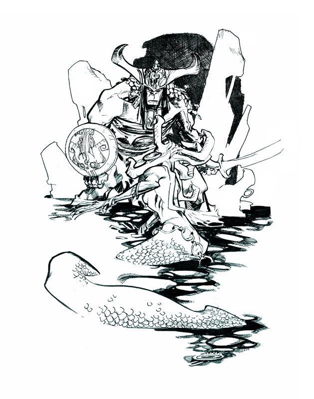
Nov 2, 2015 15:18:56 GMT 1 DE Sinclair said: Do you have any examples of Eric Canete's work that is not heavily stylized? Or is that his primary thing? If he had some conventional work it would be easier to tell about his grasp of anatomy. It's not about correct anatomy but about proportions : if he stylizes anatomy, it still has to be coherent within that very stylized proposition. And indeed, his style is always quite stylized from what I gather. He's mostly busy working in animation though, so I guess we can expect his basic skills to be quite good. Most people here just seem to not like that direction and prefer traditionnal figures, like Buscema's... I just like a variety of propositions, and Canete is quite a fascinating and skilled arist, with really good story telling and he always finds interesting and creative angles (or at least attempts). Some times it becomes to busy and doesn't do it for me (his recent image series seemed to be a story board to a long action scene!), but more than anything, I'm gratefull he still dedicates some of his time to comics.   These two are awesome. If these were comic book covers of comics I had no desire to read for the story, I'd buy them for these. |
|
|
|
Post by the4thpip on Nov 2, 2015 12:14:37 GMT -5
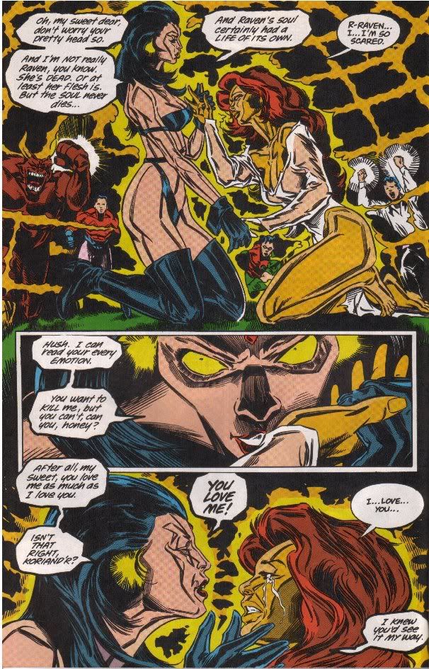
Then of course there was the late Bill Jaaska on New Titans.  i consider this just a style. Nothing wrong with the page IMHO. I must admit I was too lazy to dig out the old Titans books and scan some examples. I know Jaaska did much worse than that page, but this was all I could google on short notice. |
|
|
|
Post by Arthur Gordon Scratch on Nov 2, 2015 12:15:27 GMT -5
Check his site or google image : he got many many conan/red sonia themed pages.
|
|
|
|
Post by the4thpip on Nov 2, 2015 12:21:22 GMT -5
Let's be clear about a few things. Just because someone does great work most of the time doesn't mean they are exempt from criticism when they mess up. The Dark Knight Returns, Year One, Sin City, ect. don't excuse All Star Batman and Robin. Miller didn't even draw All-Star Batman and Robin. That was Jim Lee. |
|
|
|
Post by sunofdarkchild on Nov 2, 2015 12:27:33 GMT -5
Let's be clear about a few things. Just because someone does great work most of the time doesn't mean they are exempt from criticism when they mess up. The Dark Knight Returns, Year One, Sin City, ect. don't excuse All Star Batman and Robin. Miller didn't even draw All-Star Batman and Robin. That was Jim Lee. The art in All Star is very good, in fact I'd say it's better than the art in any of the other examples when it isn't showing cheesecake. In this case I was talking about the writing. I'm also pretty sure Miller didn't draw Year One.
|
|
|
|
Post by Arthur Gordon Scratch on Nov 2, 2015 12:32:33 GMT -5
|
|