|
|
Post by the4thpip on Nov 2, 2015 12:38:35 GMT -5
My guess is that it comes down to the OP sounding as if "worst" in comic book art were a completely subjective thing.
So when we point out that there is actual skill going into some of the examples posted, which objectively makes them better than some no-skill panels, this causes confusion.
|
|
|
|
Post by Deleted on Nov 2, 2015 12:54:26 GMT -5
Is this the art by Quietly? Because if so, I can easily go from loving to hating his art if the wind simply blows another direction. It's THAT easy. |
|
|
|
Post by the4thpip on Nov 2, 2015 13:02:38 GMT -5
Is this the art by Quietly? Because if so, I can easily go from loving to hating his art if the wind simply blows another direction. It's THAT easy. No, that was All-Star Superman. ASBATAR was by Jim Lee. |
|
|
|
Post by Cei-U! on Nov 2, 2015 13:31:06 GMT -5
But that discussion is the only interesting thing about this thread. Otherwise, it's just an exercise in cheap mockery. Cei-U! I summon the meat in the sammich! So tell me what the difference is between this thread and the 'worst cover ever' thread. Are covers so much more subject to criticism and laughter than panels? Even when those panels actually take up twice the size of any cover? When did criticizing one panel become an attack on the artist and his skills/knowledge? First, let me apologize for the confrontational wording of that last post. My brain said "most interesting thing" and my fingers typed "only." There is no difference between the two threads, other than the particular turn in this one you criticized. Believe me, I have nothing against exercises in cheap mockery. God knows I've instigated enough of them. But it shouldn't come as a surprise to anyone at CCF when the conversation gets serious in a humorous thread (or vice versa). We're all here because we value comics as both entertainment and an artform. The topic of extreme stylization is inherently interesting to folks like us and it's fascinating to hear where various posters feel the line between intelligent stylization and bad art lies. I would hope there's room enough in this thread for both conversations. Cei-U! I extend the olive branch! |
|
|
|
Post by Deleted on Nov 2, 2015 13:44:44 GMT -5
Is this the art by Quietly? Because if so, I can easily go from loving to hating his art if the wind simply blows another direction. It's THAT easy. No, that was All-Star Superman. ASBATAR was by Jim Lee. But Quietly did art some Batman and Robin book, and I quite preferred his art in that versus his art in X-Men. |
|
|
|
Post by Deleted on Nov 2, 2015 13:48:38 GMT -5
No, that was All-Star Superman. ASBATAR was by Jim Lee. But Quietly did art some Batman and Robin book, and I quite preferred his art in that versus his art in X-Men. He (Quitely) did some of the art on the main Batman book or on Batman and Robin or something like that when Grant Morrison was the writer on Batman, stuff featuring Damien Wayne as Robin. -M |
|
|
|
Post by Deleted on Nov 2, 2015 14:01:44 GMT -5
Ooh, I knew I was spelling his name wrong. Thanks.
|
|
|
|
Post by DE Sinclair on Nov 2, 2015 15:10:43 GMT -5
First off, thanks for providing the examples of some of his other works. You've succeeded in demonstrating that he is beyond a doubt an extremely competent artist. While I'll stick by my original opinion that the original Spidey panel was pretty far from successful for me, the other examples you posted were quite good. |
|
|
|
Post by Reptisaurus! on Nov 2, 2015 17:24:58 GMT -5
No, that was All-Star Superman. ASBATAR was by Jim Lee. But Quietly did art some Batman and Robin book, and I quite preferred his art in that versus his art in X-Men. I did that for YEARS, occasionally in a professional capacity. It's a pane name, and kind of a reverse anagram for "Quite Frankly." Dude's real name is Vincent Deijan. |
|
shaxper
CCF Site Custodian
Posts: 22,867
|
Post by shaxper on Nov 2, 2015 17:48:14 GMT -5
So tell me what the difference is between this thread and the 'worst cover ever' thread. Are covers so much more subject to criticism and laughter than panels? Even when those panels actually take up twice the size of any cover? When did criticizing one panel become an attack on the artist and his skills/knowledge? First, let me apologize for the confrontational wording of that last post. My brain said "most interesting thing" and my fingers typed "only." There is no difference between the two threads, other than the particular turn in this one you criticized. Believe me, I have nothing against exercises in cheap mockery. God knows I've instigated enough of them. But it shouldn't come as a surprise to anyone at CCF when the conversation gets serious in a humorous thread (or vice versa). We're all here because we value comics as both entertainment and an artform. The topic of extreme stylization is inherently interesting to folks like us and it's fascinating to hear where various posters feel the line between intelligent stylization and bad art lies. I would hope there's room enough in this thread for both conversations. Cei-U! I extend the olive branch! I see a large difference between the two threads, especially as the scope of this one is so much larger - any panel in comicdom is eligible, and there are some true atrocities out there that don't get seen unless someone opens up the book. Let's all of us (and this is not exclusively directed towards Cei-U!) watch the tone in this thread. I'm not in the mod business anymore and carry no authority here, but some of you are being downright nasty to a new member just trying to get good conversation going. Correct him, prove him wrong, but do it with class please. Sunofdarkchold has already contributed a tremendous amount to our little community in his very short time here. He deserves the same courtesies that you afford our established veterans, regardless of whether or not you see validity in his arguments. |
|
|
|
Post by Deleted on Nov 2, 2015 17:49:07 GMT -5
But Quietly did art some Batman and Robin book, and I quite preferred his art in that versus his art in X-Men. I did that for YEARS, occasionally in a professional capacity. It's a pane name, and kind of a reverse anagram for "Quite Frankly." Dude's real name is Vincent Deijan. Oh, now that is freaking adorable!!! Now I love him. |
|
|
|
Post by Reptisaurus! on Nov 2, 2015 17:59:33 GMT -5
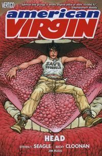
I did that for YEARS, occasionally in a professional capacity. It's a pane name, and kind of a reverse anagram for "Quite Frankly." Dude's real name is Vincent Deijan. Oh, now that is freaking adorable!!! Now I love him. Sorry, Deighan. I can not spell the guy's name right ever. I generally like his work a lot more when he's not drawing people  But I did really dig his American Virgin covers.  His straight superhero stuff.... less so. |
|
|
|
Post by Deleted on Nov 2, 2015 18:02:18 GMT -5
From scans I saw of his Batman and Robin stuff, it was WAY better than his X-Men stuff, imo. I would say because some of the criminals were super wacky looking, but the mutants in X-Men were kind of weird, too. I think he was just better on it for whatever reason. Dunno.
|
|
|
|
Post by Deleted on Nov 2, 2015 18:08:17 GMT -5
I WILL BE THE JUDGE OF EVERYTHING. Like Namor and Aquaman wearing thongs. Stop fainting. |
|
|
|
Post by Deleted on Nov 2, 2015 18:13:50 GMT -5
Anyways, this is being taken way too seriously. The point of threads like these is to laugh at the bad art, not to engage in a philosophical discussion about whether adding extra joints to a person's knees and elbows and having none of the limbs be close to the same size is stylized or just bad art. I can't have a philosophical discussion about Rob Liefeld's art. It's just whenever I try to appreciate any book of his from the 90s, I feel a warm gush as my bladder let go. It's that bad to me...but not to impugn any of his fans, just my opinion. |
|