|
|
Post by EdoBosnar on Feb 21, 2024 14:52:49 GMT -5
As far as favorite Spider-Man artists beyond Ditko and Romita, I don't think Sal Buscema gets enough love, especially his later run on Spectacular. I'm with you on Sal - he's one of my favorites in general. However, don't agree about Andru, as he's one of my pentumvirate of favorite Spidey artists: Ditko, Romita (Sr.), Kane, Andru and (Sal) Buscema.
|
|
|
|
Post by wildfire2099 on Feb 21, 2024 18:17:53 GMT -5
I finally got around to reading TMNT The Last Ronin. It's been getting a lot of buzz lately and I know movie and video game adaptations are in the works. I was a fan of the first show and original movies as a kid, and I knew the original comics were edgier, so figured I would get around to it. I knew the general gist from online buzz, and a gritty "The End" what if style endgame story seemed interesting. It was decent. I was expecting a more grounded and realistic (relatively speaking) story than some of the zanier elements showing up, but that's mostly on me for not reading the comics. There is one thing I do think is disappointing, though. The plot was fine, and the art style worked well enough, but the storytelling was hard to follow for me. It was hard to see what was happening and clearly follow action. I know the arguments between story vs art, and within art is it storytelling vs detail vs. clarity etc whatever go on endlessly, and there is no one single right or wrong answer. But the storytelling. It wasn't very good. There, said it. I really liked it. The shifting back and forth between the past and the current did take a bit to get used to... as the whole speaking to the his hallicinations was weird, but made sense in context of the story. |
|
|
|
Post by Batflunkie on Feb 21, 2024 20:01:20 GMT -5
I finally got around to reading TMNT The Last Ronin. It's been getting a lot of buzz lately and I know movie and video game adaptations are in the works. I was a fan of the first show and original movies as a kid, and I knew the original comics were edgier, so figured I would get around to it. I knew the general gist from online buzz, and a gritty "The End" what if style endgame story seemed interesting. It was decent. I was expecting a more grounded and realistic (relatively speaking) story than some of the zanier elements showing up, but that's mostly on me for not reading the comics. There is one thing I do think is disappointing, though. The plot was fine, and the art style worked well enough, but the storytelling was hard to follow for me. It was hard to see what was happening and clearly follow action. I know the arguments between story vs art, and within art is it storytelling vs detail vs. clarity etc whatever go on endlessly, and there is no one single right or wrong answer. But the storytelling. It wasn't very good. There, said it. I maybe got through issue one when I decided that it wasn't for me. While I have respect for what Eastman and Laird were doing with the turtles in the Mirage years, the stories never really held my attention that much (sacrilegious I know). I did get a lot of enjoyment out of the sparse issues of the Turtle Soup anthology that I had though |
|
Confessor
CCF Mod Squad
Not Bucky O'Hare!
Posts: 10,069 
|
Post by Confessor on Feb 21, 2024 22:11:36 GMT -5
I just now realized that I've been lying to myself for years. Steve Ditko is *not* my favorite Spider-Man artist. Ross Andru is. What's been fooling me all this time is that the Ditko run is better plotted/scripted than Andru's work with Conway and Wein, plus the villains Ditko introduced are light years more impressive than the likes of The Grizzly, The Mindworm, Cyclone, Mirage, etc. But in terms of both draftsmanship and storytelling, I like Andru better. There, I finally said it.
Cei-U! I summon the epiphany!
I love Andru's art on Spidey too. He's really underrated. I still place Romita and Ditko before him, in that order, but Andru's stuff is really, really good. I've said many times before in the forum that nobody has ever depicted the precariousness of how high up spidey is when he's swinging through the city as well as Andru. I also love his dynamic layouts, his realistic (and often architecturally and geographically accurate) backgrounds, and his fantastic facial expressions. He also drew Gwen Stacy and Mary Jane every bit as sexy and beautiful as Romita had. Lastly, but not least, his Peter Parker looked like a real cool dude, in flared jeans and a sheepskin-lined suede jacket. |
|
|
|
Post by berkley on Feb 21, 2024 23:15:20 GMT -5
I just now realized that I've been lying to myself for years. Steve Ditko is *not* my favorite Spider-Man artist. Ross Andru is. What's been fooling me all this time is that the Ditko run is better plotted/scripted than Andru's work with Conway and Wein, plus the villains Ditko introduced are light years more impressive than the likes of The Grizzly, The Mindworm, Cyclone, Mirage, etc. But in terms of both draftsmanship and storytelling, I like Andru better. There, I finally said it.
Cei-U! I summon the epiphany!
I love Andru's art on Spidey too. He's really underrated. I still place Romita and Ditko before him, in that order, but Andru's stuff is really, really good. I've said many times before in the forum that nobody has ever depicted the precariousness of how high up spidey is when he's swinging through the city as well as Andru. I also love his dynamic layouts, his realistic (and often architecturally and geographically accurate) backgrounds, and his fantastic facial expressions. He also drew Gwen Stacy and Mary Jane every bit as sexy and beautiful as Romita had. Lastly, but not least, his Peter Parker looked like a real cool dude, in flared jeans and a sheepskin-lined suede jacket.
Andru was the Spider-Man artist when I came back to the series and to comics in general in the mid-70s, so I saw a lot of his work on the series. I always thought he might have been a bit hampered by the reduced 17-page story length, as everyone was, of course, at that time. I'd rate him somewhere below Ditko, Romita, and maybe Kane, but ahead of everyone else I've seen, off the top of my head. I think that without being a straight imitation his style on the series looked closer to Romita's than anyone else's - perhaps by deliberate choice?
As with most of these 60s-70s comics, it's been a long time since I've read them so it's entirely possible I'll find my feelings have changed whenever I get around to looking at them again.
|
|
|
|
Post by Cei-U! on Feb 22, 2024 1:13:44 GMT -5
I love Andru's art on Spidey too. He's really underrated. I still place Romita and Ditko before him, in that order, but Andru's stuff is really, really good. I've said many times before in the forum that nobody has ever depicted the precariousness of how high up spidey is when he's swinging through the city as well as Andru. I also love his dynamic layouts, his realistic (and often architecturally and geographically accurate) backgrounds, and his fantastic facial expressions. He also drew Gwen Stacy and Mary Jane every bit as sexy and beautiful as Romita had. Lastly, but not least, his Peter Parker looked like a real cool dude, in flared jeans and a sheepskin-lined suede jacket. I seem to recall reading an interview where Andru said he regularly referred to the latest catalogs to dress his characters rather than giving them generic comic book clothing.
Cei-U! I summon the four-color fashionistas!
|
|
|
|
Post by Roquefort Raider on Feb 22, 2024 8:30:43 GMT -5
I love Andru's art on Spidey too. He's really underrated. I still place Romita and Ditko before him, in that order, but Andru's stuff is really, really good. I've said many times before in the forum that nobody has ever depicted the precariousness of how high up spidey is when he's swinging through the city as well as Andru. I also love his dynamic layouts, his realistic (and often architecturally and geographically accurate) backgrounds, and his fantastic facial expressions. He also drew Gwen Stacy and Mary Jane every bit as sexy and beautiful as Romita had. Lastly, but not least, his Peter Parker looked like a real cool dude, in flared jeans and a sheepskin-lined suede jacket.
Andru was the Spider-Man artist when I came back to the series and to comics in general in the mid-70s, so I saw a lot of his work on the series. I always thought he might have been a bit hampered by the reduced 17-page story length, as everyone was, of course, at that time. I'd rate him somewhere below Ditko, Romita, and maybe Kane, but ahead of everyone else I've seen, off the top of my head. I think that without being a straight imitation his style on the series looked closer to Romita's than anyone else's - perhaps by deliberate choice?
As with most of these 60s-70s comics, it's been a long time since I've read them so it's entirely possible I'll find my feelings have changed whenever I get around to looking at them again.
Same here, but I'm sure there's one thing I do not misremember: how Andru would make things look real and down to earth. Peter Parker's apartment, for example, looked like a real place with an actual floor plan. Other artists, later on, would draw a succession of rooms of varying size organized any which way; it fulfilled the requirement for some kind of decor, but didn't suggest that we were always in the same flat. Sort of like Reed Richards' lab: it never looks the same from one time to the next. Andru's approach added to the realism of Spider-man's environment, something that I think is quite important for the character. |
|
|
|
Post by Icctrombone on Feb 22, 2024 8:37:23 GMT -5
I have never cared about what Apartments looked like, but I'm guessing you mean his attention to detail was appreciated by you. Andru was never one of my favorites ,but I really liked his work on FF # 132. That's the story where the Torch walked in on Crystal and Quicksilver starting to do the horizontal mambo.
|
|
|
|
Post by Slam_Bradley on Feb 22, 2024 11:36:21 GMT -5
Andru was the Spider-Man artist when I came back to the series and to comics in general in the mid-70s, so I saw a lot of his work on the series. I always thought he might have been a bit hampered by the reduced 17-page story length, as everyone was, of course, at that time. I'd rate him somewhere below Ditko, Romita, and maybe Kane, but ahead of everyone else I've seen, off the top of my head. I think that without being a straight imitation his style on the series looked closer to Romita's than anyone else's - perhaps by deliberate choice?
As with most of these 60s-70s comics, it's been a long time since I've read them so it's entirely possible I'll find my feelings have changed whenever I get around to looking at them again.
Same here, but I'm sure there's one thing I do not misremember: how Andru would make things look real and down to earth. Peter Parker's apartment, for example, looked like a real place with an actual floor plan. Other artists, later on, would draw a succession of rooms of varying size organized any which way; it fulfilled the requirement for some kind of decor, but didn't suggest that we were always in the same flat. Sort of like Reed Richards' lab: it never looks the same from one time to the next. Andru's approach added to the realism of Spider-man's environment, something that I think is quite important for the character. Not only did it have a floorplan, but it had the kind of stuff in it that you'd find in a college student's apartment. And that stuff stayed consistent and in the same place. |
|
|
|
Post by tarkintino on Feb 22, 2024 12:33:50 GMT -5
I love Andru's art on Spidey too. He's really underrated. I believe its easy to see why he's underrated, especially on The Amazing Spider-Man; after the flat-out timeless, defining art of Romita to the entire Spider-Man universe (and powerful runs from Kane--with or without Romita), Andru came off as a severe drop in quality in comics which once had some of the superhero genre's greatest art within its covers. I believe the PTB knew Andru would be such a glaring contrast requiring readers to be conditioned to accept his work through Romita's transformational inking on Andru's 1st TASM issue, #125 ( "Wolfhunt!" from October of 1973). After that, Andru was partnered with the inks of Mooney, Hunt, and Giacoia, which allowed the most bizarre traits of Andru's work to stand out--not as a strong continuation of the level of that which had been established by his predecessors. Where art alone is concerned, the covers of so many TASM of the early Andru run were the selling point, since Romita (and Kane) crafted one classic after another. It did not help that Andru's work would be compared to Romita interiors in his own era, as seen with JRSR illustrated TASM #132 ( "The Master Plan of the Molten Man!" from May of 1974), only to have Andru return for #133, and with that, the glaring difference in artistry (as a negative for Andru) could not be ignored. Hard disagreement on that one. Among Romita's numerous artistic gifts, he was credited with illustrating some of the most beautiful women in comic book history; his advertising and romance comic background gave him the kind of perception to make women in superhero comics more attractive than they ever had been before (towering mountains above many of his contemporaries in that category), especially among TASM's cast of characters. On the other hand, Andru's female characters often appeared rough, stiff in the face, almost as if they were in some sort of pain--eve when the script did not have them in any sort of distress. |
|
|
|
Post by Prince Hal on Feb 22, 2024 12:56:10 GMT -5
Don't really have a dog in this fight, as I was never a fan of Ross Andru's art (especially when inked by Esposito), but I mostly read his DC stuff. I could sorta kinda deal with his art on the war books, but when he took over the Flash from Infantino and did a lot of work on Batman in B and B and WF, his art hurt my eyeballs. Ugly layouts, awkward positioning of figures, and nothing suggesting that any character was lean or athletic. What he and Esposito dd to the Flash was unforgivable.
Then, when I'd see him on Spider-Man, his art seemed so much more polished. Spider-Man moved smoothly, the backgrounds were (generally) less cartoony, and the facial expressions actually expressive.
I'm thinking maybe it was some combination of Romita's doing layouts, thumbnails, finishes -- whatever -- for him and the better quality of inker he often had there. Thinking of Giacoia in particular. As I said, I wasn't a reader of Spider-Man much past the Romita years, so I have no idea what the reason might have been. Maybe it was just that his work for DC was so bad. Maybe Marvel paid better rates?
|
|
|
|
Post by MDG on Feb 22, 2024 13:11:20 GMT -5
Don't really have a dog in this fight, as I was never a fan of Ross Andru's art (especially when inked by Esposito), but I mostly read his DC stuff. I could sorta kinda deal with his art on the war books, but when he took over the Flash from Infantino and did a lot of work on Batman in B and B and WF, his art hurt my eyeballs. Ugly layouts, awkward positioning of figures, and nothing suggesting that any character was lean or athletic. What he and Esposito dd to the Flash was unforgivable. ... Most of Andru's work at DC (war, Metal Men, Wonder Woman) was for Kanigher, so i wonder if he picked up Kanigher's seeming dislike for superheroes and that came through. Andru, with Esposito, did some Superman work in the late 60s that I thought was fine (including the Virus X 5-parter).
Spider-Man may have been his first work since the 50s w/o Esposito so it may have looked very different. Also, it seemed when Stan brought new artists on books, he'd have them work with an established layout artist and/or inker to get them into the house style.
|
|
|
|
Post by Prince Hal on Feb 22, 2024 15:06:02 GMT -5
Thanks, MDG . Your answers re Marvel mke sense. And I'm glad you reminded me that Andru did metal Men, because there was a title that he seemed just fine on... not too cartoony, goofy and fun. I always enjoyed that. But I'd forgotten that he did the Virus-X serial in Action and went back to take a peek. While I loved that story as a kid, and I realize it is probably unfair to compare his work on the interiors with those Adams covers, he still reuses the same damn facial expression (vacant eyes, frozen grin) whether the mood is meant to be anger, insanity or pathos. 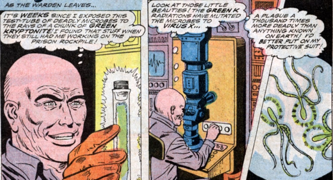   |
|
|
|
Post by MDG on Feb 22, 2024 15:16:16 GMT -5
Thanks, MDG . Your answers re Marvel mke sense. And I'm glad you reminded me that Andru did metal Men, because there was a title that he seemed just fine on... not too cartoony, goofy and fun. I always enjoyed that. But I'd forgotten that he did the Virus-X serial in Action and went back to take a peek. While I loved that story as a kid, and I realize it is probably unfair to compare his work on the interiors with those Adams covers, he still reuses the same damn facial expression (vacant eyes, frozen grin) whether the mood is meant to be anger, insanity or pathos. On the other hand, Adams' super-serious, grimacing faces on (and in) Weisinger-edited books just made them look even sillier than they might have otherwise.
|
|
|
|
Post by Cei-U! on Feb 22, 2024 15:51:19 GMT -5
Don't really have a dog in this fight, as I was never a fan of Ross Andru's art (especially when inked by Esposito), but I mostly read his DC stuff. I could sorta kinda deal with his art on the war books, but when he took over the Flash from Infantino and did a lot of work on Batman in B and B and WF, his art hurt my eyeballs. Ugly layouts, awkward positioning of figures, and nothing suggesting that any character was lean or athletic. What he and Esposito dd to the Flash was unforgivable. Then, when I'd see him on Spider-Man, his art seemed so much more polished. Spider-Man moved smoothly, the backgrounds were (generally) less cartoony, and the facial expressions actually expressive. I'm thinking maybe it was some combination of Romita's doing layouts, thumbnails, finishes -- whatever -- for him and the better quality of inker he often had there. Thinking of Giacoia in particular. As I said, I wasn't a reader of Spider-Man much past the Romita years, so I have no idea what the reason might have been. Maybe it was just that his work for DC was so bad. Maybe Marvel paid better rates? Experiencing a bit of deja vu here, as I know I've had this exact discussion before. Like you, I am not a fan of Andru's DC work for many of the same reasons you cite. The difference between Andru at DC and Andru at Marvel was the so-called "Marvel method." At DC, Andru worked from full scripts and had little say in page layout, pacing, staging, and so on. At Marvel, he worked from a plot synopsis and was free to design his pages in a way that played to his strengths (without any help from Romita, by the way). This can be seen as far back as 1968 and his first Spider-Man art job in Marvel Super-Heroes #14. He was much happier at Marvel and only went back to DC because they offered him an editing gig, which paid better than he could make as a penciller.
Cei-U! The defense rests!
|
|