Confessor
CCF Mod Squad
Not Bucky O'Hare!
Posts: 10,083 
|
Post by Confessor on Jul 1, 2018 9:17:58 GMT -5
Sorry Confessor, this is for the years of forced rabbit viewing...  Arrgghhh...my eyes!  |
|
Confessor
CCF Mod Squad
Not Bucky O'Hare!
Posts: 10,083
|
Post by Confessor on Jul 1, 2018 9:25:33 GMT -5
But Swan's Batman came off like your childhood friend's father who shows up at a Halloween party in an ill-fitting Batman costume and is about as true to the character as a skit on a late night comedy show. I think this part I've quoted is all in your imagination. I've never seen any examples of Swan having drawn the Caped Crusader in ill-fitting clothes. The man was better than that -- as Icctrombone said, he was one of the all-time greats. A quick Google search shows plenty of examples of Swan drawing Batman perfectly well. I see absolutely no issue at all with the examples below...certainly not the "Dad in an ill-fitting suit" problems you refer to.     |
|
|
|
Post by Icctrombone on Jul 1, 2018 9:47:57 GMT -5
Murphy Anderson made every drawing he worked on much better.
There I said it.
|
|
|
|
Post by Cei-U! on Jul 1, 2018 10:01:53 GMT -5
I gotta go with Confessor here. tarkintino is just flat-out wrong in this case.
Cei-U!
Didn't collect all those Swan-drawn World's Finests for nothing!
|
|
|
|
Post by tarkintino on Jul 1, 2018 12:45:53 GMT -5
Sorry Confessor , this is for the years of forced rabbit viewing... Oh, the horror. Quickly--a treatment of great Spider-Man art is required...  Whew!  |
|
|
|
Post by Prince Hal on Jul 1, 2018 12:50:00 GMT -5
That Spidey pin-up made me think of this guy!  |
|
|
|
Post by kirby101 on Jul 1, 2018 12:58:56 GMT -5
I defend Kirby as much, or more than anyone. But even I have to say his Spider-Man was less than optimal.
Swan's Batman was perfectly fine.
|
|
|
|
Post by beccabear67 on Jul 1, 2018 14:05:17 GMT -5
I'll say something ill of the dead here... I don't like Steve Gerber comics. Sorry. I'll never get his brilliance, his Guardians run was pretty disappointing and that's the one series he worked on I'm keeping. He missed deadlines so many times he wasn't even professional to me. Most of his stories were like what was on his or his girlfriend's grocery list that day... cobbled together, huge amounts of idiosyncrasy, randopm gonzo ingredients, and thought itself so amusing and tongue-in-cheek but would hammer you over the head with that so hard any such possible effect was spoiled. I can't think of another comic writer or creator where I really didn't care for anything much ever by them, but for Mr. Gerber. I even much preferred Howard The Duck by Bill Mantlo or whoever, which should be like preferring Bob Camp Ren & Stimpy over John Kricfalusi's, but it's just so true. Interviews of him that I read were better than any comic he wrote which I ever saw. Okay, boil lanced, puss drained, um, I'll stop with the metaphors right here.  |
|
|
|
Post by tarkintino on Jul 1, 2018 14:10:15 GMT -5
But Swan's Batman came off like your childhood friend's father who shows up at a Halloween party in an ill-fitting Batman costume and is about as true to the character as a skit on a late night comedy show. I think this part I've quoted is all in your imagination. I've never seen any examples of Swan having drawn the Caped Crusader in ill-fitting clothes. The man was better than that -- as Icctrombone said, he was one of the all-time greats. A quick Google search shows plenty of examples of Swan drawing Batman perfectly well. I see absolutely no issue at all with the examples below...certainly not the "Dad in an ill-fitting suit" problems you refer to. That's just it--Swan at the "height" of his powers--as seen in the first image you posted--draws a wide waist, tired-looking Batman that is not at all among the best representations of the character's general stature, physical movement or costuming or... character. The second image from 1992 was long past Swan being Swan as his art (with Anderson) was so heavily modified to fit the style guides of the period that it no longer looked like what anyone would call "typical Swan" art. Compare that to three aforementioned artists (Novick, Adams and Infantino/Anderson)--certainly all different from each other, but all equally defining, and successful at capturing the adventurous, larger than life, heart of Batman--  Again, I see Swan's Batman just as wrong for everything Batman means as Kirby's Spider-Man....Steranko's Spider-Man... |
|
|
|
Post by Deleted on Jul 1, 2018 14:20:01 GMT -5
So nobody likes this Jack Kirby Spider-Man cover...?  here side by side with the unused Ditko version of the cover...  -M |
|
|
|
Post by Icctrombone on Jul 1, 2018 14:39:33 GMT -5
I think this part I've quoted is all in your imagination. I've never seen any examples of Swan having drawn the Caped Crusader in ill-fitting clothes. The man was better than that -- as Icctrombone said, he was one of the all-time greats. A quick Google search shows plenty of examples of Swan drawing Batman perfectly well. I see absolutely no issue at all with the examples below...certainly not the "Dad in an ill-fitting suit" problems you refer to. That's just it--Swan at the "height" of his powers--as seen in the first image you posted--draws a wide waist, tired-looking Batman that is not at all among the best representations of the character's general stature, physical movement or costuming or... character. The second image from 1992 was long past Swan being Swan as his art (with Anderson) was so heavily modified to fit the style guides of the period that it no longer looked like what anyone would call "typical Swan" art. Compare that to three aforementioned artists (Novick, Adams and Infantino/Anderson)--certainly all different from each other, but all equally defining, and successful at capturing the adventurous, larger than life, heart of Batman-- Again, I see Swan's Batman just as wrong for everything Batman means as Kirby's Spider-Man....Steranko's Spider-Man... I respect you opinion but maybe you have to allow for the evolution of his artwork from the 50's to the 80's. The tired look in the first pages were more to serve the story where he was down over losing to a copycat. Kirbys artwork in the 70's was far superior to his 40's artwork also. |
|
|
|
Post by kirby101 on Jul 1, 2018 15:20:14 GMT -5
AF 15 was one of the few times Kirby did good Spidey.
I appreciate Swan's draftsmanship and talent. But compared to say Adams (the subject of a whole other thread) I often found his his books static and a little boring. Part of that was the house style of DC at the time.
I did enjoy his work on the later "triangle" Superman books.
|
|
|
|
Post by Prince Hal on Jul 1, 2018 15:33:13 GMT -5
tarkintino , I see the difference in those Swan drawings as indicative of the styles of the times in which they were drawn. Notice that Superman has the same thick-waisted physique, something I think Swan may have taken from Wayne Boring's Superman (and Batman, when the occasion arose). If the '92 image is "modified," I think you'll agree it would have been modified by Swan himself. I'll agree that Swan, like many another penciller, was better served by more detailed inking, in particular Murphy Anderson and George Klein. But in these panels inked by Mike Esposito (from Lois Lane 89), Swan's Batman looks more lithe. The story came out in 1969. 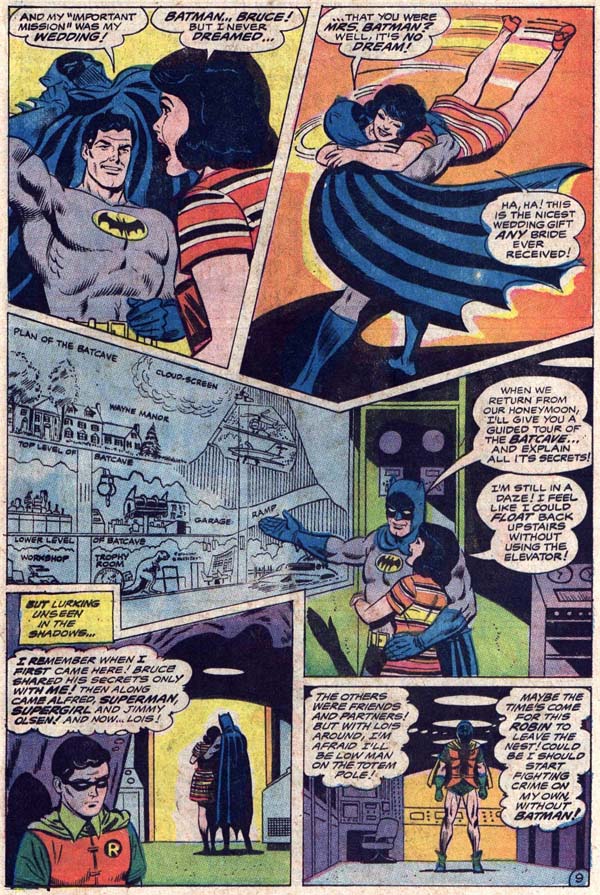 Here's George Klein on Swan's pencils from WF 172, Dec. 1967. Batman's muscular, not thick. And the emotion is obvious.    And here's Swanderson on an issue from 1971. Batman looks ticked and his ears are much better. 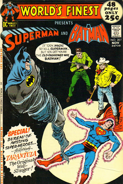 Listen, Swan was never going to give you the same kind of dynamism as Kirby or Kubert or Steranko. His strengths were telling a story well, meticulous attention to facial expressions, and action on a more human, as opposed to cosmic level. And I'm hard-pressed to think of a penciller as ill-served as often by inkers of the Colletta School of Minimalism. Why he was paired with the likes of Tex Blaisdell, Jack Abel and Mike Esposito I'll never understand. Want to see some really bad Superman and Batman? Try Andru and Esposito...  
|
|
|
|
Post by comicsandwho on Jul 1, 2018 20:00:28 GMT -5
Superman in that bottom panel has an almost 'Alex Toth Super Friends logo' expression.
|
|
|
|
Post by chadwilliam on Jul 1, 2018 21:38:07 GMT -5
So nobody likes this Jack Kirby Spider-Man cover...? here side by side with the unused Ditko version of the cover... -M It's strange to me that the only time Kirby nailed Spider-Man was when he drew him for the first time and that the inverse is true for Ditko. If you want a great looking Kirby Spider-Man and a less than amazing looking Ditko Spider-Man, look at each of their first drawings because you won't find any other examples anywhere else. |
|