Post by infobroker on May 2, 2014 0:45:46 GMT -5
Archie Goodwin and Walt Simonson - The Manhunter
In 1973 Archie Goodwin was assigned editorial duties at DC comics. Besides a trio of war titles, he was also given Detective Comics, a title that Julius Schwartz had managed so well for the ten previous years. Be aware, that even with Batman and his assorted cast as the feature players, in this time frame, DC's stalwart title, the very title that named the company, was in sales trouble and headed for possible cancellation.
In his first issue, Archie greets us with a monologue letter's page, providing some background and direction for Detective Comics, focusing mainly on the the creative staff. He picked a great writer for the book, assigned several outstanding artists for the upcoming Batman stories, and pulled some newcomer from the Rhode Island School of Design to illustrate a new backup feature, an update of Simon and Kirby's golden-age Manhunter, adding modern biological science, cooler more sophisticated weaponry, and an upscale use of traditional eastern world fighting techniques complete with ninjas and ancient power lore.
Fun stuff, new and exciting.
But let me get back to the focus this year's Classic Comics' Christmas Theme. That would be the creative staff, not the character, and the combination of Archie and Walt on this Manhunter series was indeed wonderful chemistry.
I don't know a lot of the back history behind the creation of this series beyond what Archie mentions in his monologue about wanting to bring in new readers, with fresh concepts. The goal was to help sales but not dinker around with the Batman mythos. Lacking that creative back-history, I have wondered how much of the shaping of the backup feature might have been influenced and driven by Archie knowing he chose to work with Walt Simonson's interests,art skills and styles. Did his awareness of what he sensed Walt was capable of drive some of the framing and style, or was that already well established and Archie just wanted a new look, a young artist to add freshness to a stale comical book title?
Not sure. Also not sure how Archie presented the stories to Walt. Full script? Plots and reference material? If so, how much?
He had the initial episodes well established in his head, and smart editor that he his, he told his writer not to bog down the start of the series with the origin tale. Show the new Manhunter in action, let the mystery of his past be part of the allure of the series, and unfold his history in later episodes. So it wasn't until chapter three that part of his backstory began to unfold.
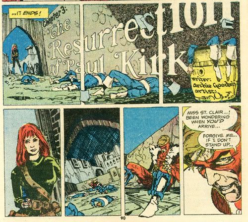
Those panels are pretty sophisticated stuff, layout, composition, the very meat of visual storytelling. The upper set shows off Walt's typography skills and a strong grasp of perspective, foreshortening, composition, all that good stuff that comes with the territory of visual storytelling.
But that bottom tier of panels suggest a strong veteran at the helm of the layout. Did Archie use onion skin overlays(a technique he used frequently and probably learned from Harvey Kurztman, one of several EC artists that he admired) to instruct Walt on how to handle these panels. If so, were they used throughout the entire 8 pages, and if so (again), how much room did Walt have for creative license and improvements?
One thing I am sure of, at least from this artist's viewpoint, there is a particular chapter within this story arc that is very challenging visually and it needed an artist with a strong design sense, appreciates and has the ability to depict detailed church architecture, yet not let it's fancy ornamentation get in the way of the story. Here are two very important pages from that episode.
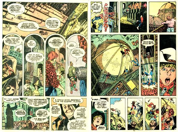
Cathedral Perilous
Pace, progression, a sense of story flow, all those things a good comical book writer can influence and control in the script, verbally or with visual aids. But ornate page layout that echoes and reflects the environment of the story, pushing tiny panels to the top and the bottom of the page to allow for some visual dynamite in the extended center panels. Yea, Archie is good enough to do that too, but his approach on past projects lean towards more traditional panel layouts. So if he did have visual indicators placed on the onion skins, or peppered about the script, he did it with a complete knowledge and understanding of just how good this new kid from Rhode Island really was.
The point I'm trying to drag home here is that the series as a whole and the Cathedral Perilous episode in particular would not have its unique visual presentation and the overall story impact, if Archie was not aware of, and choose to exploit the keen design skills, the typography knowledge and I'm willing to bet, the awareness of eastern fighting tools/techniques that Walt Simonson brought to the table.
And hey, those tiny panels, don't blow past them. I've magnified them here so you can appreciate them better.
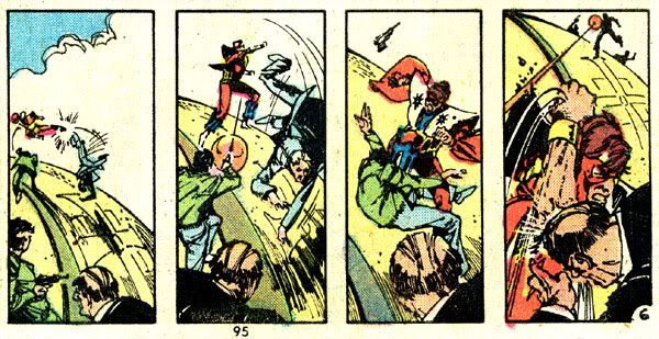
The stuff going on there is also a tremendous feast of layout mastery. Good character flow from panel-to-panel, dramatic movements, controlled yet interesting character placements, and well balanced spacial patterns depicting a lot of action, revealing a lot story.
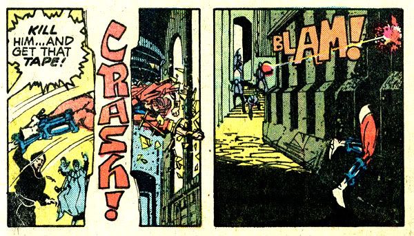
These tiny sets of panels are like pages nested inside the larger comic page. With only 8 pages to tell a story, this compression is needed, especially for a bi-monthly book, where even with an over-arching story line, each episode needs intro, build, climax and conclusion.
The Cathedral Perilous episode is a masterpiece. The professionals of the time agreed and awarded it the best short story of the year. Other Shazam awards for this series include best short story (for the one and first installment from the previous year), best new talent (Walt Simonson), best writer (Archie Goodwin), and best story (Gotterdamerung). Five peer awards in a series that only had seven installments.
Pretty impressive!
Definitely a classic combination of talent working together to create a comical book masterpiece series.
-jb the "hats off to two masters of the medium" ib -
In 1973 Archie Goodwin was assigned editorial duties at DC comics. Besides a trio of war titles, he was also given Detective Comics, a title that Julius Schwartz had managed so well for the ten previous years. Be aware, that even with Batman and his assorted cast as the feature players, in this time frame, DC's stalwart title, the very title that named the company, was in sales trouble and headed for possible cancellation.
In his first issue, Archie greets us with a monologue letter's page, providing some background and direction for Detective Comics, focusing mainly on the the creative staff. He picked a great writer for the book, assigned several outstanding artists for the upcoming Batman stories, and pulled some newcomer from the Rhode Island School of Design to illustrate a new backup feature, an update of Simon and Kirby's golden-age Manhunter, adding modern biological science, cooler more sophisticated weaponry, and an upscale use of traditional eastern world fighting techniques complete with ninjas and ancient power lore.
Fun stuff, new and exciting.
But let me get back to the focus this year's Classic Comics' Christmas Theme. That would be the creative staff, not the character, and the combination of Archie and Walt on this Manhunter series was indeed wonderful chemistry.
I don't know a lot of the back history behind the creation of this series beyond what Archie mentions in his monologue about wanting to bring in new readers, with fresh concepts. The goal was to help sales but not dinker around with the Batman mythos. Lacking that creative back-history, I have wondered how much of the shaping of the backup feature might have been influenced and driven by Archie knowing he chose to work with Walt Simonson's interests,art skills and styles. Did his awareness of what he sensed Walt was capable of drive some of the framing and style, or was that already well established and Archie just wanted a new look, a young artist to add freshness to a stale comical book title?
Not sure. Also not sure how Archie presented the stories to Walt. Full script? Plots and reference material? If so, how much?
He had the initial episodes well established in his head, and smart editor that he his, he told his writer not to bog down the start of the series with the origin tale. Show the new Manhunter in action, let the mystery of his past be part of the allure of the series, and unfold his history in later episodes. So it wasn't until chapter three that part of his backstory began to unfold.

Those panels are pretty sophisticated stuff, layout, composition, the very meat of visual storytelling. The upper set shows off Walt's typography skills and a strong grasp of perspective, foreshortening, composition, all that good stuff that comes with the territory of visual storytelling.
But that bottom tier of panels suggest a strong veteran at the helm of the layout. Did Archie use onion skin overlays(a technique he used frequently and probably learned from Harvey Kurztman, one of several EC artists that he admired) to instruct Walt on how to handle these panels. If so, were they used throughout the entire 8 pages, and if so (again), how much room did Walt have for creative license and improvements?
One thing I am sure of, at least from this artist's viewpoint, there is a particular chapter within this story arc that is very challenging visually and it needed an artist with a strong design sense, appreciates and has the ability to depict detailed church architecture, yet not let it's fancy ornamentation get in the way of the story. Here are two very important pages from that episode.

Cathedral Perilous
Pace, progression, a sense of story flow, all those things a good comical book writer can influence and control in the script, verbally or with visual aids. But ornate page layout that echoes and reflects the environment of the story, pushing tiny panels to the top and the bottom of the page to allow for some visual dynamite in the extended center panels. Yea, Archie is good enough to do that too, but his approach on past projects lean towards more traditional panel layouts. So if he did have visual indicators placed on the onion skins, or peppered about the script, he did it with a complete knowledge and understanding of just how good this new kid from Rhode Island really was.
The point I'm trying to drag home here is that the series as a whole and the Cathedral Perilous episode in particular would not have its unique visual presentation and the overall story impact, if Archie was not aware of, and choose to exploit the keen design skills, the typography knowledge and I'm willing to bet, the awareness of eastern fighting tools/techniques that Walt Simonson brought to the table.
And hey, those tiny panels, don't blow past them. I've magnified them here so you can appreciate them better.

The stuff going on there is also a tremendous feast of layout mastery. Good character flow from panel-to-panel, dramatic movements, controlled yet interesting character placements, and well balanced spacial patterns depicting a lot of action, revealing a lot story.

These tiny sets of panels are like pages nested inside the larger comic page. With only 8 pages to tell a story, this compression is needed, especially for a bi-monthly book, where even with an over-arching story line, each episode needs intro, build, climax and conclusion.
The Cathedral Perilous episode is a masterpiece. The professionals of the time agreed and awarded it the best short story of the year. Other Shazam awards for this series include best short story (for the one and first installment from the previous year), best new talent (Walt Simonson), best writer (Archie Goodwin), and best story (Gotterdamerung). Five peer awards in a series that only had seven installments.
Pretty impressive!
Definitely a classic combination of talent working together to create a comical book masterpiece series.
-jb the "hats off to two masters of the medium" ib -

