|
|
Post by rberman on Nov 23, 2019 0:44:16 GMT -5
I used to draw Ultron-6 all the time when I was a kid. I was quite taken with his look.
|
|
|
|
Post by Chris on Nov 23, 2019 1:37:54 GMT -5
I know we discussed this years ago and everyone disagreed with me, but I still feel like "splash page" means not just any full page single panel, but also the intro to that issue's story, usually including the title and credits. Shouldn't a "splash" page include water in some way, shape or form?    If that isn't a cue... (Non-splash page required for context)   |
|
|
|
Post by kirby101 on Nov 23, 2019 8:31:29 GMT -5
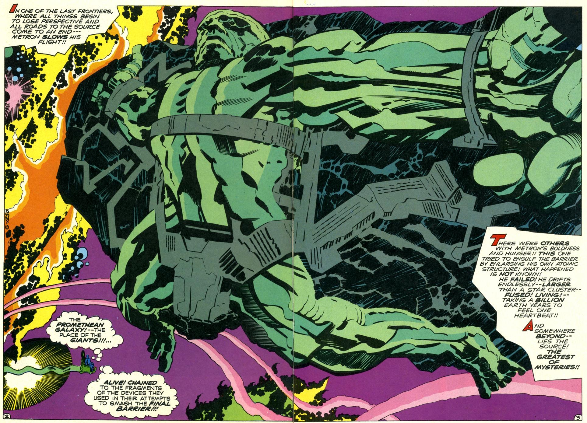
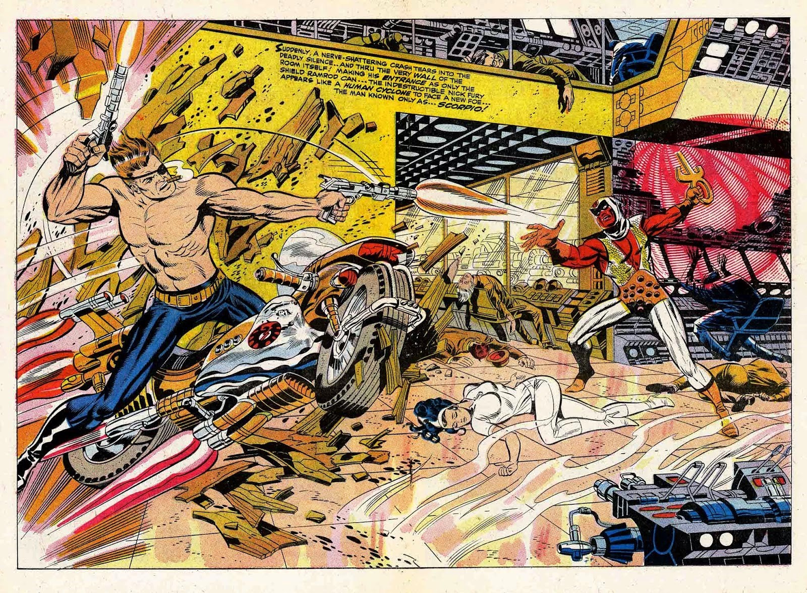
I'm in the camp of any full page panel is a splash. How else could we have so many great Kirby double splash pages if it were only the title page?  or Steranko?  I have never heard these referred to as anything but double splash pages. |
|
|
|
Post by berkley on Nov 23, 2019 15:52:26 GMT -5
double-page spreads, or something like that, is the way I remember hearing them called. Next time I get deep into re-reading a lot of 60s and 70s comics I'll try to keep an eye out for this when I read the letters pages. Could be just a weird personal quirk of mine, since no one seems to agree with me.
|
|
|
|
Post by berkley on Nov 23, 2019 15:58:10 GMT -5
I love that John Buscema poster, remember seeing it in ads or promotions in many a Marvel comic of the early 70s, I think it would have been? It makes me wish all my favourite artists had done something similar, a big picture of all or many of the characters they had drawn.
|
|
|
|
Post by Mister Spaceman on Nov 23, 2019 17:15:16 GMT -5
|
|
|
|
Post by Mister Spaceman on Nov 23, 2019 17:17:17 GMT -5
Ah, those beautiful Corben purples ...  |
|
|
|
Post by Mister Spaceman on Nov 23, 2019 17:21:42 GMT -5
|
|
|
|
Post by Mister Spaceman on Nov 23, 2019 21:47:31 GMT -5
|
|
|
|
Post by dbutler69 on Dec 11, 2019 10:22:24 GMT -5
Speaking of any full page being a splash, how about this two-pager by George Perez?  |
|
|
|
Post by electricmastro on Dec 11, 2019 22:02:16 GMT -5
Classic art by Jack Kirby from Devil Dinosaur #4 (July, 1978).  |
|
|
|
Post by brutalis on Dec 12, 2019 7:27:43 GMT -5
Man oh man oh man.Just look at how Kirby and Perez fill out a page and manage to make it exciting, interesting and fun so that your pulled into the page while your eyes are roaming the page and never let down. That is how and what a GREAT splash page should do.
|
|
|
|
Post by MDG on Dec 12, 2019 9:20:58 GMT -5
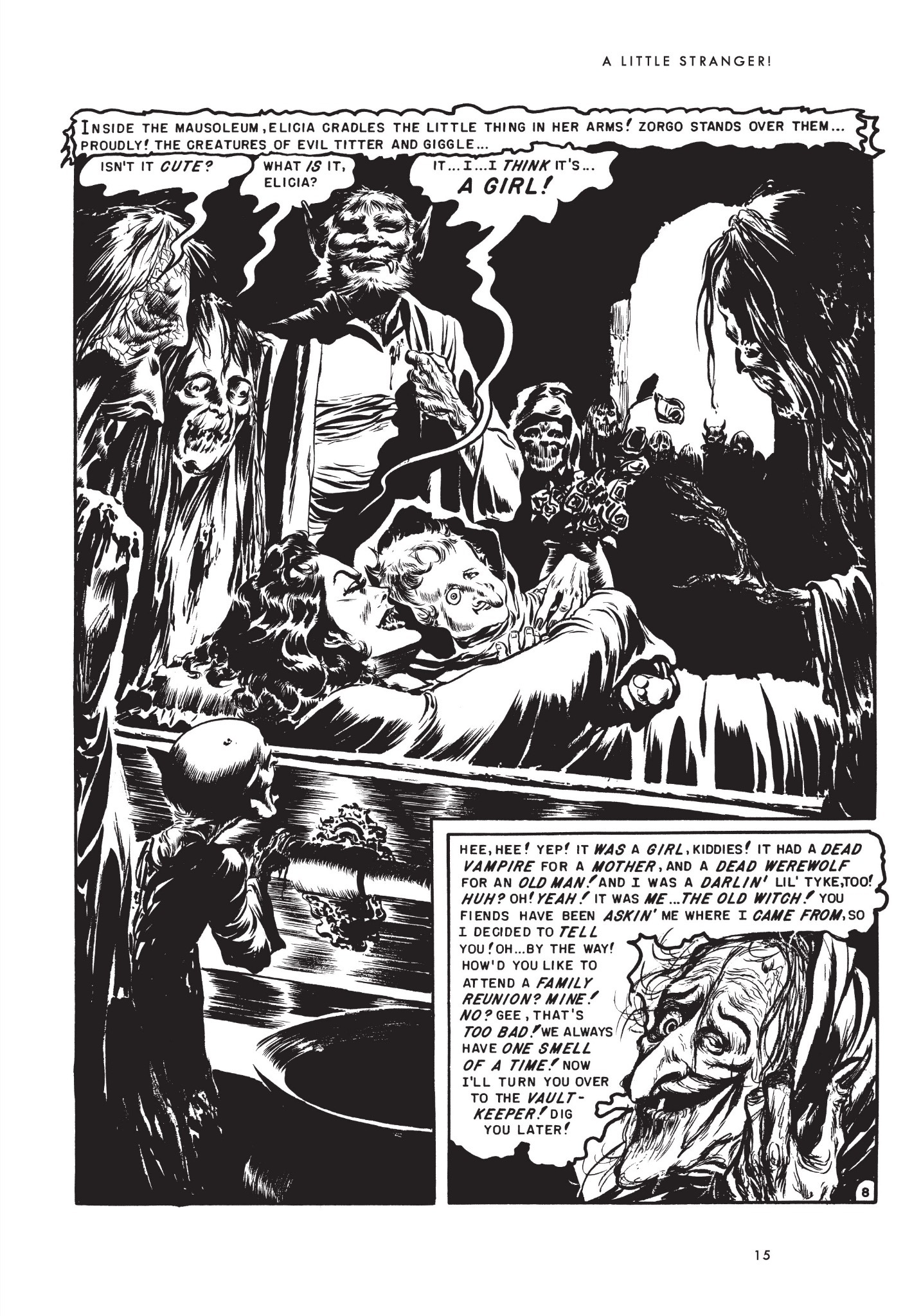
Birth of The Old Witch...  |
|
|
|
Post by Deleted on Dec 12, 2019 9:50:39 GMT -5
Another Kirby  |
|
|
|
Post by Mister Spaceman on Dec 12, 2019 17:46:20 GMT -5
A good example of effectively using negative space. Every square inch of an image doesn't always need to be filled.  |
|