|
|
Post by Farrar on Jan 7, 2020 18:03:11 GMT -5
...That's the one signed 'S S' for Seymour and Steve, and what I based "is known to have worked alongside Seymour Moskowitz" on... Right, that "SS" sig in that particular story is rather well-known--and IIRC is something that has occasionally popped up over the years as "proof" that there was no Ditko in the earlier story (since the earlier story was just signed by Moskowitz). ETA: But if Beerbohm's theory about using art students (incl. Ditko) for the earlier story is correct, the students' work could have been added after the main artist completed his work, and after the Sy Moskowtiz sig was lettered. |
|
|
|
Post by Cei-U! on Jan 7, 2020 22:41:35 GMT -5
I'm a big Kiefer fan. His work on Wambi for Fiction House is breathtaking.
Cei-U!
I summon the amazing animal art!
|
|
|
|
Post by electricmastro on Jan 7, 2020 23:52:40 GMT -5
I'm a big Kiefer fan. His work on Wambi for Fiction House is breathtaking. Cei-U! I summon the amazing animal art! I feel that a great way to tell how much detail/effort has gone into a piece of art is how well shading is used. I noticed that Planet Comics had quite a number of artists who focused on that. Don Lynch: 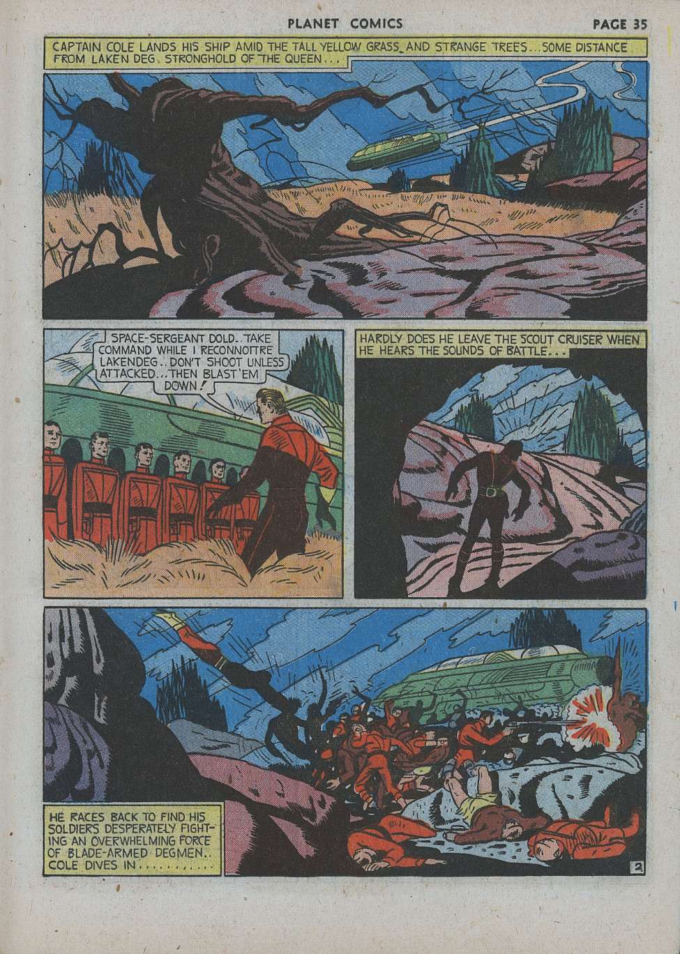 Graham Ingels: 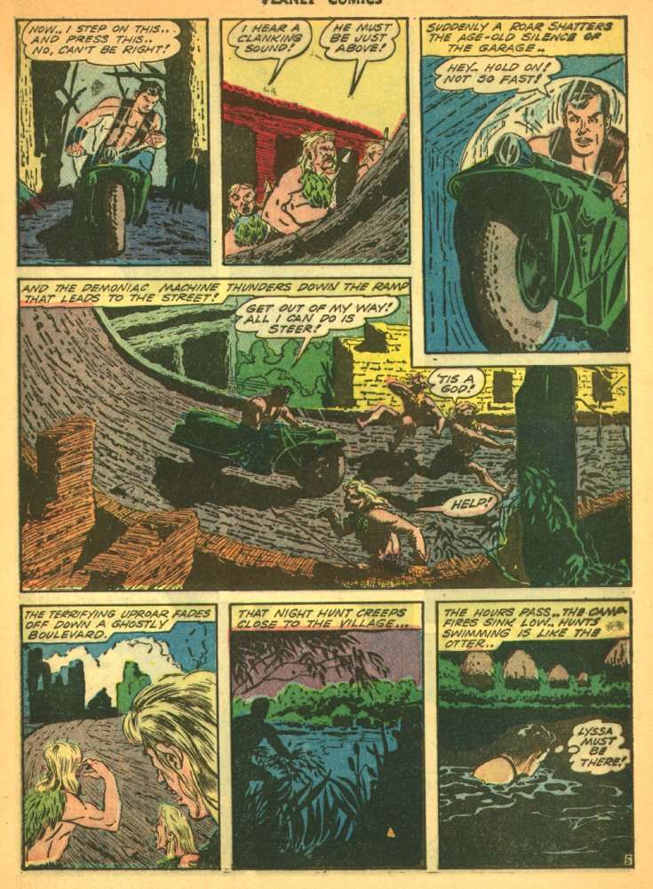 Fran Hopper: 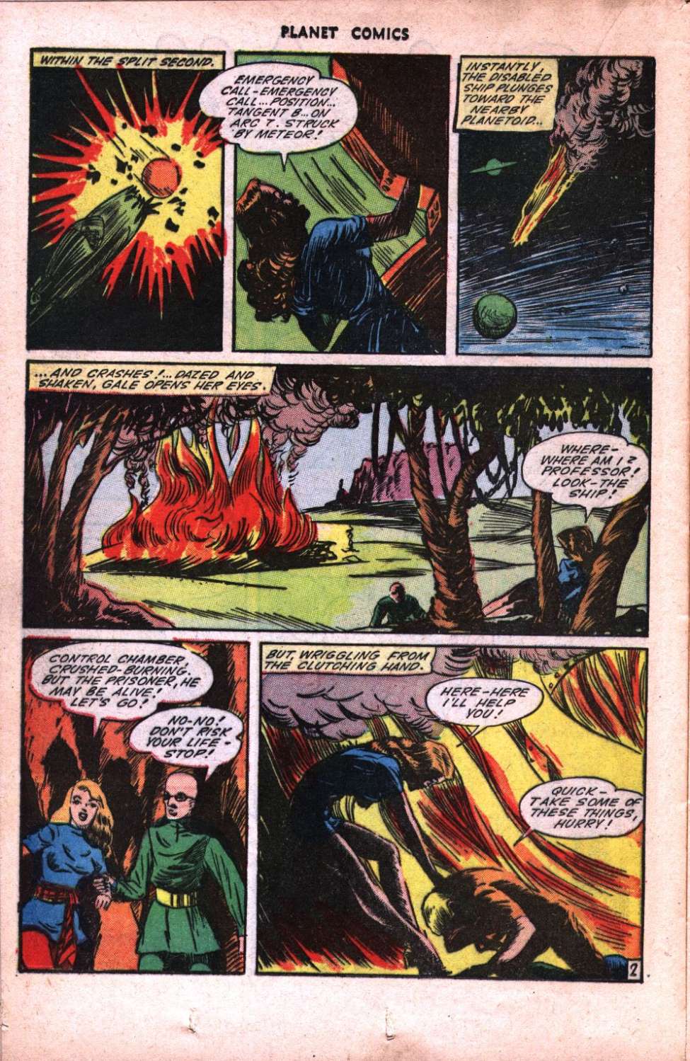 |
|
|
|
Post by MDG on Jan 8, 2020 10:34:43 GMT -5
I'm a big Kiefer fan. His work on Wambi for Fiction House is breathtaking. Cei-U! I summon the amazing animal art! In the 80s, a shop here that specialized in turn of the century French posters somehow got hold of a stack of golden age art. It was mainly Iger studio stuff, but my friend picked up 3 or 4 Kiefer Wambi pages that were very nice (though Wambi had a turban painted over or pasted up on his head for some re-named reprint). He may still have one of them. (My remaining page from that find is an Eisner-ish page from Rangers Comics by--I think--Charles Sultan.) |
|
|
|
Post by electricmastro on Feb 4, 2020 0:48:12 GMT -5
While not particularly common, does anyone else here agree that painted covers tend to age better than penciled covers?
|
|
|
|
Post by Duragizer on Feb 6, 2020 0:22:06 GMT -5
While not particularly common, does anyone else here agree that painted covers tend to age better than penciled covers? I do. |
|
|
|
Post by electricmastro on Feb 10, 2020 12:25:04 GMT -5
|
|
|
|
Post by pinkfloydsound17 on Feb 10, 2020 13:28:23 GMT -5
I always found painted covers too clean for my liking. There are some good ones but overall, I would say they are not something I gravitate towards when I am collecting.
|
|
|
|
Post by profh0011 on Feb 10, 2020 14:44:27 GMT -5
There should be a law (heh) that ALL horror comics have PAINTED covers.
Dells... Gold Key... Warren... Skywald... and Taika (down in Brazil) all look classier than 98% of the horror comics ever put out by Marvel and DC.
|
|
|
|
Post by MDG on Feb 10, 2020 15:02:20 GMT -5
There should be a law (heh) that ALL horror comics have PAINTED covers. Dells... Gold Key... Warren... Skywald... and Taika (down in Brazil) all look classier than 98% of the horror comics ever put out by Marvel and DC. Actually, I think the covers of most of the DC mystery revival under Orlando look great. Marvel made everything look like a superhero comic. |
|
|
|
Post by tarkintino on Feb 10, 2020 15:40:10 GMT -5
While not particularly common, does anyone else here agree that painted covers tend to age better than penciled covers? That depends on the artist. As your posts illustrates, in the pulp and early Golden Age, there were some timeless paintings generated, but as with any form, you will have the hacks who just crank out crud. This is really noticeable with Marvel / Curtis magazines in the 1970s/80s; for every great Bob Larkin, Neal Adams, Earl Norem or Ken Barr cover (to name a few), there were a boatload of artists hired who were either not disciplined in painting, tried to ape Frazetta or Boris, or were just plain crude. This is a syndrome that would be reborn in the early 1990s, in the wake of the Alex Ross revolution, where publishers jumped on that bandwagon, trying to get the Ross feel, but ended up looking amateurish ad not at all on his level of expression. |
|
|
|
Post by tarkintino on Feb 10, 2020 15:47:28 GMT -5
There should be a law (heh) that ALL horror comics have PAINTED covers. Dells... Gold Key... Warren... Skywald... and Taika (down in Brazil) all look classier than 98% of the horror comics ever put out by Marvel and DC. Well, George Wilson's Gold Key work was legendary not only in the sheer magnitude of his talent, but in the number of years he consistently created so many great cover paintings for nearly every book Gold Key ever published, no mater the genre. In the 60s or 70s, if you saw a great painted cover of The Twilight Zone, The Phantom, Ripley's Believe it or Not, Dark Shadows, Star Trek, Grimm's Ghost Stories, The Time Tunnel, The Occult Files of Doctor Spektor, etc., you were more than likely looking at Wilson's fantastic work. |
|
|
|
Post by electricmastro on Feb 10, 2020 20:37:09 GMT -5
|
|
|
|
Post by electricmastro on Mar 21, 2020 16:16:20 GMT -5
Here's the earliest Ditko work I've seen, from BLACK MAGIC #28 (v.4 #4 / Prize / January-February 1954) Story by Jack Oleck, based on not one but TWO separate Edgar Allan Poe stories. 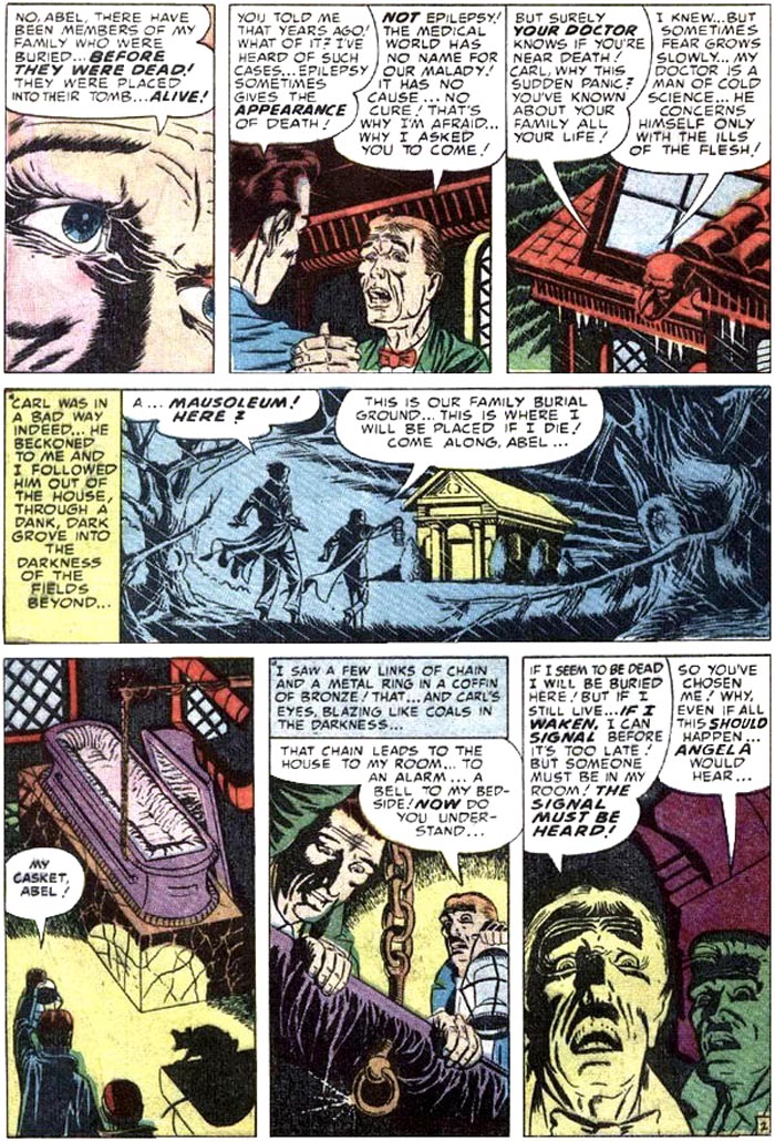 Ditko’s earliest published work was apparently in Stanley Morse’s Daring Love #1 (September, 1953), which doesn’t have any particularly creative artwork done in it aside from panels that play around with lighting: 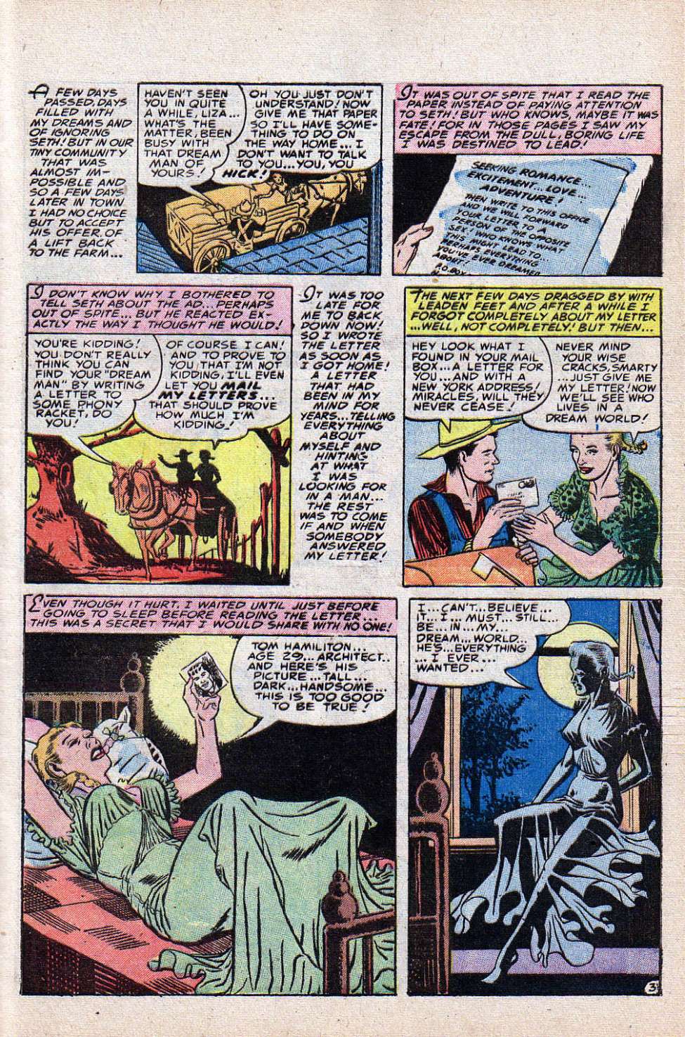 |
|
|
|
Post by mikelmidnight on Mar 23, 2020 12:05:56 GMT -5
Ditko’s earliest published work was apparently in Stanley Morse’s Daring Love #1 (September, 1953), which doesn’t have any particularly creative artwork done in it aside from panels that play around with lighting ... and frighteningly gravity-defying breasts. |
|