|
|
Post by pinkfloydsound17 on Mar 10, 2020 11:45:19 GMT -5
Stemming from seeing Avengers Annual 10 in this week's cover contest, I wondered if there are other comics denoted as "key" or are valued first appearances of some kind that have rather terrible covers. Is this possibly the worst? Marred by a banner ad and a ho hum panel sequence with no real standout features other than the red background? 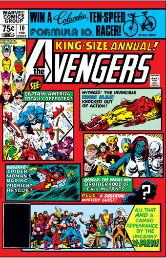 |
|
Crimebuster
CCF Podcast Guru
Making comics!
Posts: 3,919 
|
Post by Crimebuster on Mar 10, 2020 12:07:01 GMT -5
I mean...  |
|
|
|
Post by beccabear67 on Mar 10, 2020 12:58:31 GMT -5
I don't like his tie for a start... 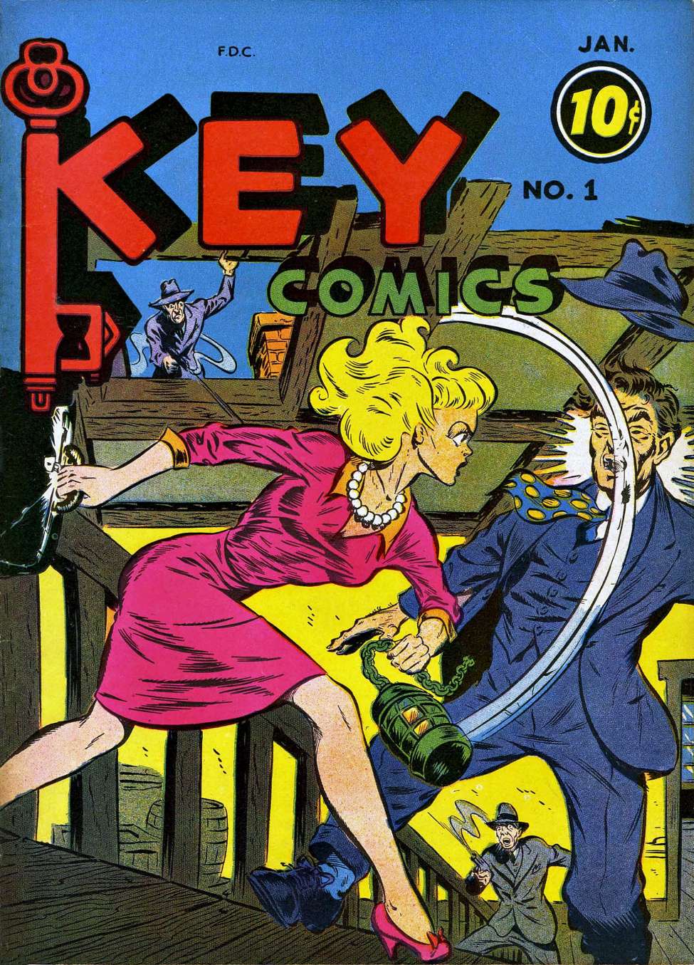 Oh, you meant key comics less literally?  |
|
|
|
Post by chadwilliam on Mar 10, 2020 13:01:10 GMT -5
Certainly not the worst, but I've always been underwhelmed by the cover of Fantastic Four #1 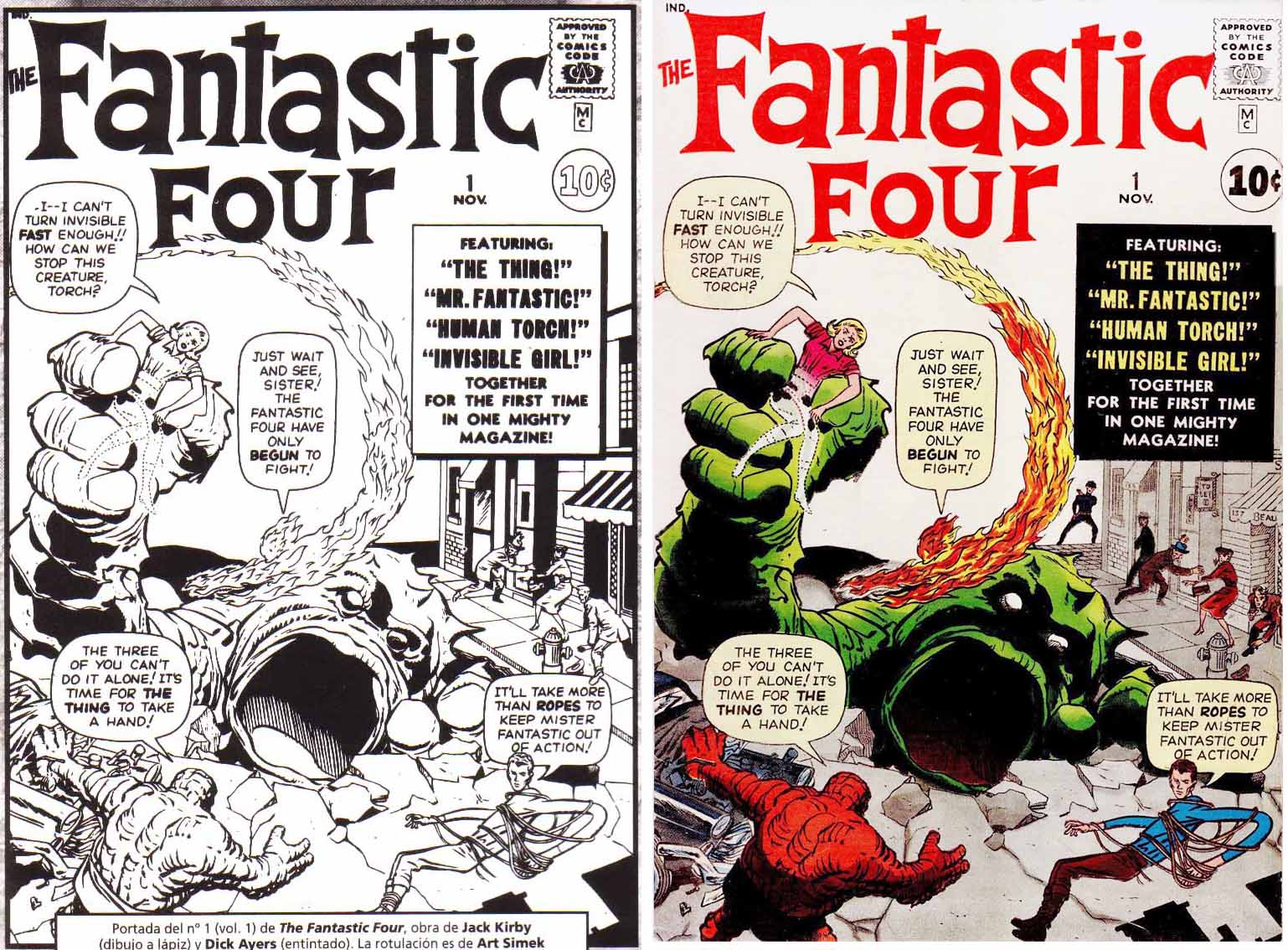 The team isn't really being showcased here; they're out of costume (yes, I know they didn't have costumes at this point); aside from The Torch, no one really looks fantastic - Reed Richards looks more gaunt than elastic except for his left arm which, though stretchy, doesn't create the impression that he's escaping from the ropes so much as he's just needlessly elongating it to push some ropes that were tossed on top of him aside - in fact, looking at it now, I can't help but wonder if he even sees the giant monster bursting through the street. It's like he thinks the big danger is "someone tied me up but I untied myself, good thing there's nothing else going- WHAT THE HELL IS THAT THING?!"; while seeing only the back of The Thing could be an artistic choice designed to tantalize the reader as to what he looks like from the front, it's clear that the giant monster in the centre of the picture is meant to be our focus in the big and scary looking department and not the relatively tiny guy in the corner which only makes me wonder why I should care about the seven foot guy when there's a fifty foot guy in the picture too. Sue Storm using her ability to hide as she plays the helpless damsel in distress undermines how cool invisibility should be. As a superhero cover it feels underwhelming; as a horror cover there's no real mood - no night sky, no shadows, no sense of terror. Again, not the worst key issue there is, and I understand that Lee wasn't quite sure what he wanted at this time with regards to superheroes, but it bugs me that it's the debut issue that gets all the homages and attention, when a truly iconic cover is waiting just around the corner 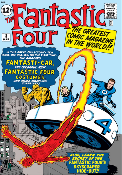 THIS cover screams FANTASTIC! Just from looking at them I can tell that Mr. Fantastic is the leader and the brains behind their vessel; The Thing shaking his fist at The Torch's showboating tells me a lot about their dynamics and personalities; and you've got to wonder what's caught Sue Storm's attention off in the distance. Yes, you can cite 100 other key issues less effective than Fantastic Four #1 (and the comic did sell so obviously it was effective to a lot of people) but very few of those covers would be from the period and feature such important characters (ie. Amazing Fantasy #15, Hulk #1, Daredevil #1, Joruney into Mystery #83, etc, etc). |
|
|
|
Post by MDG on Mar 10, 2020 14:22:49 GMT -5
Similar to FF #1, I always felt JLA #1 is a little underwhelming, action-wise: 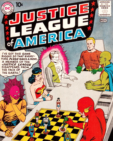 |
|
Confessor
CCF Mod Squad
Not Bucky O'Hare!
Posts: 9,545 
|
Post by Confessor on Mar 10, 2020 14:43:03 GMT -5
I don't like his tie for a start... Beatles reference? |
|
|
|
Post by Phil Maurice on Mar 10, 2020 14:54:39 GMT -5
Underwhelming Sentry cover  Inauspicious debut for Wally  Why is Robin so "jowly?"  |
|
|
|
Post by kirby101 on Mar 10, 2020 15:04:14 GMT -5
I think that Colan Captain Marvel cover is pretty good. But the real Sentry key issue is another Kirby gem.  |
|
|
|
Post by kirby101 on Mar 10, 2020 15:06:38 GMT -5
I never thought much of this cover. 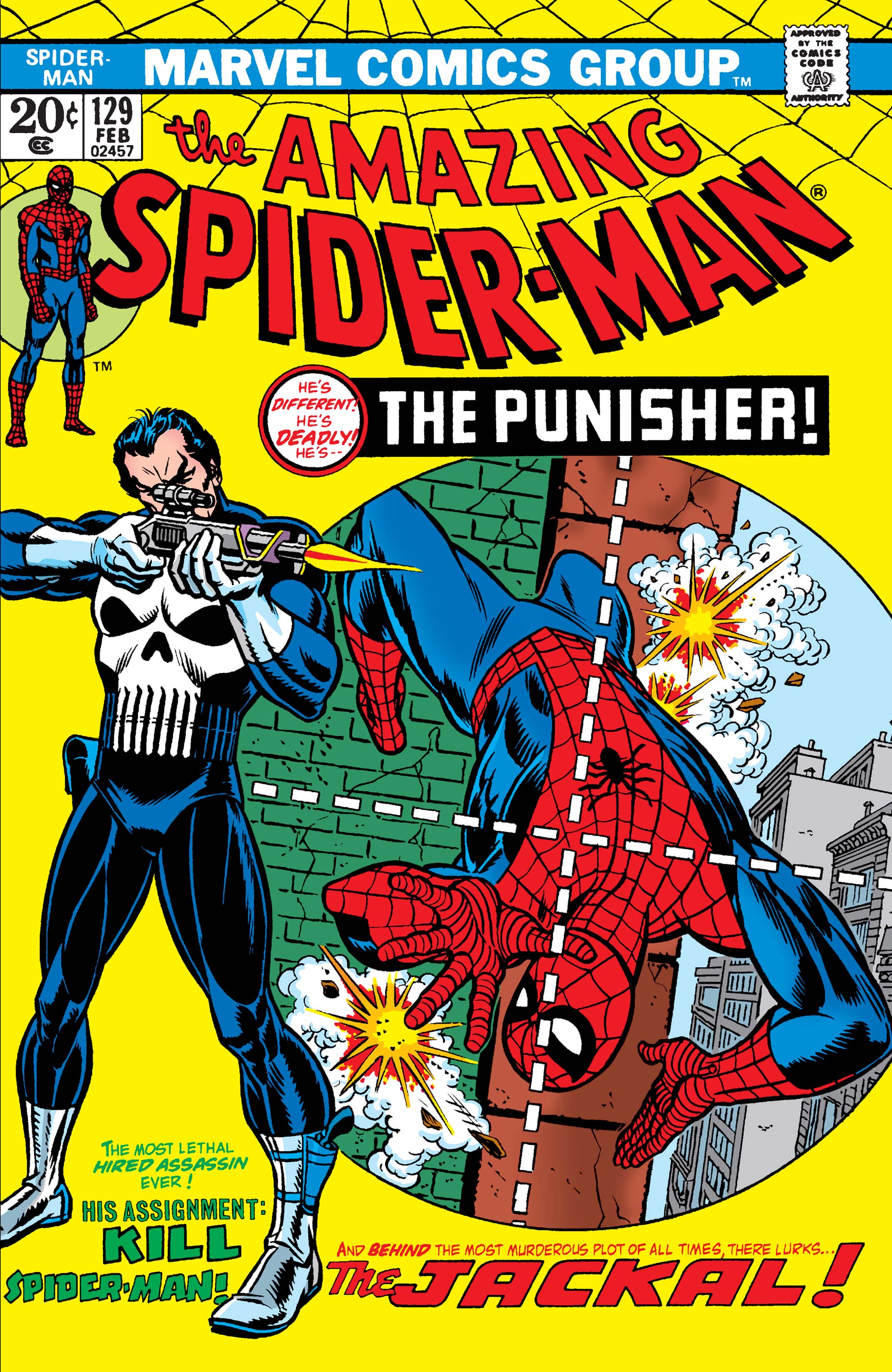 |
|
|
|
Post by Phil Maurice on Mar 10, 2020 15:18:28 GMT -5
I think that Colan Captain Marvel cover is pretty good. But the real Sentry key issue is another Kirby gem. I was thinking of Carol Danvers' debut. It's a good, but not great cover featuring the Sentry. |
|
|
|
Post by badwolf on Mar 10, 2020 15:28:38 GMT -5
Why is Robin so "jowly?"  He still has his baby fat. |
|
|
|
Post by kirby101 on Mar 10, 2020 15:36:51 GMT -5
I think that Colan Captain Marvel cover is pretty good. But the real Sentry key issue is another Kirby gem. I was thinking of Carol Danvers' debut. It's a good, but not great cover featuring the Sentry. Who knew?
|
|
|
|
Post by badwolf on Mar 10, 2020 15:37:39 GMT -5
Screamy mouths, squinty eyes and overdone "f/x"
|
|
|
|
Post by Prince Hal on Mar 10, 2020 15:43:46 GMT -5
^^ And he's other got tiny tiny feet or legs ten feet long.
And hair under his left armpit.
|
|
|
|
Post by badwolf on Mar 10, 2020 15:44:43 GMT -5
And lots of lines.
|
|