|
|
Post by pinkfloydsound17 on Mar 12, 2020 13:07:08 GMT -5
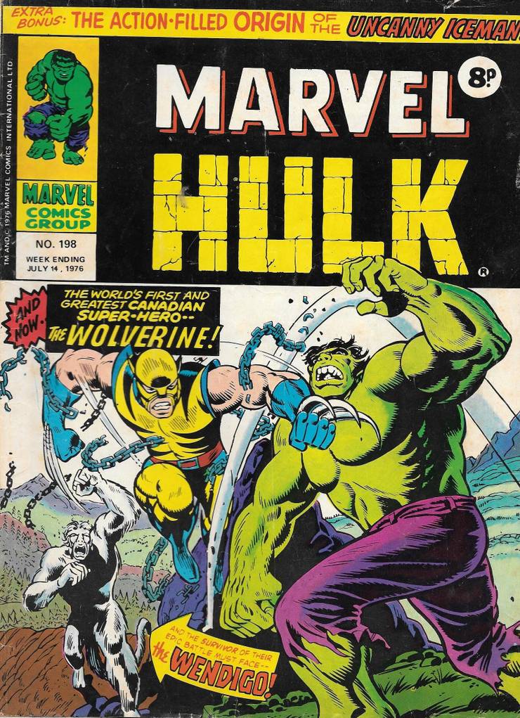
Offered for your consideration...  You think this cover is bad?! I don't know that we have the same level of appreciation. Battle cover? Check. Solid artwork? Check. Eye grabbing background colour? I mean there are nicer covers overall sure, but I would rank this up there with great first appearance covers not worst. |
|
|
|
Post by pinkfloydsound17 on Mar 12, 2020 13:08:25 GMT -5
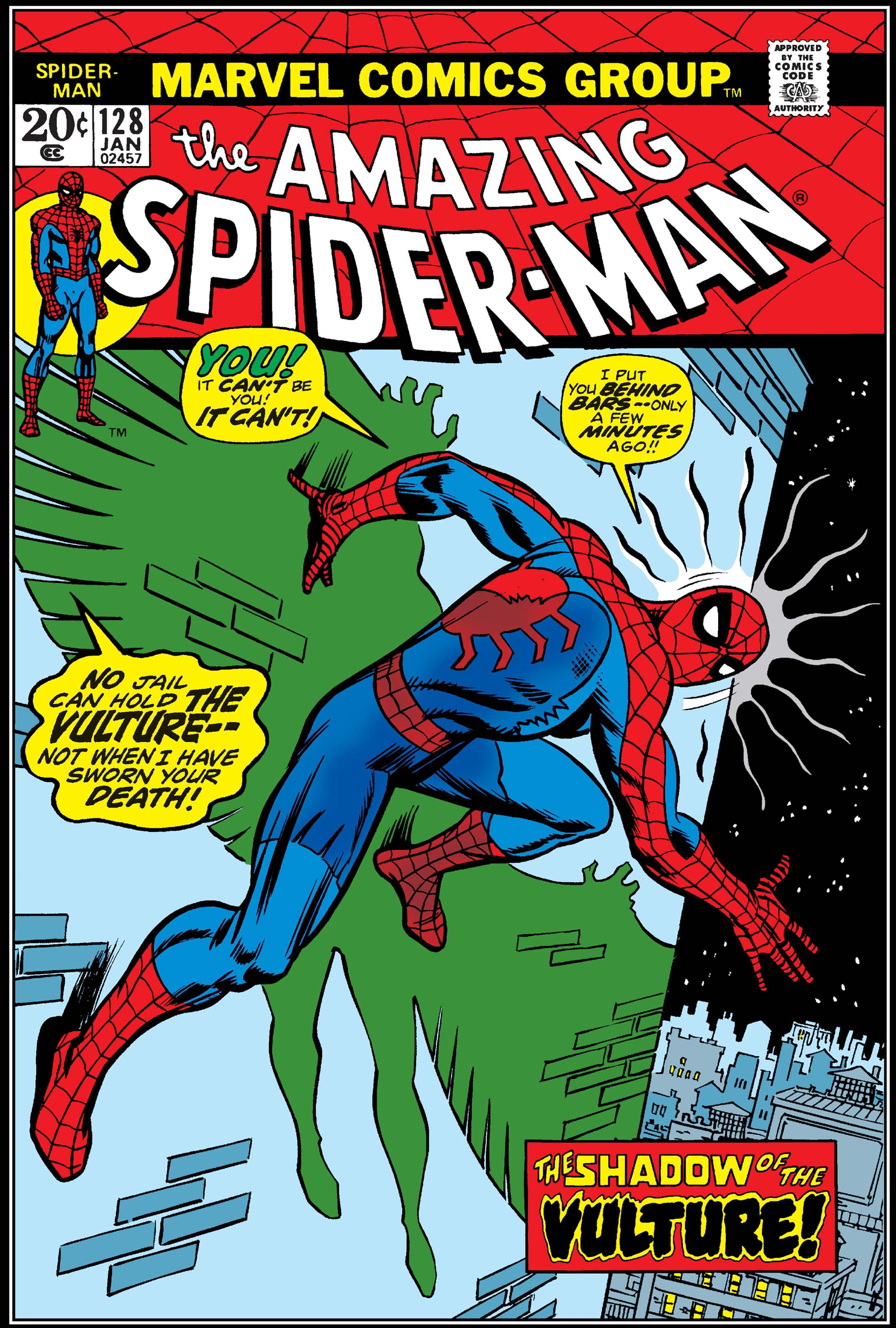
I never thought much of this cover. Wha--?? Easily one of the greatest ASM and Marvel covers. Romita and Kane's work rarely looked better than this, and the subject instantly plays into all of the dark turns Spider-Man's life had taken in this period. I agree that ASM #129 is great. The character is there, its a unique ish idea having Spidey in the crosshairs. Yellow pops like nothing else and screams BUY ME YOU FOOLISH CHILD! |
|
|
|
Post by pinkfloydsound17 on Mar 12, 2020 13:12:16 GMT -5
Shuster might not have been the best draftsman, but man, is that a powerful image. I can't image what someone in 1938 seeing this for the first time would think. Was that drawn as a cover or adapted from a panel?
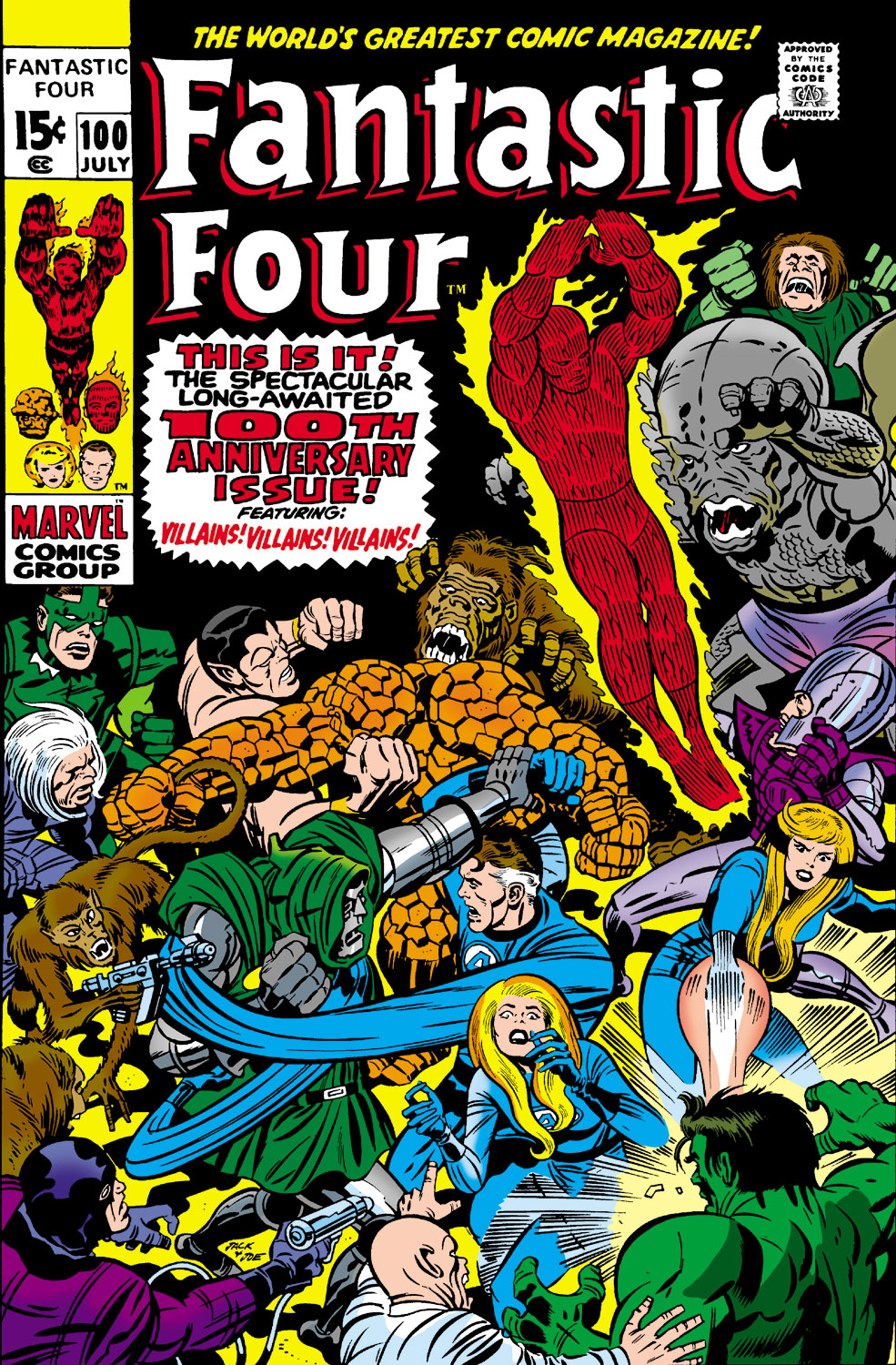
To throw around some more gasoline, I've always thought this cover was a mess:
I agree. Covers crammed with people can be done well though and really draw you in and make you want to look at everything, like the Superman vs Ali treasury. This is all over the place and dizzying. I have honestly never even stopped and stared at it long enough to care...who is that grey brown blob character to the right of the purple center blurb!?! Dragon Man? Edit: Not Dragon Man, he is on the left side under Subby...I think....my question still stands. |
|
|
|
Post by Deleted on Mar 12, 2020 13:15:01 GMT -5
Was that drawn as a cover or adapted from a panel? To throw around some more gasoline, I've always thought this cover was a mess: I agree. Covers crammed with people can be done well though and really draw you in and make you want to look at everything, like the Superman vs Ali treasury. This is all over the place and dizzying. I have honestly never even stopped and stared at it long enough to care...who is that grey brown blob character to the right of the purple center blurb!?! Dragon Man? Edit: Not Dragon Man, he is on the left side under Subby...I think....my question still stands. I believe it is the Mad Thinker's Awesome Android.  -M |
|
|
|
Post by Deleted on Mar 12, 2020 13:22:29 GMT -5
And we can debate solid artwork on the Hulk 181 cover. None of the figures have necks. The Hulk's head looks like it is sitting in a bowl created by his pecs and shoulders, the perspective of the background landscape is off, especially when in scale with the foreground landscape that Wolverine is floating over (there's no solid perch there he could be leaping off at the angle he is drawn), plus the foreshortening on his back (extended leg) is out of whack with the scale of the rest of his body, plus the claws on his front arm look as solid as noodles the way they are curved. And that dynamic background color makes it look like a Crisis Red Skies cross-over and makes no sense if one is trying to depict an actual daytime sky. But to each his own, Taste is subjective.
-M
|
|
|
|
Post by Prince Hal on Mar 12, 2020 13:30:25 GMT -5
Offered for your consideration...  You think this cover is bad?! I don't know that we have the same level of appreciation. Battle cover? Check. Solid artwork? Check. Eye grabbing background colour? I mean there are nicer covers overall sure, but I would rank this up there with great first appearance covers not worst. Maybe one more arrow-shaped blurb would have helped. And Wendigo must have had a great agent. |
|
|
|
Post by Prince Hal on Mar 12, 2020 13:31:32 GMT -5
I agree. Covers crammed with people can be done well though and really draw you in and make you want to look at everything, like the Superman vs Ali treasury. This is all over the place and dizzying. I have honestly never even stopped and stared at it long enough to care...who is that grey brown blob character to the right of the purple center blurb!?! Dragon Man? Edit: Not Dragon Man, he is on the left side under Subby...I think....my question still stands. I believe it is the Mad Thinker's Awesome Android.  -M Played by John Merrick. |
|
|
|
Post by Prince Hal on Mar 12, 2020 13:35:02 GMT -5
I'll take the FF Annual over the Superman-Ali cover any day.
De gustibus, I guess.
|
|
|
|
Post by Prince Hal on Mar 12, 2020 13:37:26 GMT -5
And we can debate solid artwork on the Hulk 181 cover. None of the figures have necks. The Hulk's head looks like it is sitting in a bowl created by his pecs and shoulders, the perspective of the background landscape is off, especially when in scale with the foreground landscape that Wolverine is floating over (there's no solid perch there he could be leaping off at the angle he is drawn), plus the foreshortening on his back (extended leg) is out of whack with the scale of the rest of his body, plus the claws on his front arm look as solid as noodles the way they are curved. And that dynamic background color makes it look like a Crisis Red Skies cross-over and makes no sense if one is trying to depict an actual daytime sky. But to each his own, Taste is subjective. -M What you said. I hate that Marvel red. Plus the Wolverine looks like he should be called Kitty-Kat Man. |
|
|
|
Post by kirby101 on Mar 12, 2020 14:00:32 GMT -5
Original Trimpe cover before Romita and crew work.  |
|
|
|
Post by badwolf on Mar 12, 2020 14:17:37 GMT -5
And we can debate solid artwork on the Hulk 181 cover. None of the figures have necks. The Hulk's head looks like it is sitting in a bowl created by his pecs and shoulders, the perspective of the background landscape is off, especially when in scale with the foreground landscape that Wolverine is floating over (there's no solid perch there he could be leaping off at the angle he is drawn), plus the foreshortening on his back (extended leg) is out of whack with the scale of the rest of his body, plus the claws on his front arm look as solid as noodles the way they are curved. And that dynamic background color makes it look like a Crisis Red Skies cross-over and makes no sense if one is trying to depict an actual daytime sky. But to each his own, Taste is subjective. -M It's called a Canadian sky you hoser. |
|
|
|
Post by Deleted on Mar 12, 2020 14:27:25 GMT -5
And we can debate solid artwork on the Hulk 181 cover. None of the figures have necks. The Hulk's head looks like it is sitting in a bowl created by his pecs and shoulders, the perspective of the background landscape is off, especially when in scale with the foreground landscape that Wolverine is floating over (there's no solid perch there he could be leaping off at the angle he is drawn), plus the foreshortening on his back (extended leg) is out of whack with the scale of the rest of his body, plus the claws on his front arm look as solid as noodles the way they are curved. And that dynamic background color makes it look like a Crisis Red Skies cross-over and makes no sense if one is trying to depict an actual daytime sky. But to each his own, Taste is subjective. -M It's called a Canadian sky you hoser.  My grandfather was a lumberjack in Quebec before emigrating to the US in the 1920s, and in all the stories I heard form him in my youth, never once did I head of a red sky in Canada. Now Red Skies at Night I have heard of, and at sunset or sunset, sure but then there is no indication of that in the actual art, again I say that it is a failure on the part of the production department who did the coloring and touch ups or Trimpe (in the draftsmanship/composition) to convey an actual sense of setting/verisimilitude to make it any more than a generic image with poor anatomy and scale. -M |
|
|
|
Post by james on Mar 12, 2020 16:11:19 GMT -5
Wha--?? Easily one of the greatest ASM and Marvel covers. Romita and Kane's work rarely looked better than this, and the subject instantly plays into all of the dark turns Spider-Man's life had taken in this period. We really disagree on what is a great cover, let alone an all time Romita great cover. The issue before is heads and shoulders above 129.  I I have to agree with Kirby I think AMSP 128,198,152, and 233 are more eye catching than 129. Guess that begs the question, if any of them held the historical weight of 129 would we be gaga over the covers? |
|
|
|
Post by berkley on Mar 12, 2020 16:58:43 GMT -5
I don't mind the Hulk cover too much - yeah, the Hulk's anatomy is a bit messed up but I don't really look for perfection in serial, deadline-driven stuff like this.
The only thing I don't like about FF King Size cover is that the central blurb takes up way too much space.
|
|
|
|
Post by kirby101 on Mar 12, 2020 17:24:33 GMT -5
Kirby did so much better multi character covers.  |
|