|
|
Post by pinkfloydsound17 on Mar 12, 2020 17:58:52 GMT -5
^YES
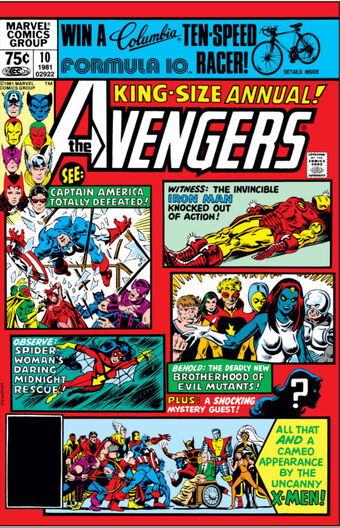
I enjoy that cover a lot. It is busy but you can clearly make out what is happening, who is who and it feels excited. That annual feels like a bunch of characters were quickly scribbled on the page.
|
|
|
|
Post by String on Mar 12, 2020 18:03:26 GMT -5
Stemming from seeing Avengers Annual 10 in this week's cover contest, I wondered if there are other comics denoted as "key" or are valued first appearances of some kind that have rather terrible covers. Is this possibly the worst? Marred by a banner ad and a ho hum panel sequence with no real standout features other than the red background?  You and I have very different definitions of 'ho-hum'. Covers are supposed to draw your eye and attention which is why I love split panel covers, teasing you with excitement over their various scenes and conflicts possibly contained within the pages of that very issue. This is one of my favorites examples of such covers: Avengers in peril, evil mutants, surprise guests, and the X-Men, all for the low low price of 75 cents. You mean to tell me that if you saw this issue, with this cover, on the spinner rack, that you wouldn't pick it up to at least check it out? I would, I did and have loved it ever since. |
|
|
|
Post by String on Mar 12, 2020 18:08:02 GMT -5
Lone Star says it's the first appearance of Mr. Sinister. Yeah...but I don't know who that is so it wasn't super helpful. I'll see your #221 and raise you by two more covers:   |
|
|
|
Post by Rob Allen on Mar 12, 2020 18:56:18 GMT -5
To throw around some more gasoline, I've always thought this cover was a mess: I agree. Covers crammed with people can be done well though and really draw you in and make you want to look at everything... This cover certainly drew me in. I must have spent hours looking at it over the years. |
|
|
|
Post by tarkintino on Mar 12, 2020 18:58:03 GMT -5
Wha--?? Easily one of the greatest ASM and Marvel covers. Romita and Kane's work rarely looked better than this, and the subject instantly plays into all of the dark turns Spider-Man's life had taken in this period. I agree that ASM #129 is great. The character is there, its a unique ish idea having Spidey in the crosshairs. Y Showing him in a position of vulnerability more aligned with reality (shooting, which was a raging problem in early 70s America), and the vigilante subject of the same era was perfect. With the "killer" perfectly balanced with the "victim" yet he commands attention with how deadly the image suggests he is. Fantastic way to introduce a character. |
|
|
|
Post by Icctrombone on Mar 12, 2020 19:13:08 GMT -5
Shuster might not have been the best draftsman, but man, is that a powerful image. I can't image what someone in 1938 seeing this for the first time would think. Was that drawn as a cover or adapted from a panel?
To throw around some more gasoline, I've always thought this cover was a mess:
I like the cover but it added characters that didn't appear in the story. |
|
|
|
Post by Icctrombone on Mar 12, 2020 19:18:12 GMT -5
Stemming from seeing Avengers Annual 10 in this week's cover contest, I wondered if there are other comics denoted as "key" or are valued first appearances of some kind that have rather terrible covers. Is this possibly the worst? Marred by a banner ad and a ho hum panel sequence with no real standout features other than the red background?  You and I have very different definitions of 'ho-hum'. Covers are supposed to draw your eye and attention which is why I love split panel covers, teasing you with excitement over their various scenes and conflicts possibly contained within the pages of that very issue. This is one of my favorites examples of such covers: Avengers in peril, evil mutants, surprise guests, and the X-Men, all for the low low price of 75 cents. You mean to tell me that if you saw this issue, with this cover, on the spinner rack, that you wouldn't pick it up to at least check it out? I would, I did and have loved it ever since. My problem with it is that the artist was subpar. Al Milgrom ? |
|
|
|
Post by Prince Hal on Mar 12, 2020 19:24:41 GMT -5
Was that drawn as a cover or adapted from a panel?
To throw around some more gasoline, I've always thought this cover was a mess:
I like the cover but it added characters that didn't appear in the story. Oh, I loved that! Especially the Two-Gun Kid! |
|
|
|
Post by Icctrombone on Mar 12, 2020 19:26:22 GMT -5
I like the cover but it added characters that didn't appear in the story. Oh, I loved that! Especially the Two-Gun Kid! Namor and Sgt Fury also were a no show. |
|
|
|
Post by Prince Hal on Mar 12, 2020 20:09:51 GMT -5
Oh, I loved that! Especially the Two-Gun Kid! Namor and Sgt Fury also were a no show. Well, Fury was there, but as a colonel, running security. |
|
Confessor
CCF Mod Squad
Not Bucky O'Hare!
Posts: 9,555 
|
Post by Confessor on Mar 13, 2020 8:56:02 GMT -5
...shooting, which was a raging problem in early 70s America... Whereas today...  |
|
|
|
Post by tarkintino on Mar 13, 2020 13:14:31 GMT -5
...shooting, which was a raging problem in early 70s America... Whereas today...  Historical reference. The early 70s was one of the most violent in U.S. history (the rise of armed, racially-oriented gangs in association with prisons, militant groups assassinating police offers over a 3 year stretch, the attacks of other "revolutionary" gruops, etc ), with some citizens arguing about the need for vigilantes, while others gasped in horror at the thought of lawless men running around dealing out their own brand of justice. In that period, the Punisher tapped into that conflict/debate, and there was no better Marvel character to be the target of that than the "murderer" Spider-Man". |
|
|
|
Post by Prince Hal on Mar 13, 2020 13:17:26 GMT -5
...shooting, which was a raging problem in early 70s America... Whereas today...  |
|
|
|
Post by tarkintino on Mar 13, 2020 13:58:48 GMT -5
Shuster might not have been the best draftsman, but man, is that a powerful image. I can't image what someone in 1938 seeing this for the first time would think. Was that drawn as a cover or adapted from a panel? To throw around some more gasoline, I've always thought this cover was a mess: Yeah, it was a mess. Its suggests he could not make up his mind about drawing a single fight scene, or add random, oddly positioned characters anywhere he could place them. ...and his Spider-Man...yikes. |
|
|
|
Post by jason on Mar 14, 2020 9:36:24 GMT -5
Always thought Daredevil #1 was kind of a mess with the Spider-Man and Fantastic Four panels taking up the right half of the book. I know it was a sales technique (similar to the film blurb "From the Studio that brought you X"), but it almost looks like they werent confident the book couldnt sell on its own. Also, while Crisis on Infinite Earths #7 (death of Supergirl) is an iconic image, it would have been more powerful without the characters in the background mourining, ditto the cover of The Death of Captain Marvel (Daredevil, Wolverine, Hulk, and Colossus didnt even have any lines in the story).
|
|