|
|
Post by EdoBosnar on Apr 8, 2020 13:58:54 GMT -5
Well, I'm nothing if not consistent. Last time I wanted to throw a little love to Charlton in the 1970s, so now we'll do the same thing for an indie publisher that launched at pretty much the same time I discovered my first comic book shop: Pacific Comics - who seemed to be the trailblazer for the 1980s indie explosion. They only held out for about four years, but they attracted some major talent (Adams, Ditko, Kirby, Grell, Aragones, Stevens...) and published some pretty cool stuff along the way, including the first appearances of now iconic characters like Groo the Wanderer and the Rocketeer. (Here's a helpful list of their titles.) So your mission this week is find and post one of the many lovely and/or awesome covers published by Pacific Comics - and *only* Pacific; several titles were assumed, without a break in the numbering, by Eclipse, so make sure the Pacific logo is on the cover:
The rules:
Post one classic cover that fits the theme of the contest.
Covers must be posted before voting begins.
Voting takes place on Tuesday, April 14th, beginning at 12:01 am PST and ending at 11:59 pm PST.
Vote by posting the name of the poster whose cover best fits the theme or whose cover you simply like the best.
Put your choice's name in bold.
The winner of the contest is the entrant with the most votes after the voting period ends.
The winner chooses the theme for the next week's contest.
If you don't think a cover fits the theme, don't vote for it. Please don't post disparaging remarks about it.
If a cover is more recent than the classic time frame, kindly point that out so that the poster can choose an alternate before voting begins.
Two posters may not use the same cover.
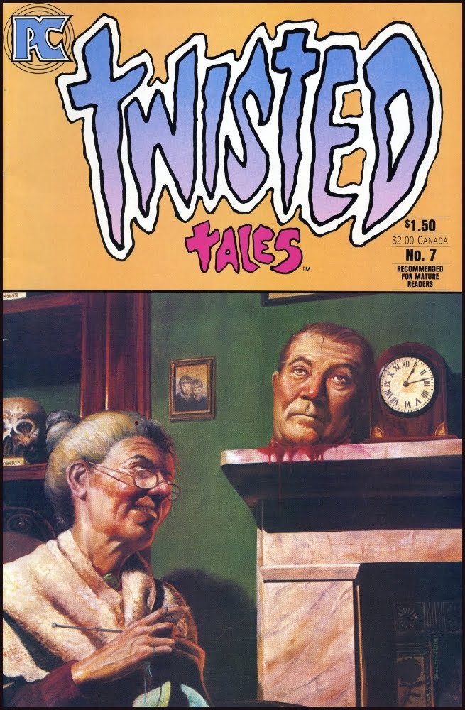
I'll start us off with this one from one of their anthology titles:
|
|
|
|
Post by Deleted on Apr 8, 2020 14:04:56 GMT -5
If Dave was alive, I'd be posing
|
|
|
|
Post by Deleted on Apr 8, 2020 14:20:30 GMT -5
Twisted Tales had some of THE most gorgeous cover art, I'd ever seen on a horror comic. . but then they screwed up the cover with that awful color-blocked title taking up a 3rd of every cover. that really impacted the art, and in many cases, diminished it greatly. this one however? works in the smaller space, and I always loved it, even if the stories inside weren't as good as the cover promised.  |
|
|
|
Post by adamwarlock2099 on Apr 8, 2020 14:22:01 GMT -5
|
|
|
|
Post by Deleted on Apr 8, 2020 14:25:01 GMT -5
 -M |
|
|
|
Post by Deleted on Apr 8, 2020 14:26:35 GMT -5
^ Love 'Goblin Market' in that one....
|
|
|
|
Post by Icctrombone on Apr 8, 2020 14:27:56 GMT -5
|
|
|
|
Post by tarkintino on Apr 8, 2020 14:31:57 GMT -5
|
|
|
|
Post by Deleted on Apr 8, 2020 14:42:41 GMT -5
^ Love 'Goblin Market' in that one.... I don't think there is a bad story in there, and it was where I discovered Leila Downing's art (I now have a few of her art books), but yeah, Bolton's work on Goblin Market is the class of the issue. -M |
|
|
|
Post by Farrar on Apr 8, 2020 14:45:25 GMT -5
Al Williamson (as if you couldn't tell). 'Nuff said.  |
|
|
|
Post by tartanphantom on Apr 8, 2020 14:47:06 GMT -5
|
|
|
|
Post by MDG on Apr 8, 2020 14:48:25 GMT -5
|
|
|
|
Post by brianf on Apr 8, 2020 14:57:30 GMT -5
|
|
|
|
Post by hondobrode on Apr 8, 2020 15:00:00 GMT -5
Pacific launched when I was a freshman in high school and I loved everything they put out.
Naively, I thought back then they would be the # 3 alternative to Marvel and DC 
ah youth
|
|
|
|
Post by kirby101 on Apr 8, 2020 15:08:18 GMT -5
|
|