|
|
Post by Slam_Bradley on May 11, 2020 11:13:43 GMT -5
I remember this being Jarring. Bill Sienkiewicz is a great artist but didn't really fit for the World's Greatest comic Magazine. I don't understand what's wrong/different about it. That makes at least two of us. |
|
|
|
Post by beccabear67 on May 11, 2020 12:48:04 GMT -5
I really like what I have seen of the Steve Ditko Hulk (Tales To Astonish #65-68), I think I prefer his to Kirby's actually. 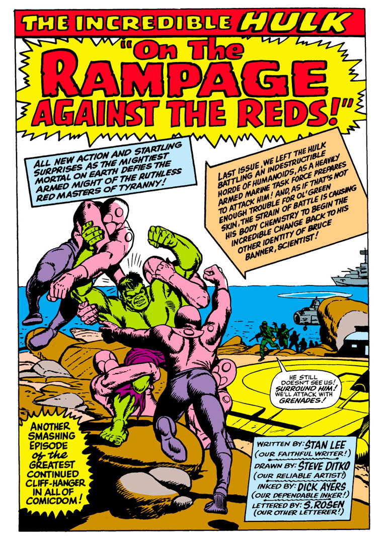 |
|
|
|
Post by electricmastro on May 11, 2020 13:13:29 GMT -5
I remember this being Jarring.  Bill Sienkiewicz is a great artist but didn't really fit for the World's Greatest comic Magazine. Which I think is still quite a contrast to how Frank Miller could draw Mr. Fantastic.  |
|
|
|
Post by MDG on May 11, 2020 13:15:49 GMT -5
I love 'em both (now), but this change was pretty jarring:  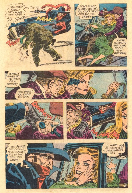 |
|
|
|
Post by electricmastro on May 11, 2020 13:54:49 GMT -5
I really like what I have seen of the Steve Ditko Hulk (Tales To Astonish #65-68), I think I prefer his to Kirby's actually. Speaking of which, this splash page from The Incredible Hulk Special #1 (October, 1968).  Artists: Jack Kirby [as JK]; Mike Esposito [as MD (Mickey Dimeo)]; Bill Everett [as BE]; Steve Ditko [as SD]; Marie Severin [as MS]; John Buscema [as JB]; Gil Kane [as GK]; Dick Ayers [as DA]; Herb Trimpe [as HT]; John Romita ? [as JR]; John Severin [as JS]; John Verpoorten [as JV] |
|
|
|
Post by kirby101 on May 11, 2020 15:34:50 GMT -5
JK + JS is probably Joe Sinnott.
|
|
|
|
Post by tarkintino on May 11, 2020 15:51:49 GMT -5
I really like what I have seen of the Steve Ditko Hulk (Tales To Astonish #65-68), I think I prefer his to Kirby's actually. I too like Ditko's Hulk; often, he would give the Hulk a very dismissive / surly expression instead of the customary rage many other artists would slap on his face. Ditko's Hulk face had a lot of character, and in concert with the Tales to Astonish stories he provided the art for, his Hulk seemed like a more vengeful creature than one who just rages/smashes everything angering him. |
|
|
|
Post by rberman on May 11, 2020 16:45:50 GMT -5
I remember this being Jarring. Bill Sienkiewicz is a great artist but didn't really fit for the World's Greatest comic Magazine. I see he's imitating the Kirby squared-off fingers. |
|
|
|
Post by Prince Hal on May 11, 2020 17:21:56 GMT -5
^^ A George Tuska trait, too.  |
|
|
|
Post by Cei-U! on May 11, 2020 17:43:41 GMT -5
JK + JS is probably Joe Sinnott. The letterer made a boo-boo. It should actually read JK + CS for Jack Kirby and Chic Stone (inker of the cover to Tales To Astonish #67, from which the image is taken).
Cei-U! I summon the red pencil!
|
|
|
|
Post by electricmastro on May 11, 2020 19:50:18 GMT -5
And if Bill Sienkiewicz’s Fantastic Four is jarring, then I wonder what that makes Skottie Young’s from Venom #18 (November, 2004).  |
|
|
|
Post by Slam_Bradley on May 11, 2020 20:59:47 GMT -5
And if Bill Sienkiewicz’s Fantastic Four is jarring, then I wonder what that makes Skottie Young’s from Venom #18 (November, 2004). Skottie Young does everything just fine. |
|
Confessor
CCF Mod Squad
Not Bucky O'Hare!
Posts: 9,533 
|
Post by Confessor on May 11, 2020 23:48:58 GMT -5
And if Bill Sienkiewicz’s Fantastic Four is jarring, then I wonder what that makes Skottie Young’s from Venom #18 (November, 2004). I love Skottie Young's artwork. It's stylistically very idiosyncratic and may not appeal to everyone, but he's a helluva visual story-teller. His compositional choices and panel-to-panel flow are superb. His superhero work can be a bit of an acquired taste, just like Humberto Ramos's, whose art is quite similar looking (at first glance, I thought that page you posted was actually by Ramos). I think the best thing I've seen Young do was the Marvel Illustrated adaptations of Frank L. Baum's Oz books. Those were utterly enchanting and his art perfectly captured the "cutesy/creepy" Oz aesthetic. |
|
|
|
Post by electricmastro on May 11, 2020 23:53:24 GMT -5
And if Bill Sienkiewicz’s Fantastic Four is jarring, then I wonder what that makes Skottie Young’s from Venom #18 (November, 2004). I love Skottie Young's artwork. It's stylistically very idiosyncratic and may not appeal to everyone, but he's a helluva visual story-teller. His compositional choices and panel-to-panel flow are superb. His superhero work can be a bit of an acquired taste, just like Humberto Ramos's, whose art is quite similar looking (at first glance, I thought that page you posted was actually by Ramos). I think the best thing I've seen Young do was the Marvel Illustrated adaptations of Frank L. Baum's Oz books. Those were utterly enchanting and his art perfectly captured the "cutesy/creepy" Oz aesthetic. And fair point there! |
|
|
|
Post by Slam_Bradley on May 12, 2020 9:33:38 GMT -5
And if Bill Sienkiewicz’s Fantastic Four is jarring, then I wonder what that makes Skottie Young’s from Venom #18 (November, 2004). I love Skottie Young's artwork. It's stylistically very idiosyncratic and may not appeal to everyone, but he's a helluva visual story-teller. His compositional choices and panel-to-panel flow are superb. His superhero work can be a bit of an acquired taste, just like Humberto Ramos's, whose art is quite similar looking (at first glance, I thought that page you posted was actually by Ramos). I think the best thing I've seen Young do was the Marvel Illustrated adaptations of Frank L. Baum's Oz books. Those were utterly enchanting and his art perfectly captured the "cutesy/creepy" Oz aesthetic. Those Oz books are an absolute delight. |
|