|
|
Post by electricmastro on May 13, 2020 18:20:21 GMT -5
Side by side panels of how Jack Kirby (Thor #156, September 1968) and John Buscema (Thor #200, June 1972) draw Thor’s face:   |
|
|
|
Post by tarkintino on May 13, 2020 20:02:28 GMT -5
Side by side panels of how Jack Kirby (Thor #156, September 1968) and John Buscema (Thor #200, June 1972) draw Thor’s face: Big difference. Buscema always had the more naturalistic look to his characters--more flexibility to features such as lips and law lines. Both are great Thor images, and when reading the title way back when, I do not recall being put off by Buscema being the next long run after Kirby (since I was already a big fan of his great work on The Avengers). |
|
|
|
Post by electricmastro on May 18, 2020 19:10:36 GMT -5
Didn’t notice until recently how artists have distinct ways of drawing Superman’s chin: Alex Toth (1983):  Curt Swan (1985):  Klaus Janson (1985):  Trevor Von Eeden (1985):  Bernie Wrightson (1988):  |
|
|
|
Post by Rob Allen on May 19, 2020 14:01:14 GMT -5
Speaking of which, this splash page from The Incredible Hulk Special #1 (October, 1968).  I always thought they picked a terrible example for Steve Ditko. He did lots of Hulk faces that were much better than the one shown here. |
|
|
|
Post by electricmastro on May 21, 2020 16:11:13 GMT -5
Ray drawing Superman with more defined abs than Shuster: Superman #6 (September, 1940). Art by Joe Shuster:  Superman #11 (July, 1941). Art by Fred Ray:  |
|
|
|
Post by tonebone on Sept 14, 2020 8:45:59 GMT -5
For the longest time, I didn’t know that Dan DeCarlo was the one, or at least one among the earliest artists, who helped give Archie Andrews the house style that became widely associated with him for decades, because he looked quite different in the beginning. Bob Montana (Pep Comics #22, December 1941):  Dan DeCarlo (Archie's Girls Betty and Veronica #6, September 1952):  Dan DeCarlo's style might well be the most imitated style in comics. Not only did it become the house style for Archie, wherein everyone there was following his style, but every teen strip from every other company was done in his style. I don't think even Kirby could compete with the number of clones. |
|
|
|
Post by mikelmidnight on Sept 16, 2020 11:35:48 GMT -5
Jack Cole’s Plastic Man #1 (1943) compared with Gil Kane’s Plastic Man #1 (1966). Whereas Cole gives Plastic Man a pointed chin, Kane gives his chin an angular square style.
Wasn't the second character actually the son of the original?
|
|
|
|
Post by chaykinstevens on Sept 16, 2020 11:48:16 GMT -5
Here's a later version of the pinup. 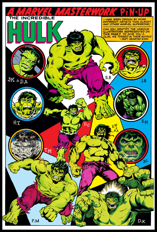 |
|
|
|
Post by kirby101 on Sept 16, 2020 12:13:51 GMT -5
Both Classic renditions of the Silver Surfer  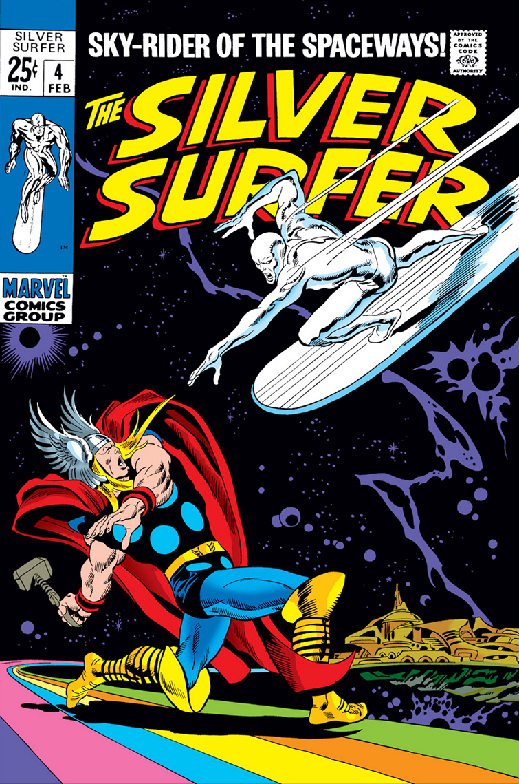 And Marshall Rodgers brought in a new, more silvery look. 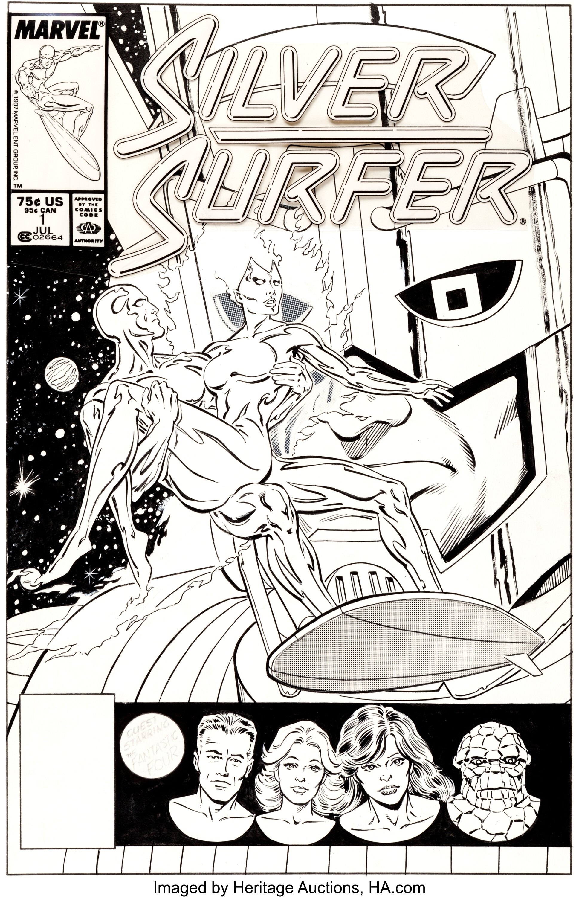 And another look from a legend. 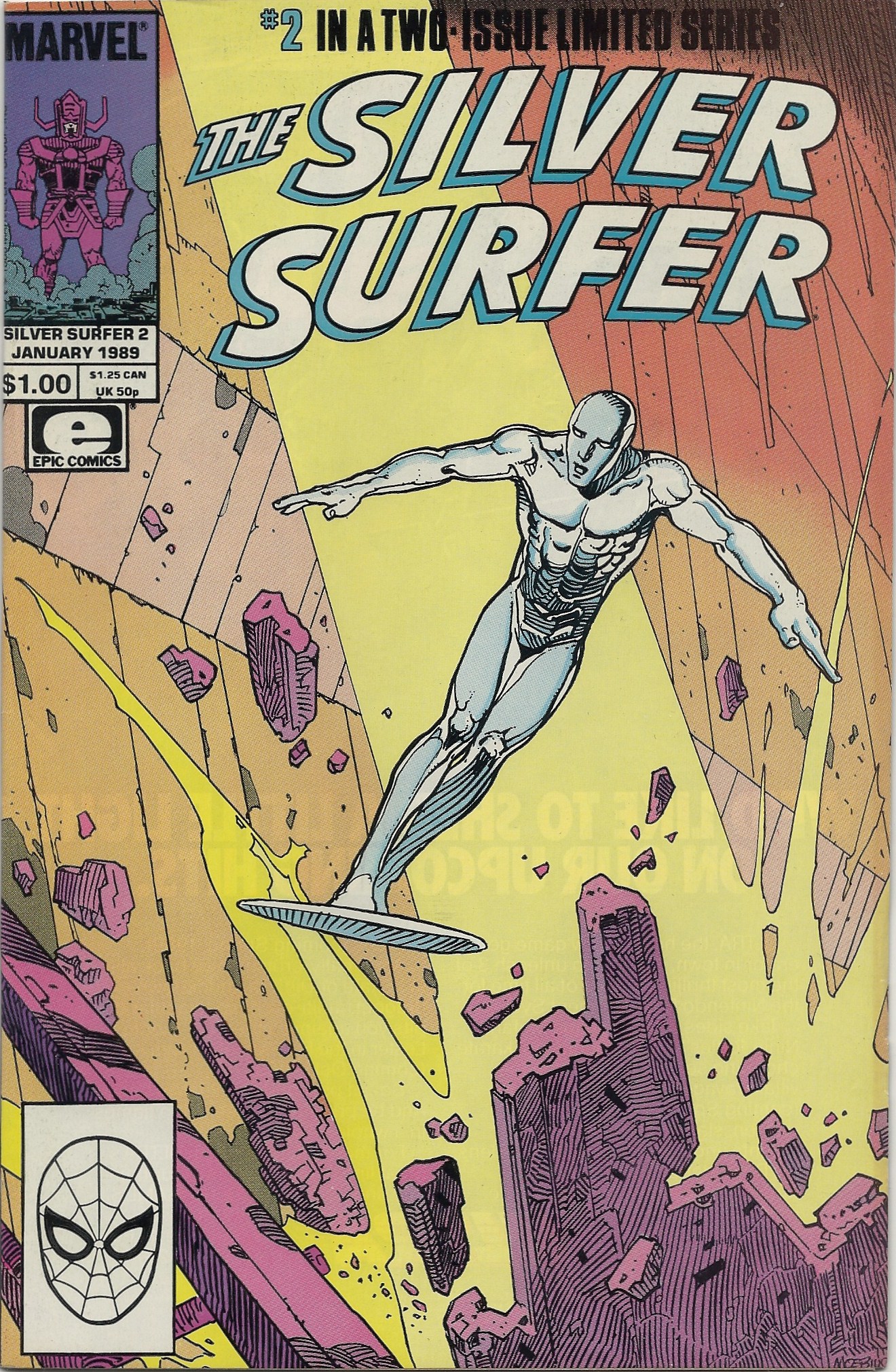 |
|
|
|
Post by berkley on Sept 18, 2020 1:11:34 GMT -5
Doctor Strange is a bit of an outlier with me in that both as a character and as a series, or "Doctor Strange Universe", I like several different versions - so much so that I'm hard put to choose a favourite from amongst Ditko, Colan, and Brunner. Marie Severin, Dan Adkins, and Barry Windsor-Smith would be serious contenders as well, and from the samples I've seen online perhaps Michael Golden, though I'd stopped following the series by the time he was working on it.
|
|
|
|
Post by Cei-U! on Sept 18, 2020 5:56:57 GMT -5
Doctor Strange is a bit of an outlier with me in that both as a character and as a series, or "Doctor Strange Universe", I like several different versions - so much so that I'm hard put to choose a favourite from amongst Ditko, Colan, and Brunner. Marie Severin, Dan Adkins, and Barry Windsor-Smith would be serious contenders as well, and from the samples I've seen online perhaps Michael Golden, though I'd stopped following the series by the time he was working on it. Don't leave out Tom Sutton. His Dr. Strange art is tres groovy.
Cei-U! I summon the oft overlooked master!
|
|
|
|
Post by berkley on Sept 18, 2020 22:07:01 GMT -5
Doctor Strange is a bit of an outlier with me in that both as a character and as a series, or "Doctor Strange Universe", I like several different versions - so much so that I'm hard put to choose a favourite from amongst Ditko, Colan, and Brunner. Marie Severin, Dan Adkins, and Barry Windsor-Smith would be serious contenders as well, and from the samples I've seen online perhaps Michael Golden, though I'd stopped following the series by the time he was working on it. Don't leave out Tom Sutton. His Dr. Strange art is tres groovy.
Cei-U! I summon the oft overlooked master!
That's right, I did forget Tom Sutton, who was one of the few bright spots in the dismally disappointing immediate post-Englehart era of the series. The one issue that he inked himself (I think it was only one?) was a particular highlight but I also liked the very different looking combination with Ernie Chan. The combination with Rudy Nebres OTOH looked more like Nebres than Sutton, not a good thing in my view. |
|
|
|
Post by earl on Sept 19, 2020 18:54:24 GMT -5
I don't know my Archie comics but that Bob Montana artwork reminds me more than a bit like Robert Crumb.
|
|
|
|
Post by earl on Sept 19, 2020 18:57:21 GMT -5
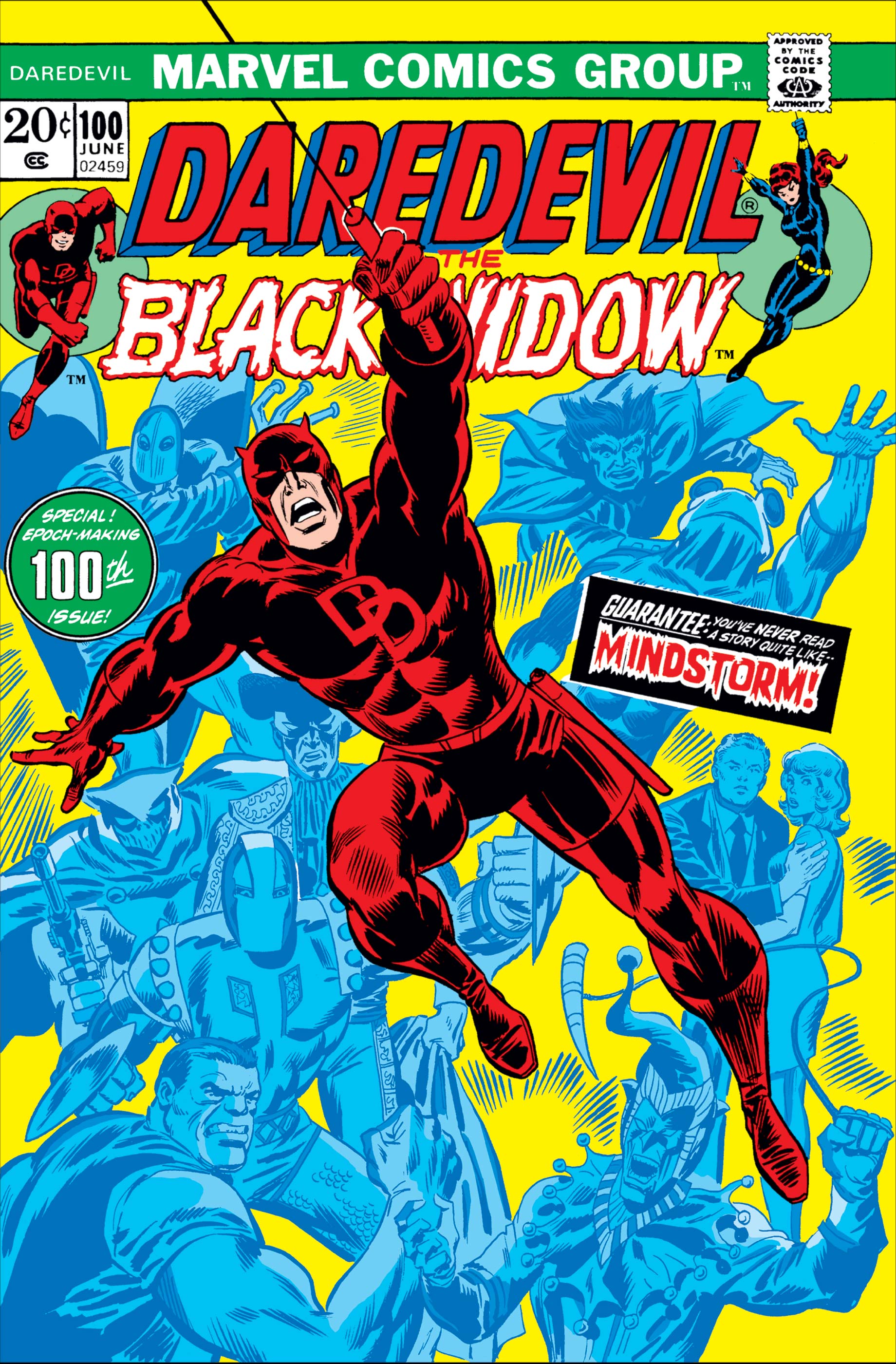 I've been looking at this cover on and off the past few days after rebagging it and not putting it back into the box. The way the head is drawn to me just does not look like Daredevil with the shape of the head and the nose. |
|
|
|
Post by berkley on Sept 19, 2020 20:27:28 GMT -5
It just occurred to me that I find John Buscema drew a great Thor - but mostly in the pages of other series, e.g. The Avengers and the Silver Surfer. In the Thor series itself, I found he was paired with inkers that weren't the best match for his style, e.g. Vince Colletta, Joe Sinnott, Tony Dezuniga. I did like the Buscema/Palmer artwork in the #270s
|
|


