|
|
Post by badwolf on Jun 22, 2022 19:51:47 GMT -5
Do you have a link for that? I'd be interested in seeing it.
I have to admit I am torn sometimes. The recoloring of Walter Simonson's Thor in the omnibus looks quite nice. But I kind of want to have it with the original coloring too. (I still have most of my original issues, but I don't plan to keep them apart from #337.)
I thought the coloring for the Howard The Duck Omni was pretty spot on when compared to the original comics I didn't know that (or any other omnis) were recolored. It does look good. But the Thor omni is a different case, where they used modern coloring (gradients, etc.).
Here's a good review that shows some side-by-side comparisons:
|
|
shaxper
CCF Site Custodian
Posts: 22,880
|
Post by shaxper on Jun 22, 2022 23:00:06 GMT -5
I'm all for making reprints of the classics cheap and accessible for the new generation, but why did they have to do this TO the Masterworks line instead of introducing a separate line entirely? Remember when Marvel was printing softcover versions in addtion to the classic hardcover format? Why did one successful line have to end in order to make room for another line aimed at a different target demographic?
|
|
|
|
Post by Deleted on Jun 22, 2022 23:07:55 GMT -5
I'm all for making reprints of the classics cheap and accessible for the new generation, but why did they have to do this TO the Masterworks line instead of introducing a separate line entirely? Remember when Marvel was printing softcover versions in addtion to the classic hardcover format? Why did one successful line have to end in order to make room for another line aimed at a different target demographic? They are still putting out new volumes of the standard Masterworks line, they just aren't putting older editions back into print in that format. But that's something that's been happening at Marvel for forever, when a collected edition goes out of print but the content is still in demand, they put out the content in a new format rather than going back to print with the previous thing. It meets the remaining demand for the content plus gets hardcore completionist collectors to double dip, creating more possible sales of the same content than just going back to print on a sold out edition would. The only format that seems to be an exception is the omnibus, where sometimes they go back to print for high demand out of print collections, but I suspect the margins are so high on that format that it remains profitable for them to do so without needing the double dipping sales to turn a profit. -M |
|
|
|
Post by Deleted on Jun 22, 2022 23:10:54 GMT -5
shaxperBesides these new volumes are not the Marvel Masterworks line, they are The Mighty Marvel Masterworks...there's actually a difference. Masterworks-hardcover upwards of $50 a pop, add mighty they get smaller and cheaper, but you can still have both on the market concurrently. -M PS there are variant covers on these, a regular cover and a direct market variant that uses a classic cover from the run as the collected edition cover rather than new art... -M
|
|
|
|
Post by Deleted on Jun 22, 2022 23:12:53 GMT -5
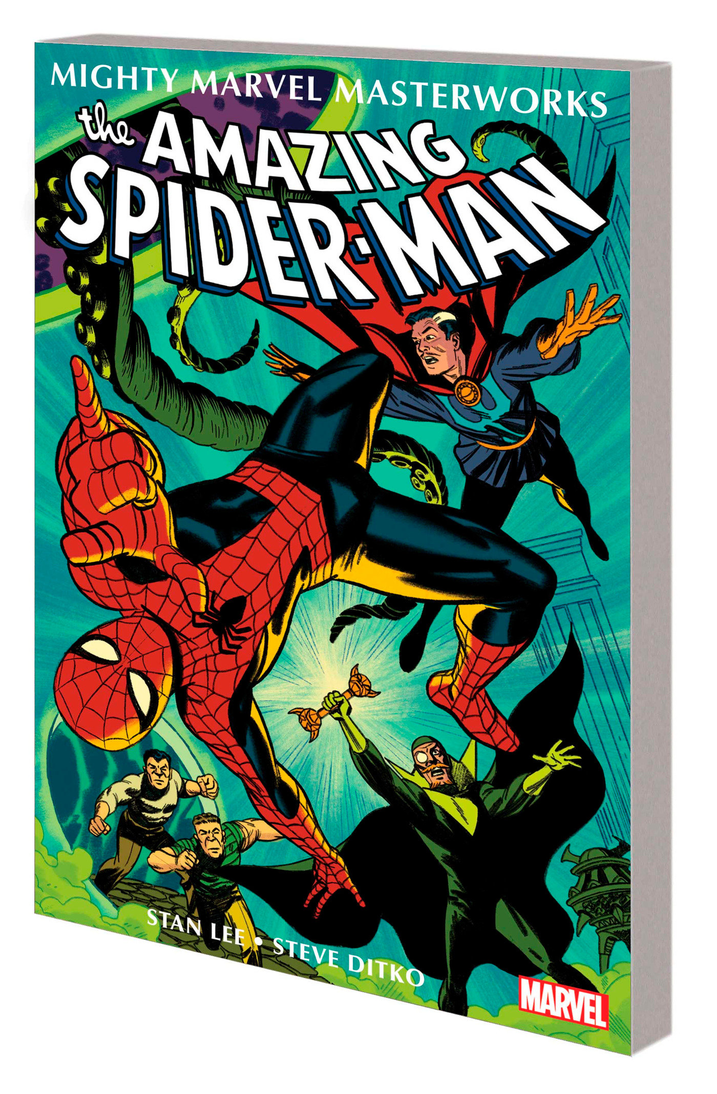
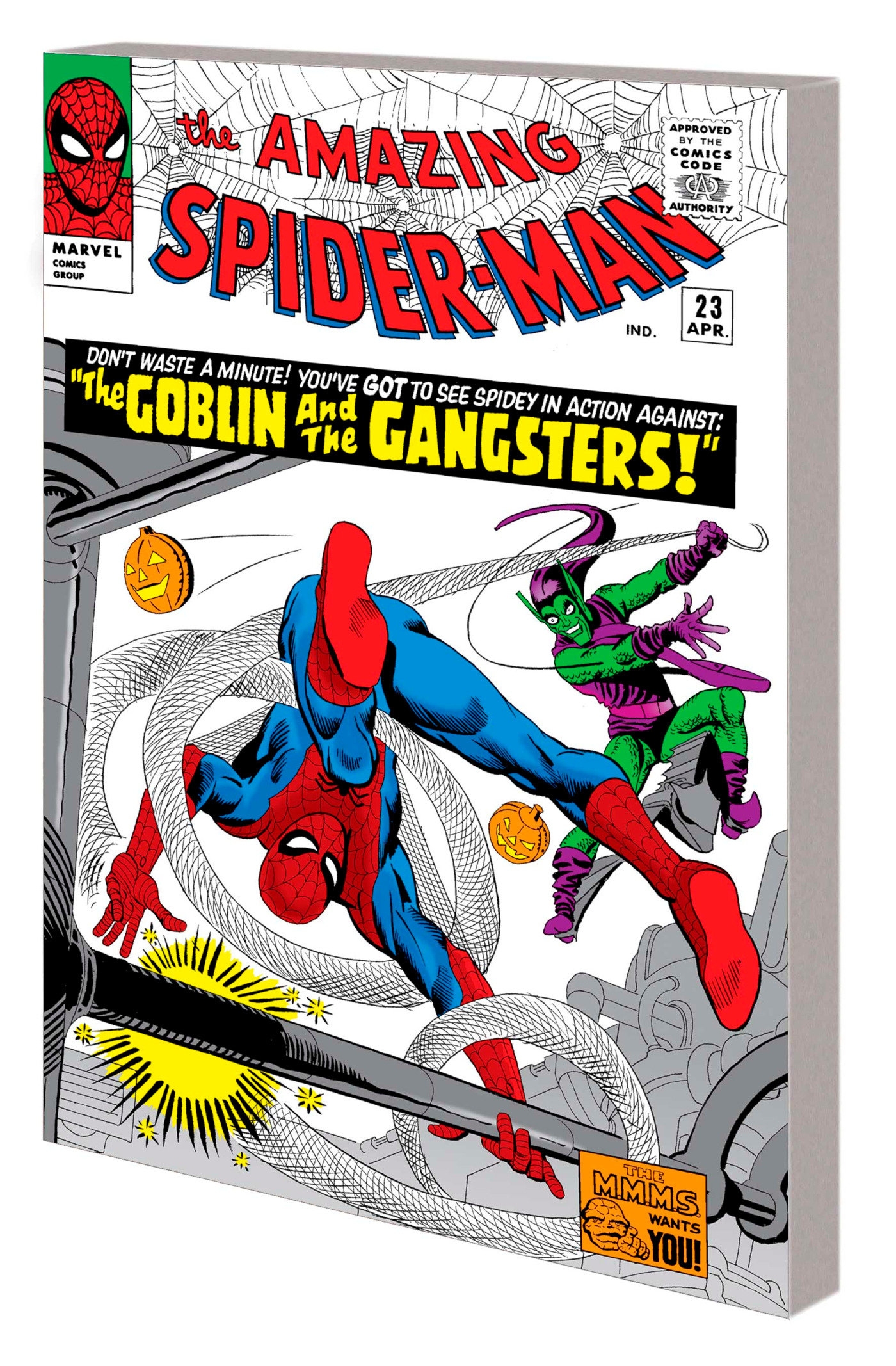
Here's a for example for Spider-Man Vol. 3 new art by Michael Cho...  Direct Market variant with classic cover art...  -M |
|
shaxper
CCF Site Custodian
Posts: 22,880
|
Post by shaxper on Jun 22, 2022 23:16:14 GMT -5
I'm all for making reprints of the classics cheap and accessible for the new generation, but why did they have to do this TO the Masterworks line instead of introducing a separate line entirely? Remember when Marvel was printing softcover versions in addtion to the classic hardcover format? Why did one successful line have to end in order to make room for another line aimed at a different target demographic? They are still putting out new volumes of the standard Masterworks line, they just aren't putting older editions back into print in that format. But that's something that's been happening at Marvel for forever, when a collected edition goes out of print but the content is still in demand, they put out the content in a new format rather than going back to print with the previous thing. It meets the remaining demand for the content plus gets hardcore completionist collectors to double dip, creating more possible sales of the same content than just going back to print on a sold out edition would. DC has been guilty of this as well (ex: the Chronicles editions vs. the Golden Age Omnibus editions). |
|
|
|
Post by Deleted on Jun 22, 2022 23:58:25 GMT -5
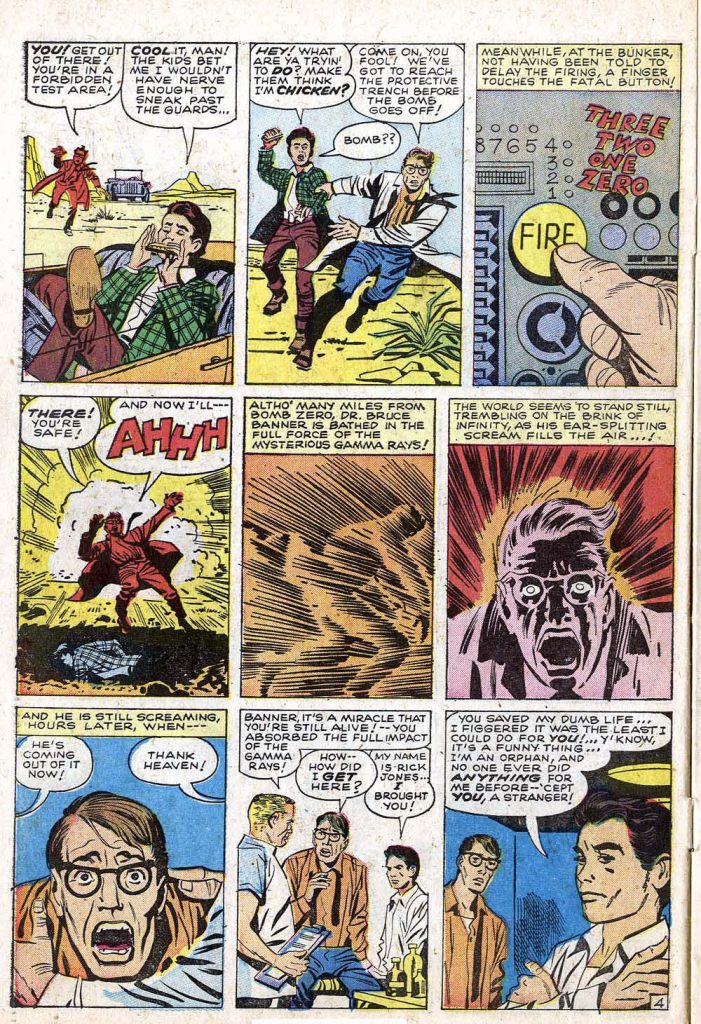
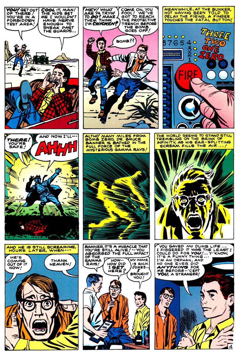
Or look at this seminal page in the original and masterworks coloring.   This has made me stay away from Marvel reprints. In the Mighty Marvel Masterworks, it's back to the red/yellow/orange background for the gamma explosion depicted in the background on panels 4-6 of pg 4, not green. -M |
|
|
|
Post by kirby101 on Jun 23, 2022 11:24:38 GMT -5
Do you have a link for that? I'd be interested in seeing it.
I have to admit I am torn sometimes. The recoloring of Walter Simonson's Thor in the omnibus looks quite nice. But I kind of want to have it with the original coloring too. (I still have most of my original issues, but I don't plan to keep them apart from #337.)
I thought the coloring for the Howard The Duck Omni was pretty spot on when compared to the original comics Looks like they tried to keep it closer to the original coloring with that one. |
|
|
|
Post by kirby101 on Jun 23, 2022 11:29:48 GMT -5
I on the other hand, dislike how muddied and dull the art looks on newsprint, and I know Kirby and other artists of the time hated that their work was diminished in quality by the cheap newsprint and primitive coloring process it required, and most longed for better paper and more robust coloring for their work. I'm not sure they would like final product, but I think they would be ecstatic that other options than the limited palette and cheap quality of newsprint was available for their work to be seen on. -M PS I am also of the mind that fan's preference of newsprint coloring aesthetics is mostly a nostalgia thing rather than a quality of presentation thing. They saw it that way so were imprinted that that is the way it's supposed to look, as opposed to the creators who saw it that way and shuddered in horror because they knew it could be better on better paper used in slicks. Not so, they can keep the colors subtle without the garishness using modern coloring. Jose Villarrubia, one of the best colorist working today, has dozens, if not hundreds of posts on Facebook about how the modern reprint colors ruin the anesthetics of the original book. Those artist who didn't like newsprint was about the sharpness of the line, not the coloring. Now they can have a sharper ink line, and good colors. |
|
|
|
Post by kirby101 on Jun 23, 2022 11:39:29 GMT -5
I get this is all personal taste, but still. Here is something I did. The top is the double splash from Captain America #110 as it was originally printed. The middle is the garishly colored reprint. With a few photoshop tweaks (maybe 15 minutes) I modified the colors to look truer to the original. I don't think there is a question of which looks batter.  |
|
|
|
Post by Slam_Bradley on Jun 23, 2022 11:45:35 GMT -5
I get this is all personal taste, but still. Here is something I did. The top is the double splash from Captain America #110 as it was originally printed. The middle is the garishly colored reprint. With a few photoshop tweaks (maybe 15 minutes) I modified the colors to look truer to the original. I don't think there is a question of which looks batter.  I honestly don't find example two to be particularly garish. I've seen a number of re-coloring jobs I don't care for. That's not even in the ball-park for bad re-coloring. |
|
|
|
Post by badwolf on Jun 23, 2022 12:04:50 GMT -5
I get this is all personal taste, but still. Here is something I did. The top is the double splash from Captain America #110 as it was originally printed. The middle is the garishly colored reprint. With a few photoshop tweaks (maybe 15 minutes) I modified the colors to look truer to the original. I don't think there is a question of which looks batter.  I honestly don't find example two to be particularly garish. I've seen a number of re-coloring jobs I don't care for. That's not even in the ball-park for bad re-coloring. I agree. I think it actually looks quite good, comparable to what we had seen in better-paper comics of the newsprint era, like Marvel Fanfare. My eye reads it as same colors, better paper. Only the magenta Hydra agent on the right really sticks out. I have to really examine it to see any indication of recoloring (the pink machine on the upper level has some parts colored differently) but if this really was a complete recoloring, I think whoever did it did an amazing job. |
|
|
|
Post by kirby101 on Jun 23, 2022 12:39:47 GMT -5
|
|
|
|
Post by EdoBosnar on Jun 23, 2022 12:42:26 GMT -5
I'd agree that the middle panel is not as bad/garish as some of the recoloring jobs I've seen, but I still have to say that I prefer kirby101's recoloring on the bottom - by a long shot.
|
|
|
|
Post by EdoBosnar on Jun 23, 2022 12:47:44 GMT -5
Otherwise, on the topic of this thread, i.e., these new affordable paperback Masterworks, has any kind of schedule been released? I'm asking because I'm not so much interested in the classic material from the 1960s nor the major series/characters like Spidey, FF, Avengers, etc. (which I mostly have in other formats), but rather some of the OOP books like, say, the second Inhumans volume.
|
|