|
|
Post by Rob Allen on May 23, 2023 13:58:26 GMT -5
Red Sonja's outfit is one of the few comic book costumes that has a book named after it. Chainmail Bikini |
|
|
|
Post by DubipR on May 23, 2023 16:18:27 GMT -5
Never cared for the Green Goblin costume. Those stupid elvish books; who the hell would wear something like into combat? You'd lose your footing and stumble. Game over. And the old fashioned sleeping cap? The tunic and face mask are okay but the green unitard? Is that shading or scales? It's a terrible look. Hobgolin's look is a bit better with the cowl, but it's a terrible costume.  |
|
|
|
Post by commond on May 23, 2023 16:27:03 GMT -5
The only reason I really didn't like DD's yellow costume comes from a practical stand point, which I know is moot in comic books. Road workers, landscapers, construction crews wear bright yellows and greens, reflective vest and other brightly colored attire so that they can be seen, whether it be day or night. DD's fighting crime at night in a bright yellow costume seems counter productive since he is well know of using stealth a lot in his crime fighting. Wonder Man's is just that terrible baby food green color. Makes me remember trying to feed my boys mushed peas. I personally like his look in the 90's series where he's more an actor with super powers than an actual superhero.  Needs more mullet.  |
|
|
|
Post by commond on May 23, 2023 16:30:22 GMT -5
Never cared for the Green Goblin costume. Those stupid elvish books; who the hell would wear something like into combat? You'd lose your footing and stumble. Game over. And the old fashioned sleeping cap? The tunic and face mask are okay but the green unitard? Is that shading or scales? It's a terrible look. Hobgolin's look is a bit better with the cowl, but it's a terrible costume. I'll take Ditko over this:  |
|
|
|
Post by berkley on May 23, 2023 16:35:18 GMT -5
Another silly, impractical, sexist costume I like is Moondragon's green swimsuit plus long, high-collared cloak.. Such a great contrast to her sometimes cold and distant personality. I think Perez was the only one who really made it work, though.
|
|
|
|
Post by DubipR on May 23, 2023 19:45:33 GMT -5
Never cared for the Green Goblin costume. Those stupid elvish books; who the hell would wear something like into combat? You'd lose your footing and stumble. Game over. And the old fashioned sleeping cap? The tunic and face mask are okay but the green unitard? Is that shading or scales? It's a terrible look. Hobgolin's look is a bit better with the cowl, but it's a terrible costume. I'll take Ditko over this: So would I but it's still a s**t design. Ditko wasn't on his game with that one. |
|
|
|
Post by commond on May 23, 2023 19:57:01 GMT -5
I dunno. If I was hiding in a dark alley and the Green Goblin was searching for me, I’m pretty sure I’d pee my pants.
|
|
|
|
Post by badwolf on May 23, 2023 19:59:44 GMT -5
This reminds me of another Conan-related heroine whose costume I do dislike and that's Belit and her fur swimsuit: and once again, I don't mind that it's silly and impractical and unnecessarily revealing, I just don't like the look of it, for whatever reason.
It's less revealing than what she wore in the original story! |
|
|
|
Post by codystarbuck on May 23, 2023 20:58:44 GMT -5
Dave Sim had the first and last word on Red Sonja.... 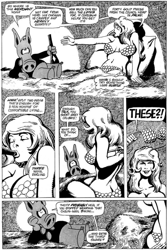 |
|
|
|
Post by Duragizer on May 24, 2023 0:42:03 GMT -5
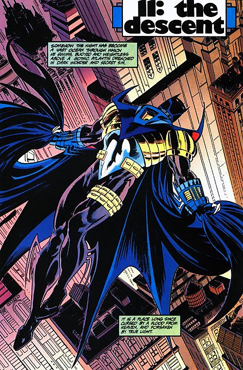 I liked this armour as a kid, and y'know what? I still kinda do. The garter pouches are stupid, but minus that, I think it's a perfectly sleek design, well-suited for a darker take on Batman. I fully concede the later evolutions of the armour are ass, though. 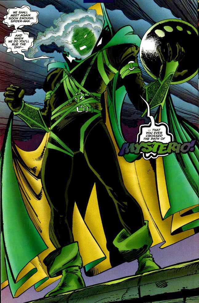 I actually don't know what the consensus opinion on Mysterio's Clone Saga redesign is, but I hated it at the time. Now, though? I don't think it's half-bad. ASM #413 restored the fishbowl, synthesizing the new and classic designs, which I thought would've been the perfect look going forward, but AFAIK, it was retired following the Clone Saga. A shame.  Even as a kid, long before my current political beliefs took shape, I disliked this costume. The wings ... the "A" on the forehead ... the scales ... the buccaneer boots ... it's just so nauseously busy. Almost every redesign has been an improvement. |
|
|
|
Post by codystarbuck on May 24, 2023 1:14:22 GMT -5
I liked this armour as a kid, and y'know what? I still kinda do. The garter pouches are stupid, but minus that, I think it's a perfectly sleek design, well-suited for a darker take on Batman. I fully concede the later evolutions of the armour are ass, though. I actually don't know what the consensus opinion on Mysterio's Clone Saga redesign is, but I hated it at the time. Now, though? I don't think it's half-bad. ASM #413 restored the fishbowl, synthesizing the new and classic designs, which I thought would've been the perfect look going forward, but AFAIK, it was retired following the Clone Saga. A shame. Even as a kid, long before my current political beliefs took shape, I disliked this costume. The wings ... the "A" on the forehead ... the scales ... the buccaneer boots ... it's just so nauseously busy. Almost every redesign has been an improvement. Chain mail, not scales; that's what later artists got wrong. Kirby was trying to follow the example of Hal Foster, but never quite got the technique, though Wally Wood had it down perfectly. In his original form, Captain America was trying to appear to be a sort of modern knight. Chain mail, helmet, heavy gauntlets and jackboots, and the templar shield (triangular). Then, MLJ called them on the carpet, for copying the Shield, and Simon & Kirby altered things, turning the helmet into a hood/mask and replacing the templar shield with a buckler (round shield). Not quite Prince Valiant but that was kind of where they were aiming. |
|
|
|
Post by commond on May 24, 2023 6:58:28 GMT -5
And then there was this.  |
|
|
|
Post by tarkintino on May 24, 2023 7:54:40 GMT -5
And then there was this. That was not a favorite. Male characters exposing skin to that degree worked at DC for Cockrum with his Legion redesigns of various characters, but Marvel should have left well enough alone with Hawkeye. He looked like what one would imagine how a porn parody of Robin Hood would appear. |
|
|
|
Post by badwolf on May 24, 2023 8:10:34 GMT -5
I actually don't know what the consensus opinion on Mysterio's Clone Saga redesign is, but I hated it at the time. Now, though? I don't think it's half-bad. ASM #413 restored the fishbowl, synthesizing the new and classic designs, which I thought would've been the perfect look going forward, but AFAIK, it was retired following the Clone Saga. A shame. Ugh, did JRJR draw that? He had a lot of terrible costume designs in his X-Men run...
 |
|
|
|
Post by adamwarlock2099 on May 24, 2023 8:12:42 GMT -5
The armor for Jean-Paul fit how he saw he should be as the Batman. Remembering he was Azrael first, being an assassin for the Order of St Dumas, makes sense that he would take a more offensive direction as Batman. Just because his costume changed from Azrael to Batman doesn't mean his conditioning did. As far as aesthetics of the costume, it was pretty cool in the context of the story but I neither like or dislike it. Now his Azrael costume I really did like. But I never followed the character much after Knightsend so the only real costume of his I know is the one in Sword of Azrael before he became Batman for a while.
|
|


