|
|
Post by Deleted on May 6, 2022 13:02:54 GMT -5
Looks great!
Incidentally, I read the 37th issue of the original Marvel title (via Marvel Unlimited), then I headed to your review. I felt that the issue didn’t quite live up to the expectation I had for it, but that’s on me. (I would have quote tweeted your review, from page 28, but it seemed redundant to do so)
I am not finding much middle ground in my enjoyment of the issues. The issues (story-wise and art-wise) are either great or so-so. Seems to be no in between, e.g. “It was okay.” Art seems inconsistent at times, too, and not always enjoying how Vader’s mask is drawn.
|
|
Confessor
CCF Mod Squad
Not Bucky O'Hare!
Posts: 10,197 
|
Post by Confessor on May 6, 2022 17:27:39 GMT -5
Incidentally, I read the 37th issue of the original Marvel title (via Marvel Unlimited), then I headed to your review. I felt that the issue didn’t quite live up to the expectation I had for it, but that’s on me. (I would have quote tweeted your review, from page 28, but it seemed redundant to do so) Yeah, I saw that you had "liked" that review. I hope you found what I wrote at least semi-interesting. I quite like the Red Queen arc as a whole, but that last part is undermined a little bit by Archie Goodwin's attempts to bridge the gap between his ongoing post-SW stories and the imminent start of his ESB adaptation -- such as with the hasty reinstatement of the bounty on Han Solo's head. I mean, I do appreciate Goodwin's efforts, but they feel a little bit clunky. Still, as I say, the Red Queen arc is pretty enjoyable overall. I like that it's tone is slightly darker than most of the Goodwin/Infantino run. It also brings the Tagge family saga to a pretty satisfying close -- although this is not the last we shall see of Domina Tagge in the series. I am not finding much middle ground in my enjoyment of the issues. The issues (story-wise and art-wise) are either great or so-so. Seems to be no in between, e.g. “It was okay.” Art seems inconsistent at times, too, and not always enjoying how Vader’s mask is drawn. That's interesting that your feelings are so "one extreme or the other". I do think that, as much as I love this series, it did tend to be a bit up or down in terms of quality. It's not unusual to have three or four great issues and then you suddenly get a really lame filler issue. Still, I think the standard is pretty good generally. For me though, the best era of the series starts with issue #39 (part 1 of the ESB adaptation) and goes right through to around issue #87 or #88. It's only after that, for the final 18 or so issues, that it really started to suck. |
|
|
|
Post by Deleted on May 6, 2022 17:30:38 GMT -5
I’m finding a lot of expediency in the way some issues are wrapped up. You no doubt have touched upon these things, and I am trying to remember the parameters that the writers are working within, given the licensed nature of the comics, but I’d definitely use the “clunky” word that you used.
|
|
Confessor
CCF Mod Squad
Not Bucky O'Hare!
Posts: 10,197 
|
Post by Confessor on May 6, 2022 17:37:30 GMT -5
I’m finding a lot of expediency in the way some issues are wrapped up. You no doubt have touched upon these things, and I am trying to remember the parameters that the writers are working within, given the licensed nature of the comics, but I’d definitely use the “clunky” word that you used. All issues were pretty much fully scripted (not done "Marvel method") and those scripts had to be approved by Lucasfilm. At this point in the run, the restrictions weren't too bad: they were not allowed to advance the Luke and Leia relationship or detail any events from the Old Republic or feature green space- rabbits (more's the pity!). But It's not until after the release of ROTJ that the restrictions got really draconian and stifling for Jo Duffy, who was the comic's regular writer at that point. |
|
|
|
Post by Deleted on May 6, 2022 17:46:43 GMT -5
Also, as subjective as it is, there are characters who I feel should not have been killed off or warranted further exploration. Everyone’s mileage varies, of course. I mean, I thought they could have done so much more with Jolli (and that her man-hating nature had potential to be explored much more).
|
|
Confessor
CCF Mod Squad
Not Bucky O'Hare!
Posts: 10,197 
|
Post by Confessor on May 6, 2022 17:59:36 GMT -5
Also, as subjective as it is, there are characters who I feel should not have been killed off or warranted further exploration. Everyone’s mileage varies, of course. I mean, I thought they could have done so much more with Jolli (and that her man-hating nature had potential to be explored much more). Yes, and Captain Valance dying was a great loss to the cast of original Marvel characters too. Valance was probably one of the top 3 most memorable original characters from the series. |
|
|
|
Post by Deleted on May 7, 2022 3:00:13 GMT -5
Star Wars #38Cover dated: August 1980 Issue title: Riders in the Void!Script: Archie Goodwin (plot, script)/Michael Golden (co-plotter) Artwork: Michael Golden (pencils)/Terry Austin (inks) Colours: Michael Golden Letters: Joe Rosen Cover art: Michael Golden Overall rating: 7 out of 10 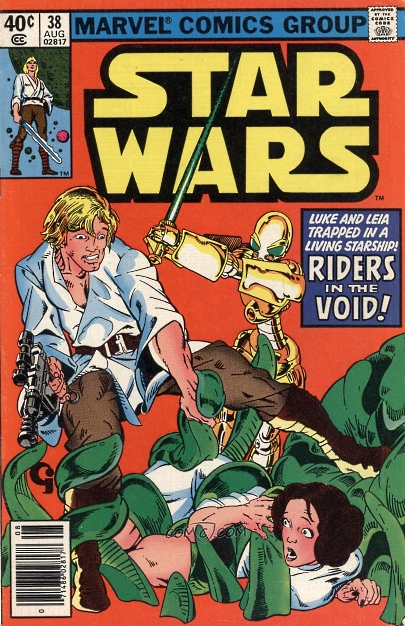 I really enjoyed this one, Confessor. Firstly, it was atypical. And atypical is good (in moderation, of course). It’s not a perfect story - can’t say I felt that Luke looked like Luke at certain points - but I did enjoy it. One of my complaints about the modern SW films is that they are just rehashing the Original Trilogy. If they make another movie, set after The Rise of Skywalker, then I do not want to see the Empire or First Order ever again. I want to see new foes, new scenarios, etc. So, this comic felt like a novelty, as we not only had a new antagonist, but they were in another galaxy (this is my first experience of SW characters leaving their galaxy, has it happened before or since?). I will say this, it did feel like a Star Trek story. I could definitely have imagined Skywalker and Leia being replaced by, say, Riker and Tasha Yar. It felt like it *could* have been a TNG story. I’m not sure whether that’s a criticism or just an observation. It was just good to see a universe beyond the Empire, and to see two major characters involved in something different. Would I want every story to be like this? Not at all, but I am disappointed that this seems to be disliked by some segments of fandom. Still, each to their own. |
|
Confessor
CCF Mod Squad
Not Bucky O'Hare!
Posts: 10,197 
|
Post by Confessor on May 7, 2022 3:51:06 GMT -5
Star Wars #38Cover dated: August 1980 Issue title: Riders in the Void!Script: Archie Goodwin (plot, script)/Michael Golden (co-plotter) Artwork: Michael Golden (pencils)/Terry Austin (inks) Colours: Michael Golden Letters: Joe Rosen Cover art: Michael Golden Overall rating: 7 out of 10  I really enjoyed this one, Confessor. Firstly, it was atypical. And atypical is good (in moderation, of course). It’s not a perfect story - can’t say I felt that Luke looked like Luke at certain points - but I did enjoy it. One of my complaints about the modern SW films is that they are just rehashing the Original Trilogy. If they make another movie, set after The Rise of Skywalker, then I do not want to see the Empire or First Order ever again. I want to see new foes, new scenarios, etc. So, this comic felt like a novelty, as we not only had a new antagonist, but they were in another galaxy (this is my first experience of SW characters leaving their galaxy, has it happened before or since?). I will say this, it did feel like a Star Trek story. I could definitely have imagined Skywalker and Leia being replaced by, say, Riker and Tasha Yar. It felt like it *could* have been a TNG story. I’m not sure whether that’s a criticism or just an observation. It was just good to see a universe beyond the Empire, and to see two major characters involved in something different. Would I want every story to be like this? Not at all, but I am disappointed that this seems to be disliked by some segments of fandom. Still, each to their own. Yeah, I kinda like this issue just for its weirdness...and Michael Golden's gorgeous art, of course. It's not an amazing story or anything, but it's a refreshing "palette cleanser" of an issue. I probably said this in my review, but I think the organic look of the alien spacecraft was likely inspired by the movie Alien. There's also a Japanese manga influence to Golden's art, I believe. |
|
|
|
Post by Deleted on May 15, 2022 15:30:01 GMT -5
Star Wars #43Cover dated: January 1981 Issue title: Betrayal at BespinScript: Archie Goodwin Artwork: Al Williamson (pencils & inks)/Carlos Garzon (pencils & inks) Colours: Glynis Wein Letters: Rick Veitch Cover art: Al Williamson (pencils & inks)/Carlos Garzon (pencils & inks) Overall rating: 10 out of 10 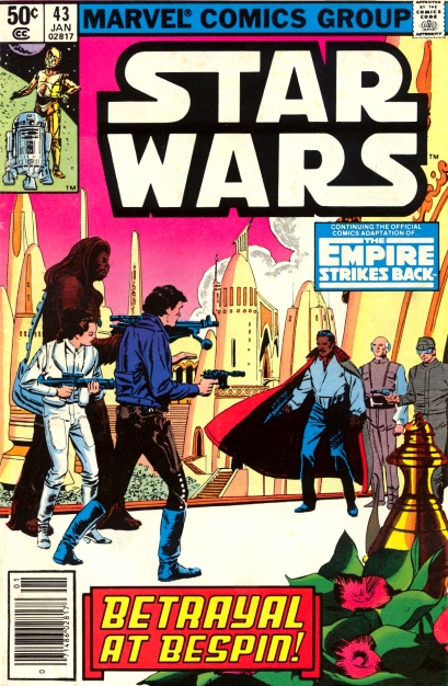 Just read this comic. And then your review. Despite the artists being the same as the preceding two issues, I found the art better in this one. Can’t quite explain why, with it being the same artists. It just looked better. |
|
Confessor
CCF Mod Squad
Not Bucky O'Hare!
Posts: 10,197 
|
Post by Confessor on May 15, 2022 22:35:50 GMT -5
Star Wars #43Cover dated: January 1981 Issue title: Betrayal at BespinScript: Archie Goodwin Artwork: Al Williamson (pencils & inks)/Carlos Garzon (pencils & inks) Colours: Glynis Wein Letters: Rick Veitch Cover art: Al Williamson (pencils & inks)/Carlos Garzon (pencils & inks) Overall rating: 10 out of 10  Just read this comic. And then your review. Despite the artists being the same as the preceding two issues, I found the art better in this one. Can’t quite explain why, with it being the same artists. It just looked better. Can't say that I'd ever noticed Williamson's art was better in this issue than in earlier ones particularly, but fair enough...its all a matter of taste after all. I do rather like Williamson's take on Cloud City here though: it's much more open and spaceous than the film version, with high-level walkways and open plazas (much like some of the Ralph MacQuarrie concept art, which no doubt informed Williamson take on the gas mine to some extent). |
|
|
|
Post by tarkintino on May 16, 2022 4:50:03 GMT -5
It’s not a perfect story - can’t say I felt that Luke looked like Luke at certain points At no point in Marvel's Star Wars did Luke ever look like Mark Hamill, even when some artists were clearly tracing publicity photos. The films will never steer too far away from the very thing that put the "war" in Star Wars. Even the pointless Rogue One--which tried to be "fresh" in focusing on the (worn out) "rag-tag" group on a mission still had to be directly connected to the larger story. At best, the streaming series are going to give you what you're looking for--except the forthcoming Kenobi series for obvious timeline reasons. Well, you compared it to TNG, and that's not exactly a compliment.  The heart of the Goodwin/Infantino run had the perfect balance of stories that built on the original film's in-universe plots, but not rehashing Death Stars, etc. (that's coming post-TESB in this title) and certainly created a number of new characters and events that were not all controlled by the Empire (or Rebellion, for that matter). As you will soon see, that successful, organic science- fantasy mix will no longer be a feature of the monthly title, as most of the post-TESB issues were--in some way and to varying degrees--trying to re-live that film (with or without Lucasfilm edicts in place), and adding some less than interesting comic-created characters, with Shira Brie being the rare exception. |
|
|
|
Post by Deleted on May 16, 2022 4:59:05 GMT -5
Star Wars #44Cover dated: February 1981 Issue title: Duel a Dark Lord!Script: Archie Goodwin Artwork: Al Williamson (pencils & inks)/Carlos Garzon (pencils & inks)/Rick Veitch (pencils - uncredited) Colours: Glynis Wein Letters: Rick Veitch Cover art: Al Williamson (pencils & inks)/Carlos Garzon (pencils & inks) Overall rating: 10 out of 10 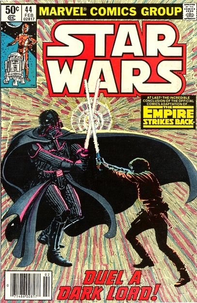 Finished that one last night. The “I am your father…” moment didn’t seem to have the impact within the comic. Now, I *should* know my own mind, but two hypotheses come to mind: 1.) Knowing that revelation due to having seen the film meant the impact was going to be lessened. This could apply with any adaptation that covered a twist from a film. 2.) While panels are action-driven/epic, they are also static due to the very nature of being a comic panel. Perhaps the very nature of it being an image on a page lessened it, especially when you consider point one. |
|
|
|
Post by Deleted on Jun 2, 2022 3:21:24 GMT -5
Star Wars #47Cover dated: May 1981 Issue title: Droid World!Script: Archie Goodwin Artwork: Carmine Infantino (breakdowns)/Gene Day (finished art & inks) Colours: Glynis Wein Letters: Rick Parker Cover art: Frank Miller (pencils)/James Sherman (inks) Overall rating: 6½ out of 10  I have to say, having read this last night, it may well have been my favourite non-arc issue of the series so far. Thank goodness for Marvel Unlimited! I agree about the level of detail for Droid World - and the colours also reminded me of the Metal Men. I found the art utterly absorbing. True, all art in a comic should be. But there’s art that kind of blends in, as you get into the story, and then there’s art which makes you think, ‘Hang on, ignore the speech bubbles for a second, let’s just soak it all in.’ I did read some UK reprints of the Droids comic, but I can’t say any issue stuck with me. This one will. Of all the solo Droid action I’ve read, this has been the best. Whatever flaws there may be can be ignored because the good parts are really good. A most welcome “detour” from the Rebels/Empire stuff. |
|
Confessor
CCF Mod Squad
Not Bucky O'Hare!
Posts: 10,197 
|
Post by Confessor on Jun 2, 2022 4:21:32 GMT -5
Star Wars #47Cover dated: May 1981 Issue title: Droid World!Script: Archie Goodwin Artwork: Carmine Infantino (breakdowns)/Gene Day (finished art & inks) Colours: Glynis Wein Letters: Rick Parker Cover art: Frank Miller (pencils)/James Sherman (inks) Overall rating: 6½ out of 10  I have to say, having read this last night, it may well have been my favourite non-arc issue of the series so far. Thank goodness for Marvel Unlimited! I agree about the level of detail for Droid World - and the colours also reminded me of the Metal Men. I found the art utterly absorbing. True, all art in a comic should be. But there’s art that kind of blends in, as you get into the story, and then there’s art which makes you think, ‘Hang on, ignore the speech bubbles for a second, let’s just soak it all in.’ I did read some UK reprints of the Droids comic, but I can’t say any issue stuck with me. This one will. Of all the solo Droid action I’ve read, this has been the best. Whatever flaws there may be can be ignored because the good parts are really good. A most welcome “detour” from the Rebels/Empire stuff. Yeah, the Carmine Infantino artwork (with help from the amazing Gene Day) is pretty nice in this issue. It's up there with Infantino's best work on the series, I'd say. I also agree that this is a very memorable adventure, with plenty of action and a tightly written script. It does have its flaws, such as Kligson not being terribly well fleshed out and the entire mission to Droid World not really making a whole lot of sense, but still, I agree that this is a nice little palette cleanser from the usual Star Wars fare. |
|
|
|
Post by Deleted on Jun 2, 2022 4:55:07 GMT -5
Do we get “palette cleansers” from Marvel in the modern age? Everything seems to be tied into the latest arc/crossover. If the “palette cleanser” issue is an extinct concept in Marvel, that’s a shame.
|
|