|
|
Post by Cei-U! on Jan 6, 2015 10:24:32 GMT -5
I'm not much of a Star Wars guy (movies or comics) but I'm enjoying your reviews, Confessor. I had already read the novelization when I bought #1 off the stands. I was so turned off by the art, I never bought another issue! Anyhoo, I'll be reading the thread but probably not contributing.
Cei-U!
I summon the popcorn!
|
|
Confessor
CCF Mod Squad
Not Bucky O'Hare!
Posts: 10,197 
|
Post by Confessor on Jan 6, 2015 11:35:53 GMT -5
I'm not much of a Star Wars guy (movies or comics) but I'm enjoying your reviews, Confessor. That's really nice of you to say, Kurt. I consider you one of the foremost (if not the foremost) authorities on comics that we have in this wonderful community of ours. So, to hear that you're enjoying my reviews is quite flattering, if I'm honest, and means that I must be doing something right!  I had already read the novelization when I bought #1 off the stands. I was so turned off by the art, I never bought another issue! Anyhoo, I'll be reading the thread but probably not contributing. Cei-U! I summon the popcorn! Yeah, as you've no doubt gathered from this thread, I've never been a fan of Chaykin's art on issue #1. I mean, it's well done, dynamic sequential storytelling and everything, but it just looks rushed, messy and a bit ugly to me. One of the most interesting things that this thread has shown, is that I'm far from alone in really not liking the art in that issue. To also find out this week, thanks to badwolf, that even Chaykin himself thinks it's pretty crappy definitely gives me a sense of "A-ha! I was right all along!" Roy Thomas, on the other hand, has always been really complimentary about the art in that first issue, and the readers whose letters were printed in issue #4 all seemed to love it too! Oh well, one man's meat and all that... Anyway, glad to have you reading along, my friend. |
|
Confessor
CCF Mod Squad
Not Bucky O'Hare!
Posts: 10,197 
|
Post by Confessor on Jan 6, 2015 17:07:03 GMT -5
Pizzazz #2Cover dated: November 1977 Issue title: The Keeper's World (Part 2) Script: Roy Thomas Artwork: Howard Chaykin (pencils)/Tony DeZuniga (inks) Colours: Marie Severin Letters: Denise Wohl Overall rating: 1 out of 10 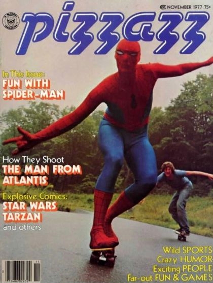 Plot summary Plot summary: En route to the Rebel Alliance base in the Akuria system, the starship that Luke Skywalker, Princess Leia, C-3PO and R2-D2 are in goes off-course and comes out of hyperspace in the middle of an Imperial fleet. The Rebels narrowly evade capture, but sustain damage to their ship, forcing them to crash land on a mysterious, uncharted planet. Comments: The second untitled instalment of The Keeper's World in Pizzazz #2 is more of the same as last issue, in terms of the script and the artwork. Again, we get some lazy writing and infantile dialogue from Roy Thomas (there's no doubt that he's definitely writing this for a much younger audience than the regular Star Wars comic) and again, the characterisation of Luke, Leia and the droids is slightly off. There's also some very non- Star Wars sounding technical jargon in the script, such as a reference to a uni-wrench or Luke engaging the "cosmic overdrive" on his starship. Howard Chaykin and Tony DeZuniga's art is all over the place in terms of quality, looking, at best, pedestrian and, at worst, rushed and messy. So yeah, The Keeper's World continues to fail to impress. Continuity issues: None Favourite panel: 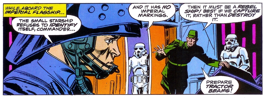 Favourite quote Favourite quote: "Only one thing to do -- try to land her on manual control, like my old Landspeeder back home!" – Luke Skywalker outlines his strategy for landing his damaged starship.
|
|
Confessor
CCF Mod Squad
Not Bucky O'Hare!
Posts: 10,197 
|
Post by Confessor on Jan 7, 2015 22:56:23 GMT -5
Star Wars #6Cover dated: December 1977 Issue title: Is This the Final Chapter?Script: Roy Thomas Artwork: Howard Chaykin (layouts)/Rick Hoberg (finished art and inks)/Bill Wray (inks)/Dave Stevens (inks - uncredited) Colours: Paty Letters: Carol Lay and Mike Royer Cover art: Rick Hoberg (pencils)/Tom Palmer (inks) Overall rating: 7½ out of 10 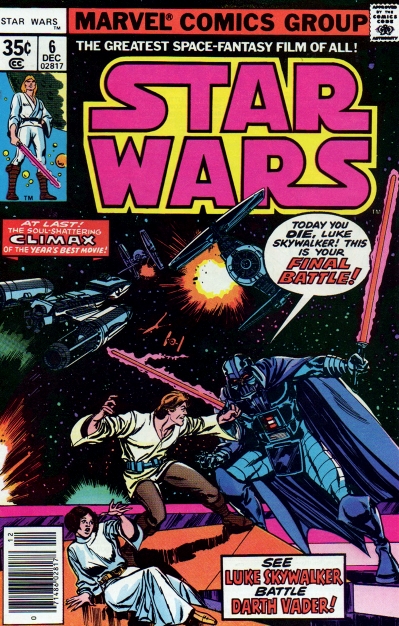 Plot summary Plot summary: As the Death Star closes in on the Rebel Alliance's base on the fourth moon of Yavin, the Rebels send a group of X-wing and Y-wing fighters to destroy the space station. A fierce battle ensues above the Death Star's surface, between the Rebel craft and the Empire's TIE fighters, during which Luke Skywalker's childhood friend Biggs Darklighter is killed. With only seconds to go before the Death Star destroys Yavin 4, Luke – with some last minute help from Han Solo and Chewbacca in the Millennium Falcon – exploits a weakness in the battle station's defences and destroys it, saving the Rebellion. In the final moments of the battle, Darth Vader's TIE fighter is sent spinning off into deep space, sparing the Dark Lord from the exploding space station. Back on Yavin 4, Luke, Han and Chewbacca are all awarded medals by Princess Leia at a special ceremony. Comments: So, we've reached the final part of the Marvel adaptation of the first Star Wars movie. All in all, it's been a pretty successful, if at times erratic, re-telling of the movie. The artwork has varied wildly in quality over the six issues and really, that would be my biggest complaint about the adaptation overall. Speaking of the art, there's another change up of artists with this issue, as Rick Hoberg is brought in to finish and ink Howard Chaykin's rough pencil layouts. Hoberg is helped with the inking by Bill Wray and an uncredited Dave Stevens (of Rocketeer fame). According to the Grand Comics Database website, Stevens inked a few pages in this issue, including page 30, in which he redrew Luke Skywalker in the final panel. Take a look...  Actually, I'd have to say that the artwork in issue #6 is some of the best of the entire adaptation. There really is some nice looking stuff here. In particular, Hoberg's use of closely spaced hatching, to create shading effects, is very nice. Also, the full-page splash that shows the Death Star exploding, as Luke's X-wing fighter soars away from the destruction, is a thing of beauty (see my favourite panel below). Chaykin crams a lot of action into the Death Star battle and we get lots of tightly packed panels, each one bursting with giddying action... 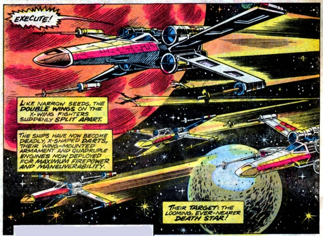 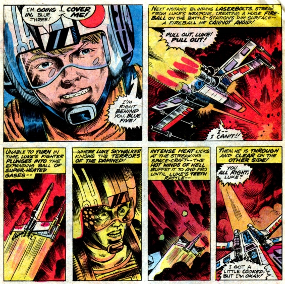 I've been very critical of Chaykin in my reviews so far, but the sequential storytelling in this issue is tense, fast-paced and a thrill a minute: just like in the movie. Sure, Hoberg et al hone the artwork and bring it to life, and in fact, they really make it their own with their inking and embellishing, but the dynamic sequential layout is pure Chaykin. Roy Thomas is as good as ever in this instalment. I'd have to say that Thomas's scripting has been the most consistently strong thing about this adaptation. I know from the interviews that I've read that Thomas was really enthusiastic about Star Wars as a movie and as a comic, and I think that enthusiasm and energy really comes through in his writing. Also, I must just say that I love how Thomas has prefixed certain nouns with the word "space" throughout this adaptation, presumably to give things a suitably "galactic" feel. So, in previous issues Han gets described as a "space-pirate" and in this issue Roy romantically writes of the "space-gods", "space-dust" and the "space-winds" (even as a kid I thought to myself, "but there's no air in space, how can there be any wind?"  ). As an aside, in 1997, Dark Horse published an entirely new adaptation of Star Wars: Episode IV - A New Hope, which was written by Bruce Jones. While that adaptation sticks much closer to the movie than the Marvel one, Jones lacks the sheer passion for the subject that Roy Thomas brings to the table. As a result, I'll take the original adaptation, with Roy's wonderfully breathless narrative prose, over the 1997 version any ol' day of the week! Something else I want to mention is that it's pretty cool to see Thomas explain that Chewbacca actually got a medal too, it's just that Leia was too short to put it on him during the award ceremony. It always bugged me as a child that the heroic Wookiee didn't get given a medal at the end of the film, so it's nice that Thomas solves that inequality in the comic. The Rick Hoberg and Tom Palmer cover is, like last issue, the result of extreme dramatic license. Absolutely nothing like the scene depicted happens in the comic or the movie. But I can definitely imagine it tempting young readers at the spinner rack. We also get the return of the "Star-Words" letters page in this issue, which features reader reaction to issues #1 and #2. The correspondents seem split on whether they prefer the all Chaykin art in issue #1 or the Chaykin/Steve Leialoha art in issue #2. We also get some explanatory blurb from someone at Marvel detailing a "story summit" for future issues of the comic between Roy Thomas, George Lucas and Mark Hamill, and explaining that new, post-movie adventures will be starting from next month. So, the adaptation of the first Star Wars movie is done and it's definitely ended on something of a high. These six issues were a huge success for Marvel and have been reprinted many, many times since they initially appeared. The huge sales that the adaptation generated must've felt like a vindication of sorts for Roy Thomas, who fought hard to convince a skeptical Stan Lee to publish a Star Wars comic in the first place. For my money, issue #2 was the best of the six-parts, but this issue definitely runs it a very close second. Next up, we get "New Planets, New Perils!" Continuity issues: - The X-wing fighters that attack the Death Star are designated as Blue Squadron, rather than Red, as they are in the film.
- On the opening splash page, it appears as if Wedge Antilles (Blue Two) is in a Y-wing fighter, whereas in the movie and later on in the comic itself, he's piloting an X-wing.
- The Rebel pilots make two runs along the Death Star trench, but in the film they make three.
- The Y-wing fighters that participate in the Death Star battle are designated as Red Squadron, rather than Gold, as they are in the film.
- During the Rebels final run down the Death Star trench, Wedge Antilles' damaged X-wing fighter leaves the trench after Biggs Darklighter is killed, whereas in the film he leaves before.
- The front cover shows Luke and Vader having a lightsaber duel – something that never happens in the film. Also, Luke's lightsaber is coloured red instead of blue/white.
Favourite panel: 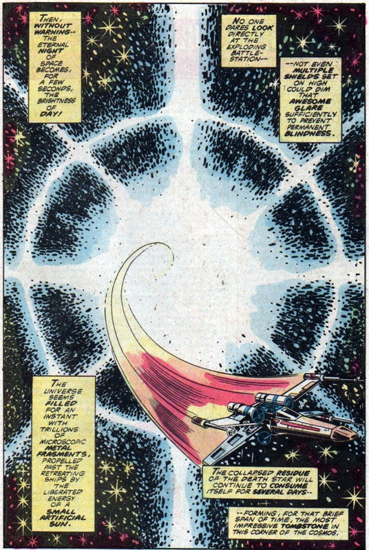 Favourite quote Favourite quote: "Stand by to lock 'S-Foils' in attack positions!" – Blue Leader preps Blue Squadron for their assault on the Death Star.
|
|
|
|
Post by thwhtguardian on Jan 7, 2015 23:04:41 GMT -5
I love that panel!
Overall, I agree that this adaptation was pretty successful; the art was a little touch and go and at times I felt the narration was a bit heavy but altogether it was a fun read.
Also, I never knew there was another adaptation of A New Hope, so I might need to try and track that down.
|
|
Confessor
CCF Mod Squad
Not Bucky O'Hare!
Posts: 10,197 
|
Post by Confessor on Jan 7, 2015 23:29:11 GMT -5
Also, I never knew there was another adaptation of A New Hope, so I might need to try and track that down. Yeah, it came out at the same time as the Special Edition of Star Wars: Episode IV hit cinemas. The dialogue is, as I recall, word for word the same as the film and, of course, it incorporates all the changes and additional scenes that appeared in the Special Edition. Also, I must say that the Eduardo Barreto drawn and Al Williamson inked artwork is really very nice. However, for me, it's a totally characterless and therefore quite forgettable adaptation. I bought it and read it as it was coming out and, although it's still in my collection, I don't think I've read it again since. In a way, it's a bit too close to the movie. I mean, if I want the movie, I'll watch the movie, you know? The nice thing about the Marvel adaptation is the differences between it and the finished film. Those differences change the story experience subtly and that's what keeps me returning to it. It's a slightly different flavour of Star Wars, whereas as the Dark Horse adaptation is the same flavour as the film. |
|
|
|
Post by Action Ace on Jan 7, 2015 23:50:29 GMT -5
This is my favorite issue on the art side. I was pleasantly floored when I found out the great Dave Stevens had worked on it. While a Y Wing does make the cover of #6 and in the novel they are referred to as Red Squadron, there are no Y-Wings in this issue and their trench run was cut. I wish that cover happened. Of course, with action figures, they fought thousands of times before Empire Strikes Back.  New Star Wars #1 is only a week away! I can't wait!  I'm going to reread the recent stellar Dark Horse series in the next week to get ready. |
|
Confessor
CCF Mod Squad
Not Bucky O'Hare!
Posts: 10,197 
|
Post by Confessor on Jan 8, 2015 0:06:53 GMT -5
While a Y Wing does make the cover of #6 and in the novel they are referred to as Red Squadron, there are no Y-Wings in this issue and their trench run was cut. The nose of a Y-Wing is visible on the opening splash page (lower right hand corner) and it appears as if Wedge Antilles is in it! Also, the nose of another Y-Wing is shown in panel 3 of page 8. The Y-Wing Squadron are referred to as Red Squadron in the comic too. New Star Wars #1 is only a week away! I can't wait!  Yeah, I was thinking this only today. I'm not actually that excited about it to be honest, I'm more like "well, let's wait and see if it's any good." I will be posting my thoughts on the issue in the "May The Force Be With You" thread though, as soon as I've read it. |
|
|
|
Post by badwolf on Jan 8, 2015 9:37:12 GMT -5
I must just say that I love how Thomas has prefixed certain nouns with the word "space" throughout this adaptation, presumably to give things a suitably "galactic" feel. So, in previous issues Han gets described as a "space-pirate" and in this issue Roy romantically writes of the "space-gods", "space-dust" and the "space-winds" (even as a kid I thought to myself, "but there's no air in space, how can there be any wind?"  ). Maybe he meant solar winds. There might be no air but there are a lot of particles/photons being thrown around. |
|
Confessor
CCF Mod Squad
Not Bucky O'Hare!
Posts: 10,197 
|
Post by Confessor on Jan 8, 2015 10:42:44 GMT -5
I must just say that I love how Thomas has prefixed certain nouns with the word "space" throughout this adaptation, presumably to give things a suitably "galactic" feel. So, in previous issues Han gets described as a "space-pirate" and in this issue Roy romantically writes of the "space-gods", "space-dust" and the "space-winds" (even as a kid I thought to myself, "but there's no air in space, how can there be any wind?"  ). Maybe he meant solar winds. There might be no air but there are a lot of particles/photons being thrown around. Yeah, I thought of that, and maybe that is what he meant. But it's just as likely that he was being wistfully romantic when he wrote of "time and the space-winds". |
|
|
|
Post by thwhtguardian on Jan 8, 2015 11:24:41 GMT -5
Maybe he meant solar winds. There might be no air but there are a lot of particles/photons being thrown around. Yeah, I thought of that, and maybe that is what he meant. But it's just as likely that he was being wistfully romantic when he wrote of "time and the space-winds". Yeah, he was definitely on the romantic side invoking the prose of Alex Raymond's Flash Gordon. |
|
|
|
Post by adamwarlock2099 on Jan 8, 2015 13:25:11 GMT -5
"The Greatest Space-Fantasy Film of All!"?
Confessor, being a fan of the franchise and not meant to be snarky at all, as I realize for Marvel it's a sales pitch, but I'd be interested to hear what you think of that. Not so much on a judgement of the comics, as the movies. Like you with SW I am a big fan of the Alien franchise, but if I were to point out the one flaw in the franchise, it would be the movies as a whole. I think that the comics and novels have far surpassed what the film side of the franchise is willing to do, and thereby, in the film side, retarding what it could be. I enjoy the Alien franchise, but the films would be the weakest link to me, even though Alien and Alien 3 rank in my top 10 movies, period.
|
|
Confessor
CCF Mod Squad
Not Bucky O'Hare!
Posts: 10,197 
|
Post by Confessor on Jan 8, 2015 14:53:34 GMT -5
I basically agree with Marvel's tag line, I think Star Wars is the greatest space-fantasy film of all. But then I see a big difference between space-fantasy and science-fiction. To me, Star Wars is just about the greatest example of the former, whereas the Alien franchise is a good to terrible example of the latter. The difference being that there is nothing, absolutely nothing in SW that connects it to our known world. It happens a long time ago in a galaxy far, far away, but nothing in the story has any ties to Earth or the Universe as we know it. Alien, on the other hand is set in our future -- those are human beings on the Nostromo, not Corrilians or Alderaanians. The key word with SW is "fantasy". On the subject of Aliens, the first movie was a total masterpiece. A brilliant, psycho-sexual thriller set in space. The follow up, Aliens was a pretty good sci-fi action film, but nothing compared to the original. It's been so long since I saw Alien 3 or Alien Resurrection, I couldn't really comment. I have no interest in the Alien vs Preditor movies at all. Prometheus was pretty good though. But yeah, as far as space-fantasy goes, Star Wars pretty much beats all comers. As an aside, I think it's telling that the original Star Wars cinema poster, basically makes the film look like a barbarian fantasy in space...  |
|
|
|
Post by Action Ace on Jan 8, 2015 22:28:58 GMT -5
I basically agree with Marvel's tag line, I think Star Wars is the greatest space-fantasy film of all. But then I see a big difference between space-fantasy and science-fiction. To me, Star Wars is just about the greatest example of the former, whereas the Alien franchise is a good to terrible example of the latter. The difference being that there is nothing, absolutely nothing in SW that connects it to our known world. It happens a long time ago in a galaxy far, far away, but nothing in the story has any ties to Earth or the Universe as we know it. Alien, on the other hand is set in our future -- those are human beings on the Nostromo, not Corrilians or Alderaanians. The key word with SW is "fantasy". On the subject of Aliens, the first movie was a total masterpiece. A brilliant, psycho-sexual thriller set in space. The follow up, Aliens was a pretty good sci-fi action film, but nothing compared to the original. It's been so long since I saw Alien 3 or Alien Resurrection, I couldn't really comment. I have no interest in the Alien vs Preditor movies at all. Prometheus was pretty good though. But yeah, as far as space-fantasy goes, Star Wars pretty much beats all comers. As an aside, I think it's telling that the original Star Wars cinema poster, basically makes the film look like a barbarian fantasy in space...  My computer desktop for the last 18 months.  Star Wars is my favorite movie of all time. Greatest space fantasy film of all is a no doubter to me. I like wide swaths of the Star Wars media empire that have been produced in the last 38 years in books, comics, cartoons, movie sequels, movie prequels, special editions, video games, rpgs, holiday specials, etc. etc. etc., but the first movie is still the undefeated undisputed champion. |
|
Confessor
CCF Mod Squad
Not Bucky O'Hare!
Posts: 10,197 
|
Post by Confessor on Jan 8, 2015 23:35:53 GMT -5
Pizzazz #3Cover dated: December 1977 Issue title: A Dread Discovery! ( The Keeper's World, Part 3) Script: Roy Thomas Artwork: Howard Chaykin (pencils)/Tony DeZuniga (inks) Colours: Marie Severin Letters: Denise Wohl Overall rating: 1½ out of 10 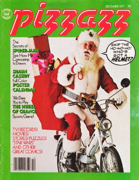 Plot summary Plot summary: Having narrowly escaped capture by an Imperial fleet, Luke Skywalker, Princess Leia, C-3PO and R2-D2 have crash-landed on an uncharted jungle planet. While exploring their surroundings, the droids discover the footprint of a huge creature that is presumably somewhere nearby. Meanwhile, the Imperials have located the crashed Rebel ship on their scanners and have dispatched a shuttle craft to apprehend our heroes. Comments: This is another weak instalment of The Keeper's World. The artwork is of the same slap-dash standard as previous parts and fails to impress, while the writing is still way more infantile than in the main Star Wars comic. Actually, while reading issue #6 of the regular Star Wars series, I noticed that there was a plug for Pizzazz magazine and Stan Lee was saying that the magazine was aimed at kids aged 8 to 14, so I guess that sort of explains why Roy Thomas's dialogue here is more simplistic and juvenile. Although, weren't regular Marvel comics aimed at that sort of age group anyway in the Bronze Age? One thing I will say in this instalment's favour is that at least the story starts to get a little bit more interesting here, with the discovery of the giant footprint and with the Empire closing in. For that reason alone, I'm gonna rate it a ½ point higher than the first two parts. But really, this is pretty throwaway stuff, in all honesty. Continuity issues: - The Imperial shuttle craft looks like a TIE fighter, which is a small, one man spaceship incapable of carrying a squad of stormtroopers, as it does here.
Favourite panel: 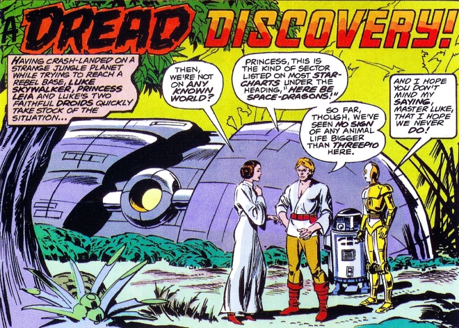 Favourite quote Favourite quote: "Princess, this is the kind of sector listed on most star-charts under the heading, 'Here Be Space-Dragons!'" – Luke attempts to explain to Leia just how off the beaten path the planet they've crashed on is.
|
|