|
|
Post by Arthur Gordon Scratch on Nov 3, 2015 5:08:27 GMT -5
And again, what is exactly wrong with this drawing??? You might find it distastful or anything, but the costume design isn't his, and the technique and pose are very craftful. I seriously doubt Jim Lee or even Buscema could pull off such a complex pose. |
|
|
|
Post by Icctrombone on Nov 3, 2015 5:59:42 GMT -5
Nothing wrong with the White Queen drawing she just looks a little slimy to me.
|
|
|
|
Post by Deleted on Nov 3, 2015 6:56:08 GMT -5
I completely agree that his x-men run is not his best work. His characters were odd looking face wise face wise especially. Really hated the way he drew Cyclops and Emma Frost. And by god those chins! Much better work than the artist that was rotating with him. Igor Kordey...now that was some nauseating art. Never much cared for his All-Star Superman either. His Batman and Robin though I really liked. Blame Grant Morrison for Igor Kordey's work on New X-Men, Grant was turning in scripts 2-3 days before it had to be at the printer and Kordey was forced to pencil and ink 22 pages in those 2-3 days to make deadlines. Check out Kordey's work on other stuff, especially his European work like Secret History being publshed in the US by Archaia to see what he is capable with when he has aprofessional writer who meets deadlines on a project and can actually spend time pencilling and inking... 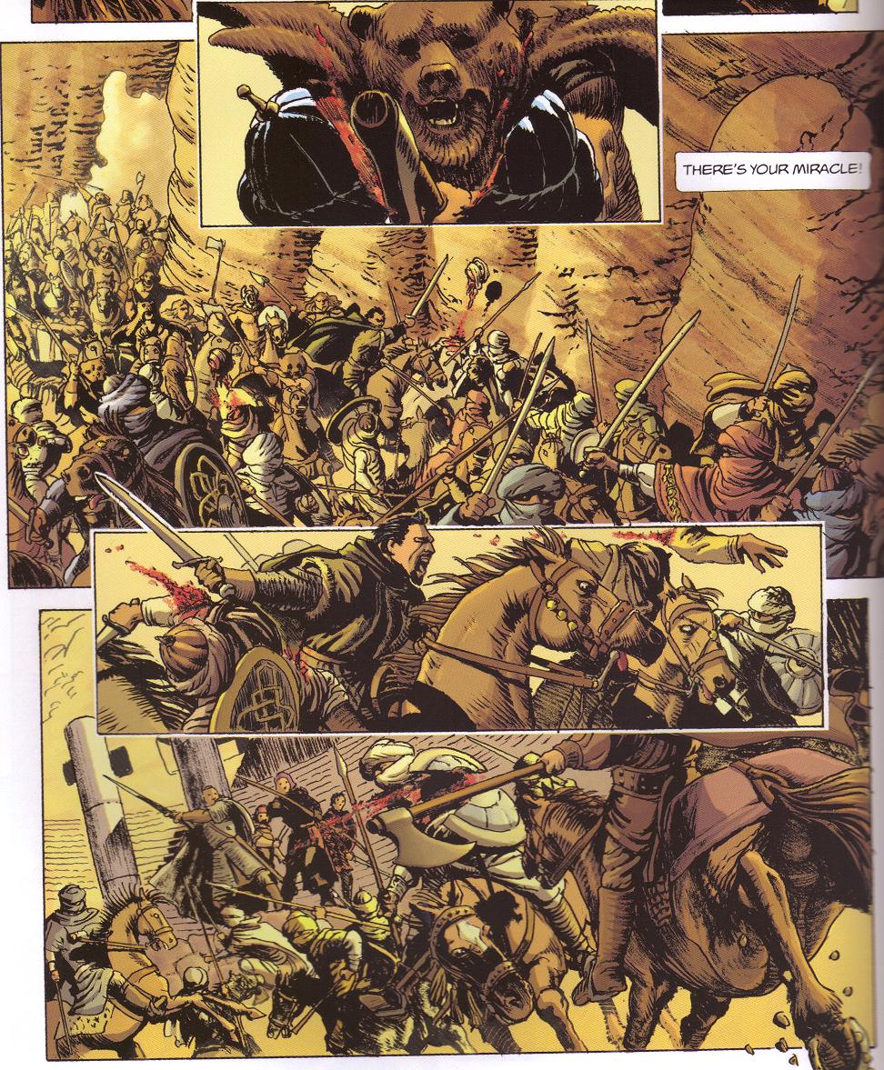  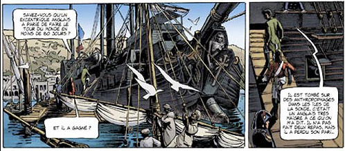 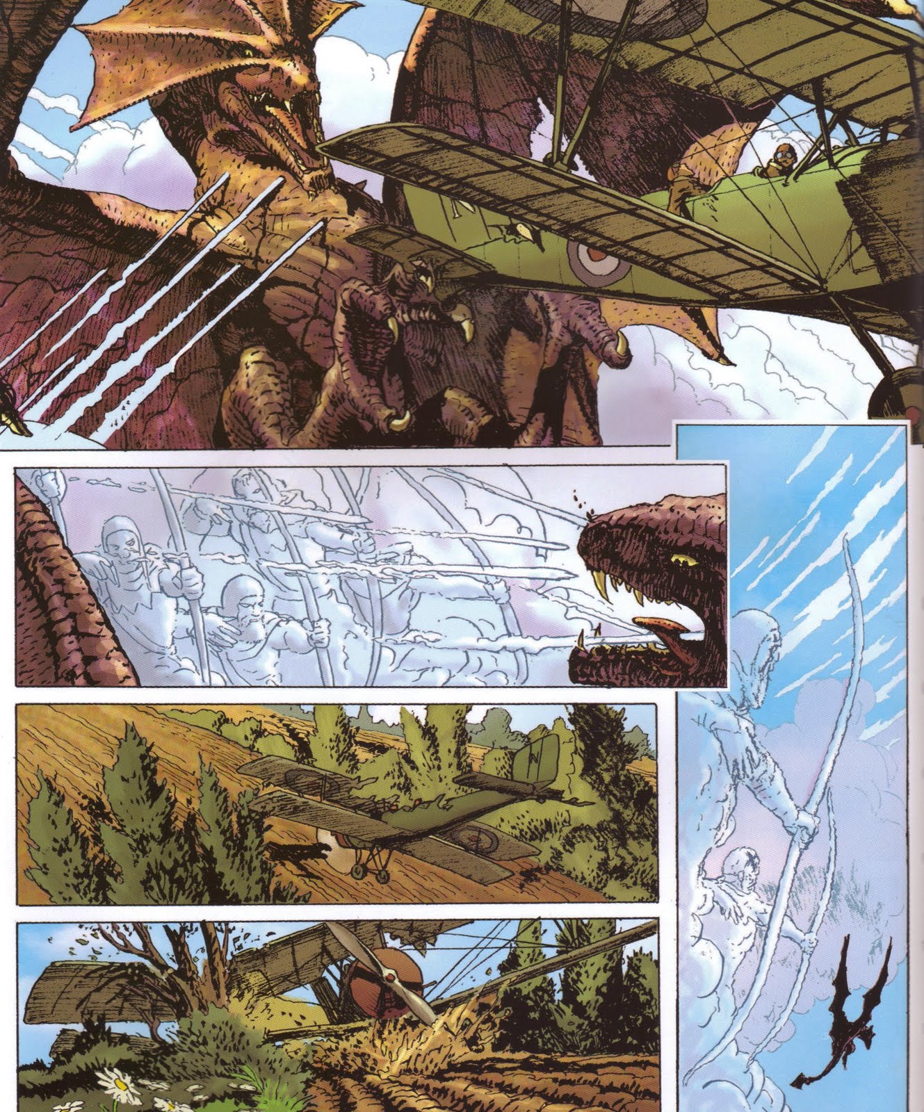 -M I know his artwork was rushed at the time when he was doing xmen and I do enjoy some of his other work but his xmen was unappealing to me because it was churned out so fast for the most part. |
|
|
|
Post by Deleted on Nov 3, 2015 7:06:48 GMT -5
Nothing wrong with the White Queen drawing she just looks a little slimy to me. I don't like the costume design even though it may not be his and I don't care for her face, the way her chest is drawn is pretty bad and it looks like she put on quite a few pounds stomach wise. So in short I don't care for it. |
|
|
|
Post by Deleted on Nov 3, 2015 7:27:41 GMT -5
Nothing wrong with the White Queen drawing she just looks a little slimy to me. I don't like the costume design even though it may not be his and I don't care for her face, the way her chest is drawn is pretty bad and it looks like she put on quite a few pounds stomach wise. So in short I don't care for it. You may not like the art which is completely fine because that's your opinion, but I think for whatever effect he was going for, it was achieved. As for her chest being "drawn pretty badly" and for her looking like "she put on quite a few pounds stomach-wise", I think for the position she is sitting in, it's pretty realistic. Even the most fat-free, "perfect" women would look similar to that if sitting in that position. Sorry her stomach and boobs are not tantalizingly perfect enough for you. Stories do have to be told, and yeah, she does look pretty slimy. Again, I am pretty sure that was probably the effect both author and artist were going for. |
|
|
|
Post by Arthur Gordon Scratch on Nov 3, 2015 8:21:31 GMT -5
Nothing wrong with the White Queen drawing she just looks a little slimy to me. I don't like the costume design even though it may not be his and I don't care for her face, the way her chest is drawn is pretty bad and it looks like she put on quite a few pounds stomach wise. So in short I don't care for it. She looks slimey, but that was obviously the intent, so this is a success. The costume design was Grant Morrison/Frank Quitely, the pounds on the belly looks more bormal than they usually are drawn in an X-Men comic, and the chest, well, she has push ups bra, what do you expect? It just seems you're not be attracted to her on that panel, which seems a weird thing to want to in the first place, but to each its own  Seriously, busting your balls a little there, but that was a really bad exemple for a badly drawn panel. I mean, if you want to diss Kordey - a very fine artist when at his pace - on his X-Men run, there's much much better choices. He sure had some uneven pages on that run, but some of it was stellar, and that panel is a perfect exemple of it. I especially enjoy the detail of how hte chair is a little bent from her weight  Here's a series of consecutive panel where you can indeed see him rushing to meet Quitely missed-deadlines   Seriously, sorry I'm baffled but Kordey is one of the best pros in the industry. Those New X-Men pages, well I read in an interview he had 7 days to draw one whole issue ! When you give him a normal deadline you get this kind of stuff : Smoke (soon after his X-men run) :    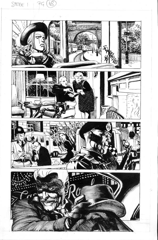 Cable/Soldier X (surprisingly good run with Darko Macan on words, right after the X-Men run) :    Oh, and his Batman Tarzan was an exercise in shdoaw drawing mastering :  |
|
|
|
Post by wildfire2099 on Nov 3, 2015 9:10:13 GMT -5
Nothing wrong with the White Queen drawing she just looks a little slimy to me. Assuming that's Kaare Andrews from Ellis' run, that's WAY better than alot of the art... some of it is just plain embarrassing... one should not have breasts bigger than one's head. Nevermind the person in the background with stick figure arms and a large rear... that person could not possible move in real life. This isn't anywhere near the worst I've seen, just what came up with a quick search. I understand he was semi-parodied Image, but it makes me cringe every time I see it. Edit: I see now that isn't NOT Andrews... I'm I guess I assumed based on the costume. 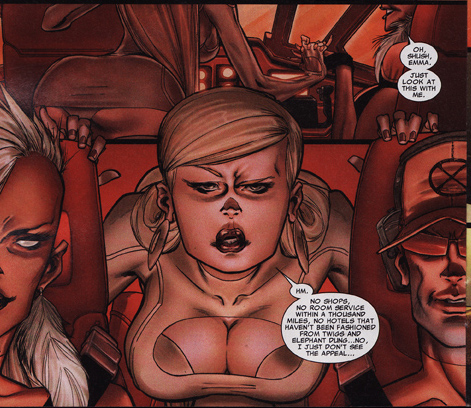 |
|
|
|
Post by DE Sinclair on Nov 3, 2015 9:23:51 GMT -5
I think this panel is extremely distasteful which appears to be exactly what he was going for. The face in particular succeeds and could have been the face for Lust of the Seven Deadly Sins. So this one is a win. A sleazy, slimy, wouldn't-touch-her-with-someone-else's-ten-foot-pole, win. |
|
|
|
Post by DE Sinclair on Nov 3, 2015 9:29:04 GMT -5
Okay, I'll play. How about this panel from Dark Reign #1  Yeah, that's Namor the Submariner. Sorry Jez, no thong. So here, Namor looks like an over 50, down on his luck cabby. Not sure what the context is here, cause I never read the story, but I can't help but wonder if the next panel has him saying "Where to mac?". The rest of the panel is fine, but that's not Namor's face. |
|
|
|
Post by Ozymandias on Nov 3, 2015 9:32:16 GMT -5
I've see a few bad panels, but nothing matches so far, the one I originally posted: It's funny you should mention this comic, as it contains what I consider the Worst Comic Book Panel Of All-Time! (another thread drift?).  I'm not just talking about the quality of the drawing, but the whole concept, of shaking a building to get a couple of goons out the window and onto a tree… hilarious. Mind you, the title I was insinuating for the thread, was "Worst Comic Book Panel Of All-Time!", without an explicit mention to drawing, because as I showed, the script behind the pencils, can powerfully aid the overall quality (or lack thereof). |
|
|
|
Post by adamwarlock2099 on Nov 3, 2015 9:47:38 GMT -5
As to Frank Quitely, New X-Men was the first (I am pretty sure) time I had seen his drawings. I wasn't reading X-Men but I was interested in seeing what the story behind Beast's new look was. I really didn't like it at first. Very jarring. Much like Miller's art. Not necessarily bad in composition (I don't like being negative) just not my style. But I actually grew accused to it, by the end of the story. Now I think the only other thing of his I've seen is We3, and it's somehow so much better than X-Men. It might be I like the story so much, or it might be that the art really is better. But either way, I'd never say a bad thing about the man's work on We3.
As to Igor Kordey, the only thing I can think of his, is X-treme X-Men, which followed Salvador Larroca (an all time favorite of mine) on interior art, and still with Larroca's covers. So personally, I can't say anything to his skill, as most anyone following Larroca, for me, would be a jarring change.
To the basic premise of this thread, it's hard, for me, to critique something whose process I don't either comprehend, or have knowledge of. So (just my two cents) I think a lot of these discussion drop off into a matter of taste. And yes, I know art is subjective, but I am also someone who is somewhere indifferent to not caring for Jack Kirby's art, a person most fans would never have a negative thing to say about. (Though he did get a mention in this thread.) I can clearly see the bad Robin and Wonder Woman examples of Miller's. The anatomy and proportions are off. But Quitely's, Kordey's and others (especially the Namor) just seem to be a difference of liking the way the character is represented. Whoever said Namor looks like a middle aged cabbie, got it perfect. But that doesn't necessarily mean that it's a bad drawing. It's just different. Maybe I am just too kind considering the effort some artist make and not hard on the end product because I can't draw worth a ____. Anyway, again just my two cents on the subject.
|
|
|
|
Post by Prince Hal on Nov 3, 2015 9:54:55 GMT -5
I've see a few bad panels, but nothing matches so far, the one I originally posted: It's funny you should mention this comic, as it contains what I consider the Worst Comic Book Panel Of All-Time! (another thread drift?).  I'm not just talking about the quality of the drawing, but the whole concept, of shaking a building to get a couple of goons out the window and onto a tree… hilarious. Mind you, the title I was insinuating for the thread, was "Worst Comic Book Panel Of All-Time!", without an explicit mention to drawing, because as I showed, the script behind the pencils, can powerfully aid the overall quality (or lack thereof). Nice not to have to worry about plumbing, gas lines, and electricty. Maybe Hercules saw this and said, "I shall see thy building and raise thee an island!" |
|
|
|
Post by Arthur Gordon Scratch on Nov 3, 2015 10:26:33 GMT -5
I've see a few bad panels, but nothing matches so far, the one I originally posted: It's funny you should mention this comic, as it contains what I consider the Worst Comic Book Panel Of All-Time! (another thread drift?).  I'm not just talking about the quality of the drawing, but the whole concept, of shaking a building to get a couple of goons out the window and onto a tree… hilarious. Mind you, the title I was insinuating for the thread, was "Worst Comic Book Panel Of All-Time!", without an explicit mention to drawing, because as I showed, the script behind the pencils, can powerfully aid the overall quality (or lack thereof). I concur : unless this is meant to be an alternate drug reality, allthe perspectives on that panel are deeply wrong, whichis a problem since the artist was obviously going with a realistic approach. It's all about coherance if you go stylized, same goes with realistic  |
|
|
|
Post by Ozymandias on Nov 3, 2015 10:28:51 GMT -5
Maybe Hercules saw this and said, "I shall see thy building and raise thee an island!" Actually, that was Doc Samson, not that it makes much of a difference. |
|
|
|
Post by MDG on Nov 3, 2015 11:24:47 GMT -5
I think this panel is extremely distasteful which appears to be exactly what he was going for. The face in particular succeeds and could have been the face for Lust of the Seven Deadly Sins. So this one is a win. A sleazy, slimy, wouldn't-touch-her-with-someone-else's-ten-foot-pole, win. Well, also this looks a little like a male figure with boobs grafted on. Of course, Michelangelo was also guilty of doing that sometimes:  |
|