|
|
Post by Ish Kabbible on Feb 19, 2017 19:34:59 GMT -5
I would've felt very cheated when actually reading MTA #10 and I would have demanded my 20 cents back!  The guy running the newsstand you purchased it from would have said |
|
|
|
Post by tarkintino on Feb 22, 2017 15:51:29 GMT -5
John Romita Sr.'s legendary cover for The Spectacular Spider-Man #2 (1968), and Romita's own reprint cover for Amazing Spider-Man Annual #9 (1973), which in turn was used as the cover of Pocket Books' 1979 novel series (reprinting ASM 14 - 20).  One of the few cases where the reprint illustration was as explosive & memorable as the original piece. Of course, Romita being the reprint artist guaranteed success. |
|
|
|
Post by tarkintino on Feb 23, 2017 8:42:41 GMT -5
Its the understatement of the century to say the reprints pale in comparison to the artistically / conceptually superior Romita covers (including Marvel Tales #36, which appears to be more Frank Giacoia than JR). . [/quote] |
|
|
|
Post by Icctrombone on Feb 24, 2017 8:01:10 GMT -5
|
|
|
|
Post by Deleted on Feb 24, 2017 9:55:41 GMT -5
^ That Avengers one ^ isn't even close to being as good as the original. The reprint is a good example of everything that is wrong with modern comic covers though! (IMO of course...  ) |
|
|
|
Post by tarkintino on Feb 24, 2017 10:31:44 GMT -5
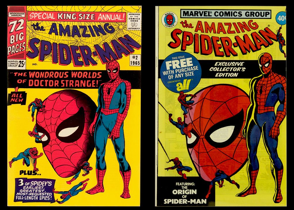
Amazing Spider-Man Annual #2 (1965) and the Spider-Man Exclusive Collector's Edition / All Detergent giveaway (1979).  Ditko's cover was typically filled with moody figures, particularly the standing figure which was used as ASM's corner symbol, but as in so many cases of the Ditko-to-Romita transition, JR's figures sent the character to dynamic heights that defined the character forevermore.
|
|
|
|
Post by Prince Hal on Feb 24, 2017 10:42:52 GMT -5
Amazing Spider-Man Annual #2 (1965) and the Spider-Man Exclusive Collector's Edition / All Detergent giveaway (1979).  Ditko's cover was typically filled with moody figures, particularly the standing figure which was used as ASM's corner symbol, but as in so many cases of the Ditko-to-Romita transition, JR's figures sent the character to dynamic heights that defined the character forevermore. Dynamic, or generic? You said it yourself; Ditko could impart "moodiness" even to a fully costumed figure on a blank background. And why would JR have changed the shape of the whites of Speider-Man's eyes? Aargh! |
|
|
|
Post by Icctrombone on Feb 24, 2017 11:34:31 GMT -5
JR made the face more likeable.
|
|
|
|
Post by Prince Hal on Feb 24, 2017 13:05:56 GMT -5
JR made the face more likeable. More's the pity. |
|
|
|
Post by dbutler69 on Feb 24, 2017 14:06:58 GMT -5
^ That Avengers one ^ isn't even close to being as good as the original. The reprint is a good example of everything that is wrong with modern comic covers though! (IMO of course...  ) Yup, I agree. |
|
|
|
Post by Farrar on Feb 24, 2017 14:08:10 GMT -5
Ditko's cover was typically filled with moody figures, particularly the standing figure which was used as ASM's corner symbol... That was the perfect image to use for the ASM corner box--that head slightly down, hint of hunched posture/stance was so spot-on for the character  |
|
|
|
Post by brutalis on Feb 24, 2017 15:41:00 GMT -5
Have to take into consideration the culture, time and differences in artistic styles between Ditko and Romita Sr. Ditko's Spidey was a young, quirky, imperfect and eerie creature of the evening/night (as Pete is in school all day most of his action would occur early/late evening after school/homework) adapting to having super powers and becoming a hero. His first attempt of a Spider-Man suit being created quickly so as to hid his identity. Also the character sprung from a then fairly new creative Marvel comics.
By the time Romita took over Pete had grown in character and skills and confidence. He would have gone through multiple suits, refining each one and simplifying design and style so as to make them simpler and easily replaced (examples being the coming/going webs under the arms and the eyes changing) for hiding from Aunt May. With Ditko gone, Spidey soon became something quite different under Stan and Romita than what was originally created.
Quickly is gone the socially awkward nerdy outcast youth and is replaced with the young hip teen who through his adventures and heroics is confident and outgoing and socially aware. Think of ourselves as we grew up from spindly children at play into budding athletically training teens. I know the changes i went through just from junior high grades (6th, 7th, 8th grade) at a small neighborhood school occurred quickly once i began going to the local high school that covered at least 8-10 neighborhoods and 4-5 times the amount of students. Just those changes alone had me act and behave slightly different as i adjusted.
I just see the artistic differences between Ditko and Romita as Spidey's growth. As the comic itself caught on and became bigger and larger in readership Romita was likely following company policy to make Spidey his "own" and less like Ditko and more standardized within the then established Marvel house style. Streamlining the design to move away from something quirky to something stylish and "hip" would be Stan's way to expand Spidey and Marvel for mass consumption. Is either version better or worst? No, just different and i like both styles!!!
|
|
|
|
Post by tarkintino on Feb 25, 2017 18:55:48 GMT -5
Quickly is gone the socially awkward nerdy outcast youth and is replaced with the young hip teen who through his adventures and heroics is confident and outgoing and socially aware. The "nerd" was in the process of disappearing even during the Ditko period, as Peter stopped wearing glasses, and he was illustrated as developing a more muscular form. I don't know if Ditko approved of that, but some change was in place before Romita took over. Romita certainly made Spider-Man his own. The Spidey covers in this thread are so iconic that art 40 - 50 years old still is the most representative of the character (even after 20 years of "McFarlane-izing" much of the licensing art). His Spectacular Spider-Man magazine art has to be one of the most famous pieces of comic art ever created--or at least I think so, right up there with Infantino & Anderson's Batman & Robin rooftop art. |
|
|
|
Post by Rob Allen on Feb 27, 2017 17:21:08 GMT -5
Quickly is gone the socially awkward nerdy outcast youth and is replaced with the young hip teen who through his adventures and heroics is confident and outgoing and socially aware. The "nerd" was in the process of disappearing even during the Ditko period, as Peter stopped wearing glasses, and he was illustrated as developing a more muscular form. I don't know if Ditko approved of that, but some change was in place before Romita took over. I think Ditko didn't just approve, he originated that change. At the time, he was becoming more and more fascinated by the ideas of Ayn Rand, and he wanted to make Peter more "heroic" in the Randian sense. The last couple of years of Ditko's tenure on Spider-Man, he and Stan didn't speak to each other - they argued so much, Stan thought it would work better that way. So Steve drew the stories on his own and handed in the pages, and Stan added the words. As long as the results made a modicum of sense and sold well, Stan didn't nitpick. |
|
|
|
Post by Icctrombone on Apr 5, 2017 7:48:59 GMT -5
|
|