|
|
Post by Prince Hal on Dec 18, 2017 12:12:32 GMT -5
Chronos, The Atom 3, November 1962
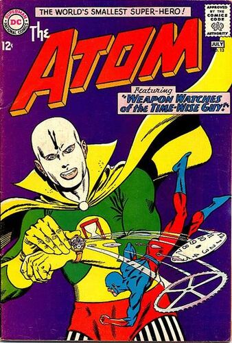 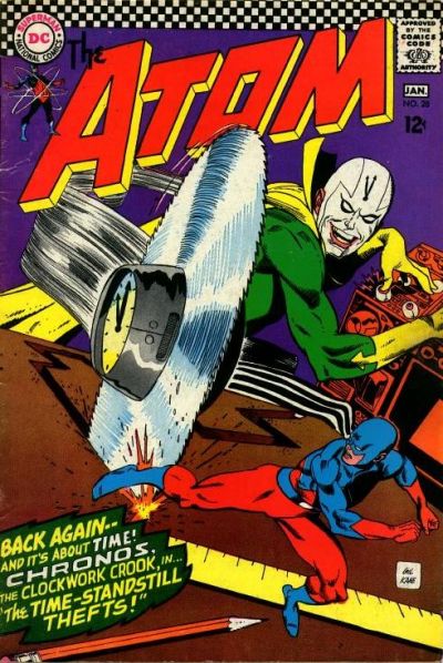 My first issue of The Atom (#13) featured the classic Gil Kane "3-D" cover on the left. I knew that The Atom was a comic written above my pay grade. I was just shy of 10, with only a little more than a year of comics reading to my credit, but I had to buy this comic because of the compelling appearance of the villain. Even though there was something of a clown's look about Chronos, with the harlequin-style riot of colors, that white face of his added a element of the creepy clown to him. (I cam't find a reference for this, but I think Chronos in some story explains that the elements of his costume are symbolic of various old types of clocks, but that may be entirely a "misremembering" on my part.) Somehow Kane gives this garish costume an element of menace thanks to that eerie face-mask. And the ears poking out, like Captain America's, though odd (probably just a way to make the look less typical) just accentuate the "evil clown" look. Like the Vulture, my previous choice, Chronos, as depicted by Kane, was more the lean and lithe kind of villain; in future incarnations, even as drawn by Kane, he is drawn as having a steroid-laced musculature, like every other run of the mill villain. I like the petty thief-turned gimmicky villain of the early Silver Age. At least the costume has stood the test of time.
|
|
|
|
Post by Pharozonk on Dec 18, 2017 12:29:17 GMT -5
#7. MordruWhile the Legion was always about the embracing of science and technology, it's interesting to note just how many of their foes were magic based, such as the Archmage or Glorith. Out of this segment of their rogues gallery, Mordru remains one of my favorites in terms of design. Once again, we have the classic green and purple color scheme with the purple tunic and green hat. The wings on the hat are reminiscent of the Greek god Hermes and evokes the character's more mythical roots. The long white hair and beard seem to have a Fu Manchu influence mixed with Gandalf, which emphasizes his ancient presence.  
|
|
|
|
Post by Reptisaurus! on Dec 18, 2017 12:50:27 GMT -5
7. The Hoi Polloi Ring Herd From Larry Marder's Beanworld. The greatest ongoing comic of all time. A nicely practical design for a bunch of aquatic, subterranean, degenerate gamblers who defend themselves by linking together. The spiky fin gives them an air of menace, and their expressive features can convey a surprisingly wide range of emotion... But what I mostly like is that the one-armed Hoi Polloi don't look complete until they're linked together... Which enhances the basic Beanworld themes of communal interdepenance and how every individual is an important part of the Big, Big, Picture. (tm) The poor things never seem to be able to save the chow from the invading beans, though! 
|
|
|
|
Post by coke & comics on Dec 18, 2017 13:52:41 GMT -5
Hopefully Cei-U! won't mind the combining of these two villains. I know Scarface is wondering why I would pair him with that dummy. 7. Scarface and the Ventriloquist by Norm BreyfogleAnother character I first met during the Knightfall saga. My youthful ignorance added a bit of surprise to the comic, as the Ventriloquist spent the whole comic looking for his partner, Scarface. And I didn't know who Scarface was until they found him. This is another example of design inextricable from character concept. A puppet of a stereotypical prohibition-era gangster. The meek man with a bow tie behind him.  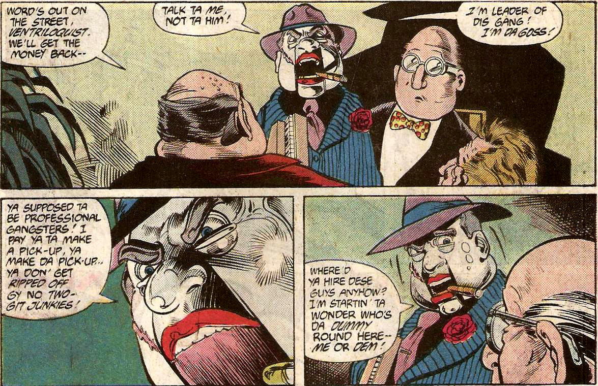 |
|
|
|
Post by Deleted on Dec 18, 2017 15:19:05 GMT -5
On the sixth day of Christmas Santa said to me here's something to help prep the wrapping paper... The Scissormen as designed by Richard Case When I first discovered Grant Morrison and the Doom Patrol (when I still liked Grant Morrison's stuff) I was still at university and these creatures became the stuff of my nightmares...   the stark contrast of the red and black in their costumes, the anonymity the costume and faceless mask provided, the implication of teaming hordes of them, the upside down crosses in the shin design (I am a survivor of Catholic school after all) with those razor sharp scissors extending from their arms (this was a year or so before Edward Scissorhands was released and that look became ubiquitous and lost its mystique) all combined to completely creep me out and make a lasting impact on me. At times they did literally haunt some of my nightmares and even seeing them today brings back the sheer creep factor I experienced on seeing them for the first time. -M |
|
|
|
Post by Jesse on Dec 18, 2017 15:33:16 GMT -5
7. Icicle The character design first appeared in All-American Comics # 90 in 1947 but my favorite version appeared much later in The Flash #56-58 in 1992. Both issues were penciled by Greg LaRocque. At the time Wally was invited to read the last will and testament of Dr. Joar Mahkent. This version takes the ice theme of the original Icicle and adds a more ghostly element making the character actually scary.  
|
|
|
|
Post by hondobrode on Dec 18, 2017 16:17:06 GMT -5
Believe it or not, this was a one hit wonder, but I really like the look of Radiant from the old Chase title DC had in the 90's 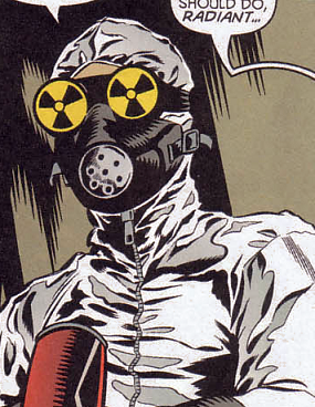 That whole hazmat symbol for eyes along with the zippered up containment suit and headgear looked great ! |
|
|
|
Post by berkley on Dec 18, 2017 16:38:04 GMT -5
7. Taharqua, design by Benoît Leblanc. 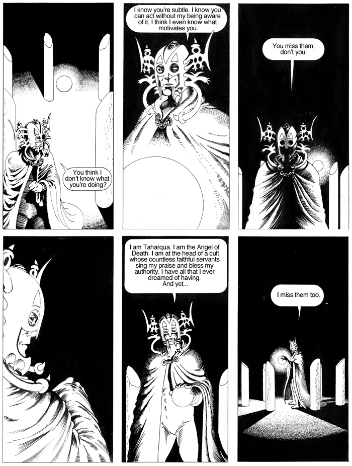   I've always liked powerful mystic or cosmic figures and this design with a complicated head-piece worthy of Jack Kirby, is one of the best I've seen. Like several of my picks, it is perhaps debatable whether Taharqua qualifies for true villain status, but he's certainly an antagonist to the hero of Le Bras d'Orion/Orion's Arm, which everyone should read!
|
|
|
|
Post by Cei-U! on Dec 18, 2017 16:49:33 GMT -5
The Invisible Man?
Cei-U!
I summon the wild-ass guess!
|
|
|
|
Post by berkley on Dec 18, 2017 16:59:56 GMT -5
The Invisible Man? Cei-U! I summon the wild-ass guess! Ha! Couldn't get imgur to work so I had to link directly to Ben's website - apologies RR! |
|
|
|
Post by pinkfloydsound17 on Dec 18, 2017 17:06:55 GMT -5
Man some great villains in this thread, some of which I have never seen! Icicle looks fantastic!
Magus
Again with the purple. I don't know why but I like evil mirror versions of characters. Magus just works for me. The cool skull belt and of course, the best fro to reflect the times. Name me another supervillain this cool with an afro!

|
|
|
|
Post by Deleted on Dec 18, 2017 17:23:32 GMT -5
|
|
|
|
Post by thwhtguardian on Dec 18, 2017 17:40:33 GMT -5
7. Taharqua, design by Benoît Leblanc.    I've always liked powerful mystic or cosmic figures and this design with a complicated head-piece worthy of Jack Kirby, is one of the best I've seen. Like several of my picks, it is perhaps debatable whether Taharqua qualifies for true villain status, but he's certainly an antagonist to the hero of Le Bras d'Orion/Orion's Arm, which everyone should read! I really need to pick this book up, I've been meaning to since RR first showed it off. |
|
|
|
Post by Paste Pot Paul on Dec 18, 2017 17:46:33 GMT -5
7. Madame Hydra-Jim Steranko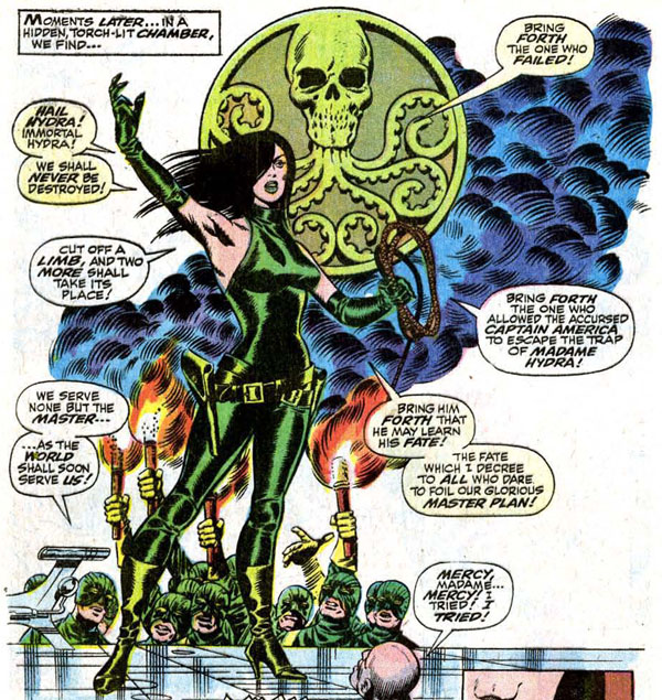 I was quite pleased to see that the good (absolutely NOT the right description of her) Madame had been chosen by someone else. There must be something about green women that strikes a chord with me, I'm a big She-Hulk fan, and also love the likes of Emerald Empress(another almost choice for me), Polaris, and Gamora. I do believe that it all started with Viper, and specifically as portrayed by Mr Steranko. Now Im well aware that as prospective romantic partners go, a homicidal nihilist with delusions of genocide doesnt get off to a great start, but those boots, the cat suit, OMG those lips...HAIL HYDRA !!!
|
|
|
|
Post by Deleted on Dec 18, 2017 18:37:33 GMT -5
Paste Pot Paul ... I had her at #12 and you had her at #7 ... so we are in good company! 
|
|