|
|
Post by Deleted on Dec 20, 2017 11:22:04 GMT -5
On the eight day of Christmas, Santa said to me beware the Lord of Blades... Jei as designed by Stan Sakai...   The wolf is the quintessential antagonist in folklore (Big BadWolf anyone?) and as an anthropomorphic wolf Jei embodies that archetype from the get-go. The exaggerated eyes, blank white with the heavy black outline add that demonic tough to his features, and the simple black monk's robes and black hair/headpiece give him the "black hat" vibe of the villain archetype. The design is simple and elegant and without knowing anyhting else about the character reads villian form the get go. Add in the wicked looking weapon and the unnerving smile and you have a classic visual villain on the page. -M |
|
Confessor
CCF Mod Squad
Not Bucky O'Hare!
Posts: 10,197 
|
Post by Confessor on Dec 20, 2017 11:25:38 GMT -5
5. Hobgoblin The original Green Goblin was a villain that almost made my Top 12 list, but he eventually got bumped in favour of other, better attired supervillains. However, the early-to-mid-80s Hobgoblin (Roderick Kingsley) just had to be on my list. Designed by Roger Stern and John Romita, Jr., with the influence of Steve Ditko's original Goblin being obvious for all to see, the Hobgoblin's costume takes everything that was cool and sinister about the Green Goblin's Halloween-themed look and ramps it up a notch. Gone is the purple and green colour scheme, replaced by a much more aesthetically pleasing and thematically appropriate blue scale armour and "pumpkin orange" cape, hood and gloves. The addition of fangs in Hobgoblin's mouth and his blood red eyes, as opposed to the Goblin's white eye lenses, only helps make him look that much more crazy and maniacal.
|
|
|
|
Post by Prince Hal on Dec 20, 2017 12:56:54 GMT -5
Black Mask, Blackhawk 242, August 1968, (Pat Boyette, Bob Haney, Marv Wolfman, Dick Giordano)
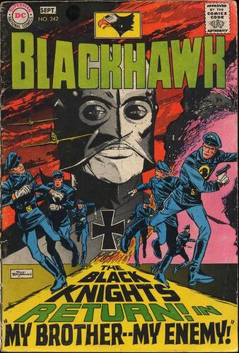  The 242nd issue of Blackhawk, the penultimate appearance of the title character, who had headlined his own book and two others non-stop since 1941. It was the first of two excellent issues in which the Blackhawks made their final flights into glory, giving those of us who had a soft spot for them the chance to remember them at their best, and not as the ridiculous "Junk-Heap Heroes" in their ignominious super-hero incarnations. Out of nowhere the Black Knights returned in 242, a story which was a reboot before such a term existed. It wasn't quite so blatant as Bobby Ewing's bad dream, but to see a year and a half's worht of insulting nonsense ditched unceremoniously in a couple of pages was a welcome relief for any comics fan, let alone fans of the Blackhawks. The cherry on the top of the sundae was the villain whom they faced in this issue. I won't reveal his identity (the second cherry atop the confection) because you should read it, but it was all about his grim appearance and that he was a Nazi, wearing a modified German helmet a design that lent him permanent sneer and bulging eye slits and a protruding nose that suggested he was an evil version of a black hawk. He looms over the cover as any arch-villain should and his personality matched that ominous appearance perfectly. Another of those characters on my list who has never returned, to my knowledge, and therefore becomes that much more memorable.
|
|
|
|
Post by coke & comics on Dec 20, 2017 13:13:47 GMT -5
5. Jei by Stan SakaiObviously, we weren't leaving without something from Usagi Yojimbo, and I think it's pretty clear who the great villain is. Psychotic murderer? Or man on a mission from the gods? What I know for sure is that everybody he meets can tell he's evil at a glance.  EDIT: I see mrp beat me to the choice and even the image! I'll delete the duplicate image.
|
|
|
|
Post by codystarbuck on Dec 20, 2017 13:14:10 GMT -5
Also, the pointed ears suggested a demonic figure, in those years before Mr Spock. Did they ever explain the pointed ears?? I don't recall ever seeing a story in any continuity as to why. In the 40s, you just kind of accepted it. Also, he was Egyptian and all anyone knew of them (comic book reader-wise) was what they say on hieroglyphs and statues, which were stylized. I suppose you could rationalize it as a symbol of his corruption. Originally, I think the ears and the widow's peak were purely to suggest devil, without making his skin red and giving him horns. |
|
|
|
Post by hondobrode on Dec 20, 2017 13:15:42 GMT -5
Validus, son of Saturn Girl and Lightning Lad  I didn't know this til the 90's and I was stunned, but it totally made sense. Giant hulking out of control monster shooting lightning bolts out of its brain. How'd that happen ? Even cooler - Darkseid stole their baby and cruelly created the Validus we know. 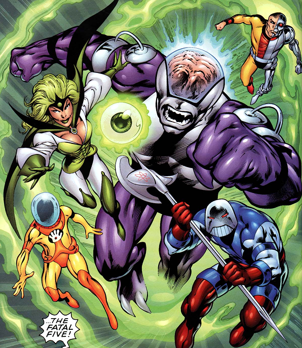 |
|
|
|
Post by james on Dec 20, 2017 13:28:38 GMT -5
5. Hobgoblin The original Green Goblin was a villain that almost made my Top 12 list, but he eventually got bumped in favour of other, better attired supervillains. However, the early-to-mid-80s Hobgoblin (Roderick Kingsley) just had to be on my list. Designed by Roger Stern and John Romita, Jr., with the influence of Steve Ditko's original Goblin being obvious for all to see, the Hobgoblin's costume takes everything that was cool and sinister about the Green Goblin's Halloween-themed look and ramps it up a notch. Gone is the purple and green colour scheme, replaced by a much more aesthetically pleasing and thematically appropriate blue scale armour and "pumpkin orange" cape, hood and gloves. The addition of fangs in Hobgoblin's mouth and his blood red eyes, as opposed to the Goblin's white eye lenses, only helps make him look that much more crazy and maniacal. In my opinion this is my favorite drawing of Hobgoblin. When JRJR was at the top of his game. |
|
|
|
Post by Prince Hal on Dec 20, 2017 15:03:43 GMT -5
Validus, son of Saturn Girl and Lightning Lad  I didn't know this til the 90's and I was stunned, but it totally made sense. Giant hulking out of control monster shooting lightning bolts out of its brain. How'd that happen ? Even cooler - Darkseid stole their baby and cruelly created the Validus we know.  He was on my longer list! Excellent choice, hondo. |
|
Crimebuster
CCF Podcast Guru
Making comics!
Posts: 3,958 
|
Post by Crimebuster on Dec 20, 2017 15:25:05 GMT -5
5. Clock KingHis face is a clock face. His face. Is. A. CLOCK. Face. 
|
|
Confessor
CCF Mod Squad
Not Bucky O'Hare!
Posts: 10,197 
|
Post by Confessor on Dec 20, 2017 15:27:50 GMT -5
|
|
|
|
Post by Paste Pot Paul on Dec 20, 2017 15:39:18 GMT -5
5. The Grey Gargoyle So, created by Jack Kirby and Stan for Journey into Mystery 107, THIS is where I fell in love with him(so to speak). 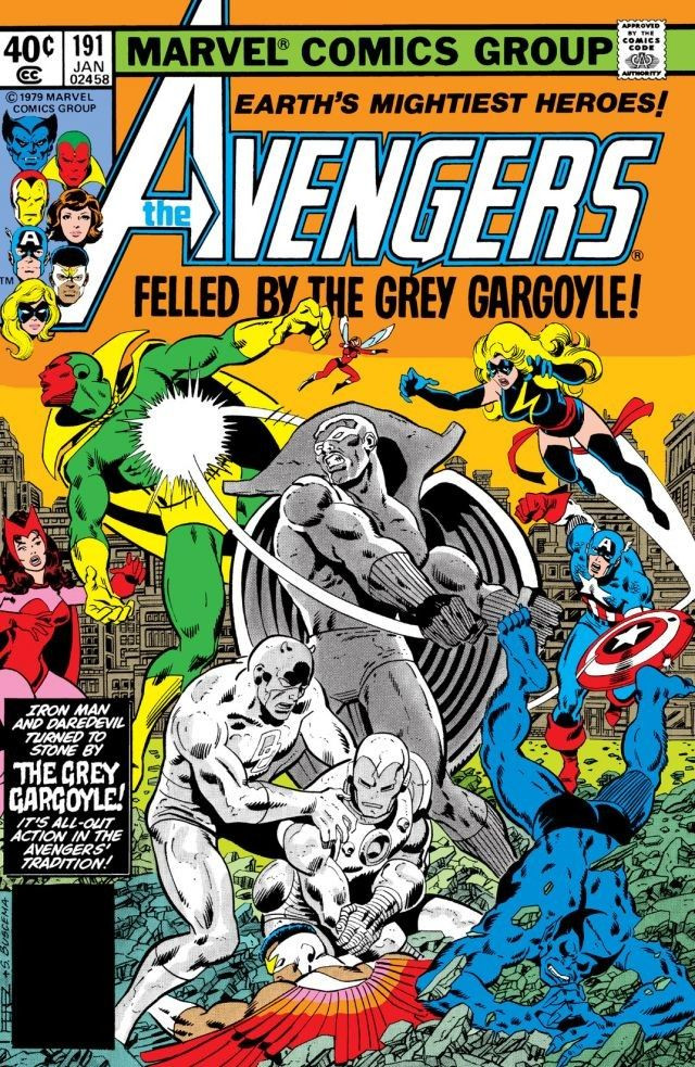 Ive read a few of the older appearances since, and am just astonished he dont get more love. If you can go toe to toe with Thor those sappy Avengers shouldnt stand a chance. |
|
|
|
Post by foxley on Dec 20, 2017 16:39:31 GMT -5
5. The CorinthianNot sure what the name means. I assume a Biblical (or maybe architectural?) reference. Corinthian has several meanings, but I believe the one Gaiman was referencing was 'dissolute; loving of luxury'. The Corinthians were a group of Regency gentlemen infamous for for their hedonistic and decadent tastes and proclivities. |
|
|
|
Post by brutalis on Dec 20, 2017 16:45:56 GMT -5
My 1st exposure to the Grey Gargoyle was in Captain America 139-142 when Cap and Falcon took on the old stone sour puss and fought him on the S.H.I.E.L.D. Heli-carrier. Was hooked on him instantly and I watched for any appearances he would make across the MU at the time. He like Batroc (and too many others) is an extremely fun and entertaining villain who has not been utilized well or often enough! |
|
|
|
Post by thwhtguardian on Dec 20, 2017 16:48:56 GMT -5
On the Eighth Day of Classic Comic Christmas I give you The Black Manta  Specifically as drawn by Patrick Gleason Aquaman #32, 2005 Once again this another choice of a design that is basically the opposite of it's opposing hero's look instead of bright primary colors it's all black and instead of portraying the freedom of the open seas it shows the depths as constricting and oppressive. Now I can hear you, why Gleason's look over a classic depiction? And I say I chose this look for two reasons: One, it retains the real life look of the original with its big thick air tubes and bulky back pack both of which had been minimized in subsequent redesigns. And two, the super reflective helmet and texturing to the wet-suit both give it again a real life look. On top of that you have the basic look that's always been so imposing, the featureless face, the piercing red eyes and the all black visage that predates Darth Vader by ten years. |
|
|
|
Post by pinkfloydsound17 on Dec 20, 2017 17:08:00 GMT -5
ElectroI love Electro. Green and yellow and the bolt face mask just works for me.  Plus any excuse to post some Ditko goodness is good in my world. 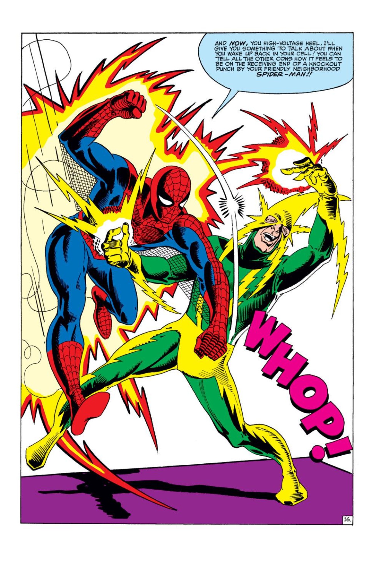
|
|