|
|
Post by Deleted on Dec 20, 2017 17:53:43 GMT -5
ElectroI love Electro. Green and yellow and the bolt face mask just works for me. I do too ... I was considering him also ... nice pick! |
|
|
|
Post by Jeddak on Dec 20, 2017 22:02:37 GMT -5
As we hit the final five, I don't have to worry anymore about whether somebody has beaten me to a pick. Good thing, since we've already seen My #5 - Captain Cold
 This is one of those designs that tells you what you need to know about the character. The dude's dressed for the cold, right? His heavy parka and fur-lined hood stand out in a world of skin-tight outfits. The color scheme further suggests cold, maybe more subtly than the white of Iceman or the Icicle. And the blue and white make a nice contrast to the bright red of the hero he usually faced.  When I started buying my own comics, I branched out from the Superman and Batman my brothers had bought. The Flash was an early favorite. And Captain Cold was my favorite out of the distinctive Rogue's Gallery. He may not have the flashiest costume around,* but it looked great to me then, and it stands up today. *sorry about that, eh?
|
|
|
|
Post by Slam_Bradley on Dec 20, 2017 22:13:32 GMT -5
Coming in at number 05 on our countdown, the simian with the sweetest sense of style... Monsieur Mallah! Honestly I wanted both Mallah and The Brain. But I didn't really have room for both. And no way was I going to cut the ape who reclaimed the beret as a fashion icon. To some extent Mallah represents a plethora of Ape villains, including the Ultra-Humanite, Gorilla Grodd and more. But ultimately, he can stand on his own as the pinnacle of Ape style.  First day of trial is kicking my butt. |
|
|
|
Post by pinkfloydsound17 on Dec 20, 2017 22:33:17 GMT -5
Mesmero I dig that funky helmet and collar combo. His design is reminiscent of this for me...I like Mesmero's colour scheme much more but that headpiece just fails for me. Much like it did for Mirage.
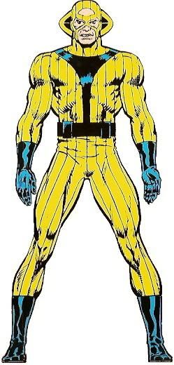
|
|
|
|
Post by foxley on Dec 21, 2017 1:58:22 GMT -5
5. Ares (George Perez design) No other costume evokes such an air of menace as Perez's Ares. The totally hidden face, save for the burning red eyes; very practical black armour that almost exudes darkness; touches like the spikes and skulls that are designed to intimidate but that in no way impede the armour's effectiveness (unlike many supervillains). One look tells you this is a foe who will offer no mercy
|
|
|
|
Post by Reptisaurus! on Dec 21, 2017 2:00:56 GMT -5
5. The CorinthianNot sure what the name means. I assume a Biblical (or maybe architectural?) reference. Corinthian has several meanings, but I believe the one Gaiman was referencing was 'dissolute; loving of luxury'. The Corinthians were a group of Regency gentlemen infamous for for their hedonistic and decadent tastes and proclivities. I'd never heard that before - Yeah, makes a lot of sense. |
|
|
|
Post by berkley on Dec 21, 2017 2:05:39 GMT -5
5. Le noir terrifiant (?) design by Philippe Druillet. The question mark is there because I don't actually remember the character being designated by that title at any point in the story in which he appears, Druillet's Gaîl, part of the Lone Sloane series, but that's what the French wiki calls him and it seems as good a name as any. Another very simple design that exerts a strong effect both in itself and also in its contrast with the incredible detail of Druillet's backgrounds: 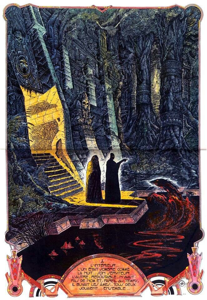 For the life of me I can't decide if I like the look of this better in colour or in black and white: 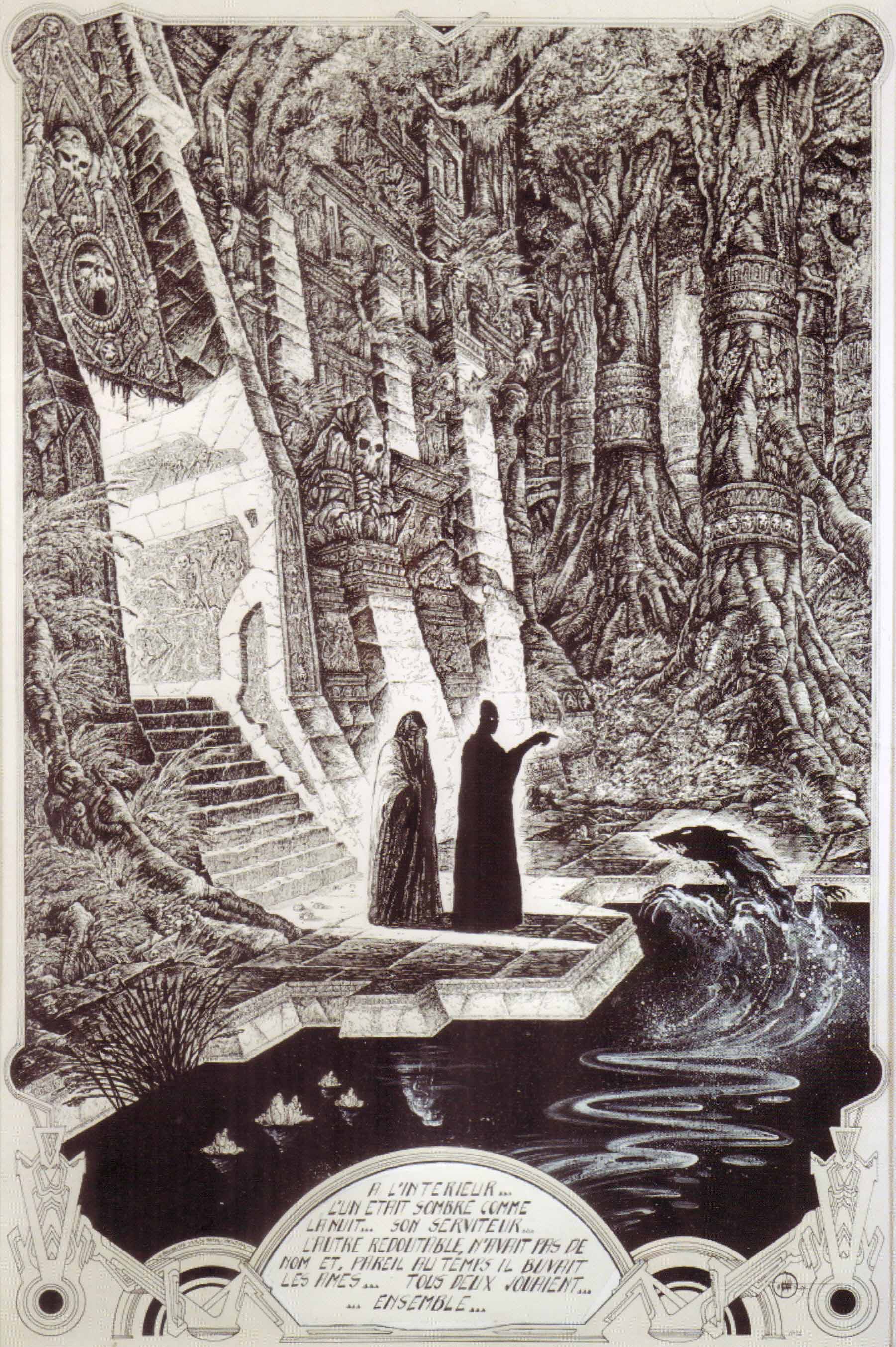 The colours are very well done, but the black and white brings out that detail more clearly and I think it might be worth sacrificing the colour in order to savour the intricacy of Druillet's line-work all the better.
|
|
|
|
Post by Roquefort Raider on Dec 21, 2017 6:50:17 GMT -5
Wow, great and unexpected choice, berkley ! We can never get enough Druillet! It’s been years since I read Gail, but at the time it came out it was without a doubt my favourite illustrated book. It was never made clear who those two characters were, the dark one and his flunky... but they thrived on death and chaos, and were perfectly sinister. After Gail, Druillet’s Lone Sloane would star in a gorgeous three-part adaptation of Gustave Flaubert’s Salammbo... and then stay out of sight for decades, before returning for the thoroughly underwhelming Chaos and Delirius II. Were I Cei-U, I would summon the disappointment! |
|
|
|
Post by Icctrombone on Dec 21, 2017 7:41:48 GMT -5
5. The Grey Gargoyle So, created by Jack Kirby and Stan for Journey into Mystery 107, THIS is where I fell in love with him(so to speak). 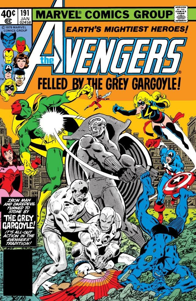 Ive read a few of the older appearances since, and am just astonished he dont get more love. If you can go toe to toe with Thor those sappy Avengers shouldnt stand a chance. I was so close to having THIS version of the Grey Gargoyle as one of my twelve 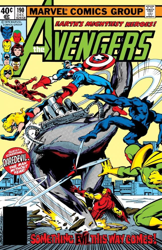 |
|
|
|
Post by Jesse on Dec 21, 2017 13:19:36 GMT -5
5. JokerParticularly when drawn by Jerry Robinson and Dick Sprang the early depictions of the clown prince of crime are incredibly creepy. You can definitely see the influence of the 1928 silent film The Man Who Laughs and the similarities to the character Gwynplaine. The exaggerated features particularly the elongated nose, chin and smile along with the pale white skin really add to how disturbing the character comes across. The green hair and purple suit manage to give off a fun vibe which is almost in contrast to the dark nature of the character. He's also in my opinion one of the greatest villains ever.  
|
|
|
|
Post by Deleted on Dec 21, 2017 16:08:27 GMT -5
foxley ... I've didn't see much of Ares in Comic Books and I usually saw him in Cartoons facing the Justice League and all that. I've have to congratulate you for your pick here. And, for Jesse ... I've just admire your Joker pick here.
|
|
|
|
Post by Farrar on Dec 21, 2017 22:57:56 GMT -5
#5 Loki Silver Age, Jack KirbyHis lithe form was attired in relatively simple garb, but the bad-guy green was paired with primary color yellow and the color combo popped. Top it off with his signature horned helmet and you have a singular look for an enduring character. Here's some Loki by Kirby:  And here's the most gorgeous opening splash I have ever seen--by Big John. 
|
|
|
|
Post by berkley on Dec 21, 2017 23:58:06 GMT -5
Yeah, always liked the image of the arrogant arrogant, slouching Loki sitting on a chair. Love it when the artist conveys something about a character through body language, something you don't see as often as you might expect in comics, but both Kirby and Buscema do a great job of it in the 1st & 3rd panels above. Nice Kirby Enchantress in that 2nd image, too!
|
|
|
|
Post by MWGallaher on Dec 22, 2017 19:59:12 GMT -5
5. Starro the Conquerer originally by Mike Sekowsky (penciller) and Gardner Fox (writer)  Gardner Fox had one foot firmly in the Lovecraftian traditions, and it showed with this first opponent for the Justice League of America. It probably wasn't an especially challenging design for Mike Sekowsky to realize--it's a giant starfish with a single eye in the middle--but it's effective in a way that, I think, a similar but more grotesque creature, like, say, M'Nagalah isn't, because of that inhuman, emotionless look. Yes, it's an eye, but it's not a window into this thing's soul! It's an unblinking, hypnotic gaze, that is even more disturbing when, in later development, Starro began creating little starfish duplicates, attached Alien-style to its victims' faces:  Icky! And with those suckered tentacles, it's easy for us to imagine the feeling of having a baby Starro plastered to our faces--how then would we be seeing the world, through that ominous red eye?
|
|
|
|
Post by Deleted on Dec 22, 2017 20:30:49 GMT -5
5. Starro the Conquerer originally by Mike Sekowsky (penciller) and Gardner Fox (writer)  Gardner Fox had one foot firmly in the Lovecraftian traditions, and it showed with this first opponent for the Justice League of America. It probably wasn't an especially challenging design for Mike Sekowsky to realize--it's a giant starfish with a single eye in the middle--but it's effective in a way that, I think, a similar but more grotesque creature, like, say, M'Nagalah isn't, because of that inhuman, emotionless look. Yes, it's an eye, but it's not a window into this thing's soul! It's an unblinking, hypnotic gaze, that is even more disturbing when, in later development, Starro began creating little starfish duplicates, attached Alien-style to its victims' faces:  Icky! And with those suckered tentacles, it's easy for us to imagine the feeling of having a baby Starro plastered to our faces--how then would we be seeing the world, through that ominous red eye? Thanks for sharing this! |
|