|
|
Post by thwhtguardian on Dec 21, 2017 10:52:20 GMT -5
On the Ninth day of Classic Comic Christmas I give unto thee... Agat(seen here in Spanish...for some reason)  Frank Miller 1983 What I love about Miller's demonic adversary from Ronin is that he really embraces Eastern culture here in the design instead of sticking with a typical western view of a demon. With the over sized fangs and the numerous horns coming out the sides of his head he really looks like the kind of demon that would inspire the oni masks worn by samurai. That level of authenticity not only gives the story an organic feel that I love but it creates a truly unique look that sticks in your mind. Plus its just so damn evil looking.  |
|
|
|
Post by thwhtguardian on Dec 21, 2017 10:56:30 GMT -5
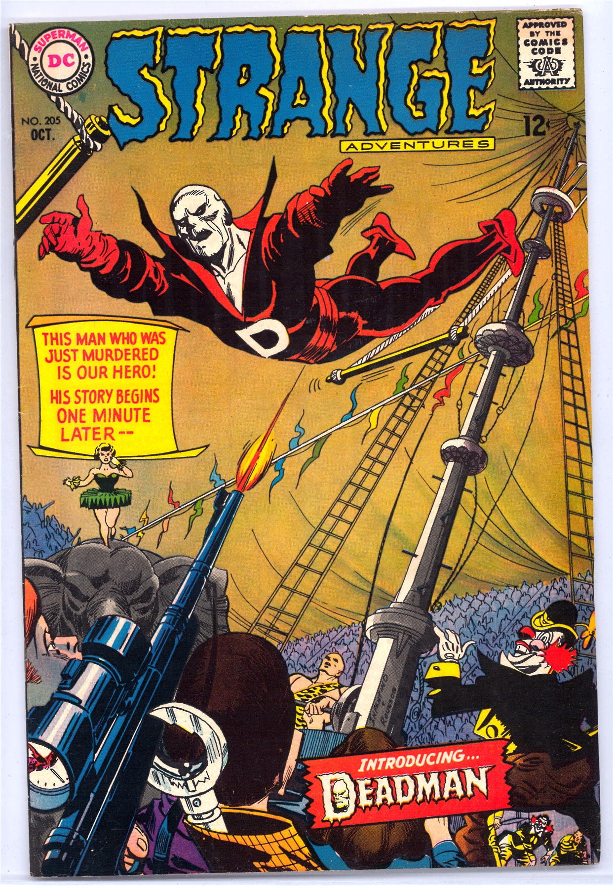
Death-Man, Batman 180, May 1966 (Kanigher, Kane and Anderson) I so wanted to turn to the first page in this issue to see that kind of art and that kind of skeletal face. I din't, but that never has lessened the impact that Death-Man's appearance had on me. I could imagine (as, truth be told, we young readers did with so many comics) that the how the insides would look, and that always helped a bit. We can't overestimate the importance of a comic book's cover back in the days before subscriptions, before specialty stores, before pre-ordering, and this cover is an example of why those covers were so important. To a certain extent, the insides didn't matter. If the cover grabbed you, decision made. Down to your last 12 cents, with only this and Hot Rod Racers #8 lying on the shelf, (Check it out here at the invaluable Mike's shebeen, not wasting an image: www.dcindexes.com/features/newsstand.php?publisher=charlton&type=calendar&month=3&year=1966&sort=alpha I think we know how everyone would have chosen. Death-Man. Like his costume, which needed no cape, no splash of color, no large "D" on a belt, his name went straight to the point. How simple. How scary. No hyperbolic, overdone "Deathmaster," "Deathdealer," "Deathbolt" or "Deathstroke" for this guy. His mask reinforced the subtlety. No leering grin, no attempt at personality beyond the wryest of grins. Very much like Mrs. Pruneface, now that I think of it, my Day 2 entry. (Love me those skeletal faces.) The .45 in his hand may seem almost an afterthought, but I noticed it right away. "Super-villains" didn't pack .45's in the DC and Marvel Universes. Their gunsels, thugs, and assorted toughs might, but their guns really weren't prominent. Super-villains used their super-powers to defeat you. Of course, a .45 is much more efficient and quick. No wonder Death-Man seems more a Dick Tracy villain than a gimmick-guy. It added one more element of grim believability about this villain who dropped in from nowhere, and never returned. Yes, like a few others on my list, Death-Man never reappeared. (I guess he's shown up in Batman '66, but I think you know what I mean. He was a one-time danger. That also makes him an even more of an archetype. Of course, we might argue, Death-Man did reappear, several months later, on an equally stunning cover, this time by Infantino and Roussos, not Kane and Anderson.  I can't recall reading about any link between the two, but Deadman's costume and overall look seems to owe at least a little something to Death-Man, one more reason I can't resist including him on my list. Grant Morrison would use him much later on in Batman Inc. and he was in the Batmanga, but yeah it's a shame he never got more exposure because he had a great look. I wish I had picked him now! |
|
|
|
Post by Pharozonk on Dec 21, 2017 11:02:33 GMT -5
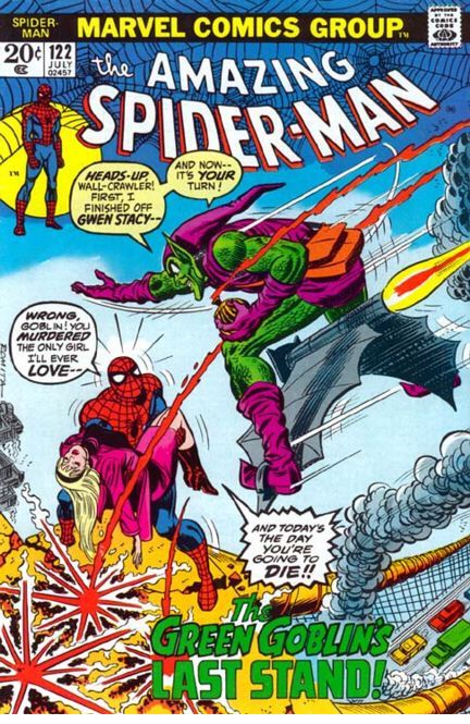
#4. Green GoblinThe third purple and green costume to make my list and easily the best, the classic Green Goblin is one of the eeriest of Spider-man's villains. The green scales are reminiscent of either actual scales or chain mail, both of which emphasize his high fantasy roots. The pointed boots and purple gloves emphasize the elfish-roots, but made sinister, a design choice that reminds me of what I like about Scarecrow's design. I also like that rather than a utility belt, he carries around a bag, something that would be totally impractical for someone engaging in high speed flight, but its' a comic book so I can forgive it!  
|
|
|
|
Post by DubipR on Dec 21, 2017 11:16:37 GMT -5
4. Beetle The Beetle's original costume was...weird. Bucket helmet, cumbersome-looking wings and those weird fingers (I'm sure some people love it though!) I like this redesign, which is more streamlined and aerodynamic, and makes him look like an actual beetle. As with Moonstone I love the bulbous eyepieces. Great choice! I had the Beetle and Mach I on my list for a while; at least in the Top 25. I too love Abner's costume. |
|
|
|
Post by Deleted on Dec 21, 2017 11:22:14 GMT -5
On the Ninth Day of Christmas, Santa said to me...here there be dragons again, but this time more dangerous... The Dragon Lady as designed by Milton Caniff  Femme fatales are a staple of comic villainy, and one of the earliest to appear was The Dragon Lady in Terry and the Pirates by Milton Caniff, whose influence on other creators is undenable.  the alluring and dangerous look was established in comics with this character here. The simple, yet revealing dresses (with or without accessories like a cloak), the cigarette on the holder, the pursed lips, the condescending stare highlighted by the slanting slightly arched brows and blue eye-shadow, the posture oozing seduction and threat, the raven tresses, all oart of the package that just embodies sex appeal and danger, the trademark traits of the femme fatale. All later femme fatales in comics owe their debt to the Dragon Lady. She was already appearing in the radio show in 1937 and in the 1940 serial, but her origins were in the strip int he 30s, and while many may have forgotten her character itself, her influence (and that of Caniff's design) are still reverberating in comics today. -M |
|
|
|
Post by Deleted on Dec 21, 2017 11:31:33 GMT -5
4. Beetle The Beetle's original costume was...weird. Bucket helmet, cumbersome-looking wings and those weird fingers (I'm sure some people love it though!) I like this redesign, which is more streamlined and aerodynamic, and makes him look like an actual beetle. As with Moonstone I love the bulbous eyepieces. I had him in my top twenty and I'm admiring your pick here and it's a winner in my book. |
|
|
|
Post by coke & comics on Dec 21, 2017 12:19:18 GMT -5
The more I see him, the more I regret failing to include Ultron on my own list. Ah well, too late now.
I summon the might have beens!
|
|
|
|
Post by thwhtguardian on Dec 21, 2017 12:31:29 GMT -5
On the Ninth Day of Christmas, Santa said to me...here there be dragons again, but this time more dangerous... The Dragon Lady as designed by Milton Caniff  Femme fatales are a staple of comic villainy, and one of the earliest to appear was The Dragon Lady in Terry and the Pirates by Milton Caniff, whose influence on other creators is undenable.  the alluring and dangerous look was established in comics with this character here. The simple, yet revealing dresses (with or without accessories like a cloak), the cigarette on the holder, the pursed lips, the condescending stare highlighted by the slanting slightly arched brows and blue eye-shadow, the posture oozing seduction and threat, the raven tresses, all oart of the package that just embodies sex appeal and danger, the trademark traits of the femme fatale. All later femme fatales in comics owe their debt to the Dragon Lady. She was already appearing in the radio show in 1937 and in the 1940 serial, but her origins were in the strip int he 30s, and while many may have forgotten her character itself, her influence (and that of Caniff's design) are still reverberating in comics today. -M I really need to get a hold of Terry and the Pirates |
|
|
|
Post by Deleted on Dec 21, 2017 12:37:24 GMT -5
@mrp ... Great Pick and I read Terry and the Pirates by Milton Caniff in my local newspaper when I was a kid and I remember this character and I've wished that I picked her instead. Thanks for sharing that with us today!  |
|
|
|
Post by Deleted on Dec 21, 2017 12:46:43 GMT -5
More Iron MaidenFYI: In my top 20, I've considered Rich Buckler design as well; but the original done by Wally Wood is far more superior than Rich, the reason for that is Rich did not draw her face very well and that's brought it down for me. I read this book and having seen his work ... Mr. Wood is the man that does her very well. I just wanted to share this today! .jpg)
|
|
|
|
Post by Slam_Bradley on Dec 21, 2017 13:01:53 GMT -5
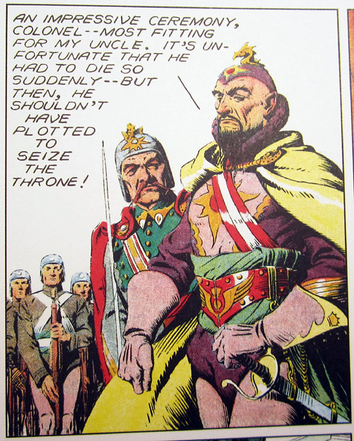
Coming in at number 04 on our countdown, the only alien that looks almost as Fu as Manchu, the Madman of Mongo... Ming the Merciless
I'm a nut for yellow peril lit and art. So to an extent Ming stands in for Fu Manchu, Yellow Claw, etc. Even though Ming is an alien he pretty clearly comes out of the yellow peril school. And Raymond makes him stand out from the pack. It only takes one look to know that this guy is a world grade menace.   |
|
|
|
Post by Jesse on Dec 21, 2017 13:28:16 GMT -5
4. Lex Luthor's War Suit (1935)I think the design first appearance in Action Comics #544 in 1983 then later post-Crisis in Man of Steel #5. The most physically formidable looking version of the character feels like he might actually be able to put up a fight against the Man of Steel. All the more impressive that he invented it himself which I think plays to the personality of the character. To me Lex Luthor represents the pinnacle of human intelligence gone wrong and I think that also comes across here as he uses the war suit in his xenophobic grudge against Superman.  
|
|
|
|
Post by badwolf on Dec 21, 2017 13:47:14 GMT -5
That Man of Steel splash is amusingly misleading; it turns out it's just one of Luthor's lackeys wearing the suit, and Luthor himself is out of frame.
|
|
|
|
Post by james on Dec 21, 2017 13:53:34 GMT -5
4. Beetle The Beetle's original costume was...weird. Bucket helmet, cumbersome-looking wings and those weird fingers (I'm sure some people love it though!) I like this redesign, which is more streamlined and aerodynamic, and makes him look like an actual beetle. As with Moonstone I love the bulbous eyepieces. I had him in my top twenty and I'm admiring your pick here and it's a winner in my book. John Byrne rendition. |
|
|
|
Post by badwolf on Dec 21, 2017 14:06:02 GMT -5
I had him in my top twenty and I'm admiring your pick here and it's a winner in my book. John Byrne rendition. Yup, first appeared in Spectacular Spider-Man #58. Hmm, I just looked back at that story and noticed that Byrne gave him normal hands/gloves, but in the next issue drawn by Ed Hannigan the weird sticky fingers are back. |
|