|
|
Post by hondobrode on Dec 21, 2017 14:08:34 GMT -5
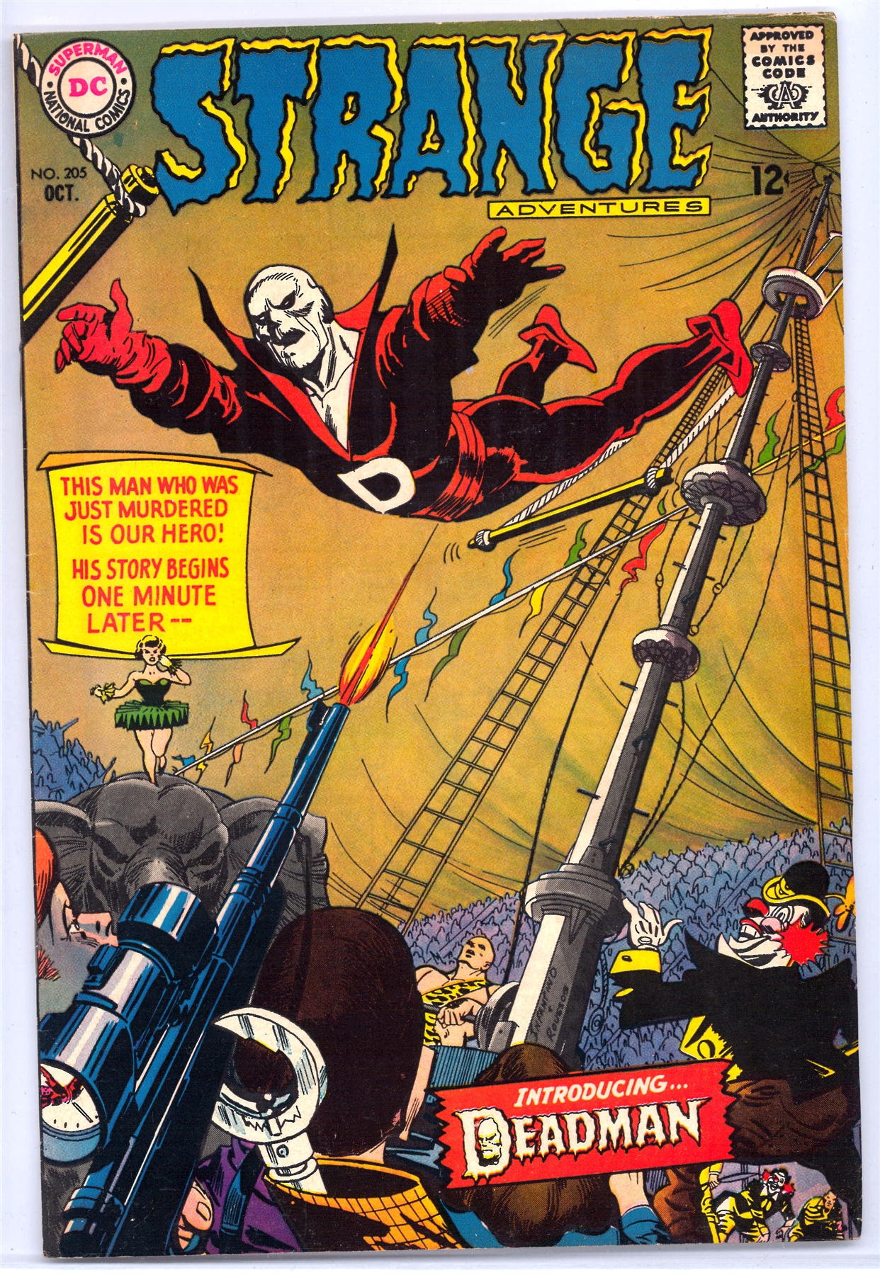
Death-Man, Batman 180, May 1966 (Kanigher, Kane and Anderson) I so wanted to turn to the first page in this issue to see that kind of art and that kind of skeletal face. I din't, but that never has lessened the impact that Death-Man's appearance had on me. I could imagine (as, truth be told, we young readers did with so many comics) that the how the insides would look, and that always helped a bit. We can't overestimate the importance of a comic book's cover back in the days before subscriptions, before specialty stores, before pre-ordering, and this cover is an example of why those covers were so important. To a certain extent, the insides didn't matter. If the cover grabbed you, decision made. Down to your last 12 cents, with only this and Hot Rod Racers #8 lying on the shelf, (Check it out here at the invaluable Mike's shebeen, not wasting an image: www.dcindexes.com/features/newsstand.php?publisher=charlton&type=calendar&month=3&year=1966&sort=alpha I think we know how everyone would have chosen. Death-Man. Like his costume, which needed no cape, no splash of color, no large "D" on a belt, his name went straight to the point. How simple. How scary. No hyperbolic, overdone "Deathmaster," "Deathdealer," "Deathbolt" or "Deathstroke" for this guy. His mask reinforced the subtlety. No leering grin, no attempt at personality beyond the wryest of grins. Very much like Mrs. Pruneface, now that I think of it, my Day 2 entry. (Love me those skeletal faces.) The .45 in his hand may seem almost an afterthought, but I noticed it right away. "Super-villains" didn't pack .45's in the DC and Marvel Universes. Their gunsels, thugs, and assorted toughs might, but their guns really weren't prominent. Super-villains used their super-powers to defeat you. Of course, a .45 is much more efficient and quick. No wonder Death-Man seems more a Dick Tracy villain than a gimmick-guy. It added one more element of grim believability about this villain who dropped in from nowhere, and never returned. Yes, like a few others on my list, Death-Man never reappeared. (I guess he's shown up in Batman '66, but I think you know what I mean. He was a one-time danger. That also makes him an even more of an archetype. Of course, we might argue, Death-Man did reappear, several months later, on an equally stunning cover, this time by Infantino and Roussos, not Kane and Anderson.  I can't recall reading about any link between the two, but Deadman's costume and overall look seems to owe at least a little something to Death-Man, one more reason I can't resist including him on my list. Outstanding pick Prince Hal |
|
|
|
Post by hondobrode on Dec 21, 2017 14:12:10 GMT -5
On the Ninth day of Classic Comic Christmas I give unto thee... Agat(seen here in Spanish...for some reason)  Frank Miller 1983 What I love about Miller's demonic adversary from Ronin is that he really embraces Eastern culture here in the design instead of sticking with a typical western view of a demon. With the over sized fangs and the numerous horns coming out the sides of his head he really looks like the kind of demon that would inspire the oni masks worn by samurai. That level of authenticity not only gives the story an organic feel that I love but it creates a truly unique look that sticks in your mind. Plus its just so damn evil looking.  and this time a great pick from thwhtguardian |
|
|
|
Post by Deleted on Dec 21, 2017 16:05:43 GMT -5
#4- CATWOMAN (2000s ERA) My second Catwoman arrives on my list and from one the board's favorite artists, Darwyn Cooke. "Trail of the Catwoman" came out in 2001 as a backup story in Detective comics, by Ed Brubaker and Darwyn Cooke and became an instant hit. Cooke's retro designs in everything he did on the page exploded with great detail. Giving Selina a shorter haircut, a cross between the weird Year One Miller/Mazzuchelli look and the end of the 90s Balent era. But it was the suit that makes this hit my list. Simple black with clunky boots, which isn't really very cat burglar-like but works well with the outfit. The hood redesign is fantastic. Still with the ears, it was inker Mike Allred that suggested the googles to be 1950s cat-like to go with the suit. Grounded in real world look instead of high fantasy, it works extremely well.  Catwoman just missed my list, but this was the look I was considering for her. It's the only design the says cat burglar of the many she has had, the rest all looked like she would stand out at a masquerade not stealthily infiltrate somewhere to get the jewels and be able to act effectively if discovered. There's an elegance in the simplicity of Cooke's design as well. Far too many super-villain costumes I find either too busy or too garish in their palette or color scheme for me to consider them good designs despite liking the characters. Perhaps I have spent too much time familiarizing myself with color theory these past few months, as it has really caused me to reevaluate the palette used on a lot of super-villain costumes to the detriment of my appreciation of them. -M |
|
|
|
Post by foxley on Dec 21, 2017 16:14:27 GMT -5
4. Darth Talon From Dark Horse's Star Wars: Legacy comics, Darth Talon is a visually striking character. Her design is intended to evoke a painted Celtic warrior. The red and black colour scheme, combined with the head tails, create a suitably demonic appearance. Talon is a more primal looking Sith Lord than most of her compratriots, who favour flowing robes or militaristic armour, as opposed to her stripped down look. This ain't your grandfather's Sith Lord. 
|
|
Crimebuster
CCF Podcast Guru
Making comics!
Posts: 3,958 
|
Post by Crimebuster on Dec 21, 2017 17:09:40 GMT -5
She definitely has that!  |
|
|
|
Post by Deleted on Dec 21, 2017 17:31:43 GMT -5
DubipR ... I've missed Darwyn Cooke and this picture is one of the best that he drew. Man, this so purrfect! 
|
|
|
|
Post by thwhtguardian on Dec 21, 2017 17:36:30 GMT -5
I nearly went with this look myself, but to me it came about in conjunction with her becoming somewhat heroic. |
|
|
|
Post by DubipR on Dec 21, 2017 18:30:43 GMT -5
4. Darth Talon From Dark Horse's Star Wars: Legacy comics, Darth Talon is a visually striking character. Her design is intended to evoke a painted Celtic warrior. The red and black colour scheme, combined with the head tails, create a suitably demonic appearance. Talon is a more primal looking Sith Lord than most of her compratriots, who favour flowing robes or militaristic armour, as opposed to her stripped down look. This ain't your grandfather's Sith Lord.  Great choice! I didn't even think of delving into the Star Wars comics for baddies. She's one of my favorites! |
|
|
|
Post by Paste Pot Paul on Dec 21, 2017 18:34:19 GMT -5
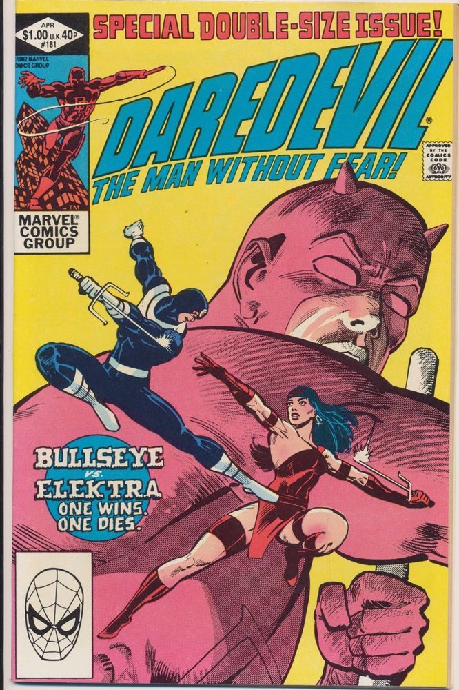
4. Bullseye - John Romita Sr. Though I had read an earlier appearance, maybe the above issue, it was his use in Daredevil by Roger McKenzie and Frank Miller that really grabbed my attention. Well me and thousands of others of course. Just that thing with the cards had me, but what hooked me from day one is the simplicity of the design, the concentric circles forming the "bullseye". Of course Frank turned him into the pillar of society we know and love now, and theres been no looking back.  Less said about the circles carved into his head the better, funny to start with, but is that the action of a hero I want to emulate?
|
|
|
|
Post by Icctrombone on Dec 21, 2017 19:37:31 GMT -5
4. Brother Blood
 Brother Blood first appeared in New Teen Titans # 21 and after his first storyline, I expected him to become a big time villain in the class of Dr. Doom or Lex Luthor but he lost his appeal in the subsequent stories he appeared in. Too bad, but he had a nice look with the red and white color scheme and a skull for a headpiece. Man, He kicked the Teen Titans @$$ in his first arc with Superman type power and I still consider his first incarnation to be impressive. 
|
|
|
|
Post by Jeddak on Dec 21, 2017 21:08:26 GMT -5
My #4 - The Hordes of Hydra

Hail Hydra! Immortal Hydra! We shall never be destroyed!
The super-villain costume as uniform. Bad guys as lackeys. There have been plenty of groups like this, from the Beagle Boys thru AIM to the Minions. But this bunch is my favorite. You've got the color scheme, green and yellow. Not a bright, vibrant green, but a vaguely sickly yellowish hue. The 'H' for Hydra isn't your usual chest emblem, but more of an integrated design element. The red eyes give these guys an inhuman, sinister touch. And of course, the baggy outfit and hood give the hordes anonymity. What emboldens a bad guy, internet troll or world conqueror, more than knowing they can avoid responsibility for their actions? What's more intimidating than a faceless mob coming your way? Plus, if you get a bunch of them together, they can do this -  which is a neat design in and of itself. |
|
|
|
Post by foxley on Dec 21, 2017 21:38:53 GMT -5
My #4 - The Hordes of Hydra

Hail Hydra! Immortal Hydra! We shall never be destroyed!
The super-villain costume as uniform. Bad guys as lackeys. There have been plenty of groups like this, from the Beagle Boys thru AIM to the Minions. But this bunch is my favorite. You've got the color scheme, green and yellow. Not a bright, vibrant green, but a vaguely sickly yellowish hue. The 'H' for Hydra isn't your usual chest emblem, but more of an integrated design element. The red eyes give these guys an inhuman, sinister touch. And of course, the baggy outfit and hood give the hordes anonymity. What emboldens a bad guy, internet troll or world conqueror, more than knowing they can avoid responsibility for their actions? What's more intimidating than a faceless mob coming your way? Plus, if you get a bunch of them together, they can do this -  which is a neat design in and of itself. Do Hydra members have to practise doing that? It just seems really odd.  |
|
|
|
Post by berkley on Dec 21, 2017 22:23:07 GMT -5
My #4 - The Hordes of Hydra
Hail Hydra! Immortal Hydra! We shall never be destroyed!
The super-villain costume as uniform. Bad guys as lackeys. There have been plenty of groups like this, from the Beagle Boys thru AIM to the Minions. But this bunch is my favorite. You've got the color scheme, green and yellow. Not a bright, vibrant green, but a vaguely sickly yellowish hue. The 'H' for Hydra isn't your usual chest emblem, but more of an integrated design element. The red eyes give these guys an inhuman, sinister touch. And of course, the baggy outfit and hood give the hordes anonymity. What emboldens a bad guy, internet troll or world conqueror, more than knowing they can avoid responsibility for their actions? What's more intimidating than a faceless mob coming your way? Plus, if you get a bunch of them together, they can do this -  which is a neat design in and of itself. Do Hydra members have to practise doing that? It just seems really odd.  The rehearsals are murder: "Ok boys, let's take it from the top! And one, and two, and ... you in the back, I've got entire hordes of replacements if you can't get this right! " |
|
|
|
Post by codystarbuck on Dec 21, 2017 22:24:09 GMT -5
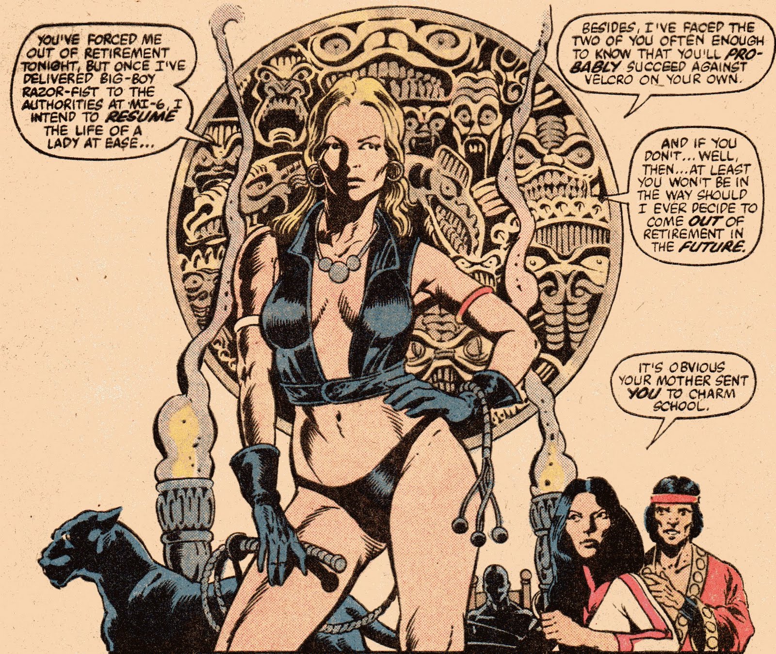
My number 4 is Pavane.....  Leaving aside the fact that she is infinitely sexy in Paul Gulacy's hands (in a dominatrix kind of way, ala Warrior Woman) the character is a terrific foe for the more moral Shang Chi. She is a deadly killer, though her loyalties are to herself, much in the mold of characters like the Dragon lady and Catwoman, who owe a lot of characterization to Sax Rohmer's Fah Lo Suee (Talia, as well). The character first appears in Doug Moench and Paul Gulacy's debut storyline, where Shang-Chi is persuaded to aid MI-6 in stopping drug lord Carlton velcro. This was a pure James Bond riff, right down to splash pages the paid homage to the movie posters of the film series (and were better covers than the actual ones). Pavane is a hired mercenary/bodyguard, employed by Velcro, as is Razorfist. Unlike Razorfist, Pavane is less defeated than persuaded to stand aside. With her panther and whip she is a deadly enemy; but, she is not necessarily for sale. Gulacy outfits her in a sort of stripper/prostitute look, with barely-there clothing, platform shoes and the ever-present whip. She would turn up a few more times, much as the Dragon Lady, in Terry and the Pirates (sepecially Moench's "Chine Seas" epic), usually ending up aiding the Master of Kung Fu, though never easily.  |
|
|
|
Post by berkley on Dec 21, 2017 23:48:14 GMT -5
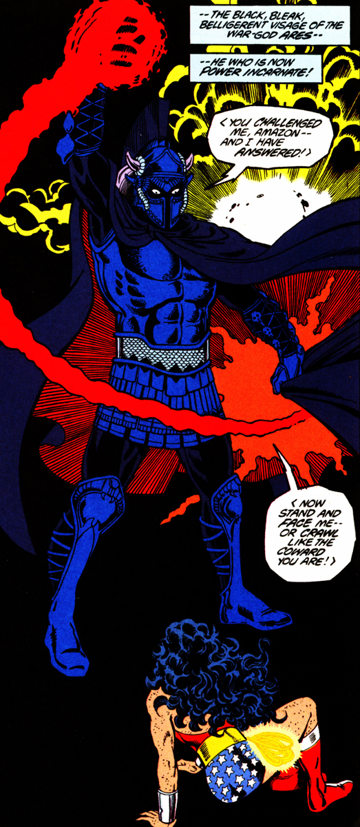
4. Aresdesign by George Perez. Breaking a self-imposed rule for this one: I had meant to choose only characters that had made an impact on me from reading the comics they appeared in, but I haven't actually read any of Perez's Wonder Woman and only know his version of Ares from seeing images online. But I decided to make an exception this time because it really is one of the best character designs I've seen and also because I don't think the ancient Greek Gods have been well depicted in comics, for the most part, in spite of the large numbers of artists that have attempted to do so over the years. Perez himself, for example, didn't manage to come up with anything very compelling for the other members of the Olympian pantheon, from what I've seen.   So this makes Perez's Ares perhaps the only impressive visualisation of any of the Olympian Gods I've ever seen in comics. I could quibble that the complete darkness inside the helmet seems more appropriate to Hades than to Ares, but it definitely makes his version believable as the deadly God of War whose henchmen are the very personifications of Fear and Terror. Now if only someone would come up with equally effective comic-book designs for the other Greek Gods ...
|
|
