|
|
Post by sabongero on Jun 20, 2018 19:03:53 GMT -5
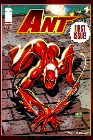
 Ant #1"Reality Bites" (part one) Ant #1"Reality Bites" (part one)August 2005 Writer: Mario Gully & Marck Hammond Illustrator: Mario Gully Inker: Mario Gully Colorist: Stefani Rennee Letterer: Dino, Payton Gauldin Editor: Michael Patrick Sullivan Synopsis: Hannah Washington is a young lady with serious memory issues. She cannot remember what occurred the day before, and her recollection only gives her bits of pieces of her past. The images of the superhero, Ant, is preying all over her senses, and seeing it everywhere in New York City. Coming across two children pulling apart a toy reminded her of her catastrophic accident as a child. Her unpredictable wandering was caused by her memory loss, that she ended up at a comic book convention where Ant's weapons supplier and partner was promoting a book release about his time as Gadget Man, Ant's partner. But Hannah remembered him as a sidekick. Perhaps he can answer her questions. Trouble happened immediately as a slugfest is underway with the super-villain, Jessica Mime and her goons attack the sidekick, and Ant suddenly showed up, and the well rendered fight scene is underway, showcasing Ant is highly skilled in martial arts. The issue ended with another super-villain appearing to join the battle against Ant, and it looked like a formidable one in the insect food chain. Comments: Comic Den went out of business back in January 2016, and I bought a few boxes of Image comic books at bargain boxes. Needless to say, those boxes has gathered dust for almost two and half years, until I decided to read some Image comic books this month. I went through the second box, and a spellbinding instant happened. Going through each boarded and plastic bagged Image comic book, one "jumped" at you and somehow appealed to your senses. It's something you don't know exactly why it jumped at you, but your intuition felt positive about it. First issues must be great. It has to distinguish itself and have some sort of direction to catch my attention as a reader in at least half the issue or at the very least, after reading the entire issue. Ant #1 may very well have done that. It gave us the lowdown, but not much story. I have been reviewing New Avengers lately, and unlike the third issue of that series, Ant #1 gave me enough to want to read more of the series. There's really nothing much known about Hannah Washington other than the near-death she suffered from a car accident as a child. She is also somewhat amnesiac, with memories playing tricks on her. The opening page monologue of the issue stated she can't remember where she got her clothes from. She sees Ant's poster and billboards all over New York City. Is she Ant? We don't know yet. But my curiosity is piqued indeed. Gully's illustrations is fantastic, albeit with many seductive imagery for an amnesiac woman with memory loss. I mean he really puts the "rip" in her rip jeans, with rips in the posterior, and in the locker room area, the rip appeared to be in the crotch area. Anyway... Gully has great point of view illustrations of Ant from different angles where she comes across as an alien insect in her poses. The costume design is eerie and comes across like an alien-like insect such as a praying mantis. The colors are standard, but Ant's sinister red eyes comes across as scary. Tomorrow is the first day of summer. And I am going to enjoy this summer. And perhaps that is why I have a pretty good feeling about the rest of this series. |
|
|
|
Post by sabongero on Jun 20, 2018 20:44:14 GMT -5
 Brigade #1 Brigade #1
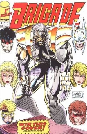
"Sabotage"August 1992 Writer: Rob Liefeld, Hank Kanalz, & Eric Stephenson Penciller: Marat Mychaels Inker: Paul Scott & Norm Rapmund Colorist: Brian Murray & Digital Chameleon Letterer: Kurt Hathaway Editor: Eric Stephenson Synopsis: Battlestone is on a morning jog and came across two teammates fighting. He ended that tussle quickly and an alert came in from the nation's capital that terrorists have hijacked a building with the requisite threat to blow it up. Battlestone decided to have his team take immediate action with the absence of the Youngblood team. The media coverage was awaiting the arrival of Youngblood, but they no-showed. Brigade appeared and was about to take action, albeit with some members not agreeing to Seahawk talking to the media as if he was the team leader. Once inside the building, team Brigade defeated the terrorists as easily as Superstar Professional Wrestlers defeated "jobbers" or enhancement wrestlers in the old school world of professional wrestling. There were no bombs to be found. However, a terrorist escaped and ran away to the lower levels of the building, but was pursued by team leader, Battlestone. The terrorist proved to be the bomb, and exploded himself. Outside, the remaining members thought Bloodstone perished in the explosion and the broken remnants of the collapsed building. But he emerged unscathed. This whole battle apparently was being watched from a great distance from another part of the galaxy as someone named Genocide was monitoring from his TV screen and deemed that Brigade was finally something worthy to challenge him, Genocide. And he's heading to Earth to battle them. Comments: Marat Mychaels illustrations are in the 1990's Rob Liefeld exaggerated art style. It has 1990's "edginess" known for big muscles and oversexed females in superhero costumes. Surprisingly, we are missing the big pouches and big guns which are trademark Rob Liefeld 1990's style "edginess" art. The Brigade team comes across as generic X-Men team clone. Some of the characters look like Wolverine, Cyclops, and Mister Sinister. One of the females is almost an exact duplicate of Marvel's Namorita (without the mini-wings at the ankles), which is the Sub-Mariner's cousin. However, only team leader Battlestone, is drawn extra-musclebound as compared to the other male characters in the issue. But it is not as overly exaggerated as Rob Liefeld's "Heroes Reborn Captain America." The two women looked almost the same in terms of facial features. Seahawk looked like Jim Valentino's Shadowhawk. Enough of the generic art, of which the designs did not really capture my attention for a first issue. Perhaps the story can be something worthy of a first issue. Not really... but at least there was an ending. And a potential next "big baddie super-villain" is looming for future encounter(s) with Brigade. But it still didn't come across as worthy of a memorable first issue of a series. Nothing much happened that captured the readers attention aside from a generic team-get-together, followed by a danger alert, response to the danger and with requisite battle where the bad guys lose, and a looming next big-baddie-super-villain to threaten the good guys from afar. Perhaps in future issues it can capture my attention moreso. |
|
|
|
Post by comicsandwho on Jun 20, 2018 22:40:41 GMT -5
Larsen also did a small bit of work at Eclipse, on DNAgents. He got work at DC, before moving to Marvel. He did have a Dragon story (not yet Savage Dragon) in Megaton #2. McFarlane ... he was very forthcoming in praising those guys in the video he did with Stan Lee, in his Comic Book Greats series. I met Giordano once, but he was pretty busy with his table, so I didn't get to say more than two words. He was rather hard of hearing, related to scarlet fever, as a child (and probably age). I had all the early DNAgents, up to #12 at least, but I must've missed the Larsen contribution. It does fit in though with Mark Evanier being at the second big convention here when Erik Larsen was back again. Glad I remembered Megaton correctly. Yes, Mr. Giordano was hard of hearing. It's funny how many people very attached to the comic strip or book form were ill a lot as children. I know I was. Like Ringo Starr though I plan to live a long time. Keith Richards, of course, will outlive the universe.  I met Dick Giordano and Marv Wolfman at a signing in a now long-defunct comic shop in the Bay Area ('Comics & Comix', Palo Alto, CA), in January of '85, as Crisis was just coming out. I'd just turned 11, and was by far the youngest one there, which seemed to amuse Mr. Giordano, who said something like 'Look how YOUNG he is!'...but in a well-meaning, not ironic, or 'snarky' way(It was 1985, and everyone wasn't jaded quite yet). There wasn't really time for individual Q & A(It was almost like a press conference, with people just standing around the table Giordano and Wolfman were sitting at), but Giordano seemed a little more 'into it' than Wolfman, who answered questions patiently, if somewhat blandly.(I asked something like 'What the heck iS 'Earth-B';anyway?', and Marv responded that it wouldn't be in the series, and was more like an 'inside joke' at DC than an, uh, 'actual' parallel Earth. I'd kind of been looking forward to finding out about Earth-B, so I hid my disappointment, and, in the long run, enjoyed Crisis maybe a little more than I disliked it(but I still wouldn't have killed Supergirl, or got rid of Earth-2...there, I said it!) The one other thing I remember learning that night was the existence of a 1950s TV pilot of 'Super Pup', featuring actors in(paraphrasing Marv) 'Paiper-mache dog head masks'...how was that NOT made? |
|
|
|
Post by beccabear67 on Jun 21, 2018 11:31:58 GMT -5
That Brigade cover screams '90s comic, let's just call that one the perfect representative. Always the glowering pouty mouths too along with the gritted constipation teeth. Lim Lee oversized cross-hathcings, check. Battle damage, check. Hair product '90s music video do's, check. Enormous muscles with veins even through a costume, check. No feet, check! Does that prove the lack of feet knock?  I never got to express my distaste to anyone at DC about Supergirl being paraded around dead on a couple covers for the sake of sales (making 'history'). That was about the fourth or fifth female character I cared about that got killed for me and was about when I seriously cut back on buying much of anything (down to Swamp Thing at DC and Moonshadow and Starstruck at Marvel/Epic right before I just quit bothering to look much anymore). |
|
|
|
Post by codystarbuck on Jun 21, 2018 12:15:05 GMT -5
That Brigade cover screams '90s comic, let's just call that one the perfect representative. Always the glowering pouty mouths too along with the gritted constipation teeth. Lim Lee oversized cross-hathcings, check. Battle damage, check. Hair product '90s music video do's, check. Enormous muscles with veins even through a costume, check. No feet, check! Does that prove the lack of feet knock?  I never got to express my distaste to anyone at DC about Supergirl being paraded around dead on a couple covers for the sake of sales (making 'history'). That was about the fourth or fifth female character I cared about that got killed for me and was about when I seriously cut back on buying much of anything (down to Swamp Thing at DC and Moonshadow and Starstruck at Marvel/Epic right before I just quit bothering to look much anymore). That I can wholly understand. It got worse, later, with senseless killings and brutalizations, such as Batgirl's, in The Killing Joke, the original "woman-in-a-refrigerator" in Green Lantern; and, my ultimate disgusting example, the brutal murder and retro-rape of Sue Dibny. At the same time, there were better comics out there, who treated female characters with respect, even when they were flawed. Rosana Winter, in Scout, Christine Spaar, in Grendel, Jennifer Mays, in the Maze Agency, Chance Falconer in Leave it to Chance, Francine and Kachoo, in Strangers in Paradise, any number of them, in Sandman. You just had to be willing to sort through all of the comics with gun-toting psychopaths (the heroes) and strippers masquerading as superheroines to find them. |
|
|
|
Post by Deleted on Jun 21, 2018 12:49:10 GMT -5
Gully's illustrations is fantastic, albeit with many seductive imagery for an amnesiac woman with memory loss. I mean he really puts the "rip" in her rip jeans, with rips in the posterior, and in the locker room area, the rip appeared to be in the crotch area. Anyway... Gully has great point of view illustrations of Ant from different angles where she comes across as an alien insect in her poses. The costume design is eerie and comes across like an alien-like insect such as a praying mantis. The colors are standard, but Ant's sinister red eyes comes across as scary. Tomorrow is the first day of summer. And I am going to enjoy this summer. And perhaps that is why I have a pretty good feeling about the rest of this series. I love Gully's work on Ant and thanks for jarring my memory here and what you've written here is spot-on and I loved the work he did with it and the red eyes are icing to the cake. One of my rare loves of IMAGE COMICS those days. |
|
|
|
Post by rberman on Jun 21, 2018 13:45:59 GMT -5
That Brigade cover screams '90s comic, let's just call that one the perfect representative. Always the glowering pouty mouths too along with the gritted constipation teeth. Lim Lee oversized cross-hathcings, check. Battle damage, check. Hair product '90s music video do's, check. Enormous muscles with veins even through a costume, check. No feet, check! Does that prove the lack of feet knock?  I have a Liefeld-o-meter which is an eight point scale used to score a comic book cover: Tiny head? Wrestling headgear? Clenched Teeth? Oversized Muscles? Oversized Gun(s)? Absent feet? Garters? Pouches? |
|
|
|
Post by sabongero on Jun 21, 2018 14:08:52 GMT -5
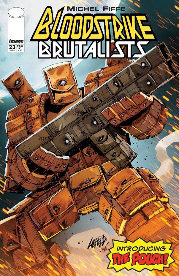
That Brigade cover screams '90s comic, let's just call that one the perfect representative. Always the glowering pouty mouths too along with the gritted constipation teeth. Lim Lee oversized cross-hathcings, check. Battle damage, check. Hair product '90s music video do's, check. Enormous muscles with veins even through a costume, check. No feet, check! Does that prove the lack of feet knock?  I have a Liefeld-o-meter which is an eight point scale used to score a comic book cover: Tiny head? Wrestling headgear? Clenched Teeth? Oversized Muscles? Oversized Gun(s)? Absent feet? Garters? Pouches?Liefeld-ian superhero like no other:  |
|
|
|
Post by codystarbuck on Jun 21, 2018 14:48:56 GMT -5
That Brigade cover screams '90s comic, let's just call that one the perfect representative. Always the glowering pouty mouths too along with the gritted constipation teeth. Lim Lee oversized cross-hathcings, check. Battle damage, check. Hair product '90s music video do's, check. Enormous muscles with veins even through a costume, check. No feet, check! Does that prove the lack of feet knock?  I have a Liefeld-o-meter which is an eight point scale used to score a comic book cover: Tiny head? Wrestling headgear? Clenched Teeth? Oversized Muscles? Oversized Gun(s)? Absent feet? Garters? Pouches? Mine has an extra setting for oversized guns that couldn't possibly work (barrel out of perspective with receiver, magazine out of skew, etc...). For the interiors you need about a hundred-point scale, to include: Costume changes from panel to panel Ridiculously inaccurate historical costumes (i.e. Nazis in brown uniforms with silver helmets, on the battlefield) Unexplained mist or dust Mullet 84 teeth, all molars No nose unless in profile Deltoid muscles much smaller than biceps Head set farther back on torso than spine |
|
|
|
Post by Deleted on Jun 22, 2018 1:20:30 GMT -5
That Brigade cover screams '90s comic, let's just call that one the perfect representative. Always the glowering pouty mouths too along with the gritted constipation teeth. Lim Lee oversized cross-hathcings, check. Battle damage, check. Hair product '90s music video do's, check. Enormous muscles with veins even through a costume, check. No feet, check! Does that prove the lack of feet knock?  I have a Liefeld-o-meter which is an eight point scale used to score a comic book cover: Tiny head? Wrestling headgear? Clenched Teeth? Oversized Muscles? Oversized Gun(s)? Absent feet? Garters? Pouches? It seems Rob Liefeld consumes way too much of your thoughts,time & energy. Something about him or his work must fascinate you for you to devote time to developing a Liefeld scale to measure score covers by? I mean something must draw you to spend that much time and effort on things Liefeld  -M |
|
|
|
Post by rberman on Jun 22, 2018 7:30:38 GMT -5
I have a Liefeld-o-meter which is an eight point scale used to score a comic book cover: Tiny head? Wrestling headgear? Clenched Teeth? Oversized Muscles? Oversized Gun(s)? Absent feet? Garters? Pouches? It seems Rob Liefeld consumes way too much of your thoughts,time & energy. Something about him or his work must fascinate you for you to devote time to developing a Liefeld scale to measure score covers by? I mean something must draw you to spend that much time and effort on things Liefeld  -M The way I choose to spend my time and energy "way too much" on something probably just reveals that I am a bad person. Now you know! |
|
|
|
Post by codystarbuck on Jun 22, 2018 12:41:00 GMT -5
There was actually a drinking game suggested, in the letters pages of the Comic Buyers Guide, for Liefeld's Team Youngblood (at least, I think that was the book). There was so much bad continuity between pages and even panels that it was suggested you take a drink every time a costume changed or a hairstyle changed. If you actually went through with it, you were drunk by about page 3.
It was hard to miss his stuff, even if you weren't reading it. Image had ads in just about every major comic publication, both distributor catalogs, not to mention and endless stream of pieces in Wizard and others. Then, if you read some other Image title, there were all of the ads in them. I stayed far away from Liefeld's work; but, I couldn't escape it, completely. It took a while for that to die down.
|
|
|
|
Post by rberman on Jun 22, 2018 14:18:04 GMT -5
There was actually a drinking game suggested, in the letters pages of the Comic Buyers Guide, for Liefeld's Team Youngblood (at least, I think that was the book). There was so much bad continuity between pages and even panels that it was suggested you take a drink every time a costume changed or a hairstyle changed. If you actually went through with it, you were drunk by about page 3. My Liefeld-o-meter originated on the Facebook group for posting "The best comic book covers ever." People would post Liefeld covers as a joke, with a frequency that was starting to annoy people, so I figured we could at least make a game out of it to salvage some fun back from the griefers. It seemed to help keep the peace between the two sides. |
|
|
|
Post by beccabear67 on Jun 22, 2018 14:18:40 GMT -5
As I wrote someplace recently, I bought a couple of mid '90s Marvel X-titles recently by artists I had liked a lot in the '80s, Jan Duursema and Terry Shoemaker, and it looked like they were under orders to copy that Image look, and it made what might have been good stories ludicrous with the two main mouth expressions and huge muscles on all males and broken backs on all females. That whole approach may have started with Art Adams and Frank Miller's original Dark Knight, then Jim Lee came in, but it seems like Leifeld and Image took it to a depressing, and for many alienating, extreme. I never even saw an actual comic of his until fairly recently, but I could see the effect of his and those along the same lines' overdone style in the windows of shops I quit going into, and pages of comics I used to enjoy and could relate to.
I think the form is still trying to recover from those late '80s and '90s years of excess and sheer exploitation/going dark. I would think here people would at least not denigrate a Sal Buscema or Jim Aparo, but I did hear these serious dark superheroes for adults people denigrate them along with anything for kids. If you find bad anatomy and other sloppy visual elements, plain unreadable stories, that seems fair game anywhere to me. A lot was taken, how much returned towards future sustainability?
|
|
|
|
Post by rberman on Jun 22, 2018 14:35:08 GMT -5
As I wrote someplace recently, I bought a couple of mid '90s Marvel X-titles recently by artists I had liked a lot in the '80s, Jan Duursema and Terry Shoemaker, and it looked like they were under orders to copy that Image look, and it made what might have been good stories ludicrous with the two main mouth expressions and huge muscles on all males and broken backs on all females. That whole approach may have started with Art Adams and Frank Miller's original Dark Knight, then Jim Lee came in, but it seems like Leifeld and Image took it to a depressing, and for many alienating, extreme. I never even saw an actual comic of his until fairly recently, but I could see the effect of his and those along the same lines' overdone style in the windows of shops I quit going into, and pages of comics I used to enjoy and could relate to. I think the form is still trying to recover from those late '80s and '90s years of excess and sheer exploitation/going dark. I would think here people would at least not denigrate a Sal Buscema or Jim Aparo, but I did hear these serious dark superheroes for adults people denigrate them along with anything for kids. If you find bad anatomy and other sloppy visual elements, plain unreadable stories, that seems fair game anywhere to me. A lot was taken, how much returned towards future sustainability? It seems to me that part of the challenge was a desire to push the art form forward. Every artist wants to make a novel contribution to his field, not just ape his predecessors. Think about how the compositional forms of the baroque era (Pachelbel, Bach) gave way to the classical period (Mozart) and then the Romantic period (Brahms, Mussorgsky). Orchestras kept getting bigger. Chord stacks longer. Later composers were stifled by the bigness of it all. So they changed the game, composing according to rules that were "wrong" compared to their predecessors. Atonality, tone rows, etc. Prokofiev, Britten, Schoenberg. Then electronic compositional techniques changed the game even more radically, with musique concrete and analog electronica under Stockhausen, Schaeffer, and the like. Then the minimalism of Cage and Reich. You can see the same impulses in pop music as the crooners of the 1940s gave way to rock and roll, which evolved into lush disco and prog rock by the mid 70s before collapsing into punk minimalism and New Wave, growing again into hair metal before giving way to grunge and hip-hop and now EDM. Or in the world of painting, where the ultra-realism of the Dutch Masters gave way to increasingly less photorealistic styles, from Impressionism to Cubism, Dada, and the cornucopia of modern styles that are more about how the art makes you feel than about how well it reproduces the appearance of the natural world. So in comic books, where could the art form go after Neal Adams and George Perez? New printing technologies emerged slowly to improve colorization, resolution, and sharpness. But that was too slow in coming, and the new generation of artists couldn't climb higher than their predecessors under the old aesthetic system. So they opted out and created a new visual vocabulary of imaginary muscles and absurd postures. The buying public responded, to an unfortunately vigorous degree which inspired a wave of imitators. You could argue that Rob Liefeld is the Sid Vicious of comic books. He may be incompetent at the old game, just as you wouldn't tap the Sex Pistols to back Frank Sinatra or Luciano Pavarotti. But he did plant a flag for a new game which, love or hate it, became a recognizable school of art. |
|
