|
|
Post by Reptisaurus! on Feb 12, 2019 19:45:07 GMT -5
This just came up somewhere but I forget where.
It is probably Herge for me. I wouldn't know his name but I definitely could recognize Tintin artwork as "The Guy Who Drew Tintin." Meanwhile most superhero artists completely blended together for me as a kid.
|
|
|
|
Post by Icctrombone on Feb 12, 2019 19:51:19 GMT -5
I'm going to guess it was Kirby with Starlin being the less prolific artist that I recall recognizing.
|
|
|
|
Post by Paste Pot Paul on Feb 12, 2019 20:11:39 GMT -5
Comics it was George Perez, Avengers in the late '70s. His absences were glaringly obvious, unfortunately for me, it was the time when he almost burnt himself and his career out, and then they replaced him with some dude with really ugly work (John Byrne), only to have him back for a couple of issues then he was gone for good.
It wasn't till I fell in love with his X-Men work that I came to like Byrne, I suspect his inkers on Avengers weren't a good match.
Of course, Perez got even better on the Titans, which seemed an impossibility at the time.
Artist would have been Frank Frazetta because Conan.
|
|
|
|
Post by Chris on Feb 12, 2019 20:31:35 GMT -5
Tough to recall for sure, and I was able to tell the difference among art styles right off the bat even if I couldn't actually name an artist yet, but I believe it was probably Neal Adams or Kurt Schaffenberger. Probably Adams, by a nose.
If I had started reading comics a few months later, it likely would have been Jose Luis Garcia-Lopez.
|
|
Confessor
CCF Mod Squad
Not Bucky O'Hare!
Posts: 10,220 
|
Post by Confessor on Feb 12, 2019 20:36:17 GMT -5
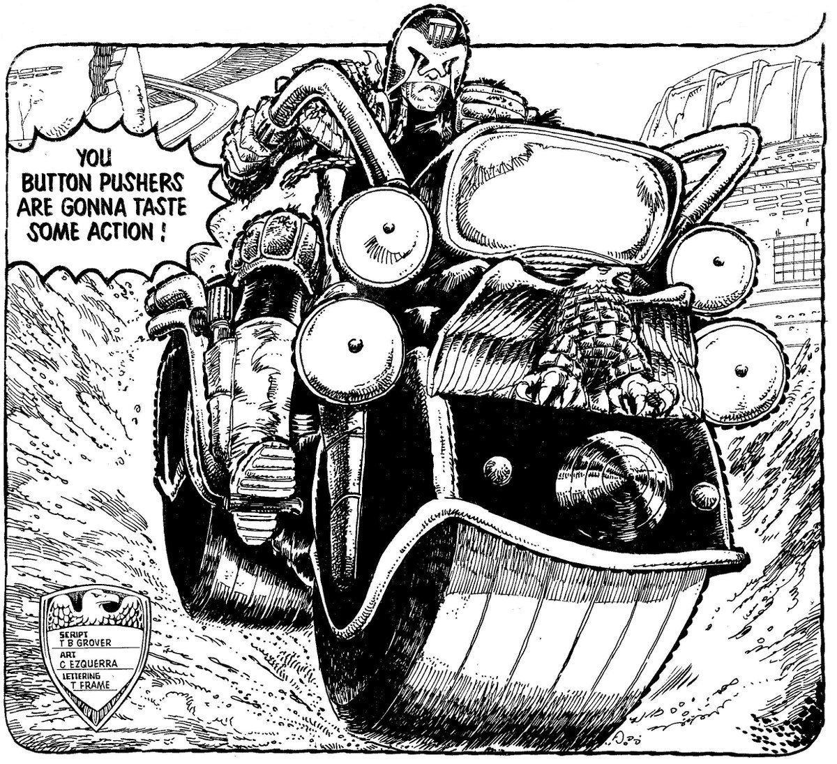
It is probably Herge for me. I wouldn't know his name but I definitely could recognize Tintin artwork as "The Guy Who Drew Tintin." Meanwhile most superhero artists completely blended together for me as a kid. Yeah, Hergé's art is very recognisable. The reason it stood out to you as a kid though was because he was drawing using the ligne claire style, a school of cartooning that places emphasis on cinematic realism in the settings and backgrounds, contrasted with slightly cartoonish characters in the foreground, and is drawn using strong, clear lines of the same width, with no hatching or cross-hatching. That's why it looked so noticeably different to the American comics you were reading: it wasn't drawn in the same style at all. Myself, I think Al Williamson was the first artist whose style I could recognise (even though I didn't learn his name until years later because I used to skip over the credits in comics). I first encountered Williamson's work when I was 8-years-old, in Marvel's 1980 adaptation of The Empire Strikes Back, and what made his work so easy to recognise was a combination of his meticulously photo-realistic style, the brooding use of shadow, and all that wonderfully crumpled clothing he put his characters in...  When I encountered Williamson's art again over the next few years, in other parts of the Marvel Star Wars run, or in Flash Gordon reprints or the Star Wars newspaper strip, I definitely remember recognising it as the same guy who drew ESB. Around the same time, over in the pages of 2000AD, Carlos Ezquerra's artwork was always pretty distinctive too -- it was the "bumps" he put around the outlines of his characters that was the dead giveaway (see Judge Dredd's helmet and motorcycle below as an example)...  |
|
|
|
Post by Deleted on Feb 12, 2019 20:40:52 GMT -5
Michael Sekowsky --- with the early days of the Justice League
Jack Kirby --- with the Fantastic Four, and then the Avengers
George Perez --- with many titles
José Luis García-López --- I can recognize his work anywhere
John Byrne --- his work on Superman
These are my top five artists that I can think on the top of my head.
|
|
|
|
Post by speakerdad on Feb 12, 2019 21:16:34 GMT -5
I feel like Kirby was the first artist that I recognized (maybe Ditko AT around the same time).. After that, it was probably Byrne.
|
|
zilch
Full Member
Posts: 244 
|
Post by zilch on Feb 12, 2019 21:41:24 GMT -5
Neal Adams on his early 70's Superman covers or Mike Sekowsky on Wonder Woman (whose work i compared to a pinball machine's artwork from the local swimming pool)
|
|
|
|
Post by Deleted on Feb 12, 2019 21:48:44 GMT -5
Neal Adams
|
|
|
|
Post by kirby101 on Feb 12, 2019 22:10:46 GMT -5
In my early reading, it was probably Kirby FFs and Ditko Spider-Man.
When I became a regular reader/collector in my teans I could recognize most artist.
Especially Barry Smith and the Marvel Bullpen.
Wait, I take that all back.
The first artist I could recognize was Mad's Don Martin.
|
|
|
|
Post by rberman on Feb 12, 2019 22:43:07 GMT -5
|
|
|
|
Post by Farrar on Feb 12, 2019 22:48:56 GMT -5
A few days ago in another thread I'd mentioned that inker Jack Abel was probably the first artist whose work I could recognize. This was back when he took over as the main inker for the Weisinger books (when George Klein, one of the group of regular DC freelancers who asked for health benefits, etc. was so ignominiously told to go elsewhere***). At the time DC didn't usually post credits in-story, at least not for the Weisinger books, but I could recognize Abel's work whether he was inking Swan or Win Mortimer (two very different pencilers). He had such a thin line; and as I mentioned in my other post his face work was very distinctive--especially the female character's eyelashes.
Over at Marvel I always recognized Vince Colletta's work no matter who he inked. In my early comic reading days I came across his inks on John Buscema, Don Heck and Gene Colan (that Medusa story in Marvel Superheroes). I could recognize Colletta's work because of how he texturized hair, adding lines plus a tiny bit of stipling; the full lips he gave many of his characters; and again, the females' lush eyelashes. I loved his '60s work.
In terms of pencilers, well, has to be Kurt Schaffenberger. In the Silver Age I'd read a few issues of Lois Lane and then when I got #78 I remember thinking how different Lois looked on the cover. It was because Curt Swan drew that particular cover and not Kurt (who usually drew both interiors and covers of the LL book up until that time). I could tell #78's cover was not Kurt's work, even if I didn't know the names of the artists back then.
***He went over to Marvel and became John Buscema's inker on the Avengers; and was, IMO, Buscema's best inker
|
|
|
|
Post by Reptisaurus! on Feb 12, 2019 23:46:54 GMT -5
It is probably Herge for me. I wouldn't know his name but I definitely could recognize Tintin artwork as "The Guy Who Drew Tintin." Meanwhile most superhero artists completely blended together for me as a kid. Yeah, Hergé's art is very recognisable. The reason it stood out to you as a kid though was because he was drawing using the ligne claire style, a school of cartooning that places emphasis on cinematic realism in the settings and backgrounds, contrasted with slightly cartoonish characters in the foreground, and is drawn using strong, clear lines of the same width, with no hatching or cross-hatching. That's why it looked so noticeably different to the American comics you were reading: it wasn't drawn in the same style at all. Yeah, yeah, good analysis. Is that common in Europe? I can't think of any European artists who's stuff looks quite like Tintin, but I dunno what % of EuroComics even make it over here in any form. |
|
Confessor
CCF Mod Squad
Not Bucky O'Hare!
Posts: 10,220 
|
Post by Confessor on Feb 13, 2019 0:19:21 GMT -5
Yeah, Hergé's art is very recognisable. The reason it stood out to you as a kid though was because he was drawing using the ligne claire style, a school of cartooning that places emphasis on cinematic realism in the settings and backgrounds, contrasted with slightly cartoonish characters in the foreground, and is drawn using strong, clear lines of the same width, with no hatching or cross-hatching. That's why it looked so noticeably different to the American comics you were reading: it wasn't drawn in the same style at all. Yeah, yeah, good analysis. Is that common in Europe? I can't think of any European artists who's stuff looks quite like Tintin, but I dunno what % of EuroComics even make it over here in any form. It became a very popular style in mainland Europe, up until the '70s, yes, particularly in Belgium and France. But was less popular in the UK, although the Tintin books are very popular over here, of course, but they were the exception, rather than the rule. The ligne claire style was actually developed by Hergé in 1934 in The Blue Lotus, and was then taken up by many bande dessinée artists, such as Edgar P. Jacobs, Jacques Martin, Jef Nys, and Albert Uderzo (who accentuated the cartoonish elements of it in the Asterix books) among others. I don't know how popular the Where's Wally? books are in the States (they were a bit of a phenomenon over here in the 1990s), but they utilise the ligne claire style too. |
|
|
|
Post by beccabear67 on Feb 13, 2019 0:46:57 GMT -5
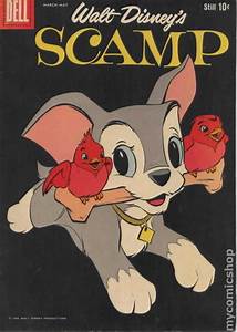
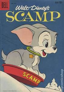
There was a good Scamp artist, i could tell his work was the best. I later knew his name... Al Hubbard.   There was also a good Chip N' Dale artist. I later found out his name from a later animator who idolized him... Jack Bradbury.   I also could tell Kurt Schaffenberger Supergirl from other versions early on. |
|