|
|
Post by profh0011 on May 27, 2019 16:19:16 GMT -5
Great, great stuff, profh0011 ! However, I'm always taken a little aback by the way publishers graphically emphasize the horror aspect in Poe's stories. They never struck me as particularly gory! A good point.
You know, it occurs to me... I really need to go back and at least scroll thru the original text of "The Tell-Tale Heart". I've read multiple comics, and I believe both the complete story AND "edited" book versions.
Quite a few versions have the insane killer attack the old man, causing him to have a heart attack, and then bury the body under the floorboards.
But SOME of them... have him CUT-- UP-- THE BODY-- using a bathtub to catch the blood-- and then bury the parts under the floor.
I'd swear, most versions I've read do not have this. I'd like to know if it's in what Poe wrote or not.
Similarly, there's that French comic that adapted "Arthur Gordon Pym". To help myself with the English translation, I wound up slowly reading the entire novel online, one bit at a time, as I worked on cleaning up, coloring & translating the comic. And there was one bit that surprised me. In the comic-- probably aimed at kids-- the mutineers force the Captain and those loyal to him into a longboat, and the rest join them to become pirates. But in the novel...HALF THE CREW is murdered, before the Captain and a few loyal men are put off the ship.
When I did my translation...I added ONE line of narration, directly from the novel, that was not in the comic. So I personally made the comic MUCH bloodier... even if it was only in the narration, not in the artwork. (I got a kick out of doing that.)  |
|
|
|
Post by profh0011 on May 27, 2019 16:22:56 GMT -5
In the 2000s, Marvel Max published a HAUNT OF HORROR mini-series, where Richard Margopoulos re-teamed with Richard Corben to do a whole new set of Poe adaptations. And every single one of them, I swear, are among the SICKEST, most disturbing horror comics I've ever read. Certainly the darkest, most disturbing variations on Poe I've ever seen. Of course... Marvel Max was usually like that, with everything they did.
I bring this up because, out of the mountain of Poe comics and the like I've found, these may have been the only ones where, after I got done reading them, found myself thinking...
"Do I REALLY want to include this stuff in the project?? YEESH!!!"  |
|
|
|
Post by profh0011 on May 27, 2019 16:33:28 GMT -5
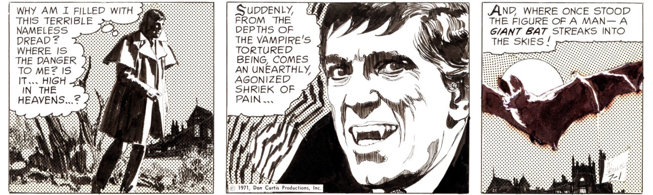
Some of the best work I've ever seen from either John Tartaglione, or Vince Colletta... Poe's THE TOMB OF LIGEIAcover by John Tartaglione & Vince Colletta (Dell / April-June 1965) 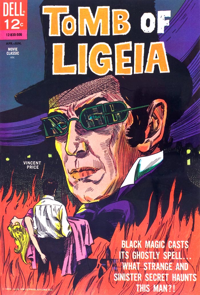 The funeral... 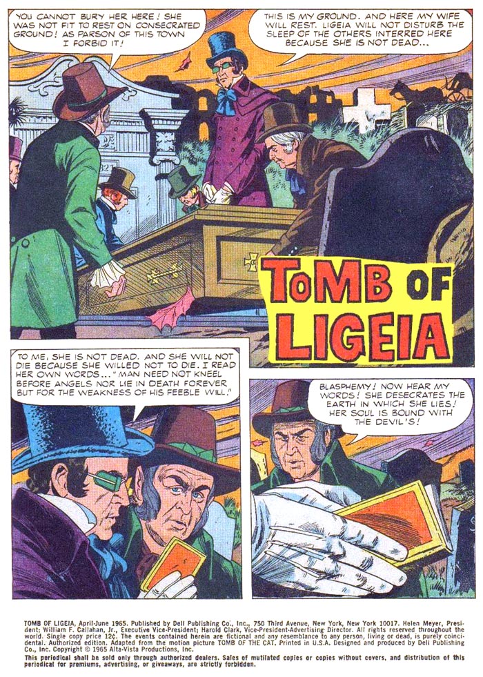 Rowena meets Verden... 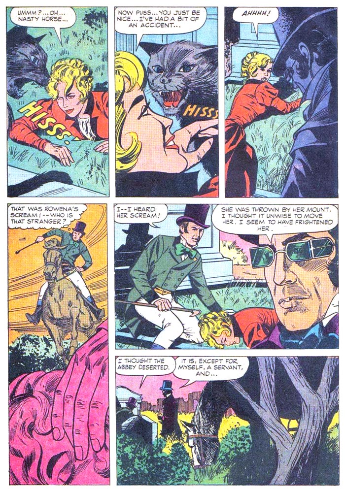 Rowena DECIDES she wants to get married. 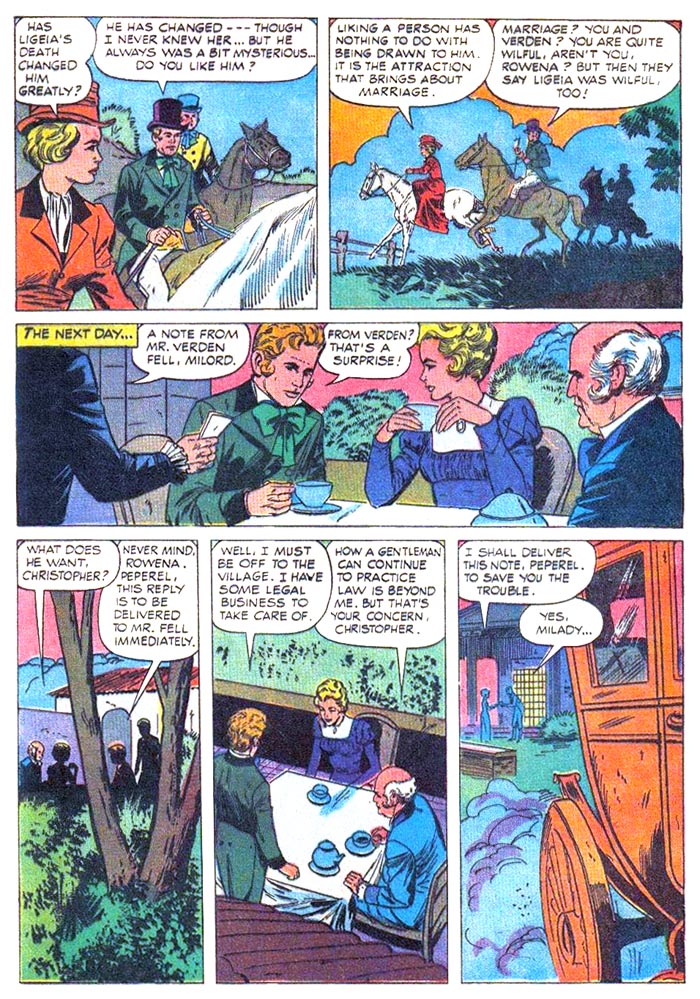 Verden notes a strange occurance in the graveyard... 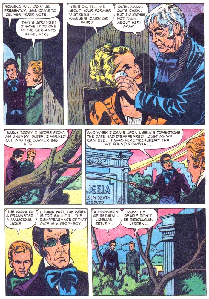 A tribute to Poe's " THE BELLS" (heh)... 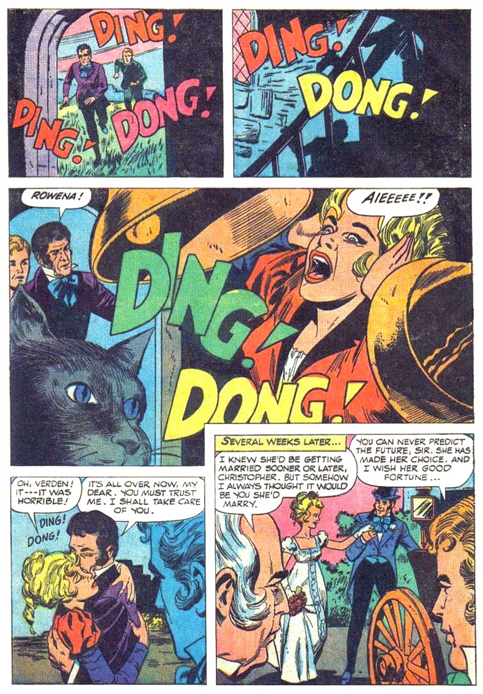 The first real evidence of something supernatural going on in the story... 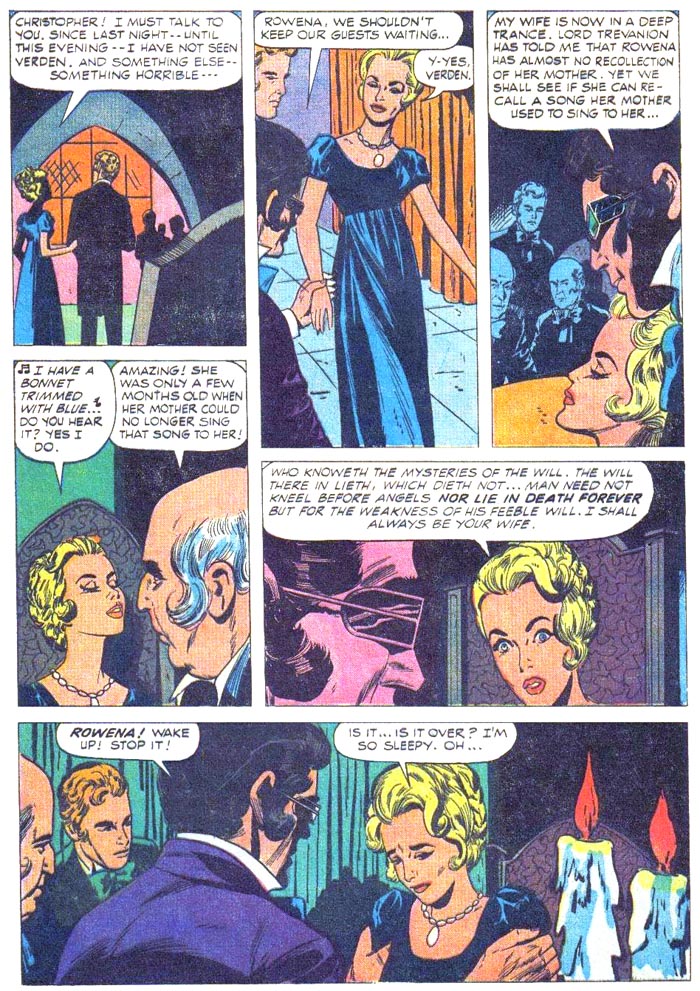 Rowena learns what her husband has been up to (CENSORED for the sake of younger comics readers)... 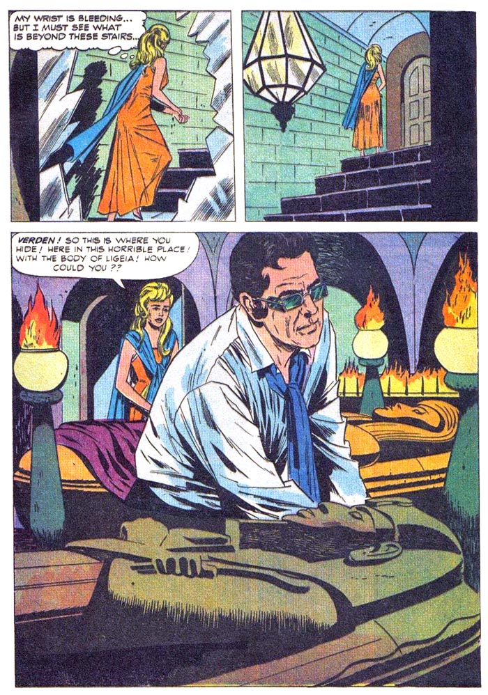 Revenge-- and mutual destruction! 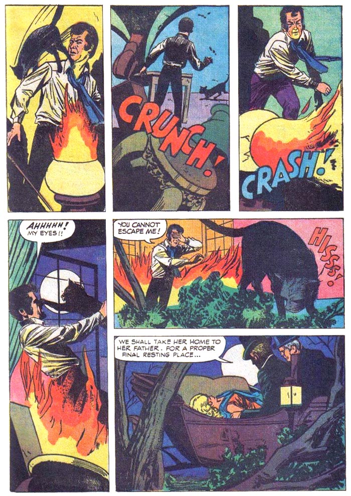 final page 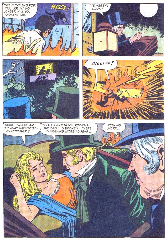 REPRINT CLASICOS DEL CINE 152cover by John Tartaglione & Vince Colletta (Novaro / Mexico / January 15, 1966) 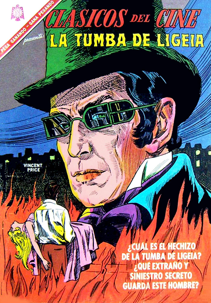 |
|
|
|
Post by tarkintino on May 27, 2019 18:17:50 GMT -5
Some of the best work I've ever seen from either John Tartaglione, or Vince Colletta... Poe's THE TOMB OF LIGEIAcover by John Tartaglione & Vince Colletta (Dell / April-June 1965) The funeral... Rowena meets Verden... I've tried to find the credits for this issue with no luck. Is it certain John Tartaglione & Vince Colletta handled the interiors, as well as the cover? I ask because some of the artists under the Western Publishing umbrella (like its own Gold Key and the partnership with Dell) had worked for both companies. The art for The Tomb of Ligeia bears a little resemblance to the work of Joe Certa, best known for co-creating DC's Martian Manhunter, and being the artist for the entire run of Gold Key's adaptation of Dark Shadows--  Not an exact match, but the styles are not so far apart from each other. |
|
|
|
Post by profh0011 on May 28, 2019 10:09:22 GMT -5
Interesting! I'm gonna take that page and share it over at this one FB group, and see what anyone else thinks.
There's a fan and artist down in Brazil, Toni Rodrigues, who has helped me immensely in this project. Not only has has e-mailed HIGH-RES scans made right off original printings of early-60s books, he's also an expert on the history of Brazillian horror comics, and a whiz at identifying artists.
HOWEVER... there was this ONE story that he wasn't sure of. 2 different names were bandied about... until, maybe 2 YEARS after he sent me the scans, I SUDDENLY one day realized it was a 3rd artist he had not mentioned. It was a guy who had DRASTICALLY changed his style over the years-- like Gil Kane did-- only more so. Kane went thru 3 distinct periods-- "early", "later", and "transitional" (in the middle). And in the case of the Brazillian guy, it turned out I was slowly recognizing elements of BOTH of his, and what I was looking at was apparently a rough, raw, CRUDE transition period where he was trying to develop a new style, but hadn't quite gotten there yet. And the story came out exactly HALFWAY between samples I had of his early and later styles.
I got such a huge kick when I realized who it was, and, that I'd figured out something Toni hadn't!
|
|
|
|
Post by profh0011 on May 28, 2019 10:15:13 GMT -5
Joe Certa's art is nice, but he doesn't seem too keen on actor likenesses. On the other hand, Ken Bald, who did the newspaper strip... WOW.
I have the TPB that collected the DS strip, but sadly, it's one of those where the art was reduced so much it's hard to appreciate it. I miss Kitchen Sink Press. They REALLY knew how to reprint newspaper comics-- a horizontal format, and 2 dailes per page!
 |
|
|
|
Post by profh0011 on May 28, 2019 10:29:32 GMT -5
The "Golden Age" of Poe comics adaptations begins... Warren was the small empire of magazine publisher James Warren. Starting out with AFTER HOURS (one of many PLAYBOY imitations) and FAMOUS MONSTERS OF FILMLAND (the work of editor Forrest J. Ackerman), which celebrated horror and science-fiction movies (old and new), the company made its first stab at ressurecting the dead genre of horror comics with a number of short adaptations of movies. When these went over big with fans, it was decided to look into expanding in that direction with an entire magazine of horror comics. CREEPY was the first result. Freed from constrictions of the Comics Code due to its B&W magazine format, editors Russ Jones and Archie Goodwin managed to recruit the cream of the old EC artists, including Jack Davis, Joe Orlando, Al Williamson, Angelo Torres and Reed Crandall, as well as Gray Morrow and Frank Frazetta. After doing his final comics story in CREEPY #1, Frazetta switched over to cover paintings, carving an entire new career for himself in the process. Mixed in with new stories were a nice spattering of adaptations of classic works, among them those of Edgar Allan Poe. In the late 60s, 6 of these appeared, the first 3 in CREEPY, the other 3 in its brother magazine, EERIE. I feel safe in saying that despite the high caliber of some of the versions seen before this, these may have to rank among the BEST ever done. Funny enough, the cover painting COULD be an illustration of the climactic scene in Poe's "House Of Usher".
From 1965-1982, Warren did 24 POE adaptations!
CREEPY 3cover by FRANK FRAZETTA (Warren / [June] 1965) 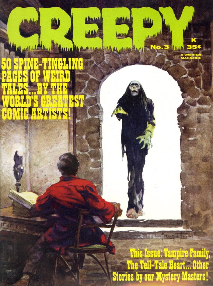 "TELL-TALE HEART!" "TELL-TALE HEART!" / Version 7 Adaptation by Archie Goodwin / Art by REED CRANDALL 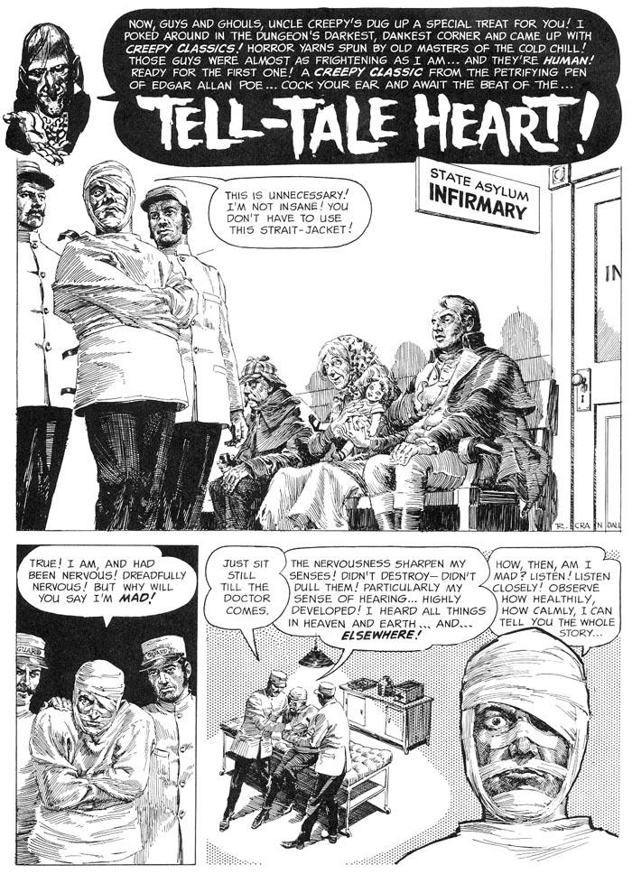 The amount of visual detail Crandall put into his art is mind-boggling! 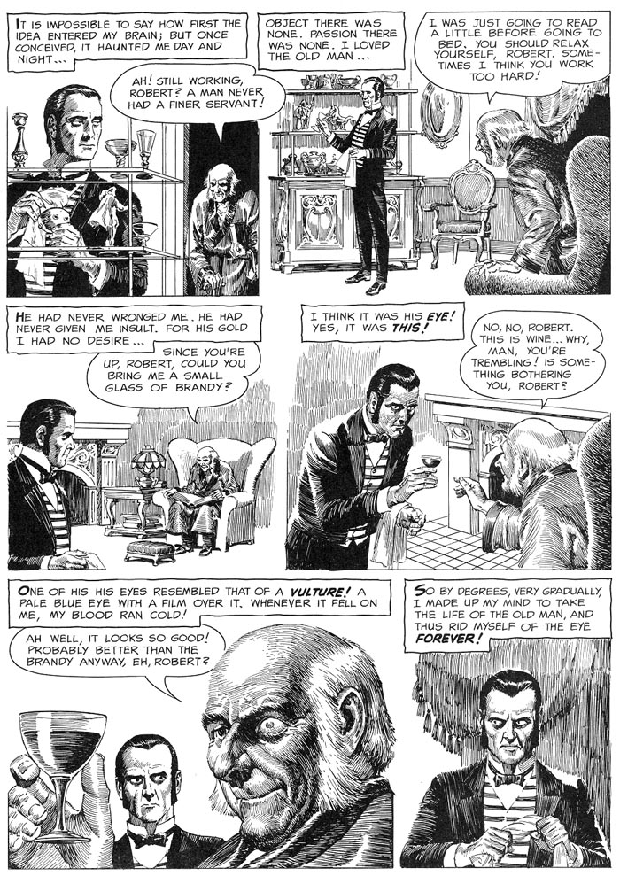 Disposing of the body... 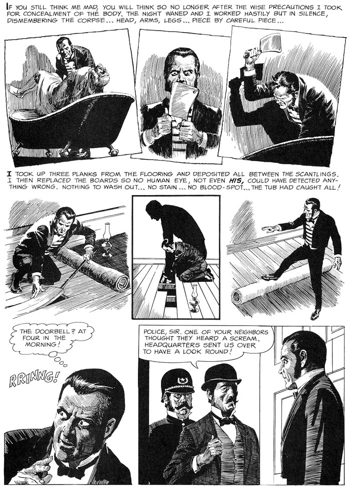 "HERE! HERE!" "HERE! HERE!"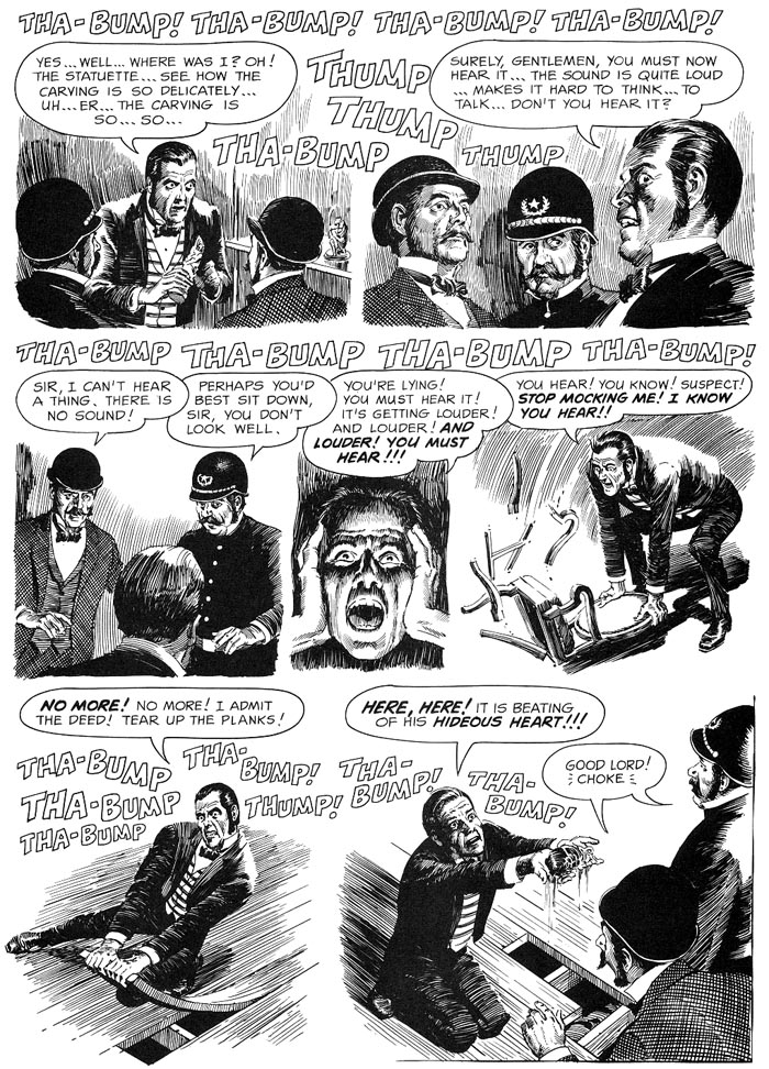 Archie Goodwin decided to add a NEW epilogue... 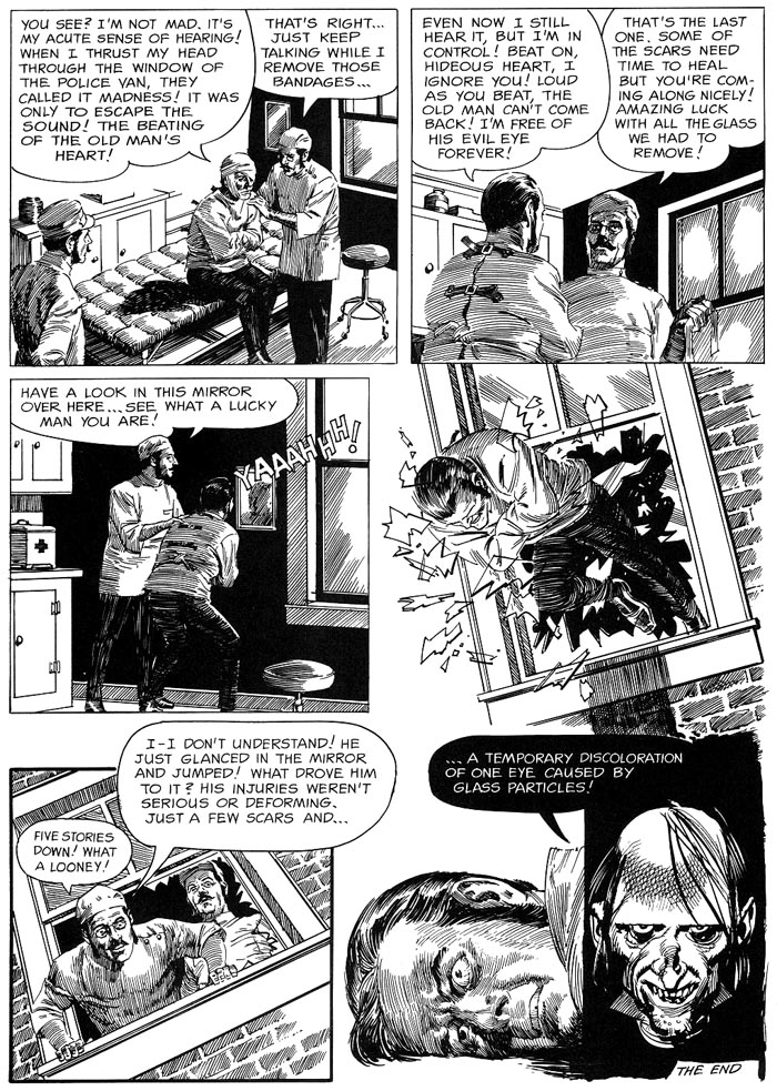 REPRINTS EERIE 13cover by VIC PREZIO (Warren / February 1968) 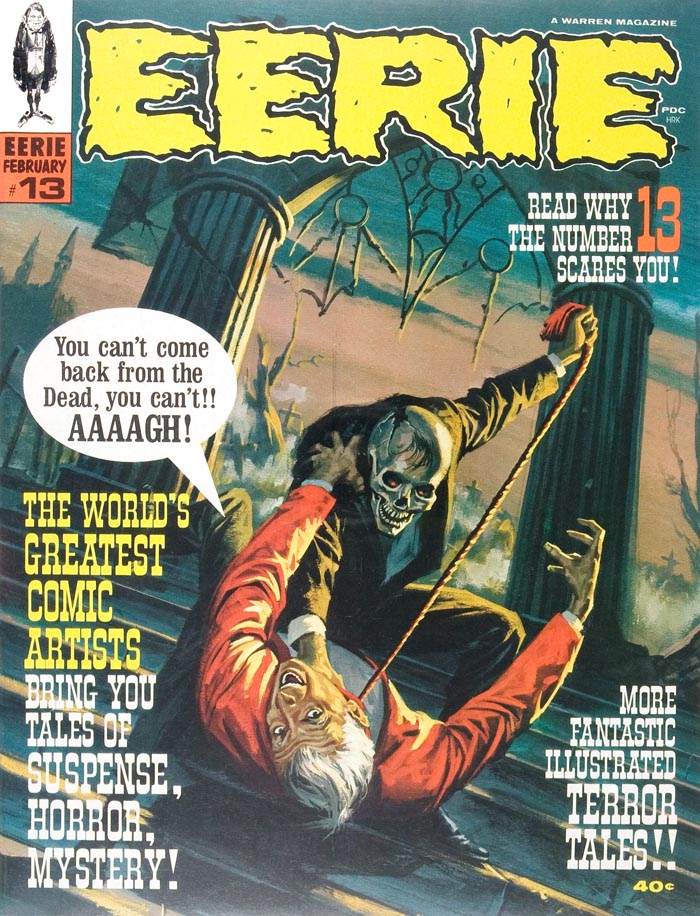 VAMPUS 3 VAMPUS 3cover by FRANK FRAZETTA (Ibero Mundial De Ediciones / Spain / November 1971) 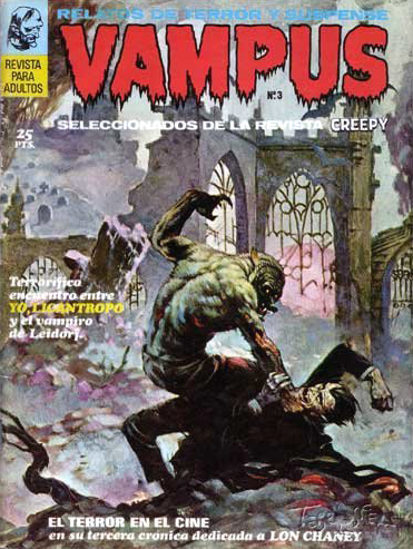 SHOKKI 12 SHOKKI 12cover by MANUEL SANJULIAN (Semic / Finland / [December] 1973) 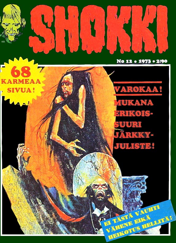 CREEPY 65 CREEPY 65cover by KEN KELLY (Warren / September 1974) 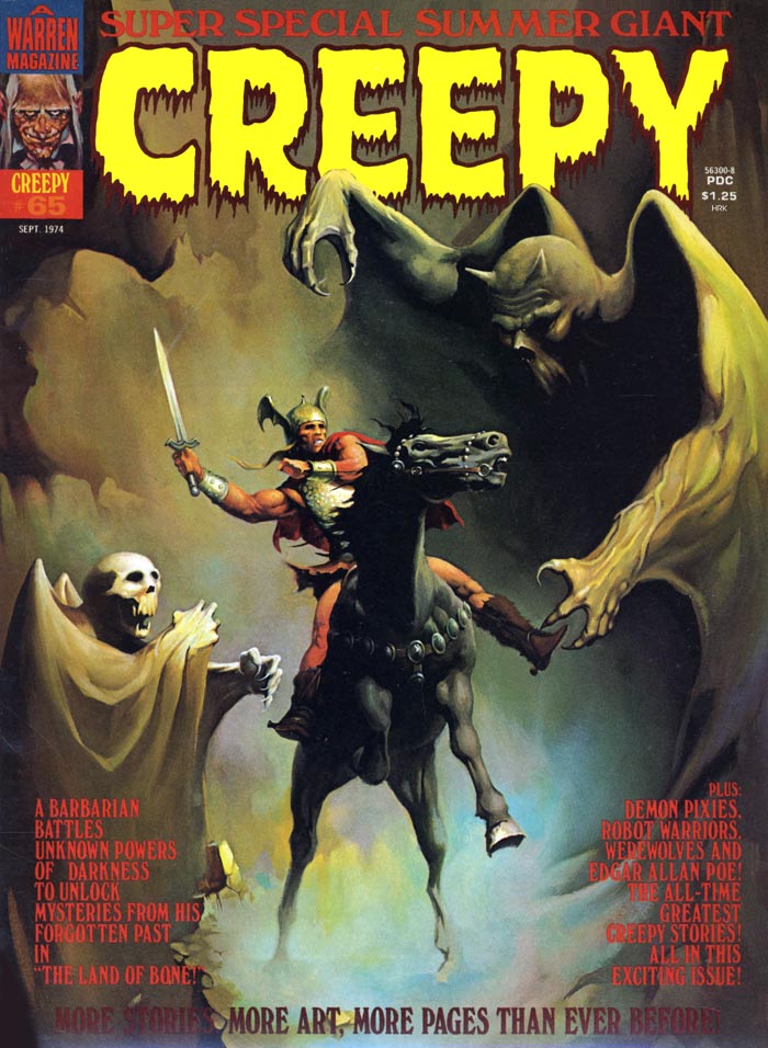 FAMOSOS MONSTERS DEL CINE 7 FAMOSOS MONSTERS DEL CINE 7cover by BASIL GOGOS (Editorial Garbo, S.A. / Spain / November 1975) 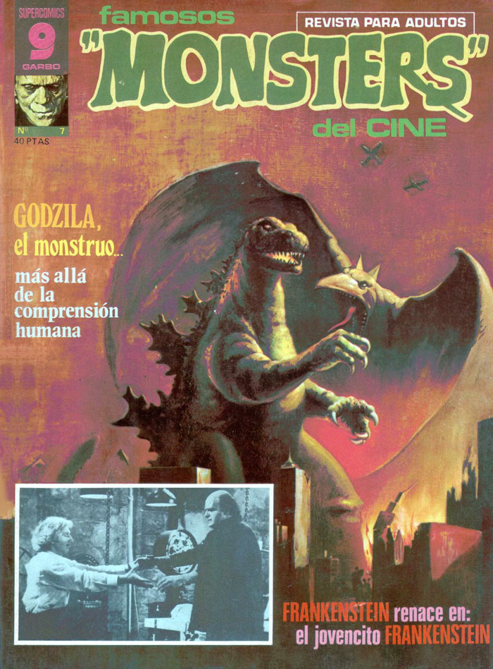 MACABRE 8 MACABRE 8cover by MANUEL SANJULIAN (Semic Press / Netherlands / 1975) 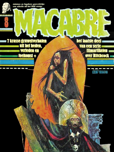 COMIX INTERNATIONAL 4 COMIX INTERNATIONAL 4cover by RICHARD CORBEN (Warren / 1976) 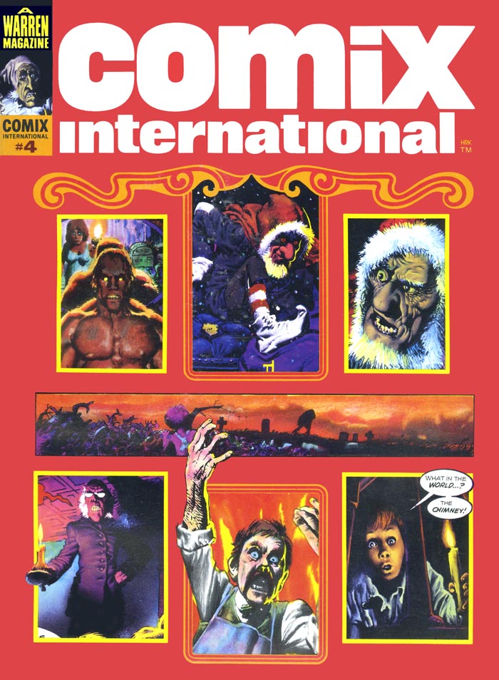 CREEPY 27 CREEPY 27cover by FRANK FRAZETTA (K.G. Murray / Australia / June 1978) 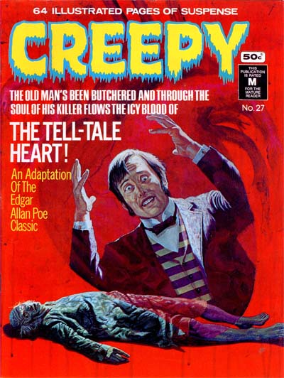 CREEPY RINDE TRIBUTO A EDGAR ALLAN POE CREEPY RINDE TRIBUTO A EDGAR ALLAN POEcover by RICHARD CORBEN (Toutain Editor / Spain / 1980) 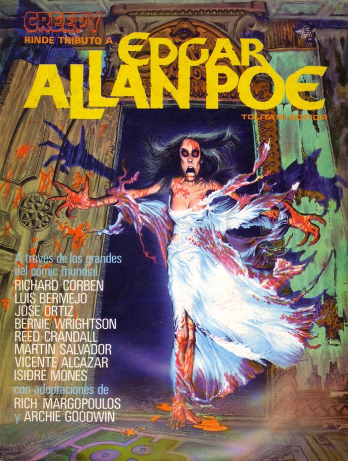 EDGAR POE EDGAR POEcover by RICHARD CORBEN (Volksverlag / Germany / 1981)  EDGAR ALLAN POE / CREEPY SPECIAL EDGAR ALLAN POE / CREEPY SPECIALcover by RICHARD CORBEN (Semic Press / The Netherlands / 1982)  FANTASTIK 2 FANTASTIK 2cover by SEGRELLES (Campus Editions / France / March-Apr 1983) 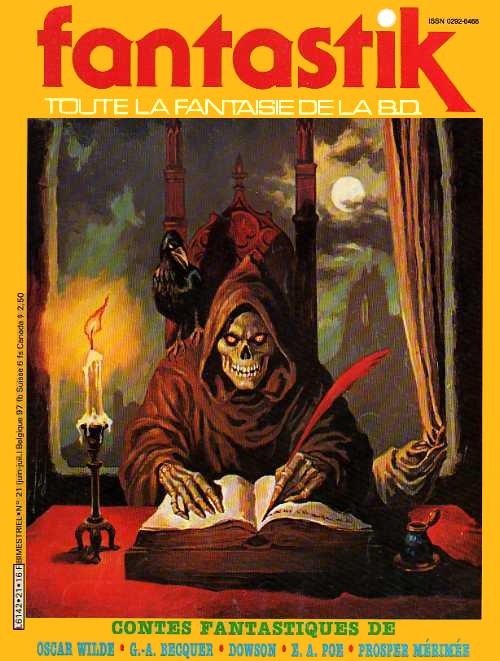 CREEPY ARCHIVES Volume 1 CREEPY ARCHIVES Volume 1cover by FRANK FRAZETTA (Dark Horse / August 2008) 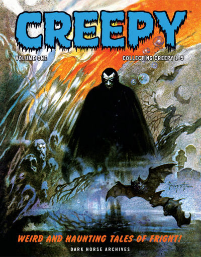 |
|
|
|
Post by tarkintino on May 28, 2019 16:43:54 GMT -5
Warren does not get enough credit from being one of the most significant game changers of the comic book format ever witnessed, particularly in the 1960s and 70s. More than being a company coming in the wake of the EC collapse (of its horror and sci-fi titles), Warren's unique methods in using the highest levels of art, innovative writing and brand / mascot identity comparable to MAD/Alfred E. Neuman, they mainstreamed horror comics like never before or since; it's rapid impact left both DC and Marvel attempting to chase after the Warren style by launching new, or reformatting long-lived anthology books to gothic horror and mascot-framed titles, with most failing. Of course, Warren's subjects had no restrictions on what kind of stories they could publish, as their brand was not tied to / had capes and cowls as their flagship characters.
Your Warren examples bring back endless fond memories of just how great their work was, and with the kind of supreme talent working there, no subject, adaptation or original idea was beyond their capabilities.
|
|
|
|
Post by MDG on May 29, 2019 10:08:16 GMT -5
Warren does not get enough credit from being one of the most significant game changers of the comic book format ever witnessed, particularly in the 1960s and 70s. More than being a company coming in the wake of the EC collapse (of its horror and sci-fi titles), Warren's unique methods in using the highest levels of art, innovative writing and brand / mascot identity comparable to MAD/Alfred E. Neuman, they mainstreamed horror comics like never before or since; it's rapid impact left both DC and Marvel attempting to chase after the Warren style by launching new, or reformatting long-lived anthology books to gothic horror and mascot-framed titles, with most failing. Of course, Warren's subjects had no restrictions on what kind of stories they could publish, as their brand was not tied to / had capes and cowls as their flagship characters. Your Warren examples bring back endless fond memories of just how great their work was, and with the kind of supreme talent working there, no subject, adaptation or original idea was beyond their capabilities. I love Warren--especially the early years--but I don't think their influence was as big or as quick, especially on DC and Marvel. It was a few years after Warren appeared that DC revamped their "mystery" titles, and that owed more to a loosening of the Code (and bringing on Joe Orlando). And as we've seen here, Dell and Gold Key provided some 4-color horror throughout the 60s.
And while Warren was head and shoulders above their main 60s competitors--mainly Myron Fass--they often seemed on the verge of going under. Basic quality varied widely and there were lots of reprints, almost from the beginning. I've read that the Warren books mainly acted as catalogs for Captain Company and Warren's main revenue came from selling merchandise.
|
|
|
|
Post by profh0011 on May 29, 2019 20:57:00 GMT -5
Dell and Gold Key provided some 4-color horror throughout the 60s.
And while Warren was head and shoulders above their main 60s competitors--mainly Myron Fass--they often seemed on the verge of going under. Basic quality varied widely and there were lots of reprints, almost from the beginning. I've read that the Warren books mainly acted as catalogs for Captain Company and Warren's main revenue came from selling merchandise.
So many (probably Marvel & DC fans) dismiss Gold Key (and Dell) as being "tame", but the BORIS KARLOFF anthology (which actually started life as a licensed comic based on THRILLER) was my favorite GK series, and comparable to several TV anthologies. Also, unlike the majority from "the big two", their horror books had PAINTED covers. As did many Brazillian horror comics, I've found. As did the Warrens!
Myron Fass-- shclockmeister supreme! Funny enough, apparently his horror covers were FAR tackier than the interiors tended to be. I've read the cover artists really enjoyed themselves, specifically because they had fun doing the sickest, most revolting, "offensive" images possible. They knew their target audience-- 13-year-olds (heh).
Although I'm currently in an EC Facebook group, I've admitted more than once that their horror tends to be too disturbing for me. Which, at my age, even I find kinda wild. But the Warrens... ahh, THAT's more my speed.
It was shortly after the debut of EERIE that Warren ran into financial problems for about 2 years. I touch on that later.
Regarding Captain Company-- back in early 1971, my Mom took my brother & I on a trip to NYC for 2 days, and, crazy enough, one of our last stops before coming home was the Warren office! As we found out, nobody who worked on any of their magazines worked there. However, they did run the mail-order business out of there. We came home with about a half-dozen back-issues of FAMOUS MONSTERS-- all in PRISTENE, MINT condition!!!!!
Now here's the funny part. Based on things I read decades later, it is quite possible-- even probable-- that the nice lady who sold us the books was Flo Steinberg, as she was working for Warren right about that time! |
|
|
|
Post by profh0011 on May 29, 2019 21:14:13 GMT -5
The final Dell POE book... WAR-GODS OF THE DEEPphoto cover (Dell / July-September 1965) 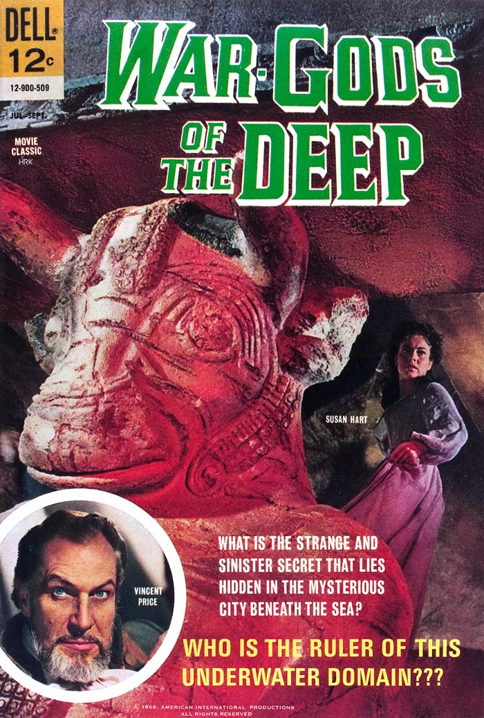 Following in the footsteps of Corman's THE RAVEN, the film takes its inspiration from one of Poe's POEMS-- using it as a springboard for an otherwise entirely-new story. Unlike the previous 8 films, this one had to do without Roger Corman, Richard Matheson, Charles Beaumont, Les Baxter... at least they had Vincent Price, but I have a feeling even he was feeling lost in this one, and wondering "Why did they bother?" That's not to say there aren't some interesting ideas here... it's just that most of them seem to have come from Jules Verne, not Poe. There was a whole run of "psuedo-Verne" films in the mid-60s, and this one seems to have been inspired in equal parts from elements of both 20,000 LEAGUES UNDER THE SEA and JOURNEY TO THE CENTER OF THE EARTH, with a bit of James Hilton's LOST HORIZON thrown in for bad measure. CITY UNDER THE SEA was released as WAR-GODS OF THE DEEP in the U.S. Go figure. John Tartaglione, who did such a wonderful job on the comics adaptation of THE TOMB OF LIGEIA, returned for this one, joined this time by Dick Giordano, who did an even better job on the inks than Vince Colletta did on the other one. It would prove to be Dell's final foray into Poe-related material. "WAR-GODS OF THE DEEP" (inspired by "THE CITY IN THE SEA") / Version 1 Adaptation by ?? / Art by John Tartaglione & Dick Giordano 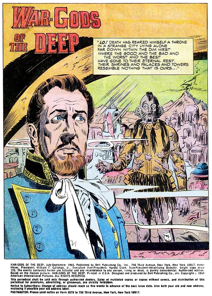 This is almost like if Disney did a horror movie back then...  The search...  The grotto...  "The Captain"...  The escape... 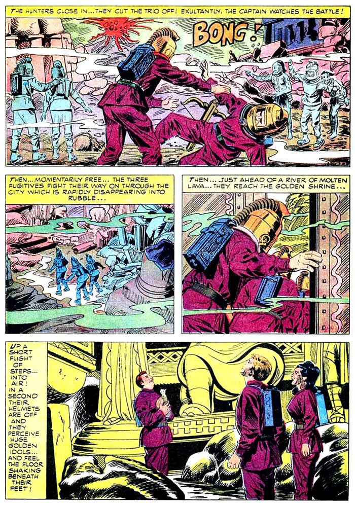 final page... 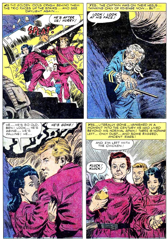 The real problems with this story are the lack of character development, the lack of logical actions on the part of the villain (I absolutely despise people who simply CANNOT be reasoned with), and the confusion regarding the locations of one part of the underwater city and another. For example, the heroes travel underwater to reach the shrine, yet walk only a short distance from there to the rest of the city. At the climax, they must walk underwater to reach the SAME shrine, and yet are only a short stairway walk back to the surface. The best thing I can say about the comic-book version, is that the interminably-long and dreadfully-boring underwater climax is reduced to a mere handful of pages, which certainly take less time to read than they did in the movie to watch. Here's the painting (before text was added) for the poster for " CITY UNDER THE SEA"... 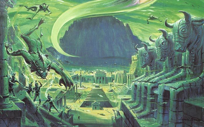 CLASICOS DEL CINE 155 CLASICOS DEL CINE 155Photo cover (Editorial Novaro / Mexico / 1966) 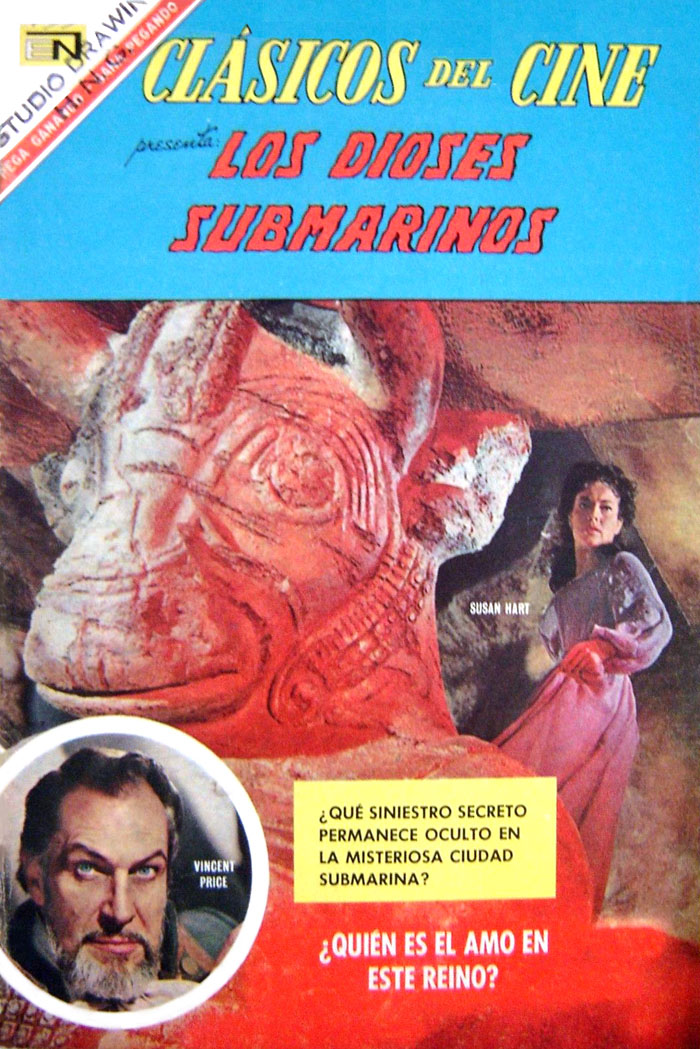 |
|
|
|
Post by profh0011 on May 31, 2019 11:50:32 GMT -5
The 2nd Warren... CREEPY 6cover by FRANK FRAZETTA (Warren / December 1965) 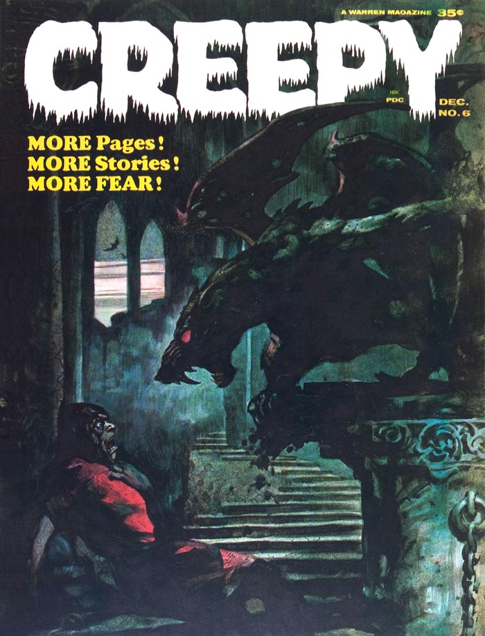 "THE CASK OF AMONTILLADO!" "THE CASK OF AMONTILLADO!" / Version 6 Adaptation by Archie Goodwin / Art by REED CRANDALL 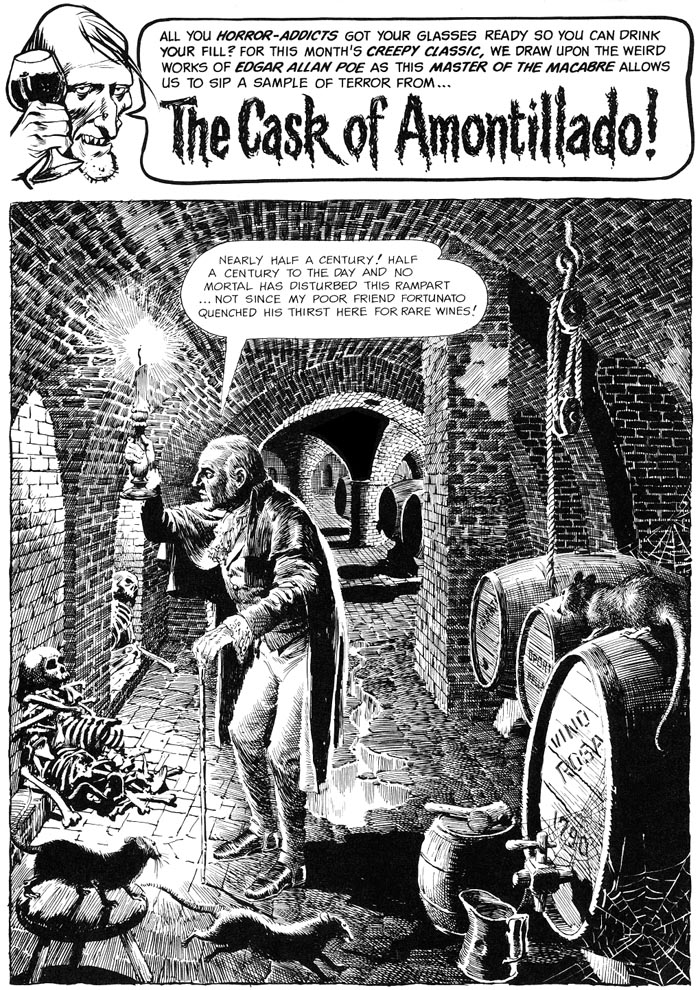 Funny enough, Crandall's Fortunato looks like Peter Lorre (who played Montressor in the Corman film). 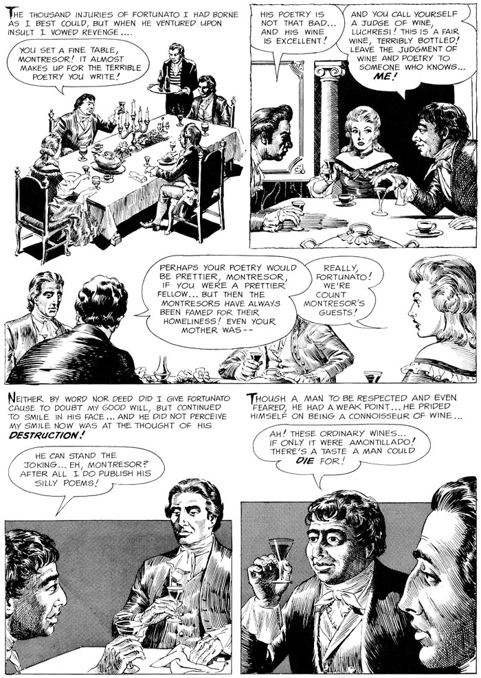 The catacombs... 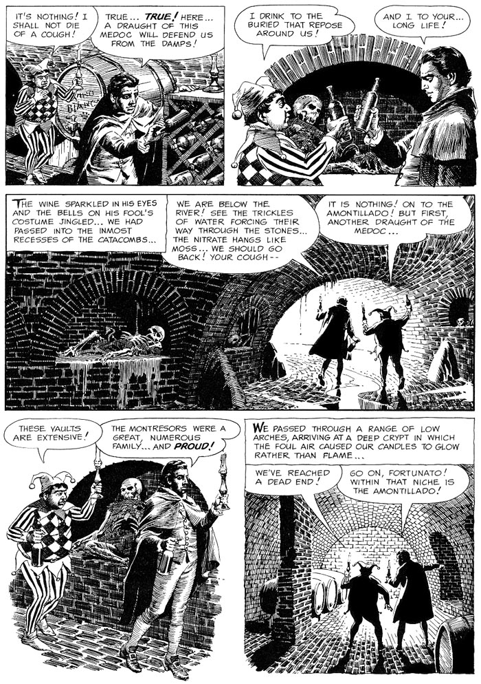 WALLED UP. 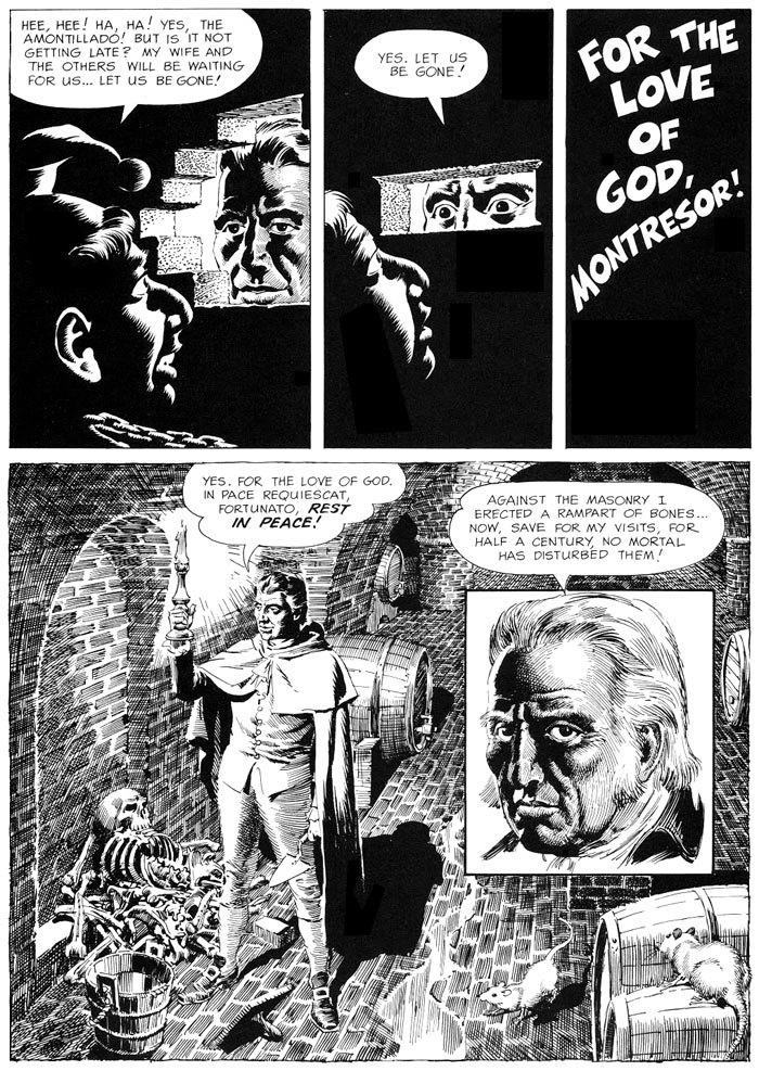 For the 2nd time in a row, Archie Goodwin adds a new epilogue. This may have been inspired by the EC version! 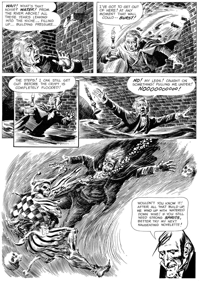 REPRINTS CREEPY 20cover by ALBERT NUETZELL (Warren / May 1968) 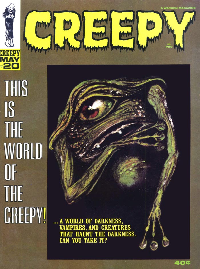 VAMPUS 1 VAMPUS 1cover by KEN KELLY (Ibero Mundial De Ediciones / Spain / September 1971) 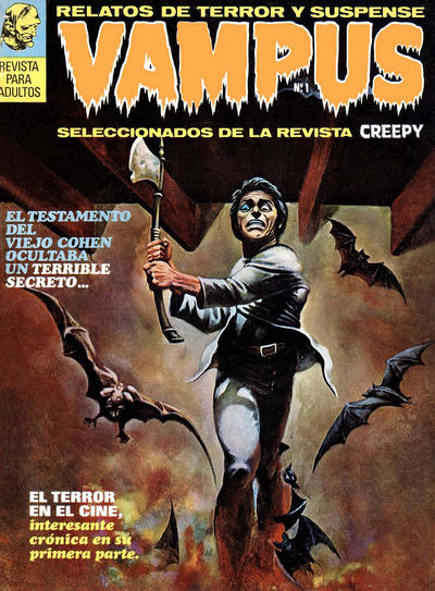 MACABRE 1 MACABRE 1cover by ENRICH (Semic Press / Netherlands / [1973]) (warning: SEXY Enrich Torres cover image!)2.bp.blogspot.com/-_6nFjyMOonk/XMCSYQZFQ_I/AAAAAAAAp98/4OEN0t98h7cD2cMKkCSmn68-DLSkedoDQCLcBGAs/s1600/1973%2BSP%2BM%2B01_cc_EBoek_HK%2B%2BA.jpgCREEPY 74cover by REED CRANDALL (Warren / October 1975) 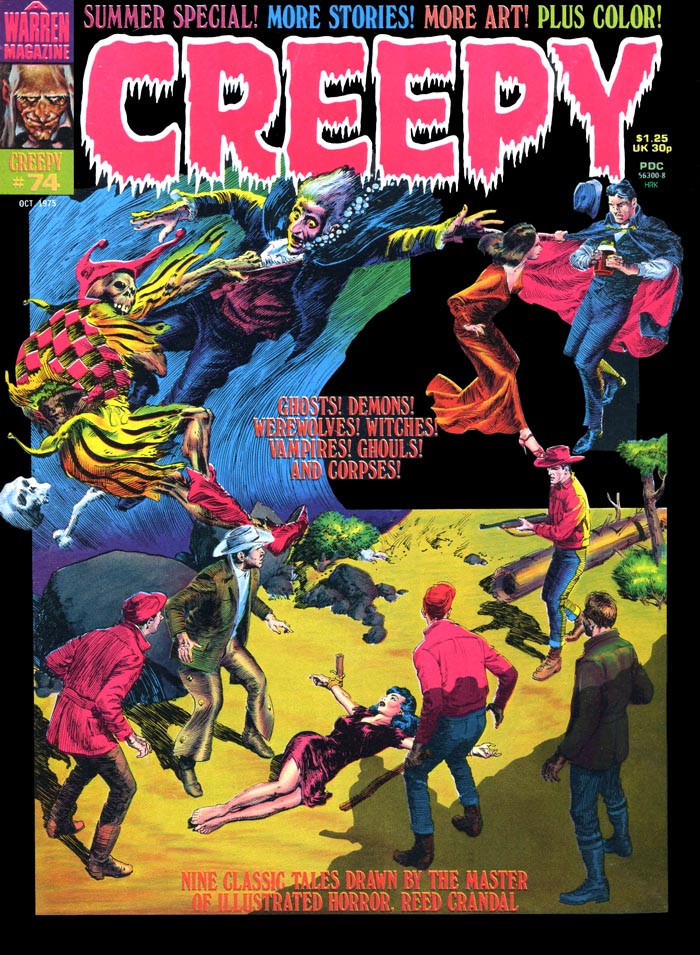 CREEPY RINDE TRIBUTO A EDGAR ALLAN POE CREEPY RINDE TRIBUTO A EDGAR ALLAN POEcover by RICHARD CORBEN (Toutain Editor / Spain / 1980)  FANTASTIK 2 FANTASTIK 2cover by SEGRELLES (Campus Editions / France / March-April 1981) 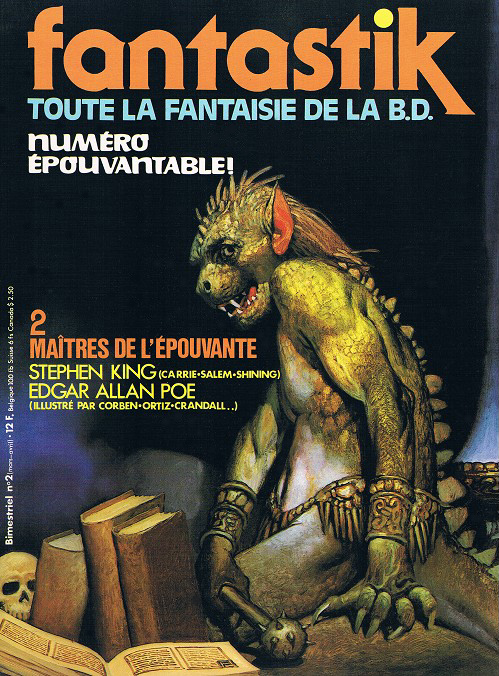 EDGAR POE EDGAR POEcover by RICHARD CORBEN (Volksverlag / Germany / 1981) 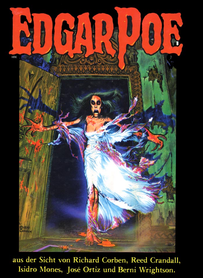 EDGAR ALLAN POE / CREEPY SPECIAL EDGAR ALLAN POE / CREEPY SPECIALcover by RICHARD CORBEN (Semic Press / The Netherlands / 1982) 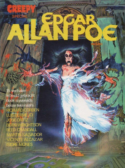 CREEPY ARCHIVES Volume 2 CREEPY ARCHIVES Volume 2cover by FRANK FRAZETTA (Dark Horse / December 2008) 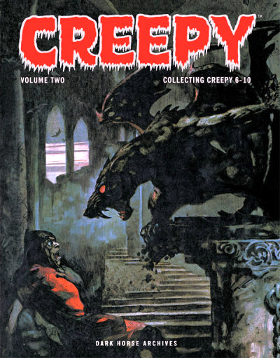 |
|
|
|
Post by profh0011 on Jun 1, 2019 13:32:10 GMT -5
The 3rd Warren, and the final Crandall. CREEPY 11cover by FRANK FRAZETTA (Warren / October 1966) 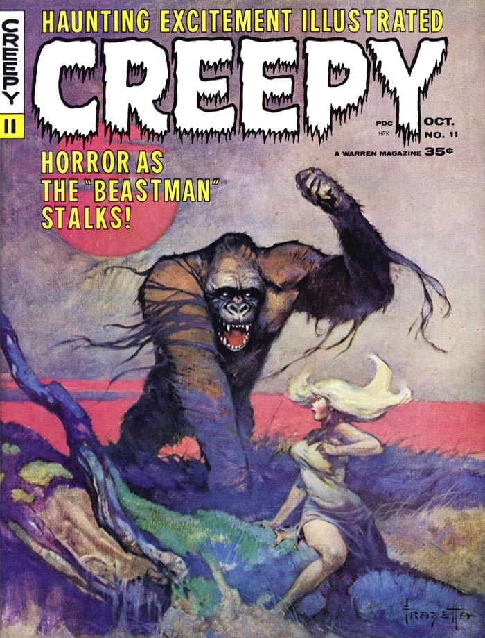 "HOP-FROG!" "HOP-FROG!" / Version 3 Adaptation by Archie Goodwin / Art by REED CRANDALL 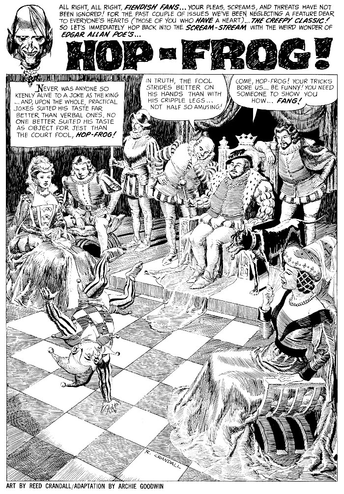 The jester gets an idea... 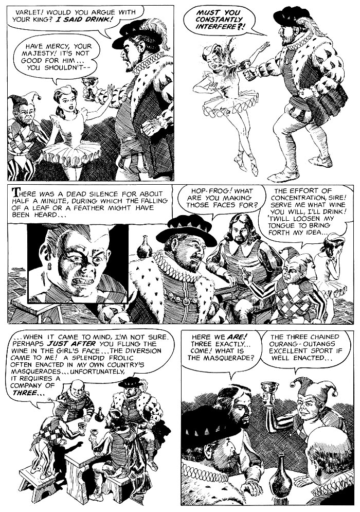 The orangutans! 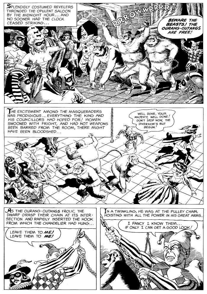 REVENGE and escape! 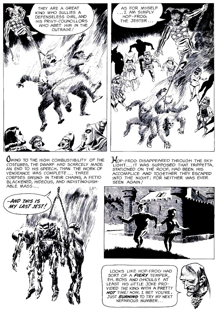 I wonder why Crandall stopped doing these? Imagine if he'd kept going... REPRINTS VAMPUS 4cover by MARTI RIPOLL (Ibero Mundial De Ediciones / Spain / December 1971) 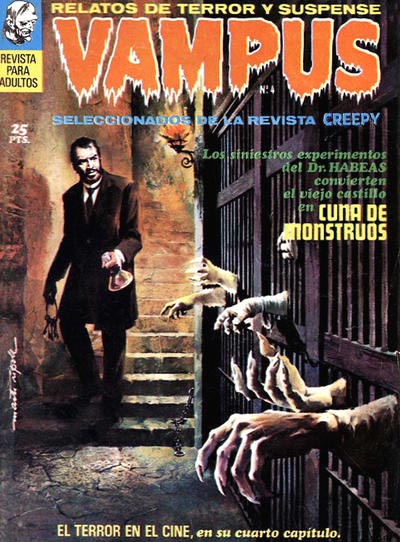 SJOKK 1 SJOKK 1cover by VICENTE SEGRELLES (Nordick Forlag / Norway / 1973) 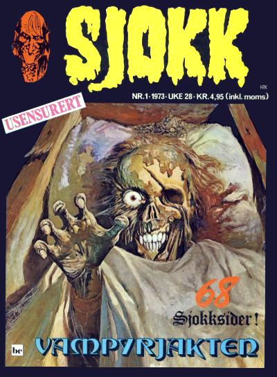 MACABRE 3 MACABRE 3cover by VICENTE SEGRELLES (Semic Press / Netherlands / 1974) 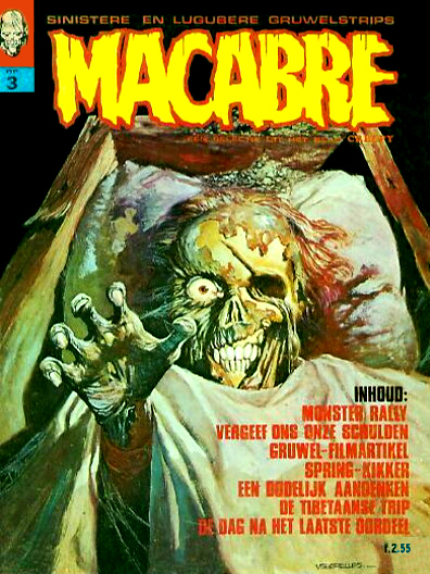 CREEPY 74 CREEPY 74cover by REED CRANDALL (Warren / October 1975)  CREEPY 14 CREEPY 14cover by FRANK FRAZETTA (K.G. Murray / Australia / June 1976) 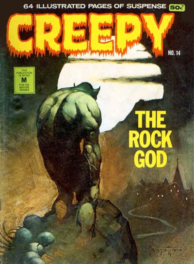 ZAKARELLA 7 ZAKARELLA 7cover by ?? (Portugal Press / ?? 1976) (WARNING! sexy cover)1.bp.blogspot.com/-4p-U-63HTLM/VSXsUpnB7ZI/AAAAAAAAYDU/e4hP2GXudys/s1600/1976%2BPP%2BZ%2B07_cc_GCD.jpgCREEPY RINDE TRIBUTO A EDGAR ALLAN POEcover by RICHARD CORBEN (Toutain Editor / Spain / 1980) EDGAR ALLAP POE / CREEPY SPECIALcover by RICHARD CORBEN (Semic Press / The Netherlands / 1982) CREEPY ARCHIVES Volume 3cover by FRANK FRAZETTA (Dark Horse / June 2009)  |
|
|
|
Post by profh0011 on Jun 2, 2019 15:31:48 GMT -5
One thing I can't figure is why a single publisher would do more than one adaptation of the same story. Yet, I've seen it happen with both Warren, and, in this case, Taika. By the mid-60s, Contnental had changed their name twice-- first to Outubro, then to Taika. Also, its original owners had a falling out, and each left the company separately, one starting another company, the other going into advertising for many years. The name Taika was used the longest, and I often refer to their entire history simply as "Taika". Their 7th POE adaptation... although the cover is a reprint, the story inside was a new version of the story the cover had originally been done for... PAGINAS SINISTRAS 3cover by JAYME CORTEZ MARTINS (Editora Outubro / Brazil / 1966) 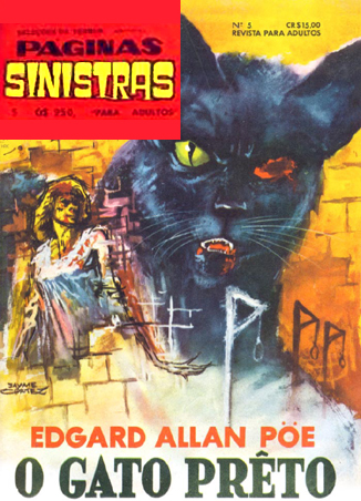 Writer Rubens Francisco Lucchetti has done comics, short stories & novels, and film scripts. He's still around, still active, and I'm delighted to have him on my Facebook "friends" list! "O GATO PRETO" ( "THE BLACK CAT") / Version 6 Adaptation by R.F. Lucchetti / Art by JUAREZ ODILON 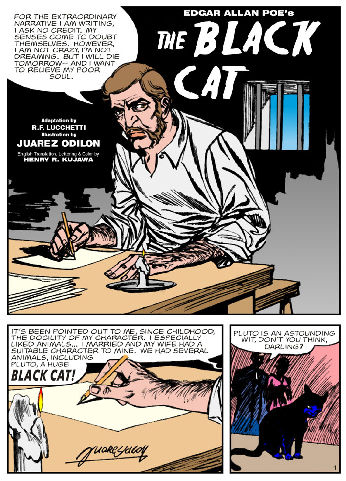 I have the strongest feeling this art was designed for a digest, then later re-formatted for a regular size comic (which is where the scans for this came from). 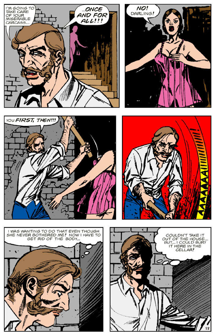 final page 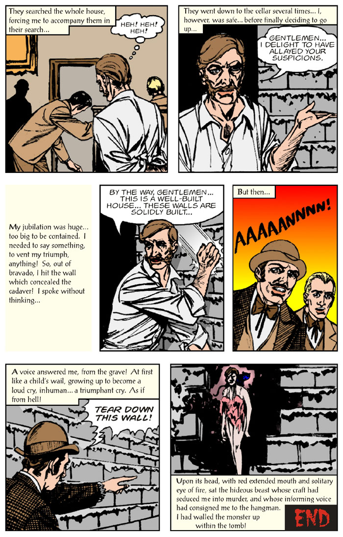 REPRINTS ALBUM CLASSICOS DE TERROR 8cover by PRIMAGGIO MANTOVI (Editora Taika / Brazil / 1968)
ALMANAQUE CLASSICOS DE TERROR 2 cover by JAYME CORTEZ MARTINS (Editora Taika / Brazil / April 1974)
CLASSICOS DE TERROR 20 cover by JOSE EVOLDO (Editora Taika / Brazil / 1977) 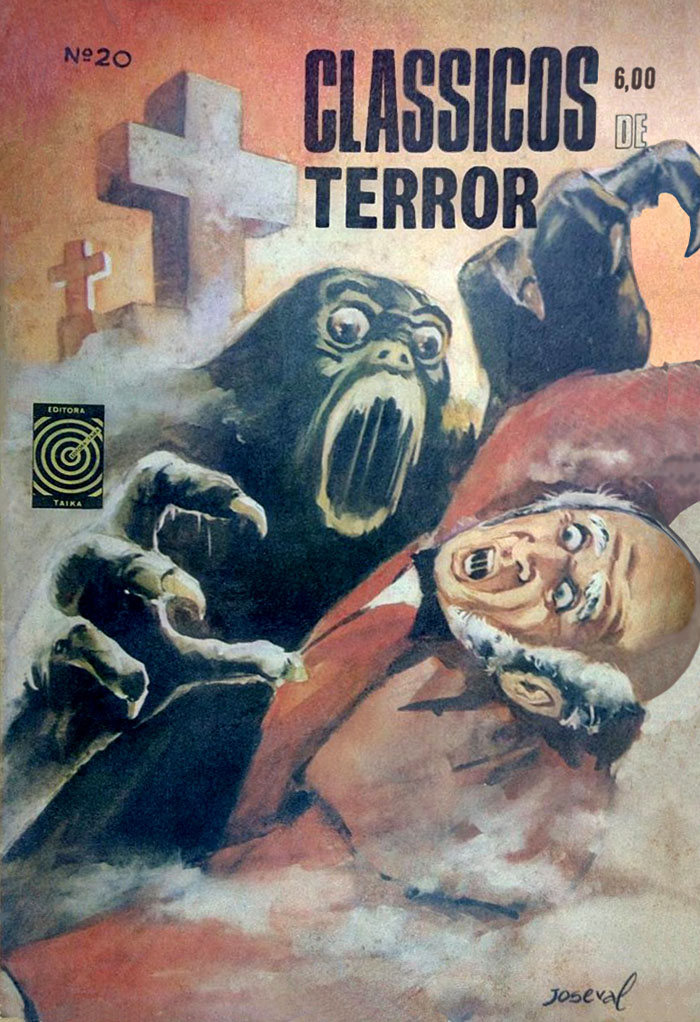 |
|
|
|
Post by profh0011 on Jun 3, 2019 14:31:16 GMT -5
With their 4th POE adaptation, Warren moved them from CREEPY to EERIE... EERIE 11cover by JOE ORLANDO (Warren / September 1967) 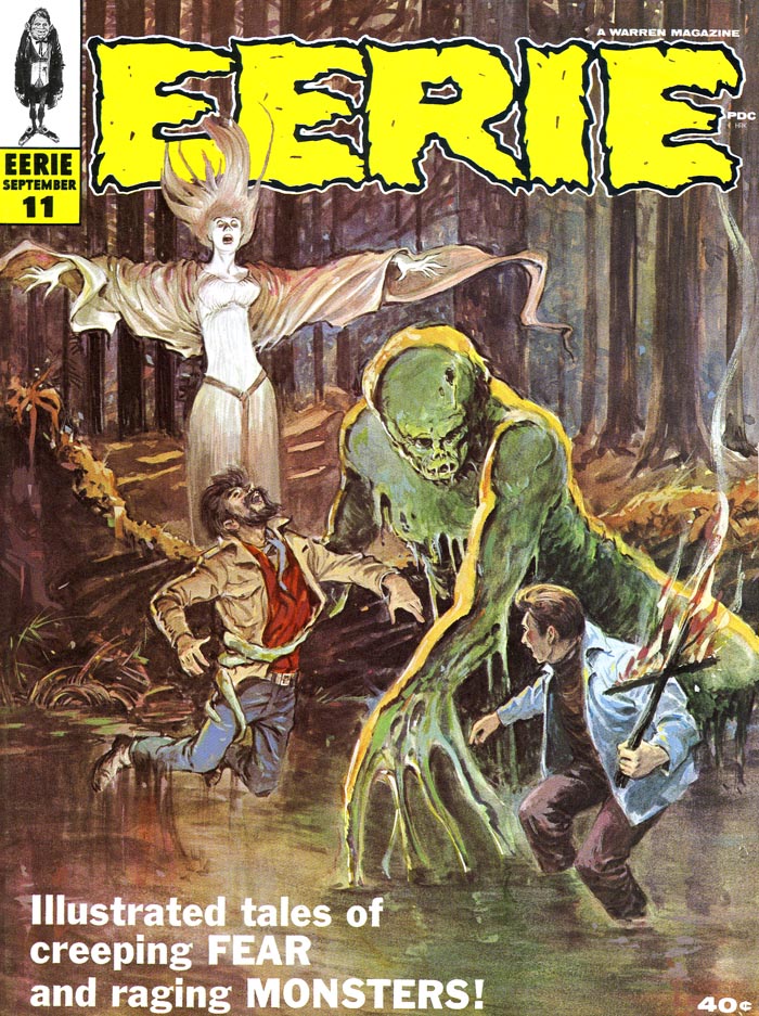 This one has so much of the orignal text, it's less an "adaptation" as just an "illustrated story". "BERENICE!" / Version 2 Adaptation by Archie Goodwin / Art by JERRY GRANDENETTI 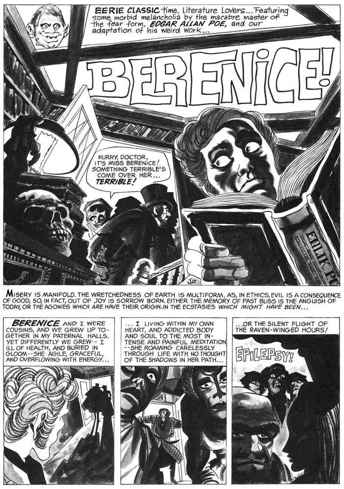 Jerry Grandenetti really some some WEIRD S*** at times! 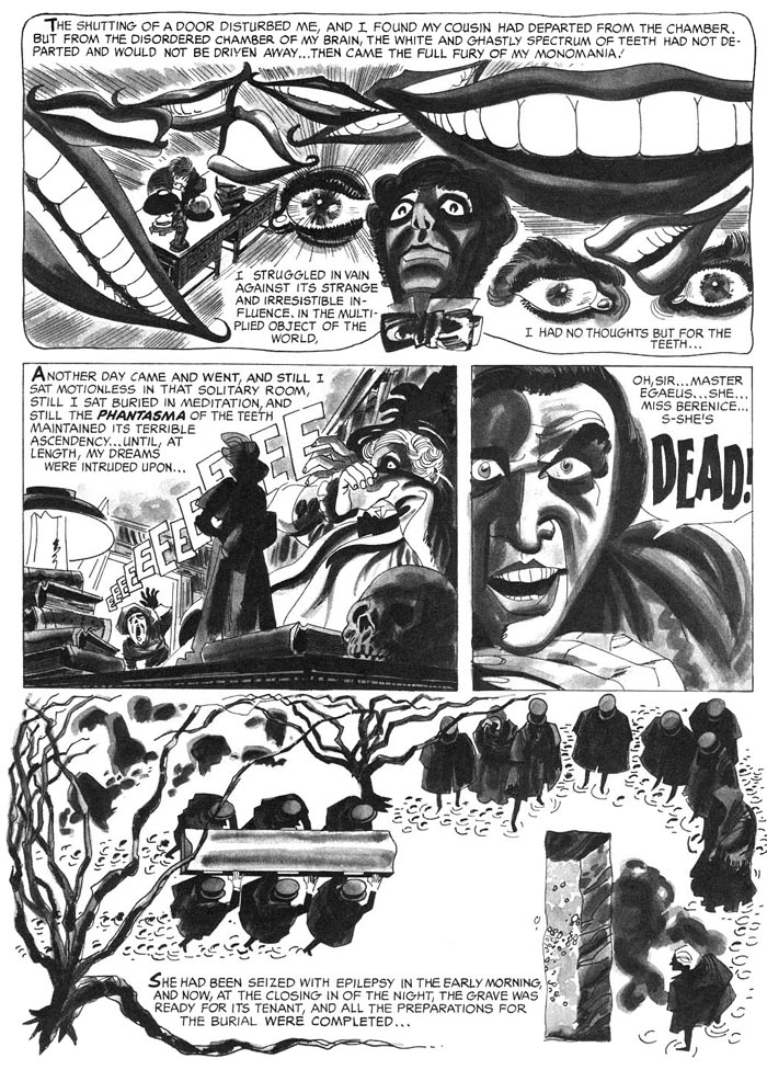 final page 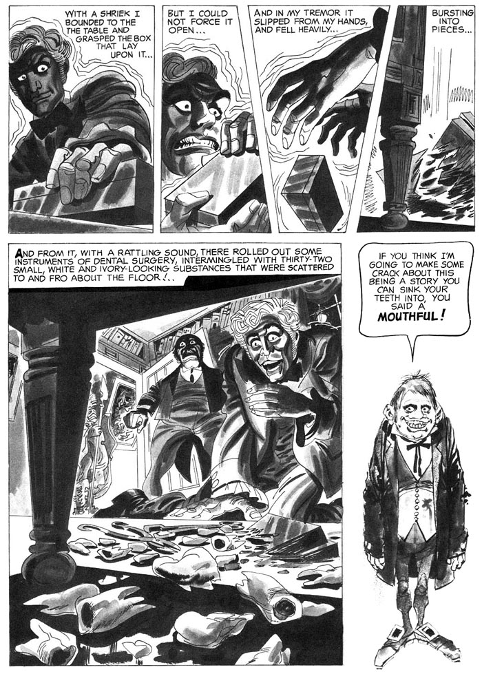 REPRINTS VAMPUS EXTRA VERANO 1972cover by JACK DAVIS (Ibero Mundial De Ediciones / Spain / 1972) 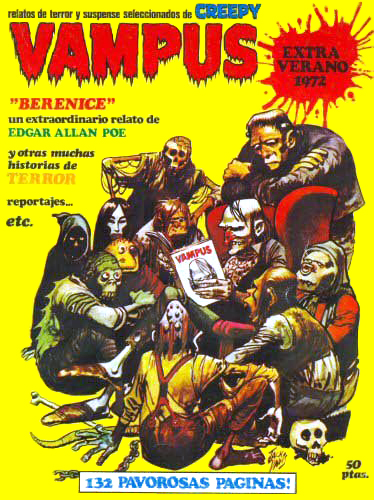 EERIE ARCHIVES Volume 3 EERIE ARCHIVES Volume 3cover by FRANK FRAZETTA (Dark Horse / June 2010)  |
|