|
|
Post by Deleted on Apr 29, 2015 20:47:33 GMT -5
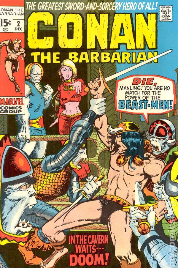
 One of the characteristics of the Bronze Age was the big 2 publishers trying new genres. Like, for instance, Marvel putting out a Conan comic. But I always hated this cover, cause it felt like they were hedging their bets. It basically looks like a typical super-hero cover, instead of embracing the fantasy elements. Hero restrained by a bunch of generic baddies, big baddie looming over him, and the obligatory melodramatic dialogue balloon. Let's do something different, but make it look like everything that's gone before. Yecch. |
|
|
|
Post by Prince Hal on Apr 29, 2015 22:16:40 GMT -5
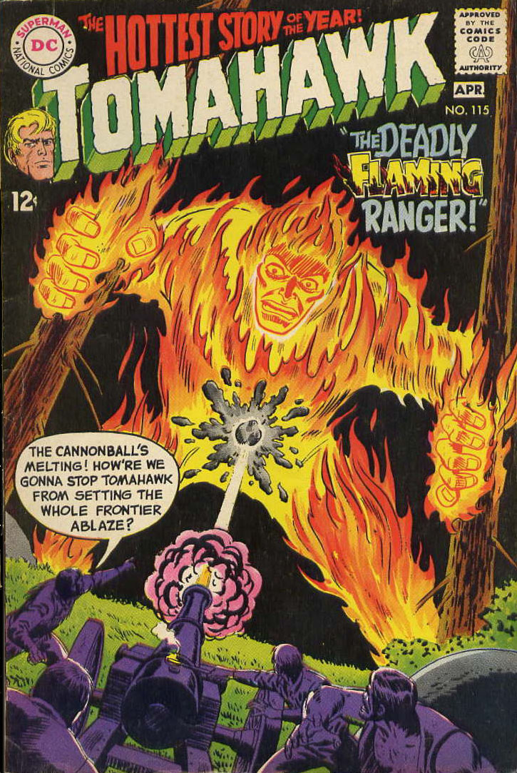
An interesting topic, Hoosier. And more entry possibilities than you might think at first. I'm going to choose one of several I saw because I've always enjoyed the title, but also because of the sudden striking difference between this issue and the one that preceded it. I think the juxtaposition will illustrate better than I could explain why this fits the criteria. Here's Tomahawk 115, about as Silver Age-y as they come: floating head in the logo; the hero transformed; tabloid-style headline; and a word balloon full of melodramatic desperation.  Here's Tomahawk 116: the floating head's still there, and the story title smacks of the Silver Age, but Neal Adams is suddenly getting all photo-realistic. And that coloring. The smell of bronze is definitely in the air.  |
|
|
|
Post by Deleted on Apr 29, 2015 22:29:28 GMT -5
I'm dropping out of this contest. Sorry. Hey Mecha, don't drop out of this--I for one love to see all the various covers you guys expose me to, and yours are always very eye-opening. To be sure, this week's theme is very challenging--coming up with a 1960s/1970s cover that has both Silver Age and Bronze Age elements--not an easy task  ! I really love your JLA cover and I think it would fit in with that "Impossible/Goofy Cover Situations" thread. It's a fantastic cover and deserves to be seen. Maybe you can move it to that thread, and then post a different cover here. I will post that cover sometimes next week - I will be gone tomorrow and won't be back late Saturday Night or by Noon on Sunday. I have to go out of town for an unexpected Wedding to attend. |
|
|
|
Post by Paradox on Apr 30, 2015 1:18:24 GMT -5
Neal Adams was setting the tone for Bronze Age art style before it even began, with a very Silver Age cover comment proclaiming "The Strangest Teens of All".  |
|
|
|
Post by foxley on Apr 30, 2015 1:56:37 GMT -5
I think this fits:  It's seems extraordinary to me that as late as 1975 DC would be publishing a cover that would have been right at home on a Silver Age issue of Lois Lane (albeit a very nice Kurt Schaffenberger cover). But there is Lex Luthor in his definitive Bronze Age outfit. |
|
|
|
Post by Icctrombone on Apr 30, 2015 6:36:42 GMT -5
That was my favorite version of Luthor.
|
|
|
|
Post by DE Sinclair on Apr 30, 2015 10:06:21 GMT -5

This one feels pretty Silver-Agey in the Bronze Age to me. The 3 little boxes that are all that have to do with the actual content of the book with their little jagged edge blurbs, the figures all standing around them, then, BAM!, in comes the Bronze Age (1974) where they were edgy enough to kill off Santa Claus! |
|
|
|
Post by Farrar on Apr 30, 2015 13:30:18 GMT -5
 Superman #215 was released in early 1969, with a cover that was uncharacteristically somber yet subdued for a Superman-related mag at the time. Instead, this cover presents a grimmer view--a Bronze Age view. Bronze Age darkness? Check--no sunny colors...look at those shadows. Bronze Age realism? Check--no Lois memorial statue or giant Lois face carved into the side of Mt. Rushmore or funeral cortege comprising costumed heroes and the populations of Metropolis and Kandor. Just a grieving widower and an uncomprehending child (and it's drawn so you almost don't notice she's in a kiddie "super" costume). And heck, it's by Nefarious Neal, the guy whose fingerprints are all over the transition period from sunny Silver to bleaker Bronze. But wait! Its Silver Age slip is showing: it's an imaginary novel, and a great one to boot--at least, that's what the emphatic cover blurb proudly proclaims.  |
|
|
|
Post by Phil Maurice on Apr 30, 2015 16:39:40 GMT -5

Another really difficult challenge. This issue of Marvel Spotlight hails from 1981, so not sure if that can properly be considered Bronze. It's certainly retro, though. It was exciting to have Ditko back at Marvel again, even on this short-lived, unpopular series. This book would have shared rack space with (among others) Miller's Daredevil, the Stern/Byrne Captain America, and the Moench/Sienkiewicz Moon Knight, making it look like even more of a throw-back. |
|
|
|
Post by pinkfloydsound17 on Apr 30, 2015 18:43:23 GMT -5
^ I hung onto those issues solely because Ditko was involved. Nothing special, you are right, but I appreciate Ditko in any form. Plus, I don't have much of his Silver Age goodness because its pricey. I would really like to get my hand on an affordable copy of Mr. A someday....
|
|
|
|
Post by hondobrode on Apr 30, 2015 23:00:33 GMT -5
 Paradox Paradox mentioned Neal Adams as a strong Bronze Age contender, but he's also known for a lot of those crazy Silver Age covers. I went a slightly different route however and am presenting Nick Fury Agent of S.H.I.E.L.D. # 1 as my pick. Obviously by Jim Steranko, another artist that helped set the tone for the Bronze Age maybe more so than the Silver Age. The design elements of the blocks being non-traditional feels more Bronze Age to me, along with difference in scale of the characters amongst the over-sized blocks (or is it mini-sized characters). A more sultry Vanessa feels more Bronze Age than homely Sue Storm or Lois Lane of the Silver Age. The psychedelic lettering and design feels very 60's, though, putting it squarely in the Silver Age, along with the MCG logo up towards the corner box. |
|
|
|
Post by Hoosier X on Apr 30, 2015 23:54:45 GMT -5
I knew we'd get some Adams and I was really hoping we'd get some Steranko. So hoo-ray!
|
|
shaxper
CCF Site Custodian
Posts: 22,871
|
Post by shaxper on May 3, 2015 17:10:30 GMT -5
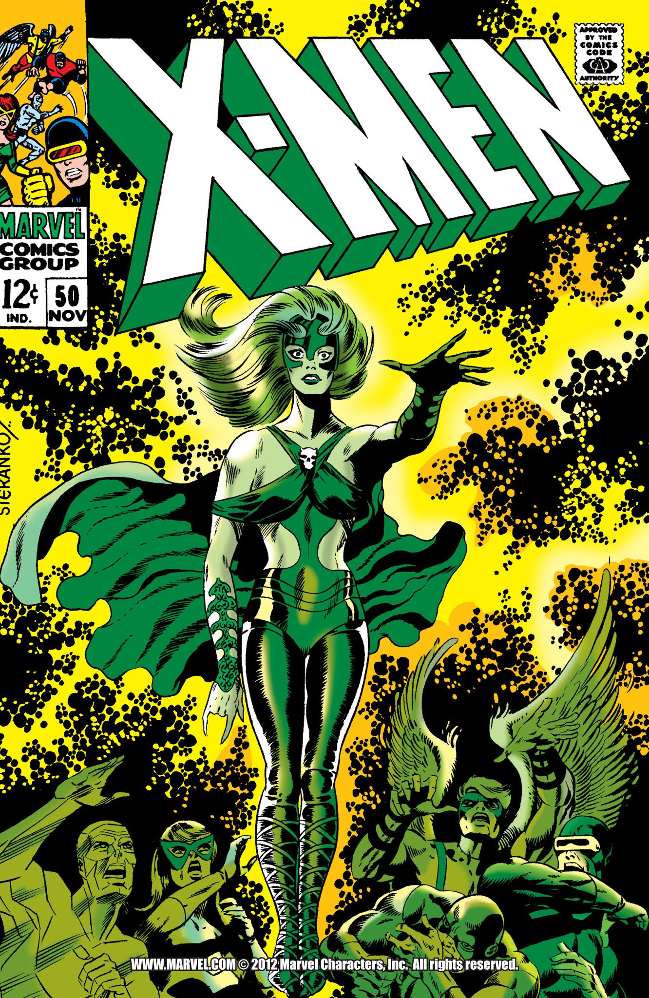
You ask for Steranko, you get Steranko...  |
|
|
|
Post by MDG on May 4, 2015 12:47:53 GMT -5
An interesting topic, Hoosier. And more entry possibilities than you might think at first. I'm going to choose one of several I saw because I've always enjoyed the title, but also because of the sudden striking difference between this issue and the one that preceded it. I think the juxtaposition will illustrate better than I could explain why this fits the criteria. Here's Tomahawk 115, about as Silver Age-y as they come: floating head in the logo; the hero transformed; tabloid-style headline; and a word balloon full of melodramatic desperation. ... Here's Tomahawk 116: the floating head's still there, and the story title smacks of the Silver Age, but Neal Adams is suddenly getting all photo-realistic. And that coloring. The smell of bronze is definitely in the air. ... There's a couple of DCs like this where it's like they just turned a switch from silver to bronze. My favorite is from House of Mystery #173 (last Dial H) to #174 (first Orlando-edited) (though the insides are all reprints). And the late silver's maybe my favorite period at DC--they were throwing a lot of things at the wall, some very good (Bat Lash, Secret Six). So this was a tough one. And I thought I'd be going with a late silver DC until I came upon:  We're solidly in the Bronze Age by this time, but this cover situation would've been at home on the stands in 1964 (though probably drawn more interestingly). |
|
|
|
Post by Deleted on May 5, 2015 2:09:56 GMT -5
MWGallaher gets my vote this week....Kubert beats Steranko and Adams by a nose this week....
-M
|
|