|
|
Post by MatthewP on Jun 4, 2015 14:59:28 GMT -5
With the prices of comics these days, I find it hard to believe any significant number of customers ever buy a book based on the cover. All the variant covers being produced these days are evidence that people will not only buy based on just the cover, but will often pay a lot more for it. Some of the biggest sellers of recent years have been books with many variants, indicating there is a signifcant number of people who feel the need to get every version, just for the cover. But even regular covers can catch people's eye and might entice them to pick the book up. It seems to me the old school style showing action related to the story inside is more enticing and more likely to catch the eye than the generic action shots, but as I get older I realize more and more that I don't understand what appeals to young folks these days. |
|
|
|
Post by Reptisaurus! on Jun 4, 2015 15:02:55 GMT -5
With the prices of comics these days, I find it hard to believe any significant number of customers ever buy a book based on the cover. And the publishers know this. No longer does a cover try to entice you with a dramatic representation of what lies inside. Its just poster art now and interchangeable. It could have been commissioned a year ago and that doesn't matter. I'm not saying I prefer one type of cover over another but I did miss the old school type That's my take on it. Impulse buys have gone down, so mainstream comics are making a lot less effort to sell their products with their covers. Although I'm pretty OCD and I'll still impulse buy. Corporate created false scarcity to lure the gullible fanbase (and retailers!) into paying more than the products are actually worth. Man, that is such a great idea that I'm sure will cause sales to rise forever and is not creating a false bubble that will burst the moment their fanbase realizes how stupid the whole thing is at all! Yep. I'm definitely waiting for 20 years down the line when everyone talks about the '00s and all the variant covers as the height of idiocy. |
|
|
|
Post by fanboystranger on Jun 4, 2015 22:05:39 GMT -5
With the prices of comics these days, I find it hard to believe any significant number of customers ever buy a book based on the cover. And the publishers know this. No longer does a cover try to entice you with a dramatic representation of what lies inside. Its just poster art now and interchangeable. It could have been commissioned a year ago and that doesn't matter. I'm not saying I prefer one type of cover over another but I did miss the old school type I won't necessarily buy a comic based on a cover, but I will take a look at the comic to see if I want to buy it. Yesterday, when I was at my LCS, that Omega Men cover caught my eye simply because it looked so different from everything else on the stands. But usually it's a Brian Bolland cover that catches my eye (as is probably evident from my avatar) because a Bolland cover generally indicates a book with a skewed, idiosyncratic style. It's a type of shorthand for a book trying something different, even if Bolland's technique itself is pretty classic in its style. |
|
|
|
Post by fanboystranger on Jun 4, 2015 22:16:54 GMT -5
With the prices of comics these days, I find it hard to believe any significant number of customers ever buy a book based on the cover. All the variant covers being produced these days are evidence that people will not only buy based on just the cover, but will often pay a lot more for it. Some of the biggest sellers of recent years have been books with many variants, indicating there is a signifcant number of people who feel the need to get every version, just for the cover. The other dimension to variant covers is that they often fetch huge prices on the original art market, too. So, essentially, the scarity of the variant for a comic issue also serves to inflate the cost of the original variant art. I wouldn't want a J Scott Campbell cover like Murderess posted, but I'd imagine there's enough people falling over themselves to buy the original art from Campbell variants that he doesn't have to do anything but covers to get by these days. (Now, an Eddie Campbell cover I'd shell out some series bank for.)
Again, the creation of a new market once original art started to be returned to artists shifted a lot of things. One of those things is that covers were more than one paycheck for a cover-- they could be a serious side business for popular artists. Someone like Walt Simonson, who has kept and catalogued all his work over the years, is actually the exception rather than the rule these days. It seems almost paradoxical, but the more generic the comic cover, the more mass appeal it will have in the original art market.
For of us who still buy new issues, I'm sure you've noticed the ads for Alex Ross' original art, prints, and commissions website in some recent books. He's the first artist I've seen do that in a Big Two book.
|
|
|
|
Post by Pharozonk on Jun 4, 2015 22:29:17 GMT -5
For of us who still buy new issues, I'm sure you've noticed the ads for Alex Ross' original art, prints, and commissions website in some recent books. He's the first artist I've seen do that in a Big Two book.
Alex Ross is one of the few artists who I think can pull off the static action cover style well, mainly because he draws these characters as larger than life.  |
|
|
|
Post by fanboystranger on Jun 4, 2015 22:34:32 GMT -5
For of us who still buy new issues, I'm sure you've noticed the ads for Alex Ross' original art, prints, and commissions website in some recent books. He's the first artist I've seen do that in a Big Two book.
Alex Ross is one of the few artists who I think can pull off the static action cover style well, mainly because he draws these characters as larger than life.  Oh, I totally agree. His covers are majestic. They feel like a snapshot of an event. I'm not as keen on his sequential work, but his covers do get my attention.
Although, now I think about it, it's his Astro City covers that really get my attention, and that's because AC is the best superhero comic on the market. I don't notice his work as much when it comes to other books.
Bolland's still my standard for contemporary comic covers. I like Jock's work a lot, too.
|
|
|
|
Post by Pharozonk on Jun 4, 2015 22:45:03 GMT -5
With the prices of comics these days, I find it hard to believe any significant number of customers ever buy a book based on the cover. And the publishers know this. No longer does a cover try to entice you with a dramatic representation of what lies inside. Its just poster art now and interchangeable. It could have been commissioned a year ago and that doesn't matter. I'm not saying I prefer one type of cover over another but I did miss the old school type I won't necessarily buy a comic based on a cover, but I will take a look at the comic to see if I want to buy it. Yesterday, when I was at my LCS, that Omega Men cover caught my eye simply because it looked so different from everything else on the stands. But usually it's a Brian Bolland cover that catches my eye (as is probably evident from my avatar) because a Bolland cover generally indicates a book with a skewed, idiosyncratic style. It's a type of shorthand for a book trying something different, even if Bolland's technique itself is pretty classic in its style. Except for when Bolland does covers for conventional superhero fare    |
|
|
|
Post by fanboystranger on Jun 4, 2015 23:59:37 GMT -5
I won't necessarily buy a comic based on a cover, but I will take a look at the comic to see if I want to buy it. Yesterday, when I was at my LCS, that Omega Men cover caught my eye simply because it looked so different from everything else on the stands. But usually it's a Brian Bolland cover that catches my eye (as is probably evident from my avatar) because a Bolland cover generally indicates a book with a skewed, idiosyncratic style. It's a type of shorthand for a book trying something different, even if Bolland's technique itself is pretty classic in its style. Except for when Bolland does covers for conventional superhero fare    Yeah, but that's why I say Bolland gets me to look at the book. After that look, I may or may not purchase it depending on what I see. That Flash run, while having fairly conventional stories, had a very interesting and unique art style that I hadn't really seen outside of Geoff Darrow or Moebius. Scott Kolins had totally switched up his style, eliminating almost all shadow, and at the time, it was a revelation. So, I would say in this case, it was fairly ordinary superhero stories with art that was anything but ordinary. Kolins was doing something unique.
More often than not, DC uses Bolland on something different, something unusual. Every now and then, he does the cover for a more conventional book, and you wonder why the comic isn't as good as the cover. See, for example, his Plastic Man/Swamp Thing cover for Convergence, which was absolutely beautiful and showed a real humorous streak that the mini didn't have.
|
|
|
|
Post by Cei-U! on Jun 5, 2015 11:03:12 GMT -5
Is it just me or are modern comic covers, for lack of a better word, boring? They aren't boring to me, especially when one modern comic can have up to 15 different covers from which to choose. Granted, the cover might have absolutely nothing to do with the inside book. Most Cap fans like this cover...although there's no Sam Wilson with this guy ->   And yet this cover is nothing but a shameless swipe of Alex Schomburg's cover for Captain America Comics #3.  What does it say about cover design that people still respond o a 74-year-old image? Cei-U! Everything old is new again! |
|
|
|
Post by pinkfloydsound17 on Jun 5, 2015 11:36:41 GMT -5
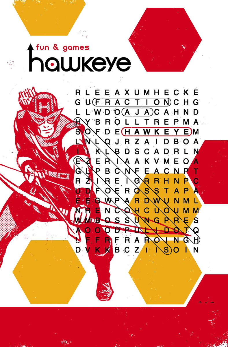
I want to pose a question here because I dont know the answer. Do computers factor in negatively in terms of the art? What I mean is, I know artists do the drawing but I just feel that somewhere along the way from turning it from a sketch to a printed copy, it loses its pizzazz. I love sketch covers, I think they look great. But the ink and actually colour that is printed out just doesn't have the same appeal as a comic from the 60's, 70's or even the 80's. Not to say that there are no wicked covers produced in the last 10-15 years. Also, the fact that (Marvel anyways) has the border with the bard code and the ad for "digital copy" on there just is so ugly. Worst series in terms of the covers for me is Hawkeye, which is a damn shame because the writing is excellent. Issue one was a decent cover but the issues since suck. Like, what is this?   |
|
|
|
Post by fanboystranger on Jun 5, 2015 12:47:10 GMT -5
They aren't boring to me, especially when one modern comic can have up to 15 different covers from which to choose. Granted, the cover might have absolutely nothing to do with the inside book. Most Cap fans like this cover...although there's no Sam Wilson with this guy ->   And yet this cover is nothing but a shameless swipe of Alex Schomburg's cover for Captain America Comics #3. What does it say about cover design that people still respond o a 74-year-old image? Cei-U! Everything old is new again! Do they, though, or is it because it has a supposed built-in collectability factor? I'm not sure the reason that people seek out that Campbell homage is because they like the cover so much as they think they'll be able to sell it somewhere down the line for a significant profit.
Personally, I prefer the Schomburg cover.
|
|
|
|
Post by fanboystranger on Jun 5, 2015 12:51:08 GMT -5
I want to pose a question here because I dont know the answer. Do computers factor in negatively in terms of the art? What I mean is, I know artists do the drawing but I just feel that somewhere along the way from turning it from a sketch to a printed copy, it loses its pizzazz. I love sketch covers, I think they look great. But the ink and actually colour that is printed out just doesn't have the same appeal as a comic from the 60's, 70's or even the 80's. Not to say that there are no wicked covers produced in the last 10-15 years. Also, the fact that (Marvel anyways) has the border with the bard code and the ad for "digital copy" on there just is so ugly. Worst series in terms of the covers for me is Hawkeye, which is a damn shame because the writing is excellent. Issue one was a decent cover but the issues since suck. Like, what is this?   See, I love the Hawkeye covers because there's a design sensibility that says, "This is Hawkeye. This book is different." There's the muted color motif always on a white background, and it often has a tongue-in-cheek vibe. It strikes me as more along the line of what Dean Motter does with Mr X covers. That sells the book to me. |
|
|
|
Post by dupersuper on Jun 5, 2015 14:39:27 GMT -5
|
|
|
|
Post by adamwarlock2099 on Jun 5, 2015 14:52:57 GMT -5
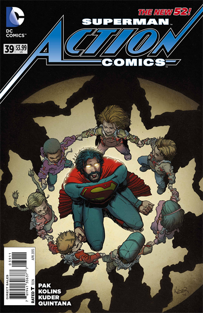
They still look cool to me...  Superman visits The Village of the Damned? |
|
|
|
Post by pinkfloydsound17 on Jun 5, 2015 16:17:37 GMT -5
^ That looks horrendous IMO.
I dislike Superman as it is. Superman with facial hair?! Yuck
And I do enjoy the earlier Hawkeye covers but that one there irks me. More so that a lot of the comics have that stupid Marvel Now border with ads and stuff. Ads are for inside or the back cover. If you want to experiment with borders, well, DON'T! Use the whole canvas for art!
|
|