|
|
Post by Pharozonk on Jun 4, 2015 9:08:57 GMT -5
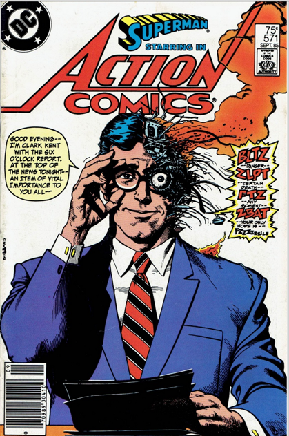
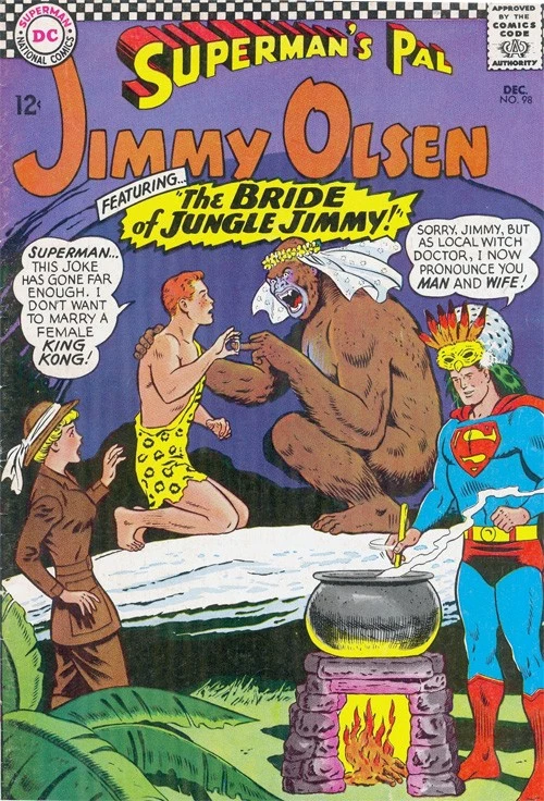
Is it just me or are modern comic covers, for lack of a better word, boring? I think part of this has to do with the digital age of coloring and inking. Colors don't pop out at you anymore like they used to, especially since superhero costumes have actually gotten toned down and the colors aren't as bright anymore.Back in the day, a comic cover used to feature some insane scenario that made you curious to find out what was going to happen in the issue? Now each issue just features the hero gritting their teeth while punching a villain or lying half dead in a pool of their own blood. It's dull and doesn't make the reader interested in something they weren't already set on buying. Take this comparison of two different Superman covers:   |
|
|
|
Post by fanboystranger on Jun 4, 2015 9:29:17 GMT -5
I think it has more to do with the resale of original art than anything else. The bulk of superhero comic covers these days are fairly static character shots rather than something with action. They're aimed at the collector of original art as much as to sell the comic. There's some exceptions, of course, but for the most part, you're not seeing a lot of dynamic superhero comic covers these days.
On the other hand, there are a lot more interestingly designed covers. It's not just action shots, but something that tries to give the series an identity. I was reading through the tpb of Lemire's Superboy stories the other night, and I was impressed with these sorts of covers:
  
There's a design motif there that gives the book a distinct identity. They may not be particularly dynamic-- although they are better than most, in that regard-- but they do stand out and say, "Hey, this isn't your father's Superboy." They also build a sense of mystery about what the story the book is telling, rather than giving it away on the cover. It's a different sort of approach for a genre built on action.
|
|
shaxper
CCF Site Custodian
Posts: 22,871
|
Post by shaxper on Jun 4, 2015 9:32:35 GMT -5
I think another important cause is the production schedule for comics these days. A cover and synopsis need to be completed and available for preorder solicits long before a script is anywhere near complete. A lot of the time, I suspect the artist has little knowledge of what will occur in the book he or she is doing a cover for.
|
|
|
|
Post by Dizzy D on Jun 4, 2015 10:00:57 GMT -5
I think it's also a bit of picking and chosing examples here: good/interesting and bad/non-descriptive covers are things of all times.
|
|
|
|
Post by fanboystranger on Jun 4, 2015 10:12:38 GMT -5
Another point about design motif giving the book an identity:
These are the first two covers for the new Omega Men series:
 
The design is stark and simple, yet it provokes a strong visceral reaction in me. It suggests that the book is going to be political, brutal, and something different from the norm. It doesn't give away the story, but suggests one. It draws my eye to its interesting, sophisticated design sensibility. It's use of color-- or lack of color, really-- tells me that this book has a sensibility far removed from the colorful world of most superheroes. The scrawled logo over the clinical propaganda style poster tells us that this is a book about rebellion. It's sending a powerful message about what the book is through its sensibility rather than its events. The cover sells the book as something different, not the same old thing. I would love to have either of these hanging on my wall as "art".
Compare this to the first cover from the original Omega Men series:

It's actually a really good cover, too, but nothing about this really says, "Hey, this is something new, something different." It doesn't really jump out from anything else on the stands. There's certainly a design sense at work, but there's not really an attempt at an iconic design to encapsulate what the series is about. Are the Omega Men the rebels or are they the conquerers? Its use of color would have stood out in its day, but otherwise, a fairly conventional cover. It serves its purpose, but there's nothing really special there. It's just another part of the book.
|
|
|
|
Post by adamwarlock2099 on Jun 4, 2015 10:26:57 GMT -5
Covers are meant to appeal to a person to pick up the book and buy it. Different covers appeal to different people. There should always be a variety in which covers are presented. In Fanboy's example above the newer series seems to want to appeal to a "sophisticated" audience. Where as the original series cover looks more action oriented and the intent to appeal to an all ages group. And I say that not because people that would buy the original OM series aren't sophisticated, or that people buying the new OM series are snobbish elitist. It's the fault, for the lack of a better word, of the publisher to try and just target one demographic based on a stereotype.
What I would say what is different, having started in the 90's that most of DC and Marvel's covers, along with Image, who seemed to have started the trend, about modern covers over pre 90's stuff is that the cover is a piece of art. It's not a panel taken from the issue and meant to, literally, say something. Modern covers are modern works of art, as the plethora of variant covers offered for most Marvel, DC and Image comics will attest to. Either way, the intent is to sell the contents based on one page, the cover, rather than the actual contents of the comic, not matter what the design of the cover is.
|
|
|
|
Post by Pharozonk on Jun 4, 2015 10:35:28 GMT -5
Compare this to the first cover from the original Omega Men series:
It's actually a really good cover, too, but nothing about this really says, "Hey, this is something new, something different." It doesn't really jump out from anything else on the stands. There's certainly a design sense at work, but there's not really an attempt at an iconic design to encapsulate what the series is about. Are the Omega Men the rebels or are they the conquerers? Its use of color would have stood out in its day, but otherwise, a fairly conventional cover. It serves its purpose, but there's nothing really special there. It's just another part of the book.
I think the big reason I prefer the latter cover is simple psychology. The human eye is adapted to detect bright colors and discern them from the rest of their environment. While this may have served a more primitive survival function in man's early days, a comic fan's eyes are drawn to bright colors that pop out to them. If I were to pass by a rack and see the first cover you listed, I may not even notice it at first. The dark black and beige layout don't catch the eye in the way the older cover does. While this may vary from person, such as in your case, I think that using brighter colors is more aesthetically pleasing for the most part. |
|
|
|
Post by DE Sinclair on Jun 4, 2015 11:13:42 GMT -5
Though it could be argued that in a sea of riotous color that are most comics covers, the stark cover would stand out.
|
|
|
|
Post by Deleted on Jun 4, 2015 12:23:24 GMT -5
Is it just me or are modern comic covers, for lack of a better word, boring? They aren't boring to me, especially when one modern comic can have up to 15 different covers from which to choose. Granted, the cover might have absolutely nothing to do with the inside book. Most Cap fans like this cover...although there's no Sam Wilson with this guy ->   |
|
|
|
Post by Deleted on Jun 4, 2015 12:27:40 GMT -5
And this cover makes me look over my shoulder every time even if it IS a riot. It worked in the 60s...but I don't think it would 50 years later.  |
|
|
|
Post by Deleted on Jun 4, 2015 13:13:12 GMT -5
Though it could be argued that in a sea of riotous color that are most comics covers, the stark cover would stand out. Exactly, and most of the time they tends to do well at Comic Books Stores because of their distinction. |
|
|
|
Post by Rob Allen on Jun 4, 2015 13:43:48 GMT -5
Though it could be argued that in a sea of riotous color that are most comics covers, the stark cover would stand out. That's exactly why L.B. Cole liked to use plain white or light-colored backgrounds with one striking image in the middle. |
|
|
|
Post by MDG on Jun 4, 2015 13:48:28 GMT -5
I think today there's less of a "one size fits all" model for covers, and the publishers are looking for covers that appeal to different segments of the audience--including different segments of a superhero audience that isn't as monolithic as in the past.
Many covers also tend to be selling a mood or tone rather than the specific story in the book.
It'd be interesting to see which covers do the best job pulling impulse buyers (apart from those featuring large boobs). Do most people still go into comic shops with a pretty good idea of what they're going to pick up?
|
|
|
|
Post by Ish Kabbible on Jun 4, 2015 14:05:29 GMT -5
With the prices of comics these days, I find it hard to believe any significant number of customers ever buy a book based on the cover. And the publishers know this. No longer does a cover try to entice you with a dramatic representation of what lies inside. Its just poster art now and interchangeable. It could have been commissioned a year ago and that doesn't matter. I'm not saying I prefer one type of cover over another but I did miss the old school type |
|
|
|
Post by wildfire2099 on Jun 4, 2015 14:09:06 GMT -5
I agree 100% that there are more generic covers these days than there used to be, but I don't think ALL cover are bad. In fact, some series specifically have great covers (Fables, Sandman, Starman, Astro City) with their own artists.
The thing I really hate is variants that have nothing to do with anything... like 'Deadpool month', where Deadpool is randomly on the cover of a Ms. Marvel comic he's not in.
|
|