|
|
Post by Reptisaurus! on Jun 5, 2015 16:42:02 GMT -5
What does it say about cover design that people still respond o a 74-year-old image? Cei-U! Everything old is new again! It's a really good 74-year-old image? I've been reading a lot of golden age Cap lately and really, really enjoying it, even after Kirby left. |
|
|
|
Post by Deleted on Jun 5, 2015 18:38:11 GMT -5
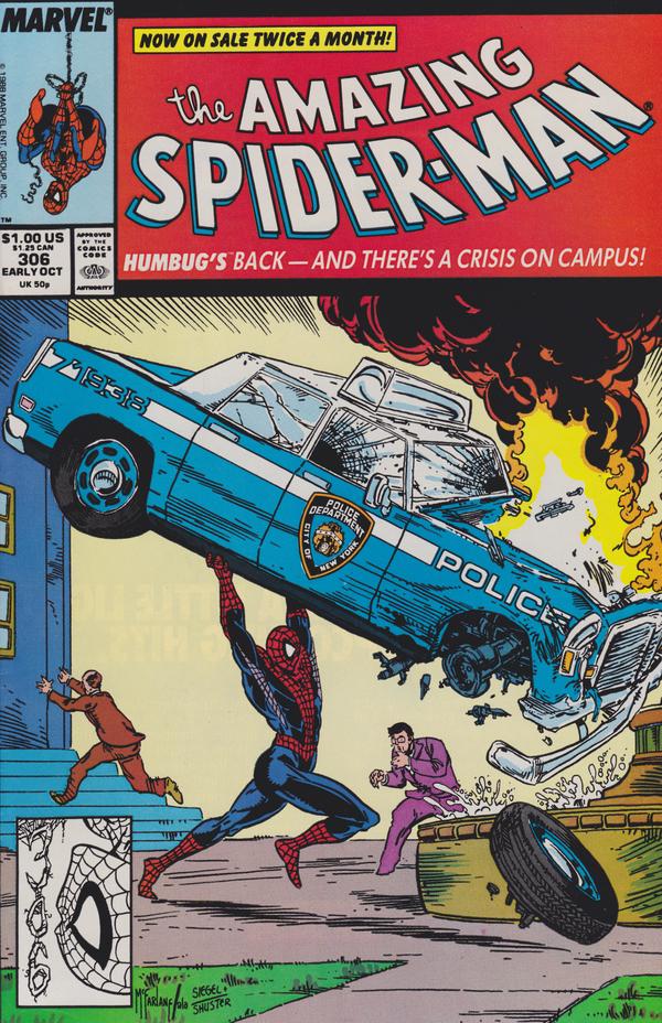
And yet this cover is nothing but a shameless swipe of Alex Schomburg's cover for Captain America Comics #3. Shameless swipe? A popular trend with variant covers (and sometimes a regular cover) is to give a tip of the hat to a blast from the past. How shameless of those who gave a nod to this one (and there have been many).  |
|
|
|
Post by marvelmaniac on Jun 5, 2015 18:39:29 GMT -5
The comic covers of yesterday are safe and sound in my collection.
|
|
|
|
Post by Pharozonk on Jun 5, 2015 18:40:58 GMT -5
And yet this cover is nothing but a shameless swipe of Alex Schomburg's cover for Captain America Comics #3. Shameless swipe? A popular trend with variant covers (and sometimes a regular cover) is to give a tip of the hat to a blast from the past. How shameless of those who gave a nod to this one.  The difference is that Todd McFarlane, at least at that point in his career, did that cover as the ONLY cover to that issue of ASM. I'm pretty sure Campbell's entire career these days is predicated on churning out variant covers for every book that Marvel is putting out and making them all callbacks to past eras/designs. |
|
|
|
Post by Deleted on Jun 5, 2015 19:02:04 GMT -5
Nah.  For the record my favourite Spidey cover era will be the John Romita Snr run from 39 up... |
|
|
|
Post by Phil Maurice on Jun 5, 2015 19:42:32 GMT -5
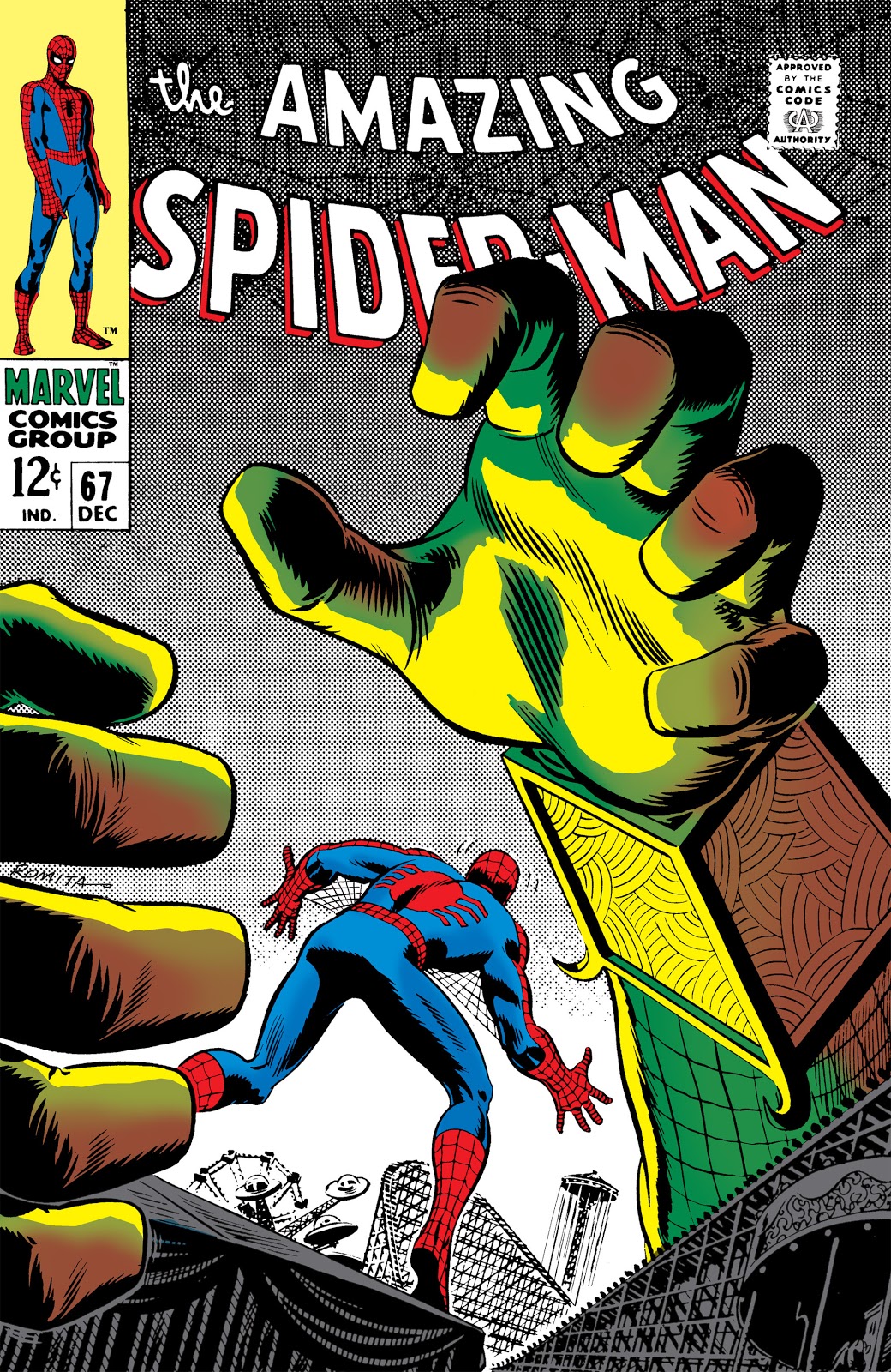
That's a nice cover. What, if any, is the significance of the number 28 on MJ's shirt (not a sports guy)? Yeah, JR Sr. is tough to top. Occasionally, he "out-Ditko-ed" Ditko, as in this one from ASM #67:

|
|
|
|
Post by Reptisaurus! on Jun 5, 2015 19:49:12 GMT -5
Yeah, I liked the Schomburg copy one as well. I thought he was one of the marginally talented Image guys way back when, but he's got some design chops now. DOES he only do covers, or has he done any interiors lately?
|
|
|
|
Post by Deleted on Jun 5, 2015 19:56:05 GMT -5
That's a nice cover. What, if any, is the significance of the number 28 on MJ's shirt (not a sports guy)? I think its Spidey's age in Amazing Spider-Man Vol. 3 (current one) as #1 refers to him being bitten by a Spider 13 yrs ago (when he was 15). |
|
|
|
Post by Phil Maurice on Jun 5, 2015 19:56:06 GMT -5
Yeah, I liked the Schomburg copy one as well. I thought he was one of the marginally talented Image guys way back when, but he's got some design chops now. DOES he only do covers, or has he done any interiors lately? Pronoun trouble. Schomburg never worked at Image, nor was he "marginally talented." He passed in 1998, so no recent interiors either.

|
|
|
|
Post by Reptisaurus! on Jun 5, 2015 21:31:40 GMT -5
Rabbit Season!
Worth noting that Schomburg did do some interiors - He's credited with the Captain Daring and his Sky Sharks feature in USA Comics # 7. (Took me twenty minutes of digging through my Masterworks to find that, though! He didn't do many full features!)
|
|
|
|
Post by crazyoldhermit on Jun 5, 2015 22:33:08 GMT -5
But even regular covers can catch people's eye and might entice them to pick the book up. It seems to me the old school style showing action related to the story inside is more enticing and more likely to catch the eye than the generic action shots, but as I get older I realize more and more that I don't understand what appeals to young folks these days. Oh definitely. It was covers like this that got me to check out Waid's Daredevil in 2011, even though at that point I had no real interest in the character: ![]()  |
|
|
|
Post by coke & comics on Jun 5, 2015 22:45:59 GMT -5
I think comic covers are doing fine these days. For Marvel at least, the nadir was some 10-15 years ago when somebody decreed every cover should be a generic image of the character posing. Glance at 50 issues of Ultimate Spidey: www.coverbrowser.com/covers/ultimate-spider-manSuch things seemed to dominate their line for a while. |
|
|
|
Post by Deleted on Jun 5, 2015 22:55:50 GMT -5
That's a nice cover. What, if any, is the significance of the number 28 on MJ's shirt (not a sports guy)? I think its Spidey's age in Amazing Spider-Man Vol. 3 (current one) as #1 refers to him being bitten by a Spider 13 yrs ago (when he was 15). That's an interesting observation - and it's makes a lot of sense here! |
|
|
|
Post by Deleted on Jun 5, 2015 23:31:51 GMT -5
^ That looks horrendous IMO. I dislike Superman as it is. Superman with facial hair?! Yuck And I do enjoy the earlier Hawkeye covers but that one there irks me. More so that a lot of the comics have that stupid Marvel Now border with ads and stuff. Ads are for inside or the back cover. If you want to experiment with borders, well, DON'T! Use the whole canvas for art! It's not "art" per se, it is a commodity featuring commercial art. Which includes logo and branding as part of its conceptual design. No different than the corner box and Marvel Comics Group banner of the 70s or A Marvel Pop Art Production of the MMMs want you ad on the front cover of Silver Age Marvel. The difference now is that the books are no long on spinner racks and are racked/shelved differently, so the layout is no longer constrained by the need to have the Marvel identifying marks at the top or on the left side. -M |
|
|
|
Post by dupersuper on Jun 8, 2015 12:15:54 GMT -5
^ That looks horrendous IMO. I dislike Superman as it is.Well then we probably won't agree on much anyway... |
|