|
|
Post by Deleted on Jun 19, 2017 22:43:47 GMT -5
Enchantress by Liefeld  Even Olive Oyl looked better! ... I'm a Liefeld hater too.
|
|
|
|
Post by wildfire2099 on Jun 20, 2017 7:46:31 GMT -5
That's probably the worst one.. even worse than super chest Cap.... one wonders how tall Loki was, to be able to reach her hand from a kneeling position.
|
|
|
|
Post by Deleted on Jun 20, 2017 8:33:45 GMT -5
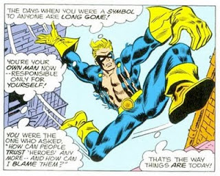 Frank Robbins on Steve Rogers as Nomad. |
|
|
|
Post by tarkintino on Jun 20, 2017 8:34:13 GMT -5
Worst drawn comicbook panel of all time
The collected works of Rob Liefeld?
|
|
|
|
Post by Icctrombone on Jun 20, 2017 8:41:15 GMT -5
 Frank Robbins on Steve Rogers as Nomad. AHHHHHHHHHHHH !! My Eyes !!!!! |
|
|
|
Post by Roquefort Raider on Jun 20, 2017 9:02:41 GMT -5
 Frank Robbins on Steve Rogers as Nomad. That's unfortunately the image that come to mind when I think of Robbins' run on Cap. Nomad looks like an action figure that was thrown in the air repeatedly! |
|
|
|
Post by Deleted on Jun 20, 2017 10:12:11 GMT -5
 Frank Robbins on Steve Rogers as Nomad. That's unfortunately the image that come to mind when I think of Robbins' run on Cap. Nomad looks like an action figure that was thrown in the air repeatedly! And, a freak of nature at the same time ... I hate Frank Robbins more than Liefeld ... Seriously and that guy doesn't know anything about Human Anatomy at all. As a student of Art in High School and College that guy gets a F Minus for sure. |
|
|
|
Post by tarkintino on Jun 20, 2017 10:34:18 GMT -5
I think it was a Marvel problem, as Robbins' late Golden Age and DC work does not look much like his Marvel work at all.
|
|
|
|
Post by MDG on Jun 20, 2017 10:48:17 GMT -5
I think it was a Marvel problem, as Robbins' late Golden Age and DC work does not look much like his Marvel work at all. Yeah--They tried to ink him into the house style, and it wasn't going to work. Robbins--like Kirby, Ditko, Toth--ain't gonna fit into your box. And, a freak of nature at the same time ... I hate Frank Robbins more than Liefeld ... Seriously and that guy doesn't know anything about Human Anatomy at all. As a student of Art in High School and College that guy gets a F Minus for sure. I tend to think Robbins knew very well what he was doing.   |
|
|
|
Post by Deleted on Jun 20, 2017 10:50:18 GMT -5
I think it was a Marvel problem, as Robbins' late Golden Age and DC work does not look much like his Marvel work at all. Absolutely! Look at the cover below. Beautiful stuff in the style of Toth or Caniff:

I remember his Marvel work described as characters drawn with their limbs akimbo. I had to look it up. It means "limbs flung out widely or haphazardly". Perfect description. I think he was a good Golden Age artist that was forced to draw in a certain style & his art in the 70's suffered as a result.
|
|
|
|
Post by The Captain on Jun 20, 2017 19:30:47 GMT -5
 Frank Robbins on Steve Rogers as Nomad. It was panels like this that I was thinking of when denigrating Robbins' work in the podcast I did with Crimebuster. This is just horrible art, with misshapen anatomy combined with unrealistic poses. |
|
|
|
Post by berkley on Jun 20, 2017 23:33:21 GMT -5
I agree that things like Johnny Hazard show that Frank Robbins was a much better artist than his Marvel work would indicate. My theory is that he just didn't "get" superheroes, or the whole visual aesthetic of superhero comics: I imagine someone telling him, "You have to exaggerate or distort the anatomy for effect", so he just started going wild with it without really having any feel for what it was supposed to do. The more I've seen of his news-strip work the more I find I can kind of look beneath the surface of even his superhero art and see something of the skills that are more evident in his other stuff.
|
|
|
|
Post by LovesGilKane on Jun 21, 2017 10:28:25 GMT -5
I agree that things like Johnny Hazard show that Frank Robbins was a much better artist than his Marvel work would indicate. My theory is that he just didn't "get" superheroes, or the whole visual aesthetic of superhero comics: I imagine someone telling him, "You have to exaggerate or distort the anatomy for effect", so he just started going wild with it without really having any feel for what it was supposed to do. The more I've seen of his news-strip work the more I find I can kind of look beneath the surface of even his superhero art and see something of the skills that are more evident in his other stuff. to back this up, we could all wonder what an issue of FF or the Avengers would look like if depicted by Charles Dana Gibson. |
|
|
|
Post by LovesGilKane on Jun 21, 2017 11:18:43 GMT -5
|
|
|
|
Post by Warmonger on Jun 21, 2017 11:28:14 GMT -5
Enchantress by Liefeld  Even Olive Oyl looked better! ... I'm a Liefeld hater too. 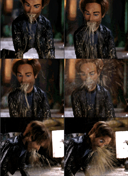 |
|