|
|
Post by Paste Pot Paul on Jun 22, 2017 10:31:18 GMT -5
You fullas leave Frank alone, hes ok by me. Comics is all about exaggeration, well supers are anyway, so stop with the hater talk or youll feel the power of my paste pot...
|
|
|
|
Post by codystarbuck on Jun 22, 2017 11:09:06 GMT -5
I like Frank Robbins work. No apologies, no qualification; I flat out liked his Marvel work. I thought it was better suited to the 1940s-set Invaders than the modern Cap; but, he got superheroes just fine, in that book. To me, he gave an energy to the characters, with the rubbery movements, that most of the other artists who worked on the series lacked. His Cap fighting Nazis was the closest, for me, to Kirby's Cap fighting crowds of Nazis. He also did a damn good Batman and wrote some tremendous mysteries there. Back to Invaders, Robbins brought to mind those Alex Schomburg covers that inspired the series, with the heroes smashing planes, swatting crowds of German soldiers, and fighting weird Nazi science. Robbins knew how to present pulp and pulp is what The Invaders was.
|
|
|
|
Post by brutalis on Jun 22, 2017 13:24:23 GMT -5
YAY to seing Robbin's support. I always loved his quirky stylistic action anatomy. Exaggerated and rubbery yet completely comic book visualization. I will take Robbins bombastic artwork over today's talking heads anytime! Invader's drawn by him kicked all sorts of ass, not just Nazi's!!!
|
|
|
|
Post by chaykinstevens on Jun 22, 2017 17:37:15 GMT -5
From Marvel Team-Up Annual #4 by Herb Trimpe and Mike Esposito  |
|
|
|
Post by Prince Hal on Jun 23, 2017 12:44:09 GMT -5
From Marvel Team-Up Annual #4 by Herb Trimpe and Mike Esposito  I thought a Spider-Man Thanksgiving Day Parade balloon got loose. Plus, that's generic Marvel art at its "best." Proof that everybody can be Sal Buscema.  |
|
|
|
Post by kirby101 on Jun 23, 2017 13:35:15 GMT -5
Plus, that's generic Marvel art at its "best." Proof that everybody can be Sal Buscema.  Them's fighting words.   |
|
|
|
Post by Deleted on Jun 23, 2017 14:29:35 GMT -5
From Marvel Team-Up Annual #4 by Herb Trimpe and Mike Esposito  Yeah, that is bad! |
|
Crimebuster
CCF Podcast Guru
Making comics!
Posts: 3,958 
|
Post by Crimebuster on Jun 23, 2017 16:13:30 GMT -5
That is hilarious.
|
|
|
|
Post by Icctrombone on Jun 23, 2017 16:43:07 GMT -5
From Marvel Team-Up Annual #4 by Herb Trimpe and Mike Esposito  Macys balloon ? |
|
|
|
Post by Roquefort Raider on Jun 23, 2017 19:38:46 GMT -5
You guys are tough! I actually like the art in that issue! Sure, it's a little goofy-looking... But it's not scratch-your-eyes-out bad like the Liefeld Enchantress or Manboon Cap!
The only time I didn't like Trimpe's art was precisely when he tried to ape the Lee-Larsen-Liefeld aesthetics, toward the end of his career at Marvel. I much preferred his kinda Kirbyish style.
|
|
|
|
Post by berkley on Jun 23, 2017 19:56:50 GMT -5
Was that Trimpe image a full page in the original comic or just one of several smaller panels? As it is, yes Spider-Man's head looks weird, but everything else looks fine to me.
|
|
|
|
Post by LovesGilKane on Jun 24, 2017 0:17:27 GMT -5
 The BG's and Luke Cage are pretty good in that one. 
|
|
|
|
Post by Ish Kabbible on Jun 24, 2017 3:07:19 GMT -5
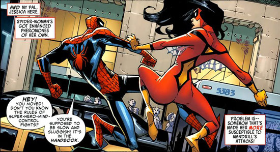
Have not followed all the posts on this thread but I'm sure it can use more Humberto Ramos needles-in-eyeball "art"   |
|
|
|
Post by LovesGilKane on Jun 24, 2017 3:22:07 GMT -5
Have not followed all the posts on this thread but I'm sure it can use more Humberto Ramos needles-in-eyeball "art"    |
|
|
|
Post by Paste Pot Paul on Jun 24, 2017 3:52:58 GMT -5
Suddenly Frank Robbins aint lookin so bad folks...
|
|