|
|
Post by beccabear67 on Nov 2, 2018 17:35:49 GMT -5
Maybe it's just me but I tended to want to avoid the pence variant comics of the '60s and '70s, although I know they would've been printed at the same time as the American issues. I looked at the All-Colour banner on X-Men #101 and said... this is just slightly wrong.  I do have some that are the American issues with a rubber stamp mark of 10p on the cover, those I don't mind. Then again I don't even like the Marvels with the blacked diamond and strike through or blank UPC box, nor DC with Whitman in the corner medallion. Yet I don't mind the Canadian newsstand price variants at all. Basically I'm as much of a freak as any collector! 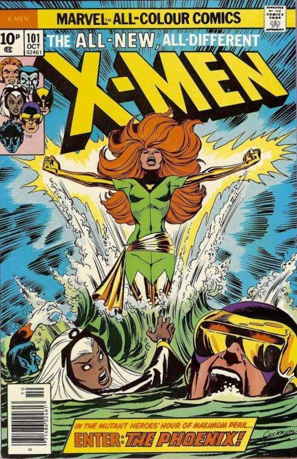 |
|
|
|
Post by tingramretro on Nov 4, 2018 9:46:02 GMT -5
Maybe it's just me but I tended to want to avoid the pence variant comics of the '60s and '70s, although I know they would've been printed at the same time as the American issues. I looked at the All-Colour banner on X-Men #101 and said... this is just slightly wrong. I do have some that are the American issues with a rubber stamp mark of 10p on the cover, those I don't mind. Then again I don't even like the Marvels with the blacked diamond and strike through or blank UPC box, nor DC with Whitman in the corner medallion. Yet I don't mind the Canadian newsstand price variants at all. Basically I'm as much of a freak as any collector! I've always preferred the British cover price versions with the "Marvel All-Colour Comics" banner, because that's what I remember from my childhood. The all-colour part was a major selling point, since most British comics at the time were in black and white. |
|
|
|
Post by Icctrombone on Nov 4, 2018 9:51:55 GMT -5
I remember buying New Teen Titans # 2, 3 in the pence version. I was told it's considered a variant and not a second printing.
|
|
|
|
Post by beccabear67 on Nov 4, 2018 12:07:34 GMT -5
Maybe it's just me but I tended to want to avoid the pence variant comics of the '60s and '70s, although I know they would've been printed at the same time as the American issues. I looked at the All-Colour banner on X-Men #101 and said... this is just slightly wrong. I do have some that are the American issues with a rubber stamp mark of 10p on the cover, those I don't mind. Then again I don't even like the Marvels with the blacked diamond and strike through or blank UPC box, nor DC with Whitman in the corner medallion. Yet I don't mind the Canadian newsstand price variants at all. Basically I'm as much of a freak as any collector! I've always preferred the British cover price versions with the "Marvel All-Colour Comics" banner, because that's what I remember from my childhood. The all-colour part was a major selling point, since most British comics at the time were in black and white. I guess that's what it's all about; what you had contact with first at the time. I did have some b&w British titles (wish I'd kept the one which had a part of the first Wolverine/Hulk story), so I can get nostalgic about them. I still have a long run of the early Marvel Doctor Who weekly/monthly, and they're more 'real' to me then the later U.S. editions in color!  |
|
|
|
Post by MDG on Nov 4, 2018 21:25:36 GMT -5
160 page Archie comics (not digests) were awesome.
Never saw these. Are they a bunch of unsold issues bound together? EDIT: just checked GCD--yep, that's what it is. |
|
|
|
Post by brianf on Nov 4, 2018 22:28:27 GMT -5
I've been reading comics since the mid 1970s and I've never liked Gene Colan's art.
Still don't.
It kinda bugs me - as a kid in the late 70's I hated Kirby, Ditko, Trimpe, Frank Robbins and other old school artists while loving stuff like Byrne, Perez, Gulacy and other "clean" artists.
Over time I've grown to appreciate most of the artists I disliked as a kid, and some I've grown to love.
My idea of good art has broadened
But Colon is is still an eyesore to me.
I know he's well loved and his fans write some inspiring words of appreciation, but every Colon comic I read I find myself flipping though quickly since his art is so, I dunno, floppy?
rounded shadows?
an out of focus fish eye lens?
Kinda indistinct to the point I have to stare at it it too long?
I can see he has talent, but it's not pleasing to me.
It really bugs me that I find no enjoyment in his art.
|
|
|
|
Post by tarkintino on Nov 4, 2018 22:53:28 GMT -5
160 page Archie comics (not digests) were awesome.
I read the digests as a kid and found them to be a lot of fun. It was a great way to access some of the earliest Archie stories for what I believe was a dollar and some change. |
|
|
|
Post by Deleted on Nov 5, 2018 4:15:32 GMT -5
Then came the mega 1000 page Archie digests. I would never believe it -- until someone post a picture of it! |
|
|
|
Post by EdoBosnar on Nov 5, 2018 5:45:55 GMT -5
I read the digests as a kid and found them to be a lot of fun. It was a great way to access some of the earliest Archie stories for what I believe was a dollar and some change. Up until the early 1980s, they were less than a dollar, and until about 1985 or thereabouts, they were a dollar even. When I entered my Archie phase, in late 1977, they were still 75 cents, but then jumped to 95 cents in 1978 and stayed that way for a few years. But yeah, I love the Archie digests, and digests in general. As for those 1000-page monsters, I'm a bit leery - the fattest digest I have now is the Archie 75 Years, 75 Stories book, which has well over 600 pages, and it's a bit unwieldy. I think 400-500 pages is the limit for a digest, in that they're still easy to hold and the spine probably won't crack.
However, if I ever stumble across one of those 1000-pagers in a thrift store for a buck or two (or on, say, eBay, for about the same price and minimal postage), I'll pick it up just out of curiosity.
|
|
|
|
Post by Icctrombone on Nov 5, 2018 6:34:58 GMT -5
Is there anyone in this forum that is a fan of Spider-Gwen ? I read , or tried to read, the first 2 issues on MU and I couldn't finish it. Her personality is a copy of the Batgirl that is currently walking around the DC Universe these days.
Yuck, I said it.
|
|
|
|
Post by Roquefort Raider on Nov 5, 2018 6:36:24 GMT -5
I love digests and always did.
American comic books were created as cheap entertainment (cheap as in inexpensive, not necessarily of low quality) and digests were an excellent way to tell a lot of stories for very little money. The lousy printing was not an issue, since the originals had been meant to be produced on similar presses and similar paper.
Whether they be DC’s Blue Ribbon comics, Pocket Book’s reprints of early Marvel comics, Archie’s digests or Artima’s translations, those small books are among the ones I most cherish in my collection.
|
|
|
|
Post by tingramretro on Nov 5, 2018 6:50:15 GMT -5
I remember buying New Teen Titans # 2, 3 in the pence version. I was told it's considered a variant and not a second printing. Of course it's not a second printing. They were printed on the same day and on the same machine as the cents copies. About the last 10% of the print run would have had the pence covers. |
|
|
|
Post by tingramretro on Nov 5, 2018 6:56:26 GMT -5
I've always preferred the British cover price versions with the "Marvel All-Colour Comics" banner, because that's what I remember from my childhood. The all-colour part was a major selling point, since most British comics at the time were in black and white. I guess that's what it's all about; what you had contact with first at the time. I did have some b&w British titles (wish I'd kept the one which had a part of the first Wolverine/Hulk story), so I can get nostalgic about them. I still have a long run of the early Marvel Doctor Who weekly/monthly, and they're more 'real' to me then the later U.S. editions in color! The first Wolverine/Hulk story was reprinted in Mighty World of Marvel in about 1976, split across roughly four issues. I still have them. Likewise the complete Doctor Who run; Marvel US only reprinted the Tom Baker and (some) Peter Davison strips, and were unable to reprint several of the original back-up strips because Alan Moore withdrew his permission for them to reprint the material featuring his Special Executive characters. |
|
|
|
Post by Cei-U! on Nov 5, 2018 8:06:30 GMT -5
I've been reading comics since the mid 1970s and I've never liked Gene Colan's art. Still don't. It kinda bugs me - as a kid in the late 70's I hated Kirby, Ditko, Trimpe, Frank Robbins and other old school artists while loving stuff like Byrne, Perez, Gulacy and other "clean" artists. Over time I've grown to appreciate most of the artists I disliked as a kid, and some I've grown to love. My idea of good art has broadened But Colon is is still an eyesore to me. I know he's well loved and his fans write some inspiring words of appreciation, but every Colon comic I read I find myself flipping though quickly since his art is so, I dunno, floppy? rounded shadows? an out of focus fish eye lens? Kinda indistinct to the point I have to stare at it it too long? I can see he has talent, but it's not pleasing to me. It really bugs me that I find no enjoyment in his art. The idea that someone doesn't "get" my all-time favorite comics artist is like a knife in my heart.
Cei-U! I summon the EMTs!
|
|
|
|
Post by Icctrombone on Nov 5, 2018 9:04:41 GMT -5
I guess that means it’s not targeted for an old geezer like me.  |
|

 I do have some that are the American issues with a rubber stamp mark of 10p on the cover, those I don't mind. Then again I don't even like the Marvels with the blacked diamond and strike through or blank UPC box, nor DC with Whitman in the corner medallion. Yet I don't mind the Canadian newsstand price variants at all. Basically I'm as much of a freak as any collector!