|
|
Post by Duragizer on Feb 7, 2022 21:43:56 GMT -5
34, though I feel ten years older. Must've been a Gen X'er in my previous life. |
|
|
|
Post by codystarbuck on Feb 7, 2022 23:00:06 GMT -5
34, though I feel ten years older. Must've been a Gen X'er in my previous life. Let's test that hypothesis; best film about a Chocolate Factory? Totally Tubular or Completely Gnarly? Crocket or Tubbs? Complete this sentence, "As God is my witness.........." The Wonderful World of__________? Who was you favorite Globetrotter? Evel Knievel Stunt Cycle or GI Joe, with the Kung Fu Grip? Big Wheel or Green Machine? |
|
|
|
Post by Deleted on Feb 7, 2022 23:47:23 GMT -5
Does anyone sell bags for Hardcovers? I've seen pics of Mile High HC stock and they all seemed to be bagged on the shelves.
|
|
|
|
Post by codystarbuck on Feb 8, 2022 0:22:05 GMT -5
Does anyone sell bags for Hardcovers? I've seen pics of Mile High HC stock and they all seemed to be bagged on the shelves.
I know I have seen magazine size bags and those should accommodate any hardcover. Golden Age bags would do for some. |
|
|
|
Post by tartanphantom on Feb 8, 2022 0:42:32 GMT -5
Does anyone sell bags for Hardcovers? I've seen pics of Mile High HC stock and they all seemed to be bagged on the shelves.
I know I have seen magazine size bags and those should accommodate any hardcover. Golden Age bags would do for some.
Yes. It would depend on the book. They make bags for Life Magazine and Treasury editions, which would work with some wrapping, but if it's something like a 2-inch thick omnibus, over-wrapping with a Treasury edition bag or 11x17 art print bag is about the only way to go.
|
|
|
|
Post by Deleted on Feb 8, 2022 0:55:46 GMT -5
If they only vary in thickness but have the same length x breadth (like these below), I thought regular bag suppliers would make suitable size bags available...
Even if a HC is left alone on a shelf, it can still accumulate some slight wear over time....guess I'll have to improvise....
|
|
|
|
Post by tartanphantom on Feb 8, 2022 1:52:21 GMT -5
If they only vary in thickness but have the same length x breadth (like these below), I thought regular bag suppliers would make suitable size bags available...
Even if a HC is left alone on a shelf, it can still accumulate some slight wear over time....guess I'll have to improvise....
Take some measurements... with that many, you may be better off buying archival book covers. It won't necessarily protect the pages within, but it should cut down on dust jacket and binding damage. Or do a search for archival library supplies. |
|
Confessor
CCF Mod Squad
Not Bucky O'Hare!
Posts: 10,058 
|
Post by Confessor on Feb 8, 2022 8:55:07 GMT -5
If they only vary in thickness but have the same length x breadth (like these below), I thought regular bag suppliers would make suitable size bags available... Even if a HC is left alone on a shelf, it can still accumulate some slight wear over time....guess I'll have to improvise....
Within book collecting circles (rather than comic collecting), the accepted wisdom seems to be that books on a shelf are better off being allowed to "breathe", rather than sealed in plastic bags. Or so I've read and heard on a number of book collecting YouTube vids. |
|
|
|
Post by tonebone on Feb 8, 2022 10:53:48 GMT -5
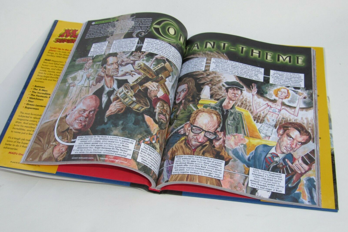
Full-colour interior, Hardcover MAD is awesome....this is from 2012. B&W sucks hehe
I can't really stomach full-color MAD. It looks nice, and all, but it looks TOO nice. There's a story about MAD in the 70's where there was a newsprint shortage. Mad was always printed on cheap newsprint, and the supplier told Gaines that he couldn't get a hold of newsprint, but he would upgrade him to glossy paper at no extra charge. Gaines was furious, and sourced the newsprint himself at double or triple the price, because he wanted Mad to be printed on cheap disposable paper. It was all part of Mad's overall aesthetic. Mad was the underdog... the magazine that was published in spite of the incompetence and insanity of the creators. When I see Mad in full color, on glossy paper, it loses that "contraband" feel. Mad is supposed to feel like some sort of underground operation, like the inmates have taken control of the asylum and published a magazine. The "modern" Mad feels like something over-produced and precious. There's no way subversive ideas are going to survive that process. Rude, crude, crass, yes... but not truly subversive. As a kid, my parents would buy Mad for me, but I would never willingly show them what they had purchased for me. It was always subversive and "too adult". My dad and I recently bonded over Mad, and he told me when he was a kid reading Mad, he felt the SAME WAY. So, when he was buying me Mad, he KNEW it was subversive and sarcastic, and probably just a little too grown up for me. As it should be. |
|
|
|
Post by impulse on Feb 8, 2022 11:07:54 GMT -5
I agree. Mad doesn't feel right in slick, shiny glossy full color. It was made to be black and white.
|
|
|
|
Post by MDG on Feb 8, 2022 11:18:43 GMT -5
I can't really stomach full-color MAD. It looks nice, and all, but it looks TOO nice. There's a story about MAD in the 70's where there was a newsprint shortage. Mad was always printed on cheap newsprint, and the supplier told Gaines that he couldn't get a hold of newsprint, but he would upgrade him to glossy paper at no extra charge. Gaines was furious, and sourced the newsprint himself at double or triple the price, because he wanted Mad to be printed on cheap disposable paper. It was all part of Mad's overall aesthetic.... As much as I agree with you, Gaines was very hesitant about changing Mad from what it was initially. He didn;t mind repackaging material, but didn;t want to tamper with the magazine. Feldstein and others wanted to go to glossy, color and have ads--using their own in-house group to create them--but Bill wouldn;t budge.
There was an interview I read with Feldstein, from right after he left Mad or (more likely) right after Bill dies where he was very candid abut their relationship. He said that at one point--because Feldstein would get incentive payments based on circulation--he was being paid more than Gaines, which didn;t sit well.
I remember one othe exchange in the interview...
Interviewer: A lot of people think Harvey Kurtzman's a genius. Feldstein: No comment.
As a kid, my parents would buy Mad for me, but I would never willingly show them what they had purchased for me. It was always subversive and "too adult". My dad and I recently bonded over Mad, and he told me when he was a kid reading Mad, he felt the SAME WAY.. One summer, my family and four or five others rented a floor of a hotel in the Catskills, where we all had private rooms and a big living room. I'd brought two or three Mads up and caught all of the dad's looking st one at some point.
But when one of my son's got a subscription in the late 90s, early oughts, it definitely had a different feel. In the 60s-70s, they were still writing for adults even if the main readership was younger: a lot of jokes about expense accounts and hiring plumbers, and a lot of--if not sophisticated political and topical humor, jokes that assumed more than a surface knowledge of what was going on. It was a kids' view into "adult world." By the late 90s, it was aimed more directly at a younger audience who knew the ins and outs of Brittany Spears gossip. And a lot more snot jokes (Tom Bunk's a good artist, but lacks the charm of Basil Wolverton. I say that seriously.)
|
|
|
|
Post by Batflunkie on Feb 8, 2022 11:19:59 GMT -5
I agree. Mad doesn't feel right in slick, shiny glossy full color. It was made to be black and white. I grew up with the colorized American reprints of Dredd and for a while didn't understand why the complete case files were in B&W, but then you get to the Brian Bolland artwork and it absolutely deserves to be in Black & White. I think Howard The Duck looks great in B&W too, it kind of gives it a noir, almost seedy underbelly quality |
|
|
|
Post by Deleted on Feb 8, 2022 12:00:06 GMT -5
I agree. Mad doesn't feel right in slick, shiny glossy full color. It was made to be black and white.
I still enjoy reading those but admit I'm more partial to full-colour comics, even the 'classic' MAD still had colour covers.....nice to be in the minority  |
|
|
|
Post by tonebone on Feb 8, 2022 13:58:45 GMT -5
I can't really stomach full-color MAD. It looks nice, and all, but it looks TOO nice. There's a story about MAD in the 70's where there was a newsprint shortage. Mad was always printed on cheap newsprint, and the supplier told Gaines that he couldn't get a hold of newsprint, but he would upgrade him to glossy paper at no extra charge. Gaines was furious, and sourced the newsprint himself at double or triple the price, because he wanted Mad to be printed on cheap disposable paper. It was all part of Mad's overall aesthetic.... As much as I agree with you, Gaines was very hesitant about changing Mad from what it was initially. He didn;t mind repackaging material, but didn;t want to tamper with the magazine. Feldstein and others wanted to go to glossy, color and have ads--using their own in-house group to create them--but Bill wouldn;t budge.
There was an interview I read with Feldstein, from right after he left Mad or (more likely) right after Bill dies where he was very candid abut their relationship. He said that at one point--because Feldstein would get incentive payments based on circulation--he was being paid more than Gaines, which didn;t sit well.
I remember one othe exchange in the interview...
Interviewer: A lot of people think Harvey Kurtzman's a genius. Feldstein: No comment.
As a kid, my parents would buy Mad for me, but I would never willingly show them what they had purchased for me. It was always subversive and "too adult". My dad and I recently bonded over Mad, and he told me when he was a kid reading Mad, he felt the SAME WAY.. One summer, my family and four or five others rented a floor of a hotel in the Catskills, where we all had private rooms and a big living room. I'd brought two or three Mads up and caught all of the dad's looking st one at some point.
But when one of my son's got a subscription in the late 90s, early oughts, it definitely had a different feel. In the 60s-70s, they were still writing for adults even if the main readership was younger: a lot of jokes about expense accounts and hiring plumbers, and a lot of--if not sophisticated political and topical humor, jokes that assumed more than a surface knowledge of what was going on. It was a kids' view into "adult world." By the late 90s, it was aimed more directly at a younger audience who knew the ins and outs of Brittany Spears gossip. And a lot more snot jokes (Tom Bunk's a good artist, but lacks the charm of Basil Wolverton. I say that seriously.)
Yeah... when my son was young (in the early '00s) I would not let him read the current Mad material... I would buy him reprints of "classic" Mad, and knew he was reading something that was written from a place of intelligence. The then-current Mad was just mean, and gross. It was as if Beavis and Butthead teamed up with Howard Stern and crapped out something and called it Mad. |
|
|
|
Post by impulse on Feb 8, 2022 14:27:01 GMT -5
I agree. Mad doesn't feel right in slick, shiny glossy full color. It was made to be black and white. I still enjoy reading those but admit I'm more partial to full-colour comics, even the 'classic' MAD still had colour covers.....nice to be in the minority Right, it should go without saying, but just in case, I am only speaking for myself, of course. You are free to prefer your Mad however you like, even in full sacrilegious color.  I also think it looks weird when old comics are recolored using modern computer coloring with thousands of shades and contours. It looks (to me) like someone clearly from a bygone era dressed up in modern trends and clearly uncomfortable and out of place with it. I recently saw some of the 90s era Jim Lee X-MEN art with modern "perfect" coloring and it just looked weird. I don't know how much of that just me knowing what it is "supposed" to look like versus seeing pencils and inks that were drawn without this type of coloring in mind being colored that way. Or maybe the concept is fine and whoever did it just didn't do it in a way I like. Who knows. |
|