|
|
Post by rberman on Mar 31, 2018 19:26:24 GMT -5
I'm sure you all know the originals...here's the homage. (There was another in the following issue since it was a two-parter.)  |
|
|
|
Post by tarkintino on Apr 5, 2018 19:59:17 GMT -5
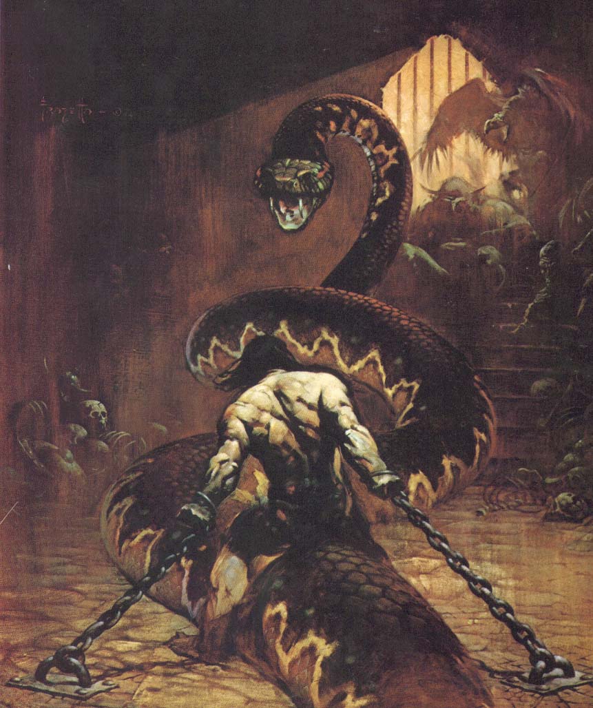
Warren's giant serpent covers; note the direction of the creature, and the position of the woman on each cover. Creepy #18 (January, 1968) by Vic Prezio. Famous Monsters of Filmland #55 (May, 1969), painting by Harry Schaare. Commissioned by ABC Merchandising, Inc. (and used as the box art for Aurora Plastics' model kit).  |
|
|
|
Post by kirby101 on Apr 6, 2018 12:53:31 GMT -5
I think this thread has long ago become "Hey here are two covers that sort of look alike" rather than actual homages or swipes.
|
|
|
|
Post by Prince Hal on Apr 6, 2018 14:00:24 GMT -5
I think this thread has long ago become "Hey here are two covers that sort of look alike" rather than actual homages or swipes. You say that as if it's a bad thing. I guess we could add "tropes" to the thread title, though. |
|
|
|
Post by tarkintino on Apr 6, 2018 14:55:02 GMT -5
I think this thread has long ago become "Hey here are two covers that sort of look alike" rather than actual homages or swipes. In the case of the serpent/snake, both appeared on Warren magazine covers, and considering the period in which both pieces were produced, I would think its a stretch to suggest one did not influence the other. Too many similarities to be coincidence. Regarding homages, there's not a strict definition where comic covers are concerned, in other words, examples need not be a direct copy+paste like the endless versions of Action Comics #1 or Amazing Fantasy #15 to fall under the homage category. |
|
|
|
Post by kirby101 on Apr 6, 2018 15:10:22 GMT -5
I think for it to be an homage, the one cover must directly influence the other. Not just have similarities. As for the serpent and snake, I have seen that type of image on dozens of covers. A snake with it's mouth agape is not unique.   |
|
|
|
Post by rberman on Apr 6, 2018 15:14:03 GMT -5
"Body coiled, head raised, mouth agape" is a pretty obvious action pose for a dangerous snake. In Tarkintino's defense, he did specifically note the body postures of the women on the two covers as well.
|
|
|
|
Post by kirby101 on Apr 6, 2018 15:50:09 GMT -5
"Body coiled, head raised, mouth agape" is a pretty obvious action pose for a dangerous snake. In Tarkintino's defense, he did specifically note the body postures of the women on the two covers as well. I've also seen that pose dozens of times. It's pretty much the default "startled reclining woman" pose.  |
|
|
|
Post by kirby101 on Apr 6, 2018 15:52:25 GMT -5
Look, I was not knocking the thread. I was just pointing out it has become more of a "tropes" thread, than homage, as Hal said.
|
|
|
|
Post by rberman on Apr 10, 2018 15:48:03 GMT -5
I feel like I may have seen this guy before...  |
|
|
|
Post by tarkintino on Apr 10, 2018 17:55:25 GMT -5
The Hildebrandt brothers really jumped self-homage and landed on the "swipe" side with the cover of Urshurak, their 1979 novel (with Jerry Nichols), which bears more than a few similarities with their poster art for Star Wars (1977), which in turn, was based on the Tom Jung poster from the film.  From the blonde hero in white (posed with a sword), the heroine sort of squatting in front of him in an action pose with the right leg supporting her / right hand holding the weapon (both on a rocky mound illuminated from some undefined light source), to key locations and/or events of the story filling the backgrounds. I understand the Hildebrandts originally created Urshurak to be a film project, and ended up as a novel, but the Star Wars influence was all over the signature art. |
|
|
|
Post by chadwilliam on Apr 11, 2018 21:39:23 GMT -5
I suspect that most of us are familiar with Bob Kane's swipes found in Detective 27's "The Case of the Chemical Syndicate" (and in case you're not I'll post a few below) but a member of a Facebook group I recently discovered posted the following today: Posted by Arty Freeman The American Weekly May 3, 1936  Action Comics 1 (1938)  A swipe in the very first superhero comic. As for those Batman swipes...  And if you want more, dial b for blog did a nice multi-part feature on Kane's swipes. dialbforblog.com/archives/391/ |
|
|
|
Post by tarkintino on Apr 12, 2018 0:33:42 GMT -5
Pretty shameless swipes. I imagine none of the artists involved thought anyone would be analyzing the inspiration for their work 8 decades later, but still...those aren't even trying to hide the inspiration.
|
|
|
|
Post by rberman on Apr 12, 2018 7:12:29 GMT -5
Interesting that the Superman swipe totally changes the tone of the interaction from "intentionally threatening" to "trying to reassure, but scaring her just because of who he is."
|
|
|
|
Post by tarkintino on Apr 18, 2018 2:17:32 GMT -5
Not sure if this has been posted before... The Amazing Spider-Man #129 (February, 1974) by Gil Kane & John Romita and The Punisher Meets Archie #1 (August, 1994) by Stan Goldberg.  |
|