|
|
Post by Red Oak Kid on Jun 21, 2016 18:34:52 GMT -5
Did you ever buy a comic based entirely on the cover and then feel ripped off when you read the story?
As a kid in the 60s I bought a ton of DC comics based on the covers by Infantino and Adams and then was disappointed by the interior art.
|
|
|
|
Post by Farrar on Jun 21, 2016 19:59:41 GMT -5
I know what you mean, esp. about Infantino back then--I loved those Infantino-Anderson/Infantino-Giella covers! Here's a comic that had a great cover, a real classic by Buscema. The interior art just couldn't measure up. I do like Heck and Roth, the story's artists; but here they just fell flat. It was not their best work by a longshot.***  *** And upon reflection, even if they had brought their A game to this, the art would've still paled in comparison to that cover. I mean, c'mon--how many can compete with Buscema??? |
|
|
|
Post by MWGallaher on Jun 21, 2016 20:56:47 GMT -5
While a good cover would get my attention in my earliest collecting days, my decision to buy a book always depended on a quick flip through the interior pages. By the time I was more discriminating with respect to art, I had come to pretty much ignore the covers, understanding that they were misleading, not necessarily representative of the interior art, and weren't what I was really paying for.
Actually, I remember being enticed by the logo more often than the cover art!
|
|
|
|
Post by dupersuper on Jun 21, 2016 23:30:23 GMT -5
I didn't feel ripped off getting this because Superman was on the cover because he was in the book. If I'd been a Batman fanboy getting it because Batman's on the cover, however, I would've been in for a disappointment.  |
|
Crimebuster
CCF Podcast Guru
Making comics!
Posts: 3,958 
|
Post by Crimebuster on Jun 22, 2016 0:36:42 GMT -5
I know what you mean, esp. about Infantino back then--I loved those Infantino-Anderson/Infantino-Giella covers! Here's a comic that had a great cover, a real classic by Buscema. The interior art just couldn't measure up. I do like Heck and Roth, the story's artists; but here they just fell flat. It was not their best work by a longshot.***  *** And upon reflection, even if they had brought their A game to this, the art would've still paled in comparison to that cover. I mean, c'mon--how many can compete with Buscema??? I hear what you're saying about the art, but I admit I have a hard time fathoming anyone being disappointed by Avengers Annual #2. The story is an all-time classic! |
|
|
|
Post by Deleted on Jun 22, 2016 1:45:51 GMT -5
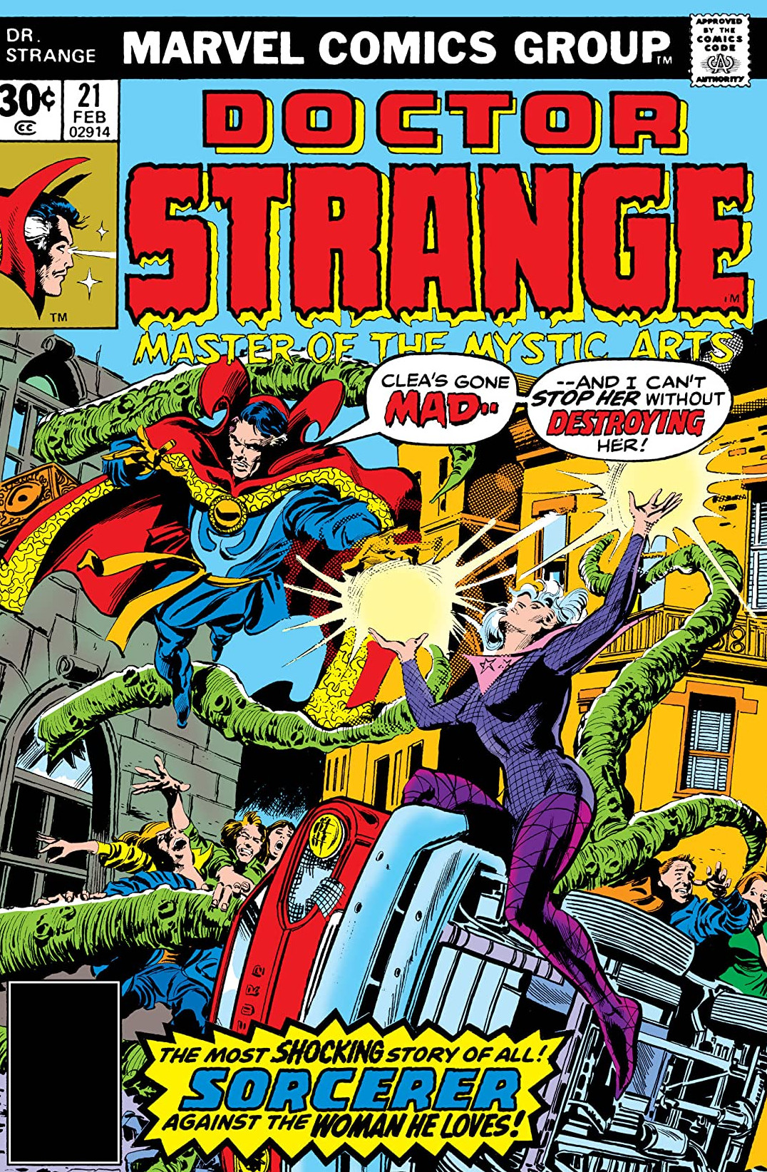
For me it's a tie between... Dr. Strange #21...  cover promises the showdown between Doc and the amnesiac Clea that the comic has been building towards in the storyline, open it up...nope, reprint of Doc 1st series #169, the ole Dreaded Deadline Doom has struck but they used the cover for the planned story anyways... and Conan the Barbarian #22  same deal, promised the Shaodow of the Vulture, part of the ongoing story, but nope, reprint of Conan the Barbarian #1 because the DDD had struck but the used the planned cover anyways as usual. -M |
|
|
|
Post by adamwarlock2099 on Jun 22, 2016 7:59:00 GMT -5
Yes. And my first realization, even though I had seen the art in other books differ from the interior art, that buying back issues is a lot different of an experience than buying off the shelf. Give an Alien mini series cover duties to John Bolton and not give him the interior art, means there's almost no way to follow up inside. But it was my first look at Sam Keith's art and it was a bit of a shock. Though the story was still good. I had forgotten until Arthur's Aliens review thread that I had traded/sold it at some point because of that stark contrast. |
|
|
|
Post by Roquefort Raider on Jun 22, 2016 8:09:45 GMT -5
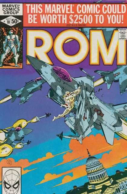
Rom #7-12 had gorgeous covers by Michael Golden but very ordinary interior art by Sal Buscema. The most misleading cover in the lot was that of issue #10, with splendidly-rendered F-16s on the cover  while the airplanes drawn inside the book were made-up things resembling no actual aircraft. Being a fan of series like Tanguy et Laverdure, Buck Danny and Dan Cooper in those days, I didn't get why airplanes in comics wouldn't be accurately depicted. (Still don't, actually, unless said planes are meant to be unknown models). |
|
|
|
Post by The Captain on Jun 22, 2016 8:10:43 GMT -5
For me it's a tie between... Dr. Strange #21...  cover promises the showdown between Doc and the amnesiac Clea that the comic has been building towards in the storyline, open it up...nope, reprint of Doc 1st series #169, the ole Dreaded Deadline Doom has struck but they used the cover for the planned story anyways... and Conan the Barbarian #22  same deal, promised the Shaodow of the Vulture, part of the ongoing story, but nope, reprint of Conan the Barbarian #1 because the DDD had struck but the used the planned cover anyways as usual. -M It's funny you posted that Doctor Strange cover, because that was the first one I thought of when I read the topic of this thread. Not only did it affect that issue, but if I remember correctly, it also affected the next issue as well.  Nowhere in that issue does Stephen face off against a knight riding a demon-vulture beast. Additionally, a quick scan of the next couple of issues following this one as well as the annual, which was released around the same time as these books, doesn't reveal this knight character in any of them either, so I'm not sure if the cover was done before the final art or if they skipped a story because of the DDD problem in issue #21. Either way, it was disappointing to open this issue expecting to see this battle and not find it actually occur on the pages. |
|
|
|
Post by adamwarlock2099 on Jun 22, 2016 9:03:07 GMT -5
Another candidate would be the late Defenders issues titled as "The New Defenders". With cover artists like Kevin Nowlan, Mike Mignola, Mike Zeck and Frank Cirocco, the interior art was pretty disappointing overall. While issue 133 was the first to catch my eye, the constant changing artist and the overall poor quality, in my opinion, kept me from ever wanting to finish the series, despite good writing and gorgeous covers. Of course, the more and more I collected comics the more I realized how much the covers were more sales pitches than anything close to a indicator of the subject or quality of the the book inside. This and my first example were early examples in my collecting. And while I like painted beautiful covers or fantasy artist not necessarily in the comic business offering their talents, the reason GL Vol. 2 (after Kyle already had the ring) appealed to me enough to keep buying the series till it ended was the vast majority of the covers showcased the interior artist, thereby giving you an accurate depiction of the book's contents. |
|
|
|
Post by Prince Hal on Jun 22, 2016 9:33:40 GMT -5
Check out this beauty from Infantino:  Now compare to the interior art:  |
|
|
|
Post by berkley on Jun 22, 2016 17:01:44 GMT -5
It's funny you posted that Doctor Strange cover, because that was the first one I thought of when I read the topic of this thread. Not only did it affect that issue, but if I remember correctly, it also affected the next issue as well.  Nowhere in that issue does Stephen face off against a knight riding a demon-vulture beast. Additionally, a quick scan of the next couple of issues following this one as well as the annual, which was released around the same time as these books, doesn't reveal this knight character in any of them either, so I'm not sure if the cover was done before the final art or if they skipped a story because of the DDD problem in issue #21. Either way, it was disappointing to open this issue expecting to see this battle and not find it actually occur on the pages. This in one disappointment that I remember in particular. The disappointment came in the store, scanning the interior before I bought it. I knew beforehand it was unlikely that Frank Brunner would be doing the interior art, but that didn't prevent me from feeling let down when I saw my expectation confirmed. I've always disliked the practice of having another artist do the cover. To me it's like you hired another writer to write the first chapter of a book or something. |
|
|
|
Post by Icctrombone on Jun 22, 2016 18:09:20 GMT -5
I know what you mean, esp. about Infantino back then--I loved those Infantino-Anderson/Infantino-Giella covers! Here's a comic that had a great cover, a real classic by Buscema. The interior art just couldn't measure up. I do like Heck and Roth, the story's artists; but here they just fell flat. It was not their best work by a longshot.***  *** And upon reflection, even if they had brought their A game to this, the art would've still paled in comparison to that cover. I mean, c'mon--how many can compete with Buscema??? No . No! No !!This is one of the greatest stories and two parters Ever ! Ever !And it has one of the most shocking splash pages ever.  |
|
|
|
Post by dupersuper on Jun 22, 2016 19:42:43 GMT -5
I know what you mean, esp. about Infantino back then--I loved those Infantino-Anderson/Infantino-Giella covers! Here's a comic that had a great cover, a real classic by Buscema. The interior art just couldn't measure up. I do like Heck and Roth, the story's artists; but here they just fell flat. It was not their best work by a longshot.***  *** And upon reflection, even if they had brought their A game to this, the art would've still paled in comparison to that cover. I mean, c'mon--how many can compete with Buscema??? No . No! No !!This is one of the greatest stories and two parters Ever ! Ever !And it has one of the most shocking splash pages ever.  How is that shocking after you've seen the cover? |
|
|
|
Post by Rob Allen on Jun 22, 2016 19:50:56 GMT -5
"Here's a comic that had a great cover, a real classic by Buscema. The interior art just couldn't measure up. I do like Heck and Roth, the story's artists; but here they just fell flat. It was not their best work by a longshot.*** *** And upon reflection, even if they had brought their A game to this, the art would've still paled in comparison to that cover. I mean, c'mon--how many can compete with Buscema??? Interesting that you should say that... when Don Heck was busy drawing this annual, John Buscema filled in for him on the monthly Avengers book. Roy Thomas, who was writing it, found that he liked working with John. Roy asked Stan to keep John on the book permanently, and Stan agreed. So this annual led directly to John Buscema replacing Don Heck on Avengers. |
|