|
|
Post by Cei-U! on Dec 16, 2017 9:22:13 GMT -5
Today’s selection is the first of four Jack Kirby designs to make my list and the only female character: 9. Hela To be honest, had I not recently seen Thor: Ragnorok, it’s likely the Asgardian goddess of death never would’ve occurred to me. But when I saw Cate Blanchett onscreen wearing Hela’s outrageous “crown of thorns” headpiece and it not only didn’t look completely ludicrous but it actually came across as awesomely bad ass. Let’s face it, this isn’t always the case with Kirby designs, which don’t always translate to more realistic art styles, let alone live-action films (people criticized the depiction of Galactus in Rise of the Silver Surfer but he’d have been laughed off the screen had the Big G showed up in all his purple-helmeted glory). At any rate, movie Hela made a big enough impression on me that her four-color counterpart bumped my original #9, the Sons of the Serpent, off my roster. Cei-U! I summon the mistress of mortality! |
|
shaxper
CCF Site Custodian
Posts: 22,860
|
Post by shaxper on Dec 16, 2017 9:41:40 GMT -5
9. Lex Luthor in the 1980s  I spent weeks going back and forth between these two very different interpretations of Lex Luthor before I ultimately decided that I love them equally and for the exact same reason. Lex Luthor is the perfect antagonist. Give the world the perfect, all-powerful hero, and what's going to stand in his way? It's tempting to bring in a General Zod or a Doomsday who can meet Superman on his level, but Luthor taps into something far more meaningful for me -- heck, I identify with him. Let's not forget that Superman was originally conceived of as a villain, because, while it's tempting to imagine being Superman, the disappointing fact is that we're not, and we're never going to be, so the ordinary human tirelessly working to compete against him makes for a compelling premise. And while that premise has been done poorly at least as often as it's been done well, these two visual depictions of Luthor are meaningful expressions of that concept. The battlesuit is the ultimate expression of man's tireless efforts to enhance himself and transcend his limitations. Can't fight Superman hand to hand? Build an elaborate armor system that can. It's visually compelling, but the concept expressed by it is even more impressive. Man CAN be Superman. Meanwhile. the three piece suit expresses a whole other level on which man can attain power, this time through social and economic means. Especially in the 1980s, the only thing more powerful and feared than a Superman was a guy in a high priced suit. And that metallic hand, so often used to crush things, was a compelling and foreboding symbol of power as well. These may not be the most visually impressive designs in their own right, but they speak volumes about the very concept of a Lex Luthor. True thought and understanding went into these designs and is conveyed by these designs as well. We can't be Superman but maybe, just maybe, we could attain the kind of power represented by these two visual designs. But...ya know, without being bad guys.
|
|
|
|
Post by Cei-U! on Dec 16, 2017 10:31:30 GMT -5
For those keeping score, I note that Joker was designed by Jerry Robinson.
Cei-U!
I set the record straight!
|
|
|
|
Post by Prince Hal on Dec 16, 2017 10:58:25 GMT -5
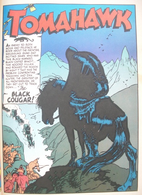
The Black Cougar, Star-Spangled Comics, 113 and 114 (Feb; March 1951)  I came upon the Black Cougar first in a reprint in (Son of) Tomahawk 139 and again in DC’s Greatest Golden Age Stories Ever Told collection when I finally bought it a few years ago. (It’s an excellent anthology, chock-full of stories and background information. Why they don’t publish anything in this format any more I don’t understand.*) From the moody opening page right on through the story, it’s Frazetta at his best, and since he could make Percival Popp and Ma Hunkel look ominous and dangerous, imagine what he does with a guy who’s wearing an all-black outfit, a black cape and a pointy-headed, full-face mask. The BC only appeared in two issues of Star-Spangled Comics, his debut in 113 and his finale in 114, but the latter was drawn not by Frazetta but by Bruno Premiani (an artist whose work I greatly enjoy), and though he did an excellent job on the Cougar, it’s those lush Frazetta inks and rich black colors that put it over the top. The Black Cougar is just one of thousands of villains, I guess, but he struck a chord with me, both for his appearance and the above-average quality of the story, but also for the thoughts of what might have been. I know I’m dating myself here (No one else would), but Frazetta’s design and execution of the Cougar remind me of some of the villainous types who inhabit the cartoons of Max Fleischer. If I could post more images for comparison, I would, but trust me, there are touches of the likes of Fleischer’s Superman cartoons and Gulliver’s Travels in Frazetta’s work. BTW, think Frazetta was an influence on the great Joe Maneely? Don’t know why the character never reappeared. Far less threatening villains have returned from far more apparent deaths, because he would have made a great recurring foe in the 1950s and would have made for an excellent revival in the 60s and /or 70s. *Buy it: www.amazon.com/Greatest-Golden-Stories-Ever-Told/dp/0930289579
|
|
Confessor
CCF Mod Squad
Not Bucky O'Hare!
Posts: 10,197 
|
Post by Confessor on Dec 16, 2017 11:04:26 GMT -5
9. Lex Luthor (Warsuit) I bought Action Comics #544 and Superman #385 off of the newsagent's shelf back in 1983 and I was absolutely blown away by the alien battlesuit that Lex Luthor acquired in those issues. I know that the revamps of both Luthor and Brainiac from those issues are not everyone's cup of tea, but as a 12-year-old kid -- which I was when those issues came out -- I just loved Luthor's gadget-filled exoskeleton. I get that, for some, it kinda took away from Luthor's "evil genius intellect verses Superman's incredible psychical strength" shtick, but, to me, it made a whole lot of sense that Luthor wouldn't hesitate to utilize such powerful alien technology to even the odds with his infinitely more powerful enemy. Quite apart from any practical, in-story explanation though, I just always thought Luthor's Warsuit looked really, really cool. It kept the green and purple colour scheme of his old costume, but made him look much, much more formidable.
|
|
|
|
Post by Roquefort Raider on Dec 16, 2017 11:08:09 GMT -5
A name echoes in the vast halls of the CCC... the name of #9 Hela, goddess of death!  Cei-U beat me to it, but I couldn't resist having the ruler of Hel on this list. Naturally, she looks nothing like a Norse goddess (although who knows what a Norse goddess actually looks like?) but has the unique quality of a Kirby Asgardian design: something that is both fantasy and sci-fi, something that is not based on a historical look but imposes its own vision and makes it even more authentic, as it were, as a more traditional look would. This Hela is downright weird, what with the gorgeous crown of thorns and a bodystocking made of green metal. |
|
|
|
Post by Jesse on Dec 16, 2017 11:23:48 GMT -5
9. Mysterio This one almost shouldn't work but it strangely does and the fishbowl with a cape look for me is the height of classic campy villainy. The helmet gives off a sort of astronaut-like science fiction vibe and adds to the cryptic nature of the character. The costume is actually really detailed from the texture of the body to the boots and gauntlets. Adding eyes to the shoulders for some reason gives it a really creepy vibe. I think Ditko really outdid himself with this design.  
|
|
|
|
Post by thwhtguardian on Dec 16, 2017 11:37:50 GMT -5
#9 The Mark III Sentinel  As drawn by Dave Cockrum X-Men #96, 1975 But wait the Sentinels all pretty much look the same you say, oh no, the Mark III's are a far superior look. To start with their heads are less dome like than their previous versions, and the bodies are leaner which gives them a less comical look. But the best defining feature in my mind are the facial features, unlike the previous mark II which could express emotions through their facial features these guys sport a stoic image all the time so they combine the cold robotic menace perfectly.
|
|
Crimebuster
CCF Podcast Guru
Making comics!
Posts: 3,958 
|
Post by Crimebuster on Dec 16, 2017 11:56:08 GMT -5
9. Monsieur MallahSure, DC has lots of gorillas. They even have other gorillas who use machine guns. But Monsieur Mallah is the only one who wears a beret and (sometimes) talks in a French accent. Plus, one of his key costume accessories is a brain in a jar. Okay, technically Brain is a separate character, but in terms of design elements, he's basically the equivalent of Captain America's shield.  
|
|
|
|
Post by Cei-U! on Dec 16, 2017 12:04:05 GMT -5
One of the things I liked about Mallah as opposed to Grodd or other comic book gorillas was that Bruno Premiani drew him anatomically accurate, complete with saddle back and pointed head. It made him much more frightening.
Cei-U!
I summon the monkey madness!
|
|
|
|
Post by codystarbuck on Dec 16, 2017 12:08:54 GMT -5
9. Monsieur MallahSure, DC has lots of gorillas. They even have other gorillas who use machine guns. But Monsieur Mallah is the only one who wears a beret and (sometimes) talks in a French accent. Plus, one of his key costume accessories is a brain in a jar. Okay, technically Brain is a separate character, but in terms of design elements, he's basically the equivalent of Captain America's shield.   You know, there is only one problem with Monsieur Mallah...... the beret is draped on the wrong side. He's a French gorilla and the French Army wear their berets draped to the left. No wonder he is a villain! |
|
|
|
Post by DubipR on Dec 16, 2017 12:13:43 GMT -5
Time to bring on the ladies for the rest of the countdown... #9- VOLCANA Secret Wars in the 80s was one of those events that young kids and pre-teens loved. It also introduced many new baddies into the Marvel Universe and Marsha Rosenberg aka Volcana was one of them. I like that she wasn't slim and beautiful like everyone else; that she was a more voluptuous figured woman. I love the way Mike Zeck create her look. While it looks like there's not a stitch on her, she does wear a leotard when she's cooled off. I like fire characters and the volcanic ash look on her body mixed with white heat of fire is a lovely mixture. While she may not be the coolest villainess, her look like Nova and other fire bodied figures stands out to me. |
|
|
|
Post by codystarbuck on Dec 16, 2017 12:19:45 GMT -5
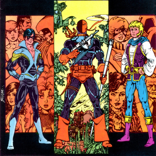
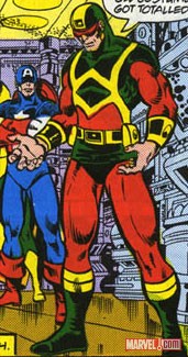
Number 9, with a bullet, is Deathstroke the Terminator (to give the full name)...  If Taskmaster was the beta test, Deathstroke is most certainly the showcase for Perez's swashbuckling assassins. Everything about this man says death, from the grenades on the belt to the big honking sword on his back. He is so bad-ass he only needs one eye and he lets his foes know it! Perez went a little nuts with the buccaneer boots, taking the cuffs all the way to the ground and he never could draw a proper firearm; but, Deathstroke stole the New Teen Titans with the second issue and never looked back. Suddenly, you are cheering for the villain. I liken it to the debut of the Road Warriors, on World Championship Wrestling, back in the 80s (same era as Deathstroke). They ran and dove into the ring, beat their opponents into a stain on the mat, then walked over to the podium and cut a promo to the stunned audience. Deathstroke did the same, taking apart the Titans, but calling a halt to carry off his dead son, warning that he would be back. It was epic, every time, until the final reckoning, in the Judas Contract. Other hands have monkeyed with the look, until smarter hands put things back to Perez. His design is so much more powerful. You can give him hockey masks and body armor, headbands and spandex; but, nothing works as well as a one-eyed, half-black, half orange hood, blue chainmail, metal collar, orange trunks and gauntlets and buccaneer boots. Deathstroke doesn't need all of that gear and the simpler you make it, the more deadly he is. Perez gave him just enough. Not bad for a guy who made Wonder Man look like a Christmas nightmare!  |
|
|
|
Post by Pharozonk on Dec 16, 2017 12:29:43 GMT -5
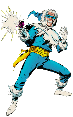
#9. Captain ColdHe's the most famous of the Flash's Rogues and one of the best dressed to boost! I love the Inuit influence with the parka and hood, which were sadly tossed out in the Nu52 redesign. The blue and white color scheme emphasizes this cold schtick, but also complement each other rather well. The freeze gun is just a plus at that point. 
|
|
|
|
Post by Deleted on Dec 16, 2017 12:45:32 GMT -5
On the Fourth Day of Christmas Santa said to me..."Hail Hydra!" Madame Hydra as designed by Jim Steranko...   I am a sucker for the femme fatale archetype (you'll see more later on my list) and Steranko delivers on that archetype with Madame Hydra. The form fitting sleeveless suit design, the holstered gun, the whip, the hair obscuring half of her face all suggestive of the unique combination of allure and danger presented by the femme fatale. All suggestive of more hidden beneath the surface as well, waiting to be explored at the risk of life and limb, but the promise it might be worth it. The color scheme evokes Hydra as well and the green lipstick is the piece de resistance, the luscious lips and their poisonous promise of doom if you give in to the temptation of those lips in the sickly green tint. All together, it's a package that delivers on it's promise and finds its place on my list. -M |
|