|
|
Post by Deleted on Jan 24, 2018 6:37:10 GMT -5
 Supergirl from DC Comics Supergirl from DC ComicsSupergirl has a lot of logos and I have two of them in my top 100 and sad to say this ... I've very limited choices to share my rejects here in this thread. This logo is rather an unique logo and I like the boldness of this one and the choice of colors that are quite unique for its itself and that makes it a good logo at the time that was used. The one in red and a black background just like one above ... I have to reject that one too. Don't worry Supergirl Fans ... I have two in my top 100 that I've shown you yet and one of them will shock you!     Any of these outside the one on top especially the one on the right bottom - I've have to cut it out for both honorary and top 100 because they used a DOT to dot the I in her logo and to me ... that's a no-no. In my top 100 ... I have some that does that and there are some exception to that rule and this one is hard to see on the cover and that's why I don't care for it. |
|
|
|
Post by Deleted on Jan 24, 2018 6:52:23 GMT -5
|
|
|
|
Post by dbutler69 on Jan 24, 2018 8:52:53 GMT -5
Hmmm, yeah, I guess that first Avengers logo is the best, it is clever, though I grew up a variation of that Avengers logo with the arrow in it (the second Avengers logo you've shown) so I am also partial to that one. The Omega logo is very nice indeed. The first Power Girl logo does have a nice color scheme, but I also like the other two. Power Man and Iron Fist is a very good logo also. I think all of the Power of Shazam are pretty good. I added the Omega logo because I saw a picture of it while I was researching logos and someone here posted it and I liked that logo (to be included in this thread) very much... I did not know about it - until I saw that picture! I really enjoyed the comic itself, too. Such a shame i ended to prematurely, with the plot still left hanging! |
|
|
|
Post by Deleted on Jan 24, 2018 11:02:29 GMT -5
  Teen Titans from DC ComicsNotes: Teen Titans from DC ComicsNotes: This is two for one deal and the reason for this is that I have an quandary about these logos and I have to say this this team has a wild history of logo changes and most of them are pretty crappy. I don't think very highly of these and part of that ... is this these four logos that so hideous that I just can't stand looking at them! Onto the two for one deal ... the logo on top is not as good as the logo on the bottom, why it's not my cup of tea and and it's a decent logo to begin with and that's why I would had made this logo Number 150 for sure in this countdown because it's pretty darn ordinary looking. Some of you may disagree with me and furthermore I just can't accept it and all the logos that I seen on books that I bought the logo on top is not my favorite. The logo on the bottom is the best Teen Titans logo of all time and I've just can't put it in my top 100 because its too ordinary looking and plain but it is a classic and that's counts for me.  This one in multi-colored is associated with the cartoon show and it's invalid for discussion only.  This one is so idiotic and I just don't understand why they put those ugly lines in the first place and that's alone is not acceptable at all. I just can't even look at it anymore.  One word: Boring!    Lousy Logos and one with the word "Pizza" is a laughingstock of a logo and I understand why they did it.  More losers ... and that's why I don't care for these logos. I should be done with the 50 logos (honorary) tomorrow and be done 2 days earlier ... |
|
|
|
Post by hondobrode on Jan 24, 2018 11:32:27 GMT -5
I like the older Avengers logo from the Bronze Age. Classic and cool looking.
Really like both the Power of Shazam logos as well as all of the Swamp Thing logos.
All very classy and do their jobs well IMO.
|
|
|
|
Post by dbutler69 on Jan 24, 2018 16:16:47 GMT -5
Those Supergirl logos are all pretty good. None are great, but none are terrible either.
The first Swamp Thing logo is the best, but they're all pretty good except the last one (the one on the far right).
The first Teen Titans logo stinks. I think the second one is pretty good. The third one (from the cartoon) is good in that it fits the mood of the show. The fourth one (all yellow lettering) is really terrible. That "The Titans" one is lame. The Judas Contract one is OK, and the rest of them stink.
|
|
|
|
Post by Deleted on Jan 25, 2018 4:03:42 GMT -5
 The Thing from Marvel Comics The Thing from Marvel ComicsThese three below me ... aren't that good of a logo and I just can't stomach the colors and I understand that they wanted to keep it in the Orange Color Scheme of Things ... and that's why I don't like their thinking here. The best one is one the one above me because it's colorful, bold, and I've liked the word "The" inside the letter T and that alone makes it a good logo and not the best in the top 100. I've think it would be better if they did not place a picture of the THING on the left of the logo and that's why I just don't understand why they did it ... in case of Power Man and Iron Fist it is permissible there and it's works for them; and that's the reason why I've don't like it at all and that's a clash of colors and all that and it's puts the logo down into the Honorable List here.  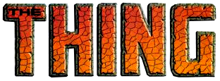  Another thing, is that I have here is that these logos don't do the character any justice and I almost at several times to ban it from my list and the word "THE" forces me to get it back every time. It's a decision that I'm happy to include this logo here. |
|
|
|
Post by Deleted on Jan 25, 2018 4:07:06 GMT -5
 Venus from Marvel Comics Venus from Marvel ComicsThis is going to be short and sweet and this logo is a pretty standard logo back then and all the logos that I've seen in the Golden Age of Comics this one really cuts everything else down to science and the logo in all its worth grabs you! ... Gold works best for me and it's make it an attractive offer because her hair and dress are silver/white and you need some opposite colors to make it work. I prefer the Blue Background 1st and the Black Background 2nd.   Doesn't matter how you sliced it ... it's a winner in my book.  .... I like this logo too; but not as good as the one that I've selected at first and I just had a hard time deciding which one is best ... but the bold one on top is the one that I feel is the best Venus logo hands down. |
|
|
|
Post by Deleted on Jan 25, 2018 4:31:12 GMT -5
 Wonder Man from Marvel Comics Wonder Man from Marvel ComicsI prefer the Yellow over the Red and I don't like the Pink line in the middle and one thing that I do like about it is the letters W and M as in Wonder and Man ... if you take the letter W and put it upside down its becomes a M and that pure beauty of this logo and the the one in the Red all line up in with and look at the costume it's pretty obvious that the Red works for them ... but the Yellow line makes it bad and having said that ... I just wished that they would forgo both pink and yellow lines and forget it about it. I just had a quandary about my decision here and that's not an easy one to do here.  I've almost let this one to be the winner but its too obvious of a choice here. This one below me is too weird for me.  |
|
|
|
Post by Deleted on Jan 25, 2018 7:51:24 GMT -5
 Zatanna from DC Comics Zatanna from DC ComicsTo be honest with all of you here ... I don't always read every comics like most of you here and I'm very limited about this character from a logo standpoint - I read Zatanna's stories in the late 60's onto the 90's and spotty in the 2000's and I know this character has great costumes and all that and one of my favorite heroines in DC Comics period. This logo is a hit because its bold and catchy too and really stands out on a comic book cover that I didn't see much at all the 2nd one done in the next post is the one that I seen the most and I'm separating the two for a good reason. I've love the design of the letters and the way the letter "Z" and "A" on either ends connected each other makes it a winner in my book and fact the matter its appears to be more uniqueness about it. The shape of the letter "Z" reminds me of Zorro and that's one of subliminal messages to me that it's cool and very stylish letter and that's alone is a fantastic logo to begin with and the problem is that there is no room for it in my top 100. Loved this logo for all its worth! |
|
|
|
Post by Deleted on Jan 25, 2018 8:24:54 GMT -5
Number 101 Zatanna from DC Comics Zatanna from DC Comics Notes: From this point on no pictures of other logos will appear from now on. The one that I selected is the best of the best and I can't change my order at all. I've spent an average of 2 hours a day staring at my list of 100 logos and even remove some of them and discarding them into my 50 logos list and I have to delete one of my 50 and I did a ballpark figure of over 35 deletions over the course of this project and it's was a very painful process of seeing some great logos that were out of the door and you won't even see them. These logos are the ones that I seen and burned that image in my mind and I can see that this logo is the best of the best. Onto Zatanna LogoThis logo is so freaking cool and it's my Number One in all the 50's logos that I save the best of the best of the 50 logos for the last and it's one of the better logos in the most part of the Silver Age of Comics and I seen this logo attached to her adventures with the Justice League of the America. Every letter of her logo is individually crafted and drawn just beautifully and done in an artistic way that I find it very appealing to my eyes and invoke some magical ways to me. The dark blots that inside the letters makes it downright attractive and adds emphasis to the logo itself. I prefer the dark grey over any other color in the world because this color invoke mysteries; why mysteries because Magic focus on the unknown and that alone makes its an unique logo by itself. It's sleek, very feminine, and most of about it ... its attractiveness that charms me greatly and that's why I had a very difficult time deciding to put in my top 100 and reason for that ... his her color that brought it down for me. It was a very painful decision on my part for not including it in my top 100 and that's why I just can't put it there. Zatanna the Mistress of Magic at 101!
This is format from now on and I'm sorry that I just can't put any other logos and pictures to back up my statement and if I did it would destroy the credibility of this project severely.
WARNING TO ALL MEMBERS
Please do not post any pictures from the internet if my choices are acceptable to you and I feel that I've the rights to do so and it will destroy this project even more and I just can't accept them at all. Please don't tamper with it by all means necessary. |
|
|
|
Post by Deleted on Jan 25, 2018 9:36:10 GMT -5
This is format from now on and I'm sorry that I just can't put any other logos and pictures to back up my statement and if I did it would destroy the credibility of this project severely.
WARNING TO ALL MEMBERS
Please do not post any pictures from the internet if my choices are acceptable to you and I feel that I've the rights to do so and it will destroy this project even more and I just can't accept them at all. Please don't tamper with it by all means necessary.I was thinking about this out having Coffee at Starbucks and I would allow pictures in two formats.
Format One ... Use Links to share your pictures Format Two ... Use Spoiler Tags
These two options are acceptable to me as long that I don't see the images and allowed all other members to see them for their own viewing pleasures. Thank You! |
|
|
|
Post by Deleted on Jan 25, 2018 15:32:44 GMT -5
It's Starts Right Now The top 100 Logos from DC and MARVEL Comics is starting right now with Number 100 that begins in the next post! |
|
|
|
Post by Deleted on Jan 25, 2018 15:52:07 GMT -5
Number 100 Black Lightning from DC Comics Black Lightning from DC Comics Our Starting Point for this LOGO Countdown begins with DC Comics Black Lightning's Logo and I've may say this is one neat logo and I just had to give this logo to the bottom of the barrel and the reason for this logo at the bottom of the barrel is that I have a hard time seeing logos being stacked like this and I have quite of few of them in my countdown for good riddance. I loved what they did with the word "Black" of which it is cool and distinctive and the word "Lightning" is very jazzy and done just right and that's there strongest selling point of this logo. I feel the color scheme of things is not your liking but you need to make this logo bright because Black Lightning as a character looks dark and exciting. 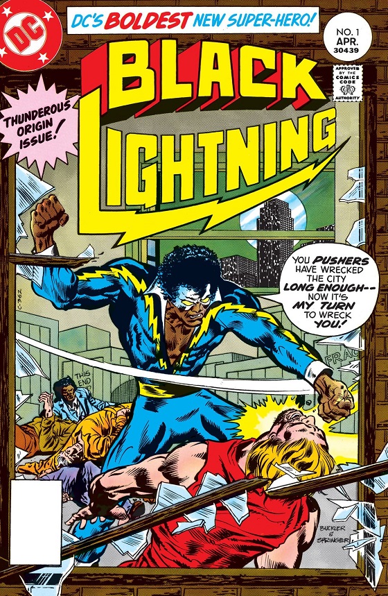 Yellow works here and the Red offset it and that why this logo makes his costume focused on the cover and that alone with the lightning bolts as part of the word "Lightning" enhance the cover just great! ... This is awesome cover and having said its works for me just right on the nose. The curves and everything about it ... just fit the cover gracefully! Black Lightning at #100!#99, coming up tomorrow! |
|
|
|
Post by dbutler69 on Jan 25, 2018 16:29:32 GMT -5
The first Thing logo is the best one, IMHO.
Those Venus logos are all boring.
I like the second Wonder Man logo the best.
The Black Lightning one is very cool. A worthy entrant to the top 100.
|
|