|
|
Post by Mister Spaceman on Mar 6, 2019 2:02:43 GMT -5
Tomb of Dracula no. 39 
|
|
|
|
Post by berkley on Mar 6, 2019 2:14:01 GMT -5
Yup, that's the exact panel, thanks for finding it. It's one of my all-time favourite comic-book entrances and made Juno a favourite villain/character based just on this brief appearance (he only lasted 3 or 4 issues, IIRC). I see now that the benday-dot effect was used on the trousers, while the upper body has that parallel lines technique, whatever it's called.
BTW, also a great example of how to make effective use of the low-camera-angle, much more impressive than is usually the case with superhero comics artists (though in fairness this wasn't a superhero series), who somehow often manage to make it look overblown and ponderous, to my eyes.
|
|
|
|
Post by berkley on Mar 6, 2019 2:20:10 GMT -5
Another favourite Colan/Palmer example I managed to find: 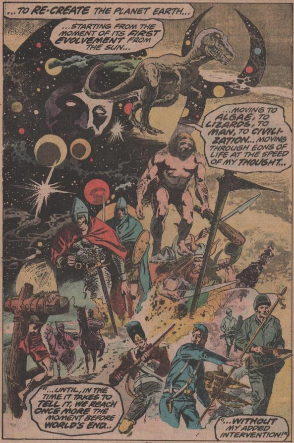 It might be a bit hard to see online, but it's in the clouds in the yellow background and in the shading on some of the human figures, for example. Also the T. Rex and Eternity.
This is from Doctor Strange #13, BTW.
|
|
|
|
Post by Mister Spaceman on Mar 6, 2019 2:35:08 GMT -5
I think Gene Colan and Tom Palmer's Star-Lord made excellent use of this stuff too, for those who especially like the look of it on higher-quality paper. Once again, couldn't find any online samples to illustrate. Yeah, Palmer completely goes to town in that story ( Marvel Super Special no. 10). I don't think there's a single page where he doesn't use it.  |
|
Confessor
CCF Mod Squad
Not Bucky O'Hare!
Posts: 10,221 
|
Post by Confessor on Mar 6, 2019 2:47:24 GMT -5
Where'd Ben-Day Dot go? I miss him.  Lol...yeah, I was reminded of ol' Ben-Day by this thread too. Haven't seen him around here in a while. |
|
|
|
Post by Mister Spaceman on Mar 6, 2019 2:47:42 GMT -5
Al Williamson and Carlos Garzon use it a lot in Marvel's 1982 Blade Runner adaptation. The technique seems particularly appropriate for a sci-fi/noir.  |
|
|
|
Post by Mister Spaceman on Mar 6, 2019 16:53:04 GMT -5
|
|
|
|
Post by brutalis on Mar 6, 2019 17:23:36 GMT -5
Bob Wiacek and Bob McLeod were both inking in the 80's utilizing zip-a-tone and the like as well if my tired old memory isn't too faulty. This added some oomph and pizzazz to otherwise average art pencils they worked on.
|
|
|
|
Post by junkmonkey on Mar 6, 2019 17:37:52 GMT -5
That series of articles is great I have used it before in my attempts to simulate Ben Day techniques in Photoshop. A task I have given up on at the moment as I was getting nowhere fast and just making confused messes.
|
|
|
|
Post by Mister Spaceman on Mar 6, 2019 18:25:08 GMT -5
Bob Wiacek and Bob McLeod were both inking in the 80's utilizing zip-a-tone and the like as well if my tired old memory isn't too faulty. This added some oomph and pizzazz to otherwise average art pencils they worked on. Yes, I forgot about them! I always relished seeing their names in the credits because I knew I'd be sure to get some of that "oomph" and "pizzazz," no matter the penciller (as opposed to my heart sinking if I saw Vince Colletta or Jack Abel listed as the inker). Bob McLeod over James Sherman pencils:  And Bob Wiacek over Dave Cockrum pencils: 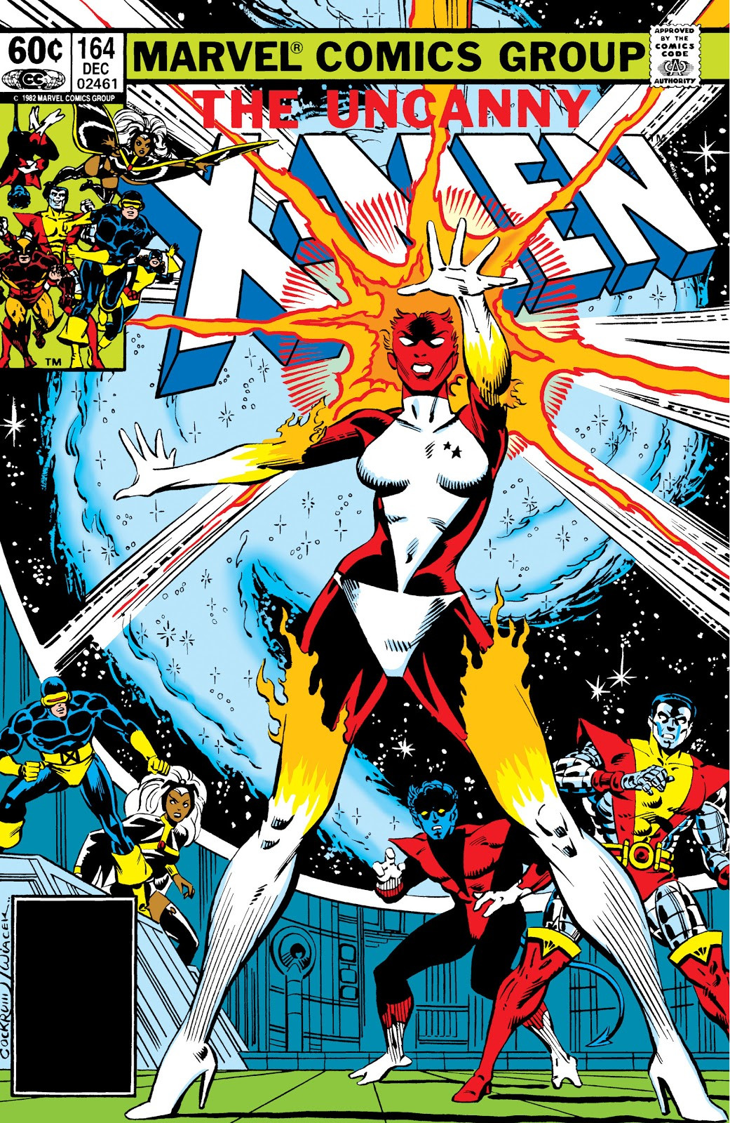 |
|
|
|
Post by Mister Spaceman on Mar 6, 2019 20:45:33 GMT -5
Terry Austin also frequently used it, most typically on Storm's cape.  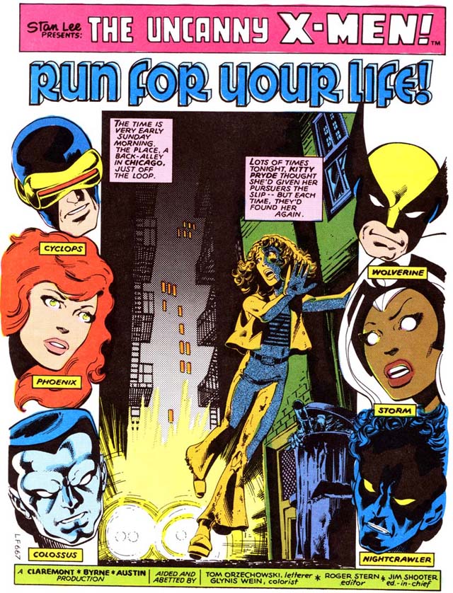 |
|
|
|
Post by Mister Spaceman on Mar 6, 2019 21:11:04 GMT -5
Another favourite Colan/Palmer example I managed to find:  It might be a bit hard to see online, but it's in the clouds in the yellow background and in the shading on some of the human figures, for example. Also the T. Rex and Eternity.
This is from Doctor Strange #13, BTW.
You can see it more clearly here. Agreed, another solid example!  |
|
|
|
Post by junkmonkey on Mar 9, 2019 14:05:23 GMT -5
I have just had a serious rush of brains to the head - prompted by this thread - and had a bit of a breakthrough in the faking Ben Day on Photoshop. I'll put together a walk-though at some point for the eddification of all because it's all a bit clumsy and clunky at the moment. Basically (for anyone interested) you have your black lines on an otherwise transparent layer with an all white background layer underneath. Make a new layer between them and fill it with a pattern. Select the background of the pattern with the wand tool. Inverse the selection. Make that layer invisible. Select your white Background layer to paint on. Select one or more CYMK channel in the Channels pallet. Paint through the the selected screen in grey/black. For red paint through the Yellow and Magenta - for green paint through the Yellow and Cyan. etc. For washes/solid just paint in a channel without a screen selected.
And, as you can save selections, it's possible to make a whole slew of screens - dots, lines, gradients, etc. ready as selections to pull up without going through the selecting, inverting and hiding layer thing every time.... oh bugger! This might just work!
EDIT: Then nudge/rotate (slightly) one or more layers out of register to obtain that real cheap printing effect.
|
|
|
|
Post by junkmonkey on Mar 9, 2019 23:51:46 GMT -5
First experiment with rush of brains to the head idea: It's slow going at the moment but with a bit of practice... 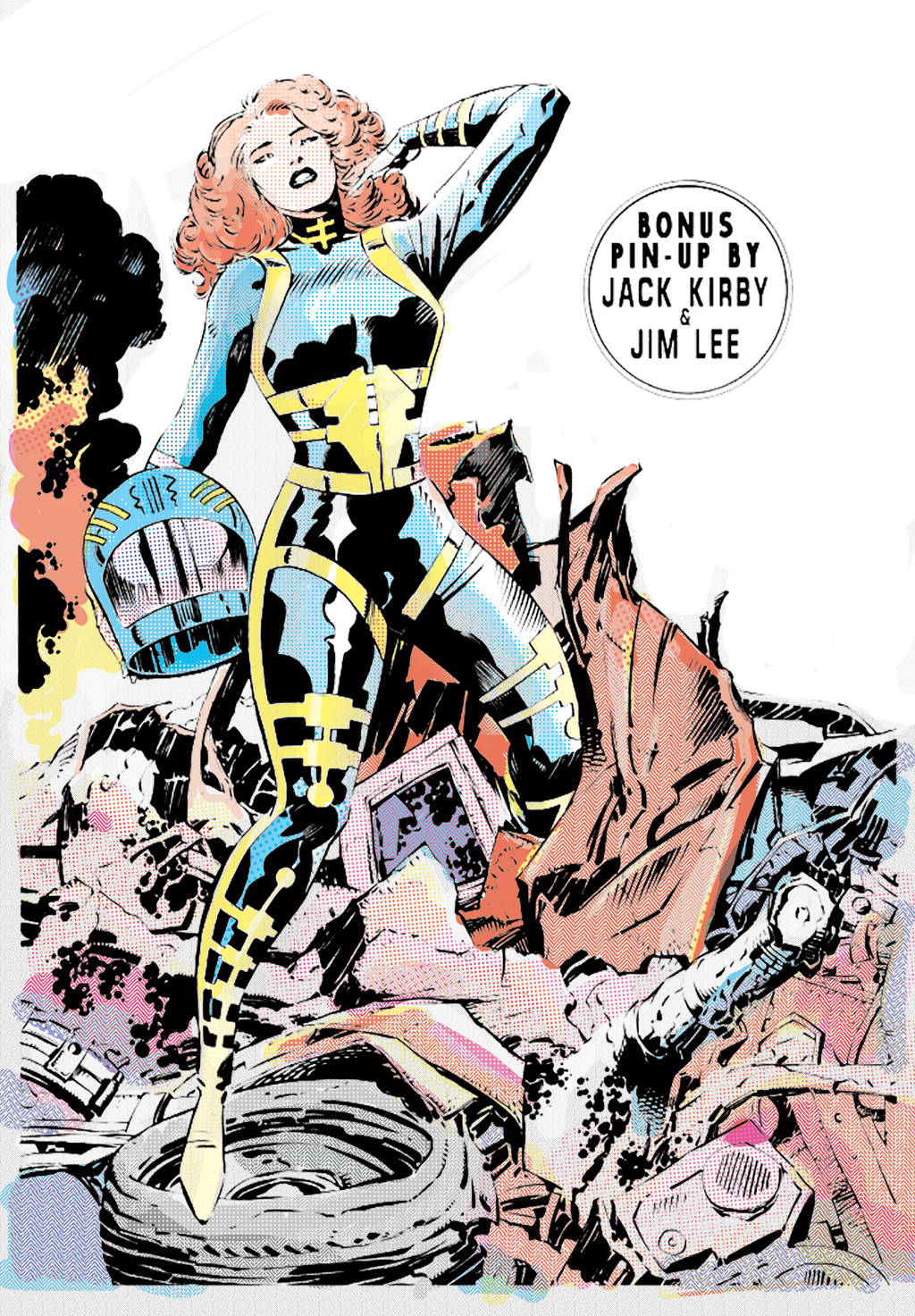 |
|
|
|
Post by Mister Spaceman on Mar 10, 2019 0:11:32 GMT -5
First experiment with rush of brains to the head idea: It's slow going at the moment but with a bit of practice...  LOVE THIS! |
|