|
|
Post by codystarbuck on Jun 20, 2019 17:03:40 GMT -5
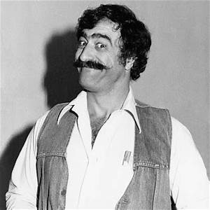
Halftone isn't the same as the transfer or stick on screentones, such as Zip-a-Tone though, right?  But yeah, I love Ben-Day dots, halftone and Zip-a-Tone shading. I'm a big fan of Tom Palmer's work, so obviously I dig that kind of thing. There's some great examples of it in Marvel's old Star Wars series from when Palmer was on the book. This splash page, which I love, springs immediately to mind, which features Palmer on finished pencils and inks, over Howard Chaykin's layouts...  As I scrolled down on this image, I was sure when I first glimpsed the space-pirate's face that this was a Mike Sekowsky page. Figured it was from the Manhunter 2070 series in Showcase. Maybe I was remembering this guy...  Naw, it was this guy...  As nasty a villain as I ever saw!  |
|
|
|
Post by Prince Hal on Jun 20, 2019 21:16:21 GMT -5
codystarbuck, tell me that's Sergio! Funny! I think he also "appeared" in Bat Lash, right? Yep, there he is! 
|
|
|
|
Post by junkmonkey on Jun 21, 2019 5:19:21 GMT -5
Current Ben Day faking technique has been simplified: USE CYMK file and use the Pattern Stamp Tool (no, I'd never heard of it either), painting on individual channels with all 4 channels visible. You can see what colour changes you make in real time without having to assemble the pic all the time.
|
|
|
|
Post by codystarbuck on Jun 21, 2019 12:22:11 GMT -5
codystarbuck , tell me that's Sergio! Funny! I think he also "appeared" in Bat Lash, right? Yep, there he is!  Yep, it's Sergio-the name Roy gave the character was a dead giveaway. He basically is playing Eli Wallach, from the Magnificent Seven. Sergio also appears and guest illustrates Jon Sable #33, where Sable looks over animation storyboards for an upcoming special, based on his (or rather, BB Flemm's) leprechaun books. Sergio does the art for the leprechaun story and also appears as the animation director, who charms Sable's girlfriend Myke Blackmon. |
|
|
|
Post by greenpear on Jul 5, 2019 23:06:55 GMT -5
 I've been working a digital method to simulate Ben Day dots. No halftone dots, no Craftint style dots, just dots in specific patterns. The method I use contains uses only CMYK dots and blends the colors in an attempt to get as close to the original as possible. This is only my latest experiments. |
|
|
|
Post by junkmonkey on Jul 7, 2019 9:23:50 GMT -5
 I've been working a digital method to simulate Ben Day dots. No halftone dots, no Craftint style dots, just dots in specific patterns. The method I use contains uses only CMYK dots and blends the colors in an attempt to get as close to the original as possible. This is only my latest experiments.
Oooooh NICE! I like it.
A lot more courageous and vigorous than my attempts at the same type of thing: |
|
|
|
Post by greenpear on Jul 31, 2019 22:15:44 GMT -5
This was a culmination of over two years of study. And it ended up being a lot harder than I ever imagined it would be. This image was from an online coloring book. The coloring is mine.  |
|
|
|
Post by Deleted on Jul 31, 2019 22:55:14 GMT -5
greenpear ... Beautiful Work and nicely done.
|
|
|
|
Post by greenpear on Aug 1, 2019 6:59:09 GMT -5
greenpear ... Beautiful Work and nicely done. Thank you. In reality I think there would normally be a few more solid tones but I wanted to test the extent to which I could create various shadings. |
|
|
|
Post by greenpear on Aug 1, 2019 10:22:39 GMT -5
 I used one of Hokusai's Thirty-Six Views Of Mt. Fuji for one of my Classic painting series pieces. I had to make numerous modifications to my shadings to accomplish this one. It stems from trying to convert the physical techniques of Ben Day screens to Photoshop's digital representations. Often, the two collide and things don't work. Doing "real" Ben Day the dots depended on the pressure and the angle of how the artist pushed on the screens. This is something I have yet to figure out how to make Photoshop copy this (if it can be done at all.) Currently the simple solution is to have the same dot patterns with various size dots. In that way I can somewhat recreate the varying pressure, and thus the shading, of my colors.
There are closeups of some parts of this on My art page |
|
|
|
Post by Deleted on Aug 1, 2019 10:42:59 GMT -5
Gorgeous Blue for the Waves here ^^^ loved the dark orange canoes and the two tone sky emphasizing early evening sort of speak here greenpear.
|
|
|
|
Post by greenpear on Aug 1, 2019 11:11:36 GMT -5
Gorgeous Blue for the Waves here ^^^ loved the dark orange canoes and the two tone sky emphasizing early evening sort of speak here greenpear. And everything was done with dots of cyan, magenta, Yellow, and black only. This is why I got so enthused about this whole process. |
|
|
|
Post by Deleted on Aug 1, 2019 13:45:50 GMT -5
Gorgeous Blue for the Waves here ^^^ loved the dark orange canoes and the two tone sky emphasizing early evening sort of speak here greenpear. And everything was done with dots of cyan, magenta, Yellow, and black only. This is why I got so enthused about this whole process. Interesting and thanks for sharing this. |
|
|
|
Post by greenpear on Aug 2, 2019 14:02:14 GMT -5
Interesting and thanks for sharing this. Thanks for checking it out. |
|