|
|
Post by Deleted on Dec 19, 2019 15:44:20 GMT -5
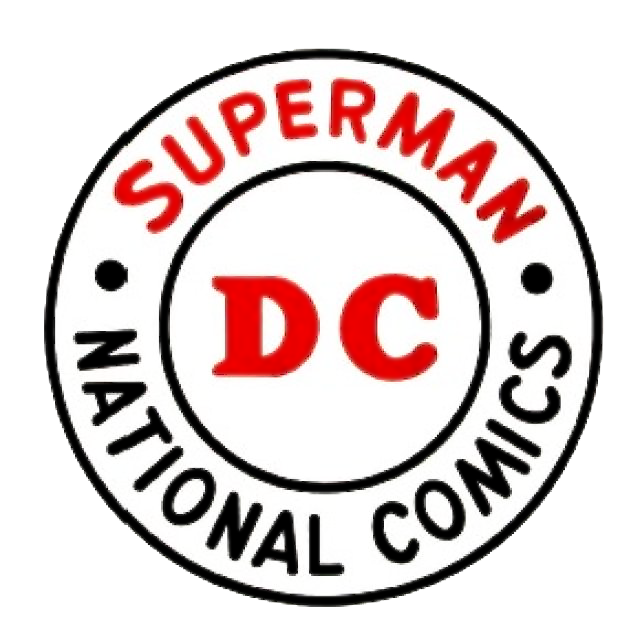
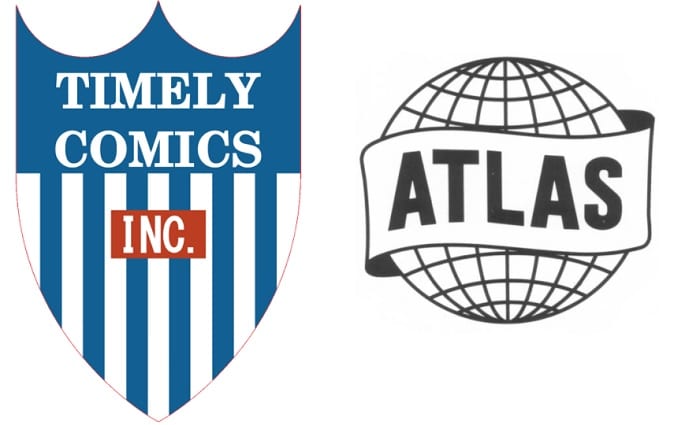
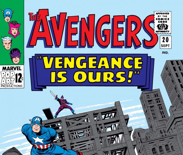
DC Logos MARVEL Logos MARVEL Logos I personally prefer the DC Logos over the Marvel ones because of uniformity of using the Circle and I had a hard time liking the Marvel one because of the wide range of sizes, colors, and styles. Sorry, for not including other Comic Book Companies like Dark Horse, Dynamite, Charlton, IDW, Valiant, and others too. My Favorite DC Comic Logo is this one below.  My Favorite Marvel Comics Logos is these two equally.  The POLL will close on January 31st, 2020. Anyway, you got 1 choice here and I'm anxious to hear from all of you here of what Comic Book Company is the one you like in terms of logos.
|
|
|
|
Post by MDG on Dec 19, 2019 15:58:34 GMT -5
DC always seemed to have a better handle on design than Marvel, though early Marvel logos and ads have a certain charm. And in the 80s, when new formats appeared and the publishers were trying to cater to more "sophisticated" audiences, DC seemed to up their game before Marvel got out of the gate.
|
|
|
|
Post by brutalis on Dec 19, 2019 16:46:17 GMT -5
DC in the 70's for the win!!!
|
|
|
|
Post by Deleted on Dec 19, 2019 17:44:35 GMT -5
Great topic!
DC for me. As Mecha said, the uniformity of the circle is important. Love the 1976 DC logo, I miss that one.
|
|
|
|
Post by badwolf on Dec 19, 2019 18:31:26 GMT -5
I wouldn't even call most of the Marvel ones logos.
I grew up with the 1976 DC logo and the 2005 was a nice update of that. I suppose the current one is fine as it recalls the blocky letters of the 70s.
|
|
|
|
Post by Mister Spaceman on Dec 19, 2019 19:46:16 GMT -5
DC always, except for that horrible one from 2005, which looks like a logo for some kitchen appliance brand, and the comparably ugly 2011 version. The classic clean circle works beautifully (1949 and 1974 are my favorites).
|
|
|
|
Post by Deleted on Dec 19, 2019 19:58:40 GMT -5
DC's 2005 logo looks like a washing powder logo; the 2011 logo looks like an insolvency administration company's logo; and the 2016 logo just looks like a generic insurance brand logo. Can't beat the 1976 one.
|
|
shaxper
CCF Site Custodian
Posts: 22,864
|
Post by shaxper on Dec 19, 2019 20:05:43 GMT -5
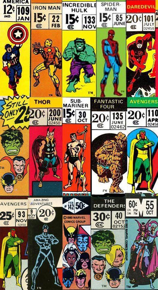
I think one has to take into account that, while the Marvel logo wasn't all that much to look at until the 1980s, Marvel was sporting striking corner box images of the characters within almost from the start. When you factor in the corner box, Marvel was far more visually striking, and it made sense NOT to have the logo overshadow the artwork beneath it.
Once DC adopted the corner box approach two decades later, Marvel upped their logo game.
So I say Marvel for the win.
|
|
|
|
Post by rberman on Dec 19, 2019 20:30:20 GMT -5
I think one has to take into account that, while the Marvel logo wasn't all that much to look at until the 1980s, Marvel was sporting striking corner box images of the characters within almost from the start. When you factor in the corner box, Marvel was far more visually striking, and it made sense NOT to have the logo overshadow the artwork beneath it. Once DC adopted the corner box approach two decades later, Marvel upped their logo game. So I say Marvel for the win. Yep. The corner boxes were much more important. |
|
|
|
Post by Deleted on Dec 19, 2019 21:05:25 GMT -5
I think one has to take into account that, while the Marvel logo wasn't all that much to look at until the 1980s, Marvel was sporting striking corner box images of the characters within almost from the start. When you factor in the corner box, Marvel was far more visually striking, and it made sense NOT to have the logo overshadow the artwork beneath it. Once DC adopted the corner box approach two decades later, Marvel upped their logo game. So I say Marvel for the win. Yep. The corner boxes were much more important. I have never heard of "Corner Boxes" ... please show me an example of that. |
|
|
|
Post by Mister Spaceman on Dec 19, 2019 21:09:03 GMT -5
Those floating heads in the corner box were very cool to me as a kid. The full figures were nifty too.   |
|
|
|
Post by Deleted on Dec 19, 2019 21:48:43 GMT -5
Mister Spaceman ... Thanks for the examples of them; personally they really blend in with the comic book itself and that alone makes the "logo" not really part of the comic book and it's diminished it and not making an impact. I just have a hard time enjoying these logos and putting the price tag of the book itself hurts it. That's why I prefer DC over Marvel and I understand the rationale that both rberman and Shaxper likes it so much. I studied art in high school, college, and trade school and I just feel that Marvel trying to do here works for them and not to me. I'm having a hard time enjoying them.
|
|
Confessor
CCF Mod Squad
Not Bucky O'Hare!
Posts: 10,197  Member is Online
|
Post by Confessor on Dec 19, 2019 22:05:14 GMT -5
I'm a real "Marvel guy" and even I voted DC.
I agree about the Marvel corner boxes though. They were things of beauty.
|
|
|
|
Post by adamwarlock2099 on Dec 20, 2019 8:20:45 GMT -5
The 76 DC logo is simplistic and perfect. It didn't need to be changed.
|
|
|
|
Post by rberman on Dec 20, 2019 8:29:24 GMT -5
The 76 DC logo is simplistic and perfect. It didn't need to be changed. Did it really last for 29 years? It's certainly the one I remember best. |
|