|
|
Post by beccabear67 on Apr 23, 2020 12:54:10 GMT -5
^ That's either a terrible Chewbacca or a not bad early Leon Russell.  |
|
|
|
Post by Prince Hal on Apr 23, 2020 13:03:20 GMT -5
Not your grampa's Sgt. Rock:  |
|
|
|
Post by Deleted on Apr 23, 2020 13:44:35 GMT -5
|
|
|
|
Post by chadwilliam on Apr 23, 2020 14:04:32 GMT -5
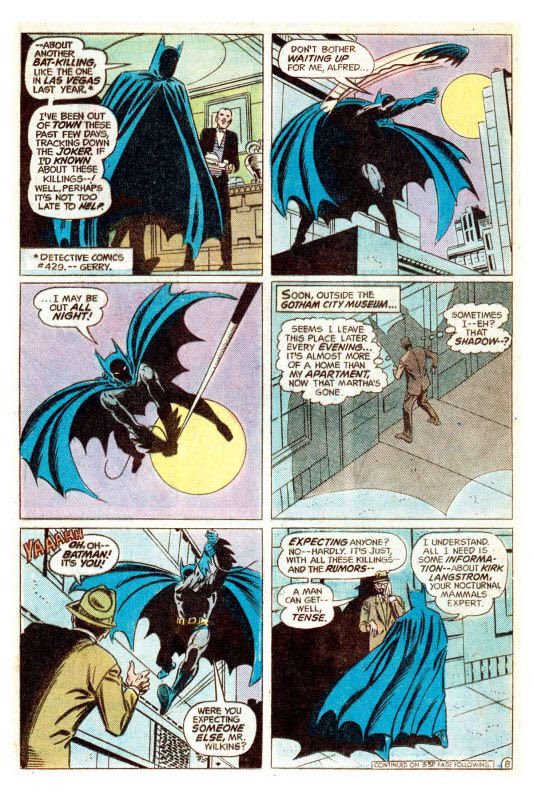
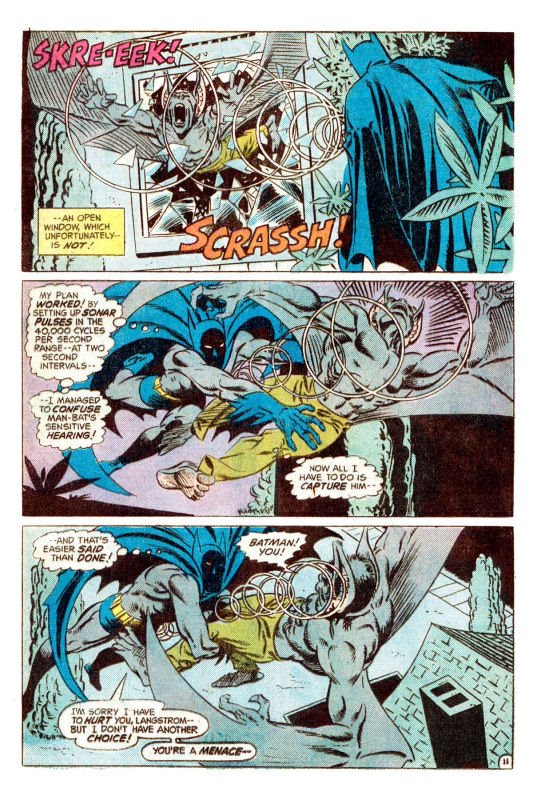
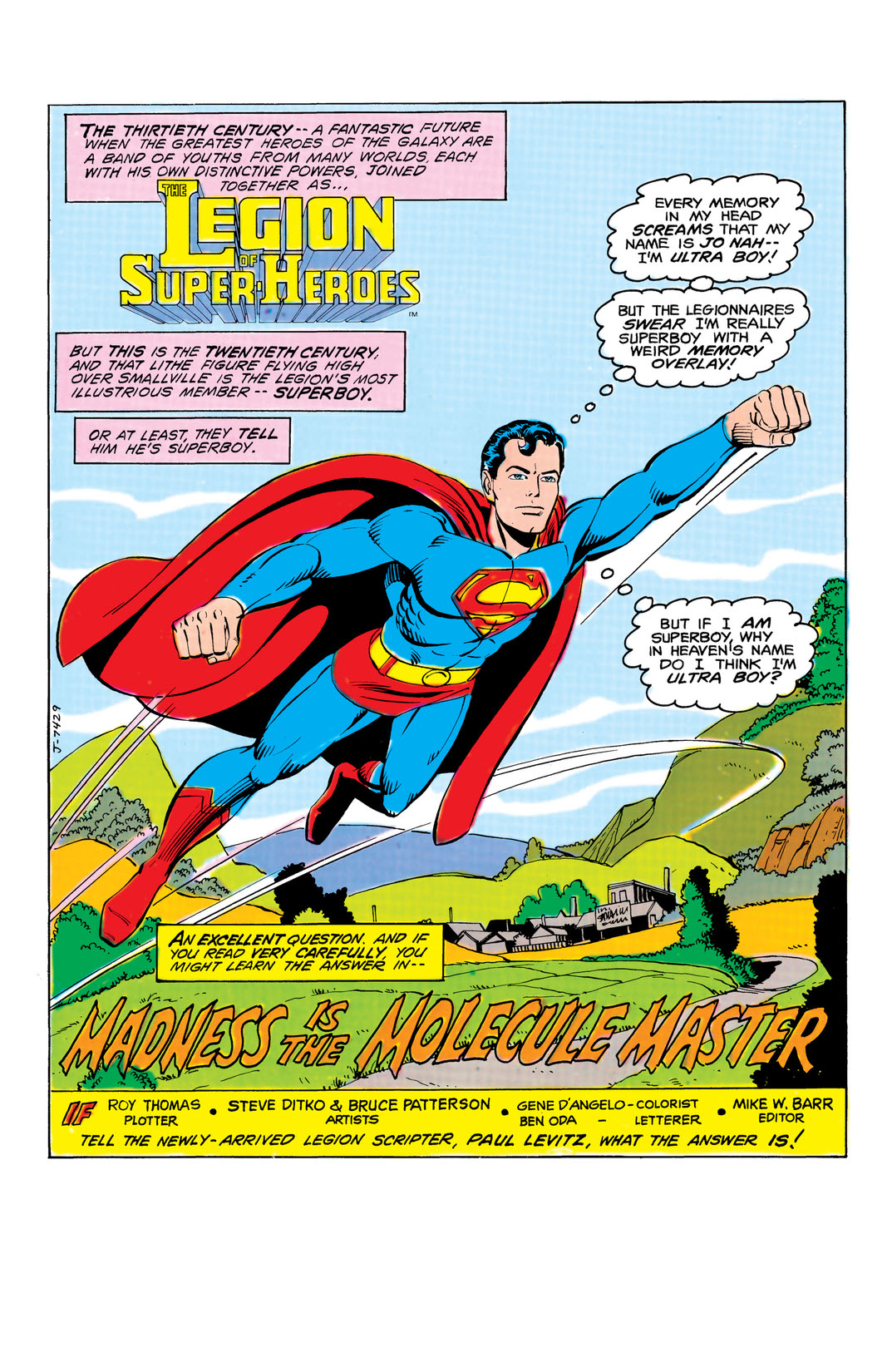
I like Ditko's take on Batman.   Keeping Bats' face shrouded in shadow is a neat approach. I'm disappointed more artists haven't gone this route. This is the first time I ever saw Ditko draw Batman. As a matter of fact, I don't remember him ever drawing DC's big guns. You might be interested in this  davescomicheroes.blogspot.com/2018/07/ditko-dc-oddities-with-superman-batman.html davescomicheroes.blogspot.com/2018/07/ditko-dc-oddities-with-superman-batman.htmlAlso   Superboy from Legion of Superheroes #281  The Spectre from Legends of the DC Universe Giant #1  Green Lantern from Action Comics Weekly #642 |
|
|
|
Post by badwolf on Apr 23, 2020 14:13:30 GMT -5
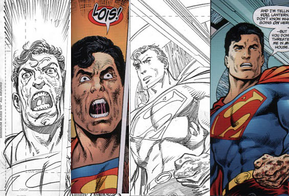
This Batman below, which I think might be credited to Paul Pope, is pretty damaged in an underground S. Clay Wilson sense...  That's pretty typical Pope, but based on the teeth and...whatever he's saying...I'm guessing it's not supposed to be the "regular" Batman? |
|
|
|
Post by electricmastro on Apr 23, 2020 14:24:00 GMT -5
Jack Kirby’s unused faces for Superman's Pal, Jimmy Olsen #143 (November, 1971), which arguably had Superman look like he had a caveman face.   |
|
|
|
Post by DubipR on Apr 23, 2020 15:37:09 GMT -5
This Batman below, which I think might be credited to Paul Pope, is pretty damaged in an underground S. Clay Wilson sense...  That's pretty typical Pope, but based on the teeth and...whatever he's saying...I'm guessing it's not supposed to be the "regular" Batman? Actually he's wearing fake monster teeth in the story to keep up the urban myth. It's actually a very good story. |
|
|
|
Post by profh0011 on Apr 23, 2020 15:42:07 GMT -5
The Kirby faces are BETTER. They have more personality. I mean, what's the point of HIRING Jack kirby to do a "Superman" related book, and not have the book look and read exactly like a "JACK KIRBY" comic? They never would have pulled S*** like this in the last 30 years.
And by the way, did anybody see the JIMMY OLSEN art right after Kirby left the book? CRAP!!! None of the characters were "on-model" at all. But they let that go... because it WASN'T Kirby they would have been SCREWING with.
|
|
|
|
Post by berkley on Apr 23, 2020 16:53:13 GMT -5
The Kirby faces are BETTER. They have more personality. I mean, what's the point of HIRING Jack kirby to do a "Superman" related book, and not have the book look and read exactly like a "JACK KIRBY" comic? They never would have pulled S*** like this in the last 30 years.
And by the way, did anybody see the JIMMY OLSEN art right after Kirby left the book? CRAP!!! None of the characters were "on-model" at all. But they let that go... because it WASN'T Kirby they would have been SCREWING with.
Yeah, they might as well have asked Curt Swan or somebody to draw his arms or whatever so that it would fit fans' expectations, as DC saw them.
If I had been in charge, my solution would have been to tell Kirby he didn't need to draw Superman at all, just concentrate on his own characters in his own, original series - which would be set in their own universe with no connection to the DCU. Of course even assuming Kirby agreed, whch isn't a given, this probably wouldn't have prevented later writers from turning Darkseid into a Superman villian but maybe it might have slowed down the process of degradation just a little bit.
|
|
|
|
Post by Duragizer on Apr 23, 2020 17:50:52 GMT -5
Jack Kirby’s unused faces for Superman's Pal, Jimmy Olsen #143 (November, 1971), which arguably had Superman look like he had a caveman face.   I see more than a passing resemblance to Henry Cavill. Heh. |
|
|
|
Post by Duragizer on Apr 23, 2020 17:58:30 GMT -5
I mean, what's the point of HIRING Jack kirby to do a "Superman" related book, and not have the book look and read exactly like a "JACK KIRBY" comic? They never would have pulled S*** like this in the last 30 years. Actually, they pulled this **** on Byrne when he was partnered with Simone Gail on Action.  The more things change ... |
|
|
|
Post by brutalis on Apr 23, 2020 19:40:03 GMT -5
Pa Kent live action. Choose a look already would ya? Hell, choose an age even.
Ed Cassidy. Tom Fadden. Glenn Ford. Stuart Whitman. Eddie Jones. John Schneider. Kevin Costner.
Thought Eddie Jones looked closest to comic book version. But Ford & Whitman hit the rural, tough & ready & intelligent farmer profile very nicely.
|
|
|
|
Post by beccabear67 on Apr 23, 2020 19:50:21 GMT -5
 The Spectre from Legends of the DC Universe Giant #1 This looked very different when finished by Kevin Nowlan. It was a pretty good combination but there was as much or more Nowlan in the end result as Ditko. |
|
|
|
Post by tarkintino on Apr 23, 2020 19:57:38 GMT -5
The Kirby faces are BETTER. They have more personality. I mean, what's the point of HIRING Jack kirby to do a "Superman" related book, and not have the book look and read exactly like a "JACK KIRBY" comic? They never would have pulled S*** like this in the last 30 years.
And by the way, did anybody see the JIMMY OLSEN art right after Kirby left the book? CRAP!!! None of the characters were "on-model" at all. But they let that go... because it WASN'T Kirby they would have been SCREWING with.
You know the history: even with established and/or great artists, if some are working on a title not necessarily associated with their hand, one of the "Big Guns" (using the house and/or more popular style) will embellish or outright alter faces, bodies, etc. At Marvel, it happened to Buscema (by Romita) and Kirby in cases where it was not a direct penciller/inker collaboration (also by Romita). Same thing happened at DC with Swan or Adams bringing certain artists' style into the house fold, or gave it the expected commercial appeal it apparently lacked. |
|
|
|
Post by chadwilliam on Apr 23, 2020 22:18:49 GMT -5
 The Spectre from Legends of the DC Universe Giant #1 This looked very different when finished by Kevin Nowlan. It was a pretty good combination but there was as much or more Nowlan in the end result as Ditko. Nowlan's inks have, as far as I know, always been a little too overpowering for my tastes which is why I tried to find a link to the original pencils as opposed to the finished artwork. Of course, by this time, Ditko wasn't putting much effort into his pencils (by his own admission) so I can't really blame it looking more Nowlanesque than it should. Here's Ditko not looking at all like he should:  |
|