|
|
Post by Ozymandias on May 4, 2014 17:20:46 GMT -5
To me, Cable is just another of the 'big guns and bad attitude' characters typical of the 90s. Plus he opened the floodgates on characters travelling back from the future that contributed to my abandoning the X-books. Yes, the only Cable stories I liked were those by Darko Macan and Igor Kordey. |
|
|
|
Post by Deleted on May 4, 2014 17:39:58 GMT -5
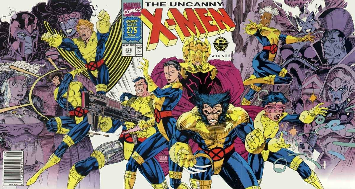
Well you're better at it than me, and that was hand picked Lee. Look at his overall body of work, has he ever illustrated a front to back hand painted comic? On average, they all look the same to me. On more than one occasion with the artists mentioned, I had to check either the signature or the credits on the inside cover to make sure it wasn't illustrated by Liefeld. I'm not sure I follow you here. Is that cover handpicked, or is it representative of his overall body of work? It was the most recent Jim Lee image I had seen on CBR, when it was posted just the other day. At a glance I thought it was a Liefeld image until someone had mentioned Jim Lee's name. It is pretty representative of his work though, his work I've seen, the work he is famous for. X-Men and Wildcats. |
|
|
|
Post by Ish Kabbible on May 4, 2014 17:47:25 GMT -5
I can't believe that Slott got so angry over a comment that wasn't even directed towards him. I wonder how much of that wasn't just theatrics. He didn't leave, after all. He didn't? I know he stopped posting for a long time. In his farewell post he said I was the last straw,that Ramos was hard-working and everyone at the office liked him.Now I do admit it was an over-the-top remark but it was directed at his work and not him as a person.But its hard to separate the two and Slott was tired of the anti-Ramos posts. If Slott came back,thats fine for my vitriol wasn't aimed at him I did respond back to Slott's farewell address.I said a person working hard does not absolve him of turning out substandard work. And just because he brings donuts to the office and folks like him that we need to pay $4 an issue and be stuck with his artwork. Ah well-I got it off my chest. Unfotunately it did not prevent one of the ugliest Marvel comic covers ever to have a #1 on it from coming out.I tried |
|
|
|
Post by Deleted on May 4, 2014 17:48:08 GMT -5
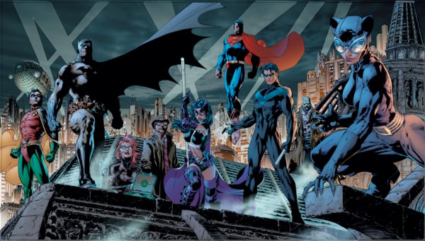
Lee isn't the pinnacle of good art but, unlike Liefeld, he can reach eyebrow-raising level. Liefeld's greatest quality as an artist, as far as I'm concerned, was the enthusiasm he brought to his early work; his What if..? issues were so full of energy that one didn 't notice the technical shortcomings. I can't say I care at all for the general style that he and Lee helped introduce in the early 90s, though. It was tremendously popular, but I thought it had far more flash than substance... And it made Lee & Liefeld imitators replace better and more seasoned artists. He hid feet just as well and just as often as any other bad 90's artist.  only one unobscured view of a foot on a fold out cover featuring 14 characters.  Three feet that aren't shadowed out, on a wraparound cover featuring over 20 characters. That box of text on the bottom left isn't an accident. I don't know why he didn't add a boulder in front of the foot of that redheaded woman. He just flat out cut the foot off, like she's ankle deep in swamp water or something.  More obscured feet. But that wasn't what brought this cover to my attention when I first saw it. It's the capes, the wind blowing a different direction for each character. Batman and Robin shoulder to shoulder, and the wind blowing their capes opposite directions. |
|
|
|
Post by Hoosier X on May 4, 2014 18:18:08 GMT -5
That drawing of the Batman characters is so so so much better than either of the X-Men examples.
|
|
|
|
Post by MDG on May 4, 2014 18:36:44 GMT -5
Lee seems to have retained much of the fan following that he had since the 80s and 90s, whereas a lot of people who used to like Liefeld's art as a kid have grown up and moved on. That was kind of my point. To me they look pretty much exactly the same, to Liefeld's harshest critics, Lee is the pinnacle of good art. It's just odd. Bingo! |
|
|
|
Post by MDG on May 4, 2014 18:47:44 GMT -5
That drawing of the Batman characters is so so so much better than either of the X-Men examples. True, but one of the things that pushed me out of superhero comics in the 90s was the constant flood of "group portraits" on covers and even in stories. |
|
Crimebuster
CCF Podcast Guru
Making comics!
Posts: 3,958 
|
Post by Crimebuster on May 4, 2014 21:10:43 GMT -5
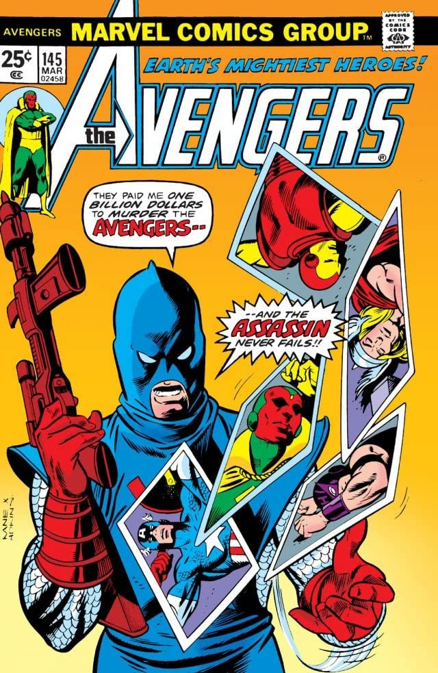
Okay, since our discussion of the relative merits of Rob Liefeld, Todd McFarlane and Jim lee was derailing the introduction thread, I thought I'd move it here instead. I'll start by saying that, embarrassing as it may be to admit it, I still think the cover for New Mutants #87 is cool. Iconic, even. I don't currently own a copy, but I want to get one. Of course, it wouldn't be Rob Liefeld if there wasn't something wrong with it, which in this case is the fact that he swiped the composition from Gil Kane's cover to Avengers #145. But at least he had the good taste to swipe from one of the best cover artists ever.  |
|
|
|
Post by Fan of Bronze on May 4, 2014 21:15:29 GMT -5
Was Herb Trimpe ever on staff? My impression is that he was a long-term free-lancer who always had an assignment (until Jim Shooter's emphasis on clear storytelling no longer drove artist hiring decisions). That doesn't really make Marvel's treatment of the older artists any more palatable, but it is a significant distinction, nevertheless. |
|
Crimebuster
CCF Podcast Guru
Making comics!
Posts: 3,958 
|
Post by Crimebuster on May 4, 2014 21:22:03 GMT -5
Was Herb Trimpe ever on staff? My impression is that he was a long-term free-lancer who always had an assignment (until Jim Shooter's emphasis on clear storytelling no longer drove artist hiring decisions). That doesn't really make Marvel's treatment of the older artists any more palatable, but it is a significant distinction, nevertheless. Well, it's hard to tell by his description in the diary. He basically just stopped getting work from them, which sounds like freelance, but then several months later, they actually sent him a termination notice and he had to work out a severance and benefits package with them. So I don't know what exactly the definition of his job was, but it didn't sound like straight freelance the way he describes it. |
|
|
|
Post by Fan of Bronze on May 4, 2014 21:24:53 GMT -5
Well, it's hard to tell by his description in the diary. He basically just stopped getting work from them, which sounds like freelance, but then several months later, they actually sent him a termination notice and he had to work out a severance and benefits package with them. So I don't know what exactly the definition of his job was, but it didn't sound like straight freelance the way he describes it. Sounds like he had a contract. |
|
Crimebuster
CCF Podcast Guru
Making comics!
Posts: 3,958 
|
Post by Crimebuster on May 4, 2014 21:28:14 GMT -5
Liefeld, McFarlane and Lee all seem like branches of an artist family tree that originally sprang forth from Neal Adams.
Maybe I'm nuts, but to my eye there seems to be a pretty clear progression in art styles that goes like so:
Neal Adams -> Michael Golden -> Art Adams -> Liefeld, Lee and McFarlane
I might be missing a link between Golden and Adams, as Golden's work is certainly more cartoony, with some hints of Ploog in it as well to me. but in terms of the sketchiness of the inking, that all feels like fourth generation Neal Adams derivation.
And Art Adams was kinda/sorta a contemporary of Liefeld, Lee and McFarlane. But his work on Longshot and the New Mutants/X-men Annual crossover in 1985 seems like a clear influence on everything the Image guys would later go on to do.
|
|
|
|
Post by Deleted on May 4, 2014 21:30:23 GMT -5
Liefeld, McFarlane and Lee all seem like branches of an artist family tree that originally sprang forth from Neal Adams. Maybe I'm nuts, but to my eye there seems to be a pretty clear progression in art styles that goes like so: Neal Adams -> Michael Golden -> Art Adams -> Liefeld, Lee and McFarlane I might be missing a link between Golden and Adams, as Golden's work is certainly more cartoony, with some hints of Ploog in it as well to me. but in terms of the sketchiness of the inking, that all feels like fourth generation Neal Adams derivation. And Art Adams was kinda/sorta a contemporary of Liefeld, Lee and McFarlane. But his work on Longshot and the New Mutants/X-men Annual crossover in 1985 seems like a clear influence on everything the Image guys would later go on to do. I think perhaps Walt Simonson needs to be in that progression somewhere. I think Liefeld has mentioned him as an influence, but I am not sure. -M |
|
|
|
Post by Phil Maurice on May 4, 2014 21:35:41 GMT -5
"Stop trying to make TRLAS happen! It's a not a thing!"
--Hystericalposter616 |
|
|
|
Post by Deleted on May 4, 2014 21:44:48 GMT -5
How to draw women the Rob Liefeld way....   |
|