|
|
Post by tartanphantom on Apr 2, 2022 0:16:12 GMT -5
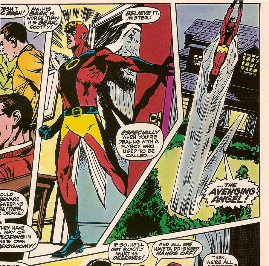
When you've got to find something nice to say about an unwanted gift...  How about this monstrosity.... 
Warren Worthington III needs the fashion advice of Bob Mackie in the worst way...
|
|
|
|
Post by tarkintino on Apr 2, 2022 6:24:46 GMT -5
Going by many of the samples above perhaps the title of this thread should be changed to "What Were the '90s Thinking?" That would run past 30,000 pages. |
|
|
|
Post by Duragizer on Apr 2, 2022 17:28:18 GMT -5
|
|
|
|
Post by Cei-U! on Apr 2, 2022 17:31:23 GMT -5
Hey now, do NOT be dissin' Razorback!
Cei-U! I summon the Big Pig!
|
|
|
|
Post by mikelmidnight on Apr 4, 2022 11:50:40 GMT -5
Offered for your consideration... 
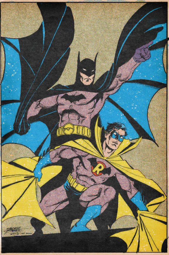
Actually, I want to stand up for this costume. Aesthetically of course, it's atrocious. However, it codes just perfectly. Any eight-year-old will look at this and immediately recognize that it's an older Robin taking over from Batman.
|
|
|
|
Post by Deleted on Apr 4, 2022 12:26:59 GMT -5
Costume is good, I feel, it’s just the proportions that are bad for me. Erik Larsen draws bodies that are too big, that’s what that reminds me of. If Robin had looked slimmer in that image, I’d be fine.
|
|
|
|
Post by chadwilliam on Apr 4, 2022 17:11:09 GMT -5
Offered for your consideration... 
Actually, I want to stand up for this costume. Aesthetically of course, it's atrocious. However, it codes just perfectly. Any eight-year-old will look at this and immediately recognize that it's an older Robin taking over from Batman.
But is he a grown-up Robin or Batman II? It's just such a mess - the emblem seems to say "I'm Batman, No, wait - The 'R' means 'Robin' but the red circle means I'm neither!" The cape is yellow - a carry-over from his Robin days, but why is everything from the chest down Batman? Why the pointed mask and collar? They scream "I want to add something original that was not a part of either original outfits, but try to, at the same time, evoke those identities but in a manner no sane individual ever would!" This looks even worse than Bob Kane's red and black domino masked Bat-Man outfit which Bill Finger had to step in and fix. |
|
Confessor
CCF Mod Squad
Not Bucky O'Hare!
Posts: 10,200 
|
Post by Confessor on Apr 4, 2022 17:40:01 GMT -5
Offered for your consideration...  Admittedly, that might be a pretty bad looking costume, but that is a cracking issue of Justice League of America. |
|
|
|
Post by majestic on Apr 4, 2022 18:23:11 GMT -5
That costume was ugly. However his second costume was much better. I believe Neal Adams designed this one. Art by John Byrne.

|
|
|
|
Post by majestic on Apr 4, 2022 19:00:22 GMT -5
Although George Perez made the first one look good:  |
|
|
|
Post by Deleted on Apr 4, 2022 19:03:47 GMT -5
In fairness, George Perez could draw any of the costumes in this thread and make them look good.
|
|
|
|
Post by majestic on Apr 4, 2022 19:15:39 GMT -5
In fairness, George Perez could draw any of the costumes in this thread and make them look good. looking at Perez drawing I feel if you got rid of the pointy collar and made the cape blue it would be much better. |
|
|
|
Post by Commander Benson on Apr 11, 2022 9:57:44 GMT -5
Actually, I want to stand up for this costume. Aesthetically of course, it's atrocious. However, it codes just perfectly. Any eight-year-old will look at this and immediately recognize that it's an older Robin taking over from Batman.
But is he a grown-up Robin or Batman II? It's just such a mess - the emblem seems to say "I'm Batman, No, wait - The 'R' means 'Robin' but the red circle means I'm neither!" The cape is yellow - a carry-over from his Robin days, but why is everything from the chest down Batman? Why the pointed mask and collar? They scream "I want to add something original that was not a part of either original outfits, but try to, at the same time, evoke those identities but in a manner no sane individual ever would!" That's actually the second version of the Robin of Earth-Two's original adult costume. The version above, seen on the cover of JLA # 55 (Aug., 1967), was not seen inside a book until the next issue---# 56 (Sep., 1967). Inside issue # 55, the no-longer-Boy Wonder debuts in a slightly different costume. There are no blue trunks, just grey leggings. Instead of the standard skin-tight super-hero shirt, he wears a grey jerkin with flared ends beneath his utility belt, similar to the red vest he wore as a boy. The bat-winged "R" chest emblem did not have the red circle. And his mask did not have the nose-piece. The effect is more of a balance between Batman's costume and the boyhood Robin outfit. I have no direct knowledge why the costume was tinkered with for the first cover and the second half of that JLA/JSA team-up (and would remain the definitive version). In fact, most folks don't even realise the costume looked slightly different in JLA # 55. I discussed the changes more at length in one of my Deck Log entries, linked here: captaincomics.ning.com/forum/topics/deck-log-entry-181-mysteries-of-the-silver-age-part-oneHope this helps. |
|
|
|
Post by chadwilliam on Apr 11, 2022 22:23:36 GMT -5
That vest actually feels like it's on the right track - a sort of merger between two outfits instead of Batman's pants + Robin's cape. Even his mask in JLA #55 works better in my eyes due to the addition of those extra pointed tips. As an inversion of Batman's chest emblem, it's actually quite clever.
|
|
|
|
Post by Duragizer on Apr 14, 2022 15:30:34 GMT -5
|
|