|
|
Post by Deleted on May 8, 2022 8:06:15 GMT -5
It looks like there was a survey and thread a couple of years ago on a related topic, but since it's been a bit and I might have a slightly different spin on the theme, thought I'd post this for consideration. Publisher logos are functionally branding tools of course, but they can also bring a bit of an aesthetic quality when done creatively. One thing I loved about the DC bullet logo was the little color touches they could do with it, a great example being this cover to match the Riddler theme:  But over time there's also maybe an emotional investment. The DC bullet logo started just months before I began reading comic books at a very young age and had a long run well into adulthood for me. Every time when I'm shopping for back issues, in some ways my "personal Bronze Age" starts right there, it's a visual cue of sorts. Similarly, I really loved the early days of First Comics in the 80's and every time I see this logo it evokes good feelings (I think it's a nice simple design as well):  But later when it switched to this style, I associate it with a period that wasn't as strong creatively overall to me and my interest started to wane. Even though I do enjoy a number of comics that have this version of the logo, I find myself less actively searching for back issues if I see this on them, right or wrong.  So a few questions to throw out: 1) Do certain logos have an appeal to you based more on aesthetic quality, and if so any examples that particularly demonstrate that like my Batman cover above?
2) Do you find yourself more emotionally vested to certain ones like in my First Comics example, and why? |
|
|
|
Post by tarkintino on May 8, 2022 10:08:29 GMT -5
Personally, logos were less about aesthetic quality and more about a memory/pleasure association with certain titles (the point of their design, to some degree). Of all of the comic publishers' logos, Gold Key's--  --was such a standout. In addition to the memory/pleasure association, that "gold key" in a black rectangle with its back & magenta stripes on its side was impossible to ignore, whether on a shelf, spinner rack, laid out in stacks at a newsstand or any other way comics were displayed. The actual meaning of "gold key" was not necessary for readers to know--it was a such a stark symbol so unlike that of any other publisher. |
|
|
|
Post by Chris on May 8, 2022 13:01:43 GMT -5
I have to agree about the Gold Key logo. I always liked the look and thought it made the books look more, I don't know, professional or something. Still, I rarely saw a Gold Key title that I was actually interested in buying. But they looked great.
|
|
|
|
Post by tonebone on May 8, 2022 18:02:13 GMT -5
I believe DC was far superior in its graphic design and trade dress than Marvel during the 70's - 90's... but NOTHING beats this Marvel trade dress, with the Character Box, and the Marvel Comics Group banner across the top. Hands down, the absolute best design ever. 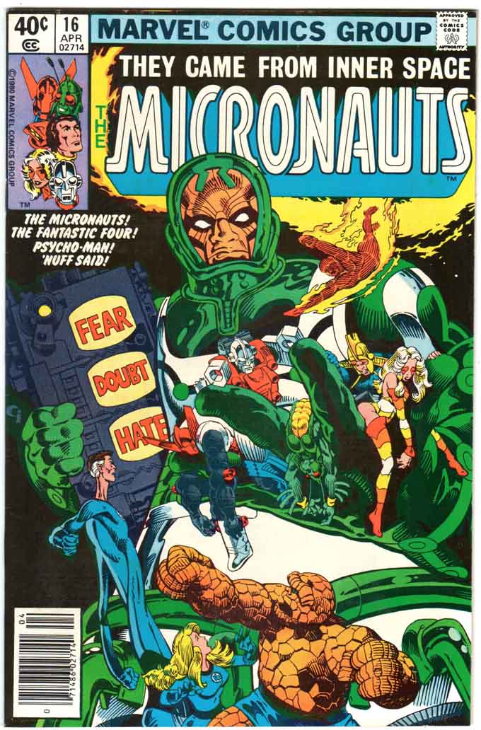 |
|
|
|
Post by tonebone on May 8, 2022 18:04:41 GMT -5
I present to you the BEST DC Comics Logo, Designed by Milton Glazer...  And the WORST, designed by a chimpanzee with a pirated copy of Photoshop.... 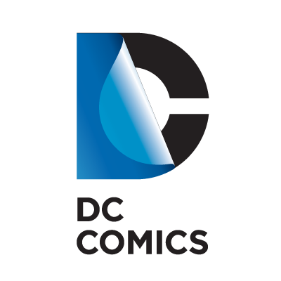 |
|
|
|
Post by Deleted on May 8, 2022 18:16:34 GMT -5
I present to you the BEST DC Comics Logo, Designed by Milton Glazer...  And the WORST, designed by a chimpanzee with a pirated copy of Photoshop....  For truth on both!! |
|
|
|
Post by Deleted on May 8, 2022 18:28:03 GMT -5
I believe DC was far superior in its graphic design and trade dress than Marvel during the 70's - 90's... but NOTHING beats this Marvel trade dress, with the Character Box, and the Marvel Comics Group banner across the top. Hands down, the absolute best design ever. Yeah, as you say that, it reminds me how the character box itself has been put to good use many times like with this issue of the West Coast Avengers mini-series and how it further enhances the "roll call" mystery:  |
|
|
|
Post by tonebone on May 8, 2022 20:52:38 GMT -5
I believe DC was far superior in its graphic design and trade dress than Marvel during the 70's - 90's... but NOTHING beats this Marvel trade dress, with the Character Box, and the Marvel Comics Group banner across the top. Hands down, the absolute best design ever. Yeah, as you say that, it reminds me how the character box itself has been put to good use many times like with this issue of the West Coast Avengers mini-series and how it further enhances the "roll call" mystery:  Yeah that's a great one! And, I actually like how they rolled it all into one box when they dropped the banner across the top. I really HATE the way Marvel, today, puts the red "Marvel" log just anywhere on the page, wherever there's space. And I REALLY hate whenever anyone puts the price and issue number (especially) in the box with the UPC. |
|
|
|
Post by codystarbuck on May 8, 2022 21:11:19 GMT -5
I present to you the BEST DC Comics Logo, Designed by Milton Glazer...  And the WORST, designed by a chimpanzee with a pirated copy of Photoshop....  A little glue will stop that peeling. |
|
|
|
Post by codystarbuck on May 8, 2022 21:18:35 GMT -5
|
|
|
|
Post by EdoBosnar on May 9, 2022 1:49:23 GMT -5
Yeah, the Charlton Bullseye is a really well-designed logo and has always been a personal favorite. Otherwise, although the company didn't last very long and I've never even read any of their books, I think Defiant had a really nice logo:  |
|
|
|
Post by badwolf on May 9, 2022 8:56:32 GMT -5
I liked the classic DC bullet. Of all the modern designs they played with in recent years, I thought this was a nice updating of it: 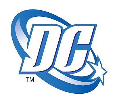 The logo they seemed to settle on finally is okay, and also a callback to a vintage logo so that's alright I guess. The "peelaway" logo was bizarre! What were they thinking? As plain as it was, I am emotionally attached to the Marvel Comics Group banner. It was what they were using when I first started reading comics, and for some years after. However, I loved it when they went to the new design that left more room for the art. I remember there was a cute house add featuring the Thing that announced it a month or two before. I too hate the chaotic nature of the modern covers with the logo floating around everywhere. I guess newsstands are gone, but some comic shops still display the books with the spine edge peeking out, so you'd think they'd want some brand stability over there. Bring back the 80s design with corner boxes, I say! |
|
|
|
Post by tonebone on May 9, 2022 11:07:29 GMT -5
I liked the classic DC bullet. Of all the modern designs they played with in recent years, I thought this was a nice updating of it:  The logo they seemed to settle on finally is okay, and also a callback to a vintage logo so that's alright I guess. The "peelaway" logo was bizarre! What were they thinking? As plain as it was, I am emotionally attached to the Marvel Comics Group banner. It was what they were using when I first started reading comics, and for some years after. However, I loved it when they went to the new design that left more room for the art. I remember there was a cute house add featuring the Thing that announced it a month or two before. I too hate the chaotic nature of the modern covers with the logo floating around everywhere. I guess newsstands are gone, but some comic shops still display the books with the spine edge peeking out, so you'd think they'd want some brand stability over there. Bring back the 80s design with corner boxes, I say! Yes! Very cool update! Has DC, has the circle, has a star, even has some motion and action. Too bad it got sued out of use, by DC Shoes...  DC Comics was eager to use their new logo on fashion, including shoes. They discovered that there was actually already a DC Shoes company, and DC Comics SUED them for trademark infringement... however, DC Comics had not actually trademarked their design, and the shoe company WON, and not only did they get to keep the shoe logo, but DC Comics had to PAY them to uses the new DC Comics logo, hence the "peeling band aid" logo that came next. |
|
|
|
Post by MDG on May 9, 2022 11:09:52 GMT -5
... And the WORST, designed by a chimpanzee with a pirated copy of Photoshop....  A little glue will stop that peeling. The kindest this you can say about it, though, is that it shows DC still wanted to emphasize that they were in the book business.
I like how the undergrpund publishers let artists just draw a version of the logo on the cover. (This says "older" but the real variety in the 60s-early 70s was much wider.)
|
|
|
|
Post by badwolf on May 9, 2022 11:24:17 GMT -5
I liked the classic DC bullet. Of all the modern designs they played with in recent years, I thought this was a nice updating of it:  The logo they seemed to settle on finally is okay, and also a callback to a vintage logo so that's alright I guess. The "peelaway" logo was bizarre! What were they thinking? As plain as it was, I am emotionally attached to the Marvel Comics Group banner. It was what they were using when I first started reading comics, and for some years after. However, I loved it when they went to the new design that left more room for the art. I remember there was a cute house add featuring the Thing that announced it a month or two before. I too hate the chaotic nature of the modern covers with the logo floating around everywhere. I guess newsstands are gone, but some comic shops still display the books with the spine edge peeking out, so you'd think they'd want some brand stability over there. Bring back the 80s design with corner boxes, I say! Yes! Very cool update! Has DC, has the circle, has a star, even has some motion and action. Too bad it got sued out of use, by DC Shoes...  DC Comics was eager to use their new logo on fashion, including shoes. They discovered that there was actually already a DC Shoes company, and DC Comics SUED them for trademark infringement... however, DC Comics had not actually trademarked their design, and the shoe company WON, and not only did they get to keep the shoe logo, but DC Comics had to PAY them to uses the new DC Comics logo, hence the "peeling band aid" logo that came next. That's crazy! They don't look even remotely similar! |
|