|
|
Post by Deleted on May 9, 2022 21:06:51 GMT -5
Nope - more like six: for more or less two months in 1980 (on books that went on sale in June and July) and then again for four months in 1981 (books on sale from August to November). They may be ugly... they may be intrusive... but man, just LOOKING at those banners really transports me back to the days I purchased them off the spinner rack. 100% agree!! |
|
|
|
Post by tonebone on May 10, 2022 7:23:50 GMT -5
|
|
|
|
Post by tonebone on May 10, 2022 7:28:23 GMT -5
I think my personal favorite is still the bronze-age DC "double bullet" trade dress-- with a simple "DC" logo on the left (often with the book title included, for quick thumbing through issues on a spinner or flat rack), balanced by the price point on the right.
The beauty of this design allowed for use of a heavy bar title masthead, which harkened back to the early DC Golden Age design,
OR-- it could even be implemented with no masthead and a floating title logo--
The first variation being my personal favorite, as the price box isn't crowded by the issue info, and consequently offers the perception of cleaner symmetry. In either case, leave it to that pesky CCA stamp to despoil just about any design of the time...
I may be in the minority, but I never cared for the "Marvel Comics Group" masthead bar used throughout the '70s & '80s--- and I hated it even more when they started crowding that space with the various contest promo garbage. With regard to Marvel, I think the "Pop Art Productions" corner boxes that Prince Hal mentioned were the epitome of Marvel's trade dress when combined with a floating title logo. Again, the CCA stamp generally fobbed up an otherwise attractive design.
And as much as I love the Charlton bullseye logo, I still have a major soft spot for the "Big C" Charlton logo, as that is what they were using when I first discovered Charlton books.
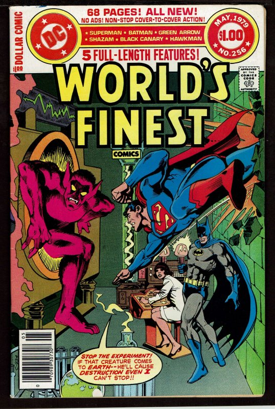
Along with the "double bullet" design, I love the DC Dollar Comic "barbell" design... It takes up a chunk of the top of the cover, but with some very valuable info... it's 68 pages, no adds, for A DOLLAR! DID I MENTION IT"S A DOLLAR???  |
|
|
|
Post by MWGallaher on May 10, 2022 7:44:37 GMT -5
The Harvey Comics jack-in-the-box logo is a great logo.  I was probably a weird kid, but I always hated the "toy" known as the "jack-in-the-box". I'd watch the tv Christmas special "Rudolph the Red-Nosed Reindeer": and think "Hey, no child wants to play with a jack-in-the-box, either, Charlie." |
|
|
|
Post by badwolf on May 10, 2022 9:22:00 GMT -5
Along with the "double bullet" design, I love the DC Dollar Comic "barbell" design... It takes up a chunk of the top of the cover, but with some very valuable info... it's 68 pages, no adds, for A DOLLAR! DID I MENTION IT"S A DOLLAR???  I love the Dollar Comics design too and it really takes me back. They could have maybe gotten rid of the white background, though.
|
|
|
|
Post by tonebone on Jul 15, 2022 7:29:19 GMT -5
I just stumbled across this... they are concept mockups for the redesign of the DC logo... I'm guessing this was the 2005 version, which got sued out of existence by a shoe company.   These were concepts done by the Tate Design Group, however, my research says the final logo was done by Richard Bruning and Josh Beateman, which sounds like it was done in-house. |
|
|
|
Post by tonebone on Jul 15, 2022 7:32:15 GMT -5
This one didn't die soon enough....  |
|
|
|
Post by tonebone on Jul 15, 2022 7:39:43 GMT -5
Man, I have always hated this... so cartoony, too detailed. I have always thought it looked very amateurish.  |
|
|
|
Post by Ish Kabbible on Jul 15, 2022 7:52:09 GMT -5
I like logos that come to life  |
|
|
|
Post by MDG on Jul 15, 2022 8:04:37 GMT -5
Retconned by Giffen...  |
|
|
|
Post by EdoBosnar on Jul 15, 2022 9:18:34 GMT -5
Nothing ground-breaking about this one, but I've always been fond of the updated logo Pacific introduced about a half-year after its launch:  And among the logos of 'newer' publishers, I really like the one from Red 5 Comics:  |
|
|
|
Post by tonebone on Jul 18, 2022 8:36:03 GMT -5
Retconned by Giffen...  I think the joke here was Johnny DC gets retconned to Jonni DC.... just like the then-recently published retcon of Johnny Thunder to Jonni Thunder. |
|